条形图的多种画法
import numpy as np
import matplotlib
matplotlib.use('nbagg')
import matplotlib.pyplot as plt
%matplotlib inline
np.random.seed(0)
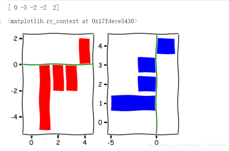
x = np.arange(5)
y = np.random.randint(-5,5,5)
print (y)
fig,axes = plt.subplots(ncols = 2)
v_bars = axes[0].bar(x,y,color='red')
h_bars = axes[1].barh(x,y,color='blue')
axes[0].axhline(0,color='green',linewidth=2)
axes[1].axvline(0,color='green',linewidth=2)
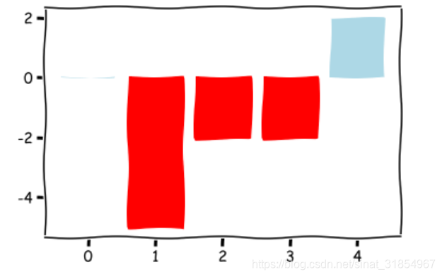
plt.xkcd()
fig,ax = plt.subplots()
v_bars = ax.bar(x,y,color='lightblue')
for bar,height in zip(v_bars,y):
if height < 0:
bar.set(edgecolor = 'darkred',color = 'red',linewidth = 3)
plt.show()
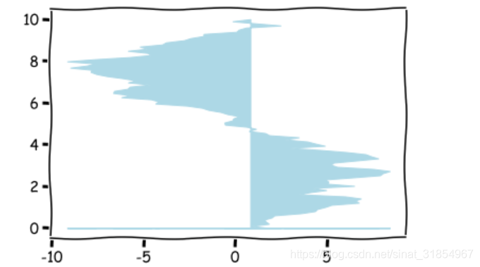
x = np.random.randn(100).cumsum()
y = np.linspace(0,10,100)
fig,ax = plt.subplots()
ax.fill_between(x,y,color='lightblue')
plt.show()
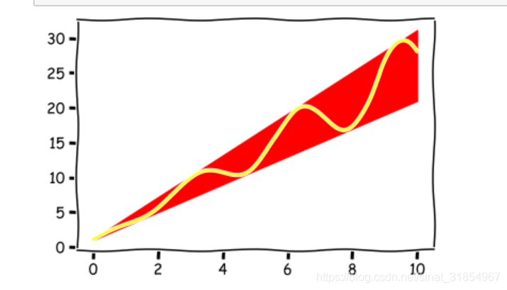
x = np.linspace(0,10,200)
y1 = 2*x +1
y2 = 3*x +1.2
y_mean = 0.5*x*np.cos(2*x) + 2.5*x +1.1
fig,ax = plt.subplots()
ax.fill_between(x,y1,y2,color='red')
ax.plot(x,y_mean,color='yellow')
plt.show()
条形图的细节操作
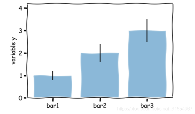
mean_values = [1,2,3]
variance = [0.2,0.4,0.5]
bar_label = ['bar1','bar2','bar3']
x_pos = list(range(len(bar_label)))
plt.bar(x_pos,mean_values,yerr=variance,alpha=0.3)
max_y = max(zip(mean_values,variance))
plt.ylim([0,(max_y[0]+max_y[1])*1.2])
plt.ylabel('variable y')
plt.xticks(x_pos,bar_label)
plt.show()
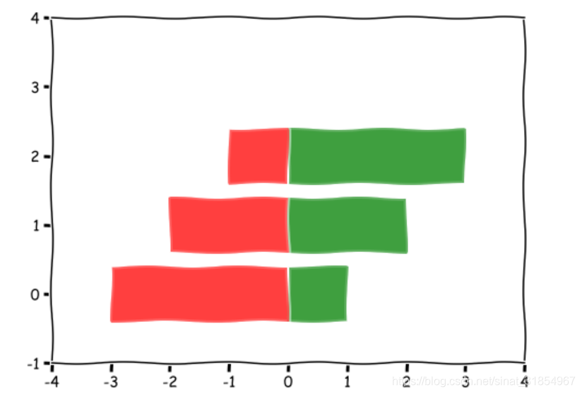
x1 = np.array([1,2,3])
x2 = np.array([3,2,1])
bar_labels = ['bar1','bar2','bar3']
fig = plt.figure(figsize = (8,6))
y_pos = np.arange(len(x1))
y_pos = [x for x in y_pos]
plt.barh(y_pos,x1,color='g',alpha = 0.5)
plt.barh(y_pos,-x2,color='r',alpha = 0.5)
plt.xlim(-max(x2)-1,max(x1)+1)
plt.ylim(-1,len(x1)+1)
plt.show()
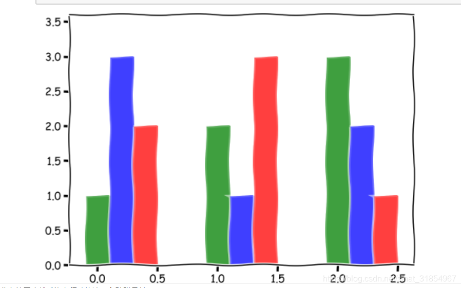
green_data = [1, 2, 3]
blue_data = [3, 1, 2]
red_data = [2, 3, 1]
labels = ['group 1', 'group 2', 'group 3']

pos = list(range(len(green_data)))
width = 0.2
fig, ax = plt.subplots(figsize=(8,6))

plt.bar(pos,green_data,width,alpha=0.5,color='g',label=labels[0])
plt.bar([p+width for p in pos],blue_data,width,alpha=0.5,color='b',label=labels[1])
plt.bar([p+width*2 for p in pos],red_data,width,alpha=0.5,color='r',label=labels[2])

plt.show()
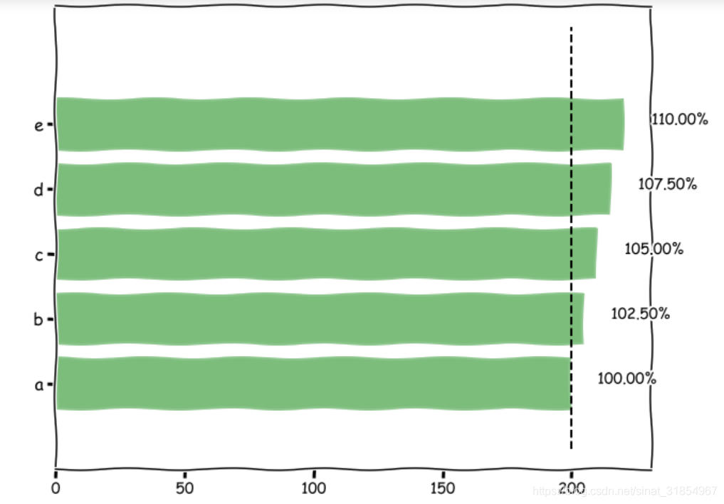
data = range(200, 225, 5)
bar_labels = ['a', 'b', 'c', 'd', 'e']
fig = plt.figure(figsize=(10,8))
y_pos = np.arange(len(data))
plt.yticks(y_pos, bar_labels, fontsize=16)
bars = plt.barh(y_pos,data,alpha = 0.3,color='g')
plt.vlines(min(data),-1,len(data)+0.5,linestyle = 'dashed')
for b,d in zip(bars,data): plt.text(b.get_width()+b.get_width()*0.05,b.get_y()+b.get_height()/2,'{0:.2%}'.format(d/min(data)))
条形图外观设置
自定义颜色库Cmap
mean_values = range(10,18)
x_pos = range(len(mean_values))
import matplotlib.colors as col
import matplotlib.cm as cm
cmap1 = cm.ScalarMappable(col.Normalize(min(mean_values),max(mean_values),cm.hot))
cmap2 = cm.ScalarMappable(col.Normalize(0,20,cm.hot))
plt.subplot(121)
plt.bar(x_pos,mean_values,color = cmap1.to_rgba(mean_values))
plt.subplot(122)
plt.bar(x_pos,mean_values,color = cmap2.to_rgba(mean_values))
plt.show()
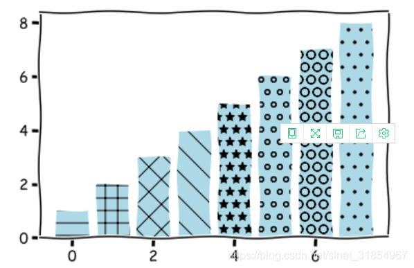
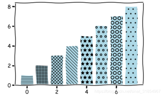
自定义字符填充
patterns = ('-', '+', 'x', '\\', '*', 'o', 'O', '.')
fig = plt.gca()
mean_value = range(1,len(patterns)+1)
x_pos = list(range(len(mean_value)))
bars = plt.bar(x_pos,mean_value,color='lightblue')
for bar,pattern in zip(bars,patterns):
bar.set_hatch(pattern)
plt.show()


 4752
4752


 被折叠的 条评论
为什么被折叠?
被折叠的 条评论
为什么被折叠?
 到【灌水乐园】发言


