


目录
动画
通过 CSS3,我们能够创建动画,这可以在许多网页中取代动画图片、Flash 动画以及 JavaScript。
@keyframes规则
@keyframes 规则用于创建动画。在 @keyframes 中规定某项 CSS 样式,就能创建由当前样式逐渐改为新样式的动画效果。
浏览器支持
表格中的数字表示支持该属性的第一个浏览器版本号。
紧跟在 -webkit-, -ms- 或 -moz- 前的数字为支持该前缀属性的第一个浏览器版本号。
| 属性 | Chrome | IE | Firefox | Safari | Opera |
|---|---|---|---|---|---|
| @keyframes | 43.0 4.0 -webkit- | 10.0 | 16.0 5.0 -moz- | 9.0 4.0 -webkit- | 30.0 15.0 -webkit- 12.0 -o- |
| animation | 43.0 4.0 -webkit- | 10.0 | 16.0 5.0 -moz- | 9.0 4.0 -webkit- | 30.0 15.0 -webkit- 12.0 -o- |
CSS3动画属性
| 属性 | 描述 | CSS |
|---|---|---|
| @keyframes | 规定动画。 | 3 |
| animation | 所有动画属性的简写属性,除了 animation-play-state 属性。 | 3 |
| animation-name | 规定 @keyframes 动画的名称。 | 3 |
| animation-duration | 规定动画完成一个周期所花费的秒或毫秒。默认是 0。 | 3 |
| animation-timing-function | 规定动画的速度曲线。默认是 "ease"。 | 3 |
| animation-delay | 规定动画何时开始。默认是 0。 | 3 |
| animation-iteration-count | 规定动画被播放的次数。默认是 1。 | 3 |
| animation-direction | 规定动画是否在下一周期逆向地播放。默认是 "normal"。 | 3 |
| animation-play-state | 规定动画是否正在运行或暂停。默认是 "running"。 | 3 |
| animation-fill-mode | 规定对象动画时间之外的状态。 | 3 |
注释:当动画完成后,动画的状态会回到初始状态。
注释:要改变这一点,可以设置 animation-fill-mode: forwards; 使动画完成后停留在最后一帧。
CSS3动画
当在 @keyframes 中创建动画时,请把它捆绑到某个选择器,否则不会产生动画效果。
通过规定至少以下两项 CSS3 动画属性,即可将动画绑定到选择器:
- 规定动画的名称
- 规定动画的时长
什么是CSS3中的动画
动画是使元素从一种样式逐渐变化为另一种样式的效果。
您可以改变任意多的样式任意多的次数。
请用百分比来规定变化发生的时间,或用关键词 "from" 和 "to",等同于 0% 和 100%。
0% 是动画的开始,100% 是动画的完成。
为了得到最佳的浏览器支持,您应该始终定义 0% 和 100% 选择器。
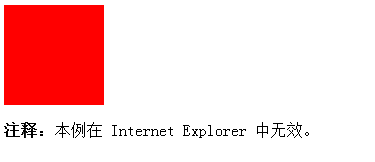
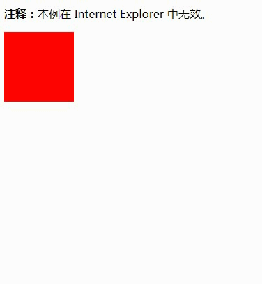
实例
捆绑一个动画到 div 元素,时长 5s
<!DOCTYPE html>
<html>
<head>
<style>
div
{
width:100px;
height:100px;
background:red;
animation:myfirst 5s;
-moz-animation:myfirst 5s; /* Firefox */
-webkit-animation:myfirst 5s; /* Safari and Chrome */
-o-animation:myfirst 5s; /* Opera */
}

@keyframes myfirst
{
from {background:red;}
to {background:yellow;}
}

@-moz-keyframes myfirst /* Firefox */
{
from {background:red;}
to {background:yellow;}
}

@-webkit-keyframes myfirst /* Safari and Chrome */
{
from {background:red;}
to {background:yellow;}
}

@-o-keyframes myfirst /* Opera */
{
from {background:red;}
to {background:yellow;}
}
</style>
</head>
<body>

<div></div>

<p><b>注释:</b>本例在 Internet Explorer 中无效。</p>

</body>
</html>注释:必须定义动画的名称和时长。如果忽略时长,则动画不会允许,因为默认值是0.
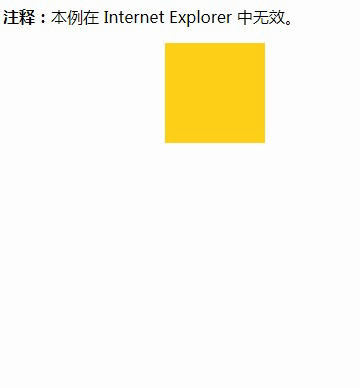
当动画为 25% 及 50% 时改变背景色,然后当动画 100% 完成时再次改变
<!DOCTYPE html>
<html>
<head>
<style>
div
{
width:100px;
height:100px;
background:red;
animation:myfirst 5s;
-moz-animation:myfirst 5s; /* Firefox */
-webkit-animation:myfirst 5s; /* Safari and Chrome */
-o-animation:myfirst 5s; /* Opera */
}

@keyframes myfirst
{
0%   {background:red;}
25%  {background:yellow;}
50%  {background:blue;}
100% {background:green;}
}

@-moz-keyframes myfirst /* Firefox */
{
0%   {background:red;}
25%  {background:yellow;}
50%  {background:blue;}
100% {background:green;}
}

@-webkit-keyframes myfirst /* Safari and Chrome */
{
0%   {background:red;}
25%  {background:yellow;}
50%  {background:blue;}
100% {background:green;}
}

@-o-keyframes myfirst /* Opera */
{
0%   {background:red;}
25%  {background:yellow;}
50%  {background:blue;}
100% {background:green;}
}
</style>
</head>
<body>

<div></div>

<p><b>注释:</b>当动画完成时,会变回初始的样式。</p>

<p><b>注释:</b>本例在 Internet Explorer 中无效。</p>

</body>
</html>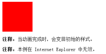

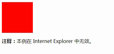
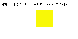
改变背景色和位置
<!DOCTYPE html>
<html>
<head>
<style>
div
{
width:100px;
height:100px;
background:red;
position:relative;
animation:myfirst 5s;
-moz-animation:myfirst 5s; /* Firefox */
-webkit-animation:myfirst 5s; /* Safari and Chrome */
-o-animation:myfirst 5s; /* Opera */
}

@keyframes myfirst
{
0%   {background:red; left:0px; top:0px;}
25%  {background:yellow; left:200px; top:0px;}
50%  {background:blue; left:200px; top:200px;}
75%  {background:green; left:0px; top:200px;}
100% {background:red; left:0px; top:0px;}
}

@-moz-keyframes myfirst /* Firefox */
{
0%   {background:red; left:0px; top:0px;}
25%  {background:yellow; left:200px; top:0px;}
50%  {background:blue; left:200px; top:200px;}
75%  {background:green; left:0px; top:200px;}
100% {background:red; left:0px; top:0px;}
}

@-webkit-keyframes myfirst /* Safari and Chrome */
{
0%   {background:red; left:0px; top:0px;}
25%  {background:yellow; left:200px; top:0px;}
50%  {background:blue; left:200px; top:200px;}
75%  {background:green; left:0px; top:200px;}
100% {background:red; left:0px; top:0px;}
}

@-o-keyframes myfirst /* Opera */
{
0%   {background:red; left:0px; top:0px;}
25%  {background:yellow; left:200px; top:0px;}
50%  {background:blue; left:200px; top:200px;}
75%  {background:green; left:0px; top:200px;}
100% {background:red; left:0px; top:0px;}
}
</style>
</head>
<body>

<p><b>注释:</b>本例在 Internet Explorer 中无效。</p>

<div></div>

</body>
</html>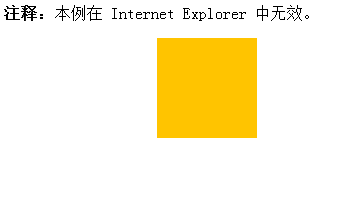
该例设置了所有属性
<!DOCTYPE html>
<html>
<head>
<style>
div
{
width:100px;
height:100px;
background:red;
position:relative;
animation-name:myfirst;
animation-duration:5s;
animation-timing-function:linear;
animation-delay:2s;
animation-iteration-count:infinite;
animation-direction:alternate;
animation-play-state:running;

/* Firefox: */
-moz-animation-name:myfirst;
-moz-animation-duration:5s;
-moz-animation-timing-function:linear;
-moz-animation-delay:2s;
-moz-animation-iteration-count:infinite;
-moz-animation-direction:alternate;
-moz-animation-play-state:running;

/* Safari and Chrome: */
-webkit-animation-name:myfirst;
-webkit-animation-duration:5s;
-webkit-animation-timing-function:linear;
-webkit-animation-delay:2s;
-webkit-animation-iteration-count:infinite;
-webkit-animation-direction:alternate;
-webkit-animation-play-state:running;

/* Opera: */
-o-animation-name:myfirst;
-o-animation-duration:5s;
-o-animation-timing-function:linear;
-o-animation-delay:2s;
-o-animation-iteration-count:infinite;
-o-animation-direction:alternate;
-o-animation-play-state:running;
}

@keyframes myfirst
{
0%   {background:red; left:0px; top:0px;}
25%  {background:yellow; left:200px; top:0px;}
50%  {background:blue; left:200px; top:200px;}
75%  {background:green; left:0px; top:200px;}
100% {background:red; left:0px; top:0px;}
}

@-moz-keyframes myfirst /* Firefox */
{
0%   {background:red; left:0px; top:0px;}
25%  {background:yellow; left:200px; top:0px;}
50%  {background:blue; left:200px; top:200px;}
75%  {background:green; left:0px; top:200px;}
100% {background:red; left:0px; top:0px;}
}

@-webkit-keyframes myfirst /* Safari and Chrome */
{
0%   {background:red; left:0px; top:0px;}
25%  {background:yellow; left:200px; top:0px;}
50%  {background:blue; left:200px; top:200px;}
75%  {background:green; left:0px; top:200px;}
100% {background:red; left:0px; top:0px;}
}

@-o-keyframes myfirst /* Opera */
{
0%   {background:red; left:0px; top:0px;}
25%  {background:yellow; left:200px; top:0px;}
50%  {background:blue; left:200px; top:200px;}
75%  {background:green; left:0px; top:200px;}
100% {background:red; left:0px; top:0px;}
}
</style>
</head>
<body>

<p><b>注释:</b>本例在 Internet Explorer 中无效。</p>

<div></div>

</body>
</html>
使用上例的简写动画animation属性,效果相同:
div
{
animation: myfirst 5s linear 2s infinite alternate;
/* Firefox: */
-moz-animation: myfirst 5s linear 2s infinite alternate;
/* Safari 和 Chrome: */
-webkit-animation: myfirst 5s linear 2s infinite alternate;
/* Opera: */
-o-animation: myfirst 5s linear 2s infinite alternate;
}


 1万+
1万+


 被折叠的 条评论
为什么被折叠?
被折叠的 条评论
为什么被折叠?
 到【灌水乐园】发言


