


SciPy.org — SciPy.org https://www.scipy.org,网站Documentation——pandas——search
import numpy as np
import pandas as pd
import matplotlib as mpl
from matplotlib import pyplot as plt
—————————————————————————————————————————————————
1、一维表数据:pd.Series绘图
        ts=pd.Series(np.random.randn(5), index=(pd.date_range('2018-1-2', periods=5)))
        print("\n", ts)
        ts.plot(title="series figure", label="normal")
        ts_cumsum=ts.cumsum()       #累积求合
        ts_cumsum.plot(style="r--", title="cumsum", label="cumsum")
        plt.legend()
        plt.tight_layout()
        plt.show()
        print(pd.date_range('2018-1-2', periods=5))
        print(list(ts))
print(ts[1], ts.describe())2018-01-03 -0.759367
2018-01-04 0.860679
2018-01-05 0.485978
2018-01-06 2.142398
Freq: D, dtype: float64
DatetimeIndex(['2018-01-02', '2018-01-03', '2018-01-04', '2018-01-05', '2018-01-06'],dtype='datetime64[ns]', freq='D')
[-0.82106454286404507, -0.75936745569288955, 0.86067941929987268, 0.48597835929906374, 2.1423982039549121]
-0.759367455693
2018-01-02 -0.821065
2018-01-03 -1.580432
2018-01-04 -0.719753
2018-01-05 -0.233774
2018-01-06 1.908624
Freq: D, dtype: float64 count 5.000000
mean 0.381725
std 1.233798
min -0.821065
25% -0.759367
50% 0.485978
75% 0.860679
max 2.142398
dtype: float64

————————————————————————————————————————————
2、二维表数据绘图:pd.DataFrame数据绘图 df=pd.DataFrame(np.random.randn(5,4),index=ts.index, columns=list("abcd"))#索引可仍使用其它数据表的索引
df_cumsum=df.cumsum()
df.plot(title="df_normal")
df_cumsum.plot(title="df_cumsum") #对各列数值累积求和
plt.legend()
plt.tight_layout()
plt.show() #图df_normal
print(df)
print(df_cumsum)
print( df_cumsum.describe())
df_cumsum.plot(title="df_cumsum,share x", subplots=True, figsize=(6, 6))#启用子图模式,将各列分成子图,x轴共享。
plt.legend()
plt.tight_layout()
plt.show()
df_cumsum.plot(title="df_cumsum,share y", subplots=True, sharey=True ) #y轴共享,同一尺度。
plt.show()未求和前: a b c d
2018-01-02 -0.308039 -0.519612 -0.360294 -0.581729
2018-01-03 -0.348079 -0.378372 -0.950676 1.006028
2018-01-04 -1.121475 0.554456 -0.737296 -1.675940
2018-01-05 1.523723 -1.411862 -0.128237 0.815316
2018-01-06 0.749522 0.924785 -1.343048 -0.750494
累积求和后: a b c d
2018-01-02 -0.308039 -0.519612 -0.360294 -0.581729
2018-01-03 -0.656118 -0.897983 -1.310970 0.424299
2018-01-04 -1.777592 -0.343528 -2.048266 -1.251641
2018-01-05 -0.253869 -1.755390 -2.176504 -0.436325
2018-01-06 0.495653 -0.830604 -3.519552 -1.186819


————————————————————————————————————————————————
DataFrame中数据任意一列做x轴,任意一列或几列做y,绘制线形图。
        df["id"]=np.arange(len(df))    #在末尾列,追加一名称“id”的列
df.plot(x='id',y=['b', 'c'] , title="df_normal") #可指定任意一列为x轴、y轴,绘制线形图。本例绘制b、c两条线形图。3、DataFrame中数据任意一行数据做条形图
        df=pd.DataFrame(np.random.rand(10, 4), columns=['a', 'b', 'c', 'd'])
        df.ix[0].plot(kind="bar")    #选择第一行数据绘制条形图
        plt.legend()
        plt.tight_layout()
        plt.show()

——————————————————————————————————————————————
4、pandas.DataFrame之簇状条形图绘制
        df=pd.DataFrame(np.random.rand(10, 4), columns=['a', 'b', 'c', 'd'])
        df.plot.bar()    #行索引或行名为x轴,绘制簇状条形图(数据表中每列名做为每一簇中各个条形图)
        plt.legend()
        plt.tight_layout()
        plt.show()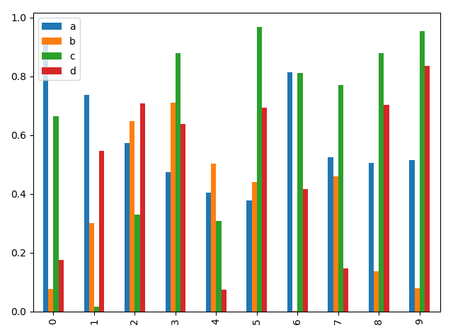
——————————————————————————————————————————
5、pandas.DataFrame之堆叠条形图绘制(其中水平堆叠图pandas.DataFrame.plot.barh)
        df=pd.DataFrame(np.random.rand(10, 4), columns=['a', 'b', 'c', 'd'])
        df.plot.bar(stacked=True)
        plt.legend()
        plt.tight_layout()
        plt.show()
df.plot.barh(stacked=True) #水平堆叠图画法,或者df.plot(kind='barh',stacked=True) #水平堆叠图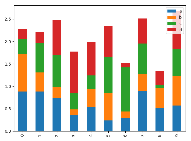
————————————————————————————————————————
5、pandas.DataFrame之直方图绘制
        df=pd.DataFrame({"a":np.random.randn(1000),"b": np.random.rand(1000), "c":np.random.randn(1000)}, columns=['a', 'b', 'c'])
        df["a"].hist(bins=30)   # a列绘制直方图
        df.plot.hist(bins=50, alpha=0.9)  #各列形成的直方图绘制在一个无子图的figure中,同时加参数stacked=True亦可实现堆叠效果。
        df.plot.hist(subplots=True, bins=50)  #将各列在一figure中分成子图,
        plt.legend()
        plt.tight_layout()
        plt.show()
df["a"].plot.hist(bins=30, title="plot") # a列绘制概率密度图,可用title属性。
df["a"].hist(bins=30) #注意,无plot仍可绘图,但不可用title属性。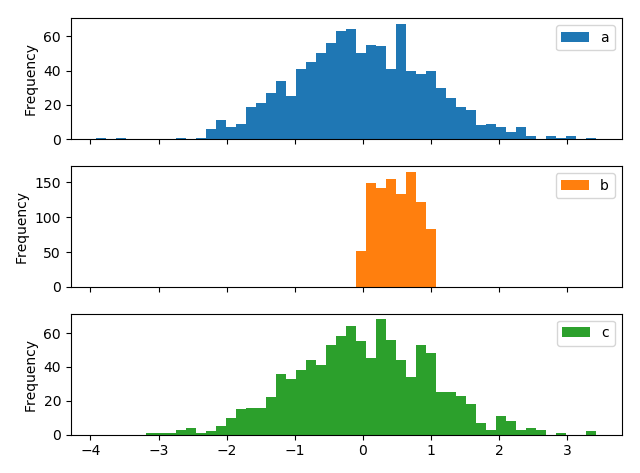
————————————————————————————————————————————
5、pandas.DataFrame之直方图绘制
        df=pd.DataFrame({"a":np.random.randn(1000)+1,"b": np.random.rand(1000), "c":np.random.randn(1000)-1}, columns=['a', 'b', 'c'])
        df["a"].plot.kde()   # a列绘制概率密度图
        df.plot.kde()           #数据表所有列的概率密度图
df.mean()    #求均值
df.std()     #求方差
————————————————————————————————————————————————
6、pandas.DataFrame之散点图(散布图)绘制
        df=pd.DataFrame(np.random.rand(10, 4), columns=['a', 'b', 'c', 'd'])
        df.plot.scatter(x='a', y='b')
        plt.legend()
        plt.tight_layout()
        plt.show()
————————————————————————————————————————————
7、pandas.DataFrame之饼图绘制
        s=pd.Series(3*np.random.rand(4), index=['a', 'b', 'c', 'd'], name="series")
        s.plot.pie(figsize=(6, 6), labels=["a_good", "b_bad", "c_no", "d_what"], autopct="%0.2f", fontsize=15)
        plt.legend()
        plt.tight_layout()
        plt.show()
在pandas.tools.plotting一些高级画法。
几个函数:
pd.Series:One-dimensional ndarray with axis labels (including time series).
class pandas.Series(data=None, index=None, dtype=None, name=None, copy=False, fastpath=False)[source]
Labels need not be unique but must be a hashable type. The object supports both integer- and label-based indexing and provides a host of methods for performing operations involving the index. Statistical methods from ndarray have been overridden to automatically exclude missing data (currently represented as NaN).
Operations between Series (+, -, /, , *) align values based on their associated index values– they need not be the same length. The result index will be the sorted union of the two indexes
pandas.Series — pandas 0.22.0 documentation http://pandas.pydata.org/pandas-docs/stable/generated/pandas.Series.html?highlight=series
pd.date_range:Return a fixed frequency DatetimeIndex, with day (calendar) as the default frequency
pandas.date_range(start=None, end=None, periods=None, freq='D', tz=None, normalize=False, name=None, closed=None, **kwargs)[source]
pandas.date_range — pandas 0.22.0 documentation http://pandas.pydata.org/pandas-docs/stable/generated/pandas.date_range.html?highlight=date_range#pandas.date_range
pandas.Series.cumsum:Return cumulative sum over requested axis.
cumulative
Series.cumsum(axis=None, skipna=True, *args, **kwargs)
pandas.Series.cumsum — pandas 0.22.0 documentation http://pandas.pydata.org/pandas-docs/stable/generated/pandas.Series.cumsum.html?highlight=cumsum#pandas.Series.cumsum
pandas.Series.plot:Make plots of Series using matplotlib / pylab.
Series.plot(kind='line', ax=None, figsize=None, use_index=True, title=None, grid=None, legend=False, style=None, logx=False, logy=False, loglog=False, xticks=None, yticks=None, xlim=None, ylim=None, rot=None, fontsize=None, colormap=None, table=False, yerr=None, xerr=None, label=None, secondary_y=False, **kwds)[source]
pandas.Series.plot — pandas 0.22.0 documentation http://pandas.pydata.org/pandas-docs/stable/generated/pandas.Series.plot.html?highlight=plot#pandas.Series.plot
import numpy as np
import pandas as pd
import matplotlib as mpl
from matplotlib import pyplot as plt
ts=pd.Series(np.random.randn(3), index=pd.date_range('2000/1/1', periods=3))
print(ts)
以下为输出结果:
2000-01-01    0.013128
2000-01-02   -0.296826
2000-01-03    0.283250
Freq: D, dtype: float64
ts=ts.cumsum()
print(ts)
以下为输出结果:
2000-01-01    0.013128
2000-01-02   -0.283698
2000-01-03   -0.000449
Freq: D, dtype: float64
ts.plot(kind='line',figsize=(5, 5), title="pd.Series生成的图", linestyle="r--")
plt.show()
        ts=pd.Series(np.random.randn(300), index=pd.date_range('2000/1/1', periods=300))
        print(ts)
        ts=ts.cumsum()
        ts.describe()
        print(ts)
        ts.plot(kind='line',figsize=(5, 5), title="pd.Series生成的图", linestyle="--")

        df=pd.DataFrame(np.random.randn(300, 4), index=ts.index, columns=list("ABCD"))
        df.describe()
        df=df.cumsum()
        df.plot( )
        print(df)
        plt.show()


 4万+
4万+

 被折叠的 条评论
为什么被折叠?
被折叠的 条评论
为什么被折叠?
 到【灌水乐园】发言


