


一、背景
Flex布局是轴线布局,只能指定"项目"针对轴线的位置,可以看作是一维布局。
Grid 布局则是将容器划分成“行"和“列”,产生单元格,然后指定"项目所在”的单元格,可以看作是二维布局,Grid布局远比 Flex布局强大。
每一个方格内放入echarts图表既是大屏效果。本文仅做基础布局,供日后参考。
二、方案
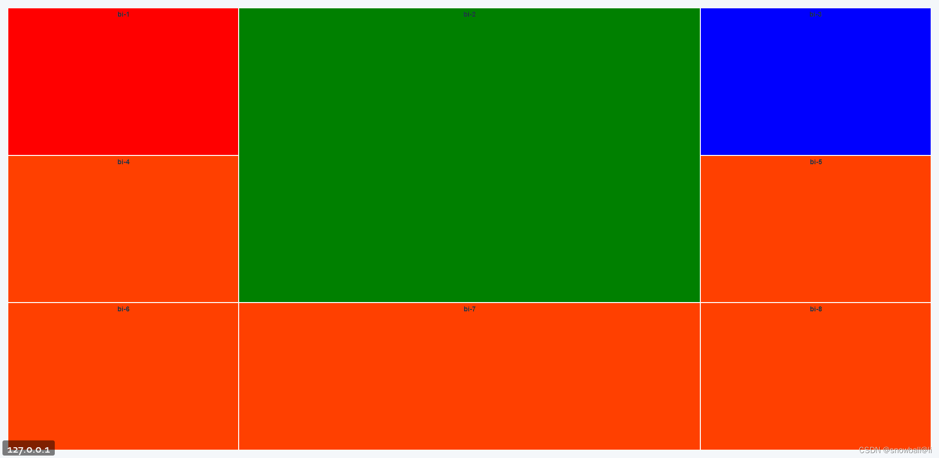
方案一:

<template>
<div class="container">
  <div class="item">bi-1</div>
  <div class="item">bi-2</div>
  <div class="item">bi-3</div>
  <div class="item">bi-4</div>
  <div class="item">bi-5</div>
  <div class="item">bi-6</div>
  <div class="item">bi-7</div>
  <div class="item">bi-8</div>
  <div class="item">bi-9</div>
</div>

</template>

<script setup lang="ts">

</script>
<style scoped lang="less">
.container{
  width: 100vw;
  background: #FF4000;
  display: grid;
  grid-template-rows: 1fr 1fr 1fr; // 行
  grid-template-columns: 1fr 1fr 1fr; // 列
  // grid-row-gap: 5px; // 行间距
  // grid-column-gap: 5px; // 列间距
  .item{
    text-align: center;
    border: 1px solid #fff;
    font-weight: bold;
    &:nth-child(1){
      background: red;
    }
    &:nth-child(2){
      background: green;
    }
    &:nth-child(3){
      background: blue;
    }
  }
}
</style>
方案二:
<template>
<div class="container">
  <div class="item">bi-1</div>
  <div class="item">bi-2</div>
  <div class="item">bi-3</div>
  <div class="item">bi-4</div>
  <div class="item">bi-5</div>
  <div class="item">bi-6</div>
  <div class="item">bi-7</div>
  <div class="item">bi-8</div>
  <!-- <div class="item">bi-9</div> -->
</div>

</template>

<script setup lang="ts">

</script>
<style scoped lang="less">
.container{
  width: 100vw;
  background: #FF4000;
  display: grid;
  grid-template-rows: 1fr 1fr 1fr; // 行
  grid-template-columns: 1fr 1fr 1fr; // 列
  // grid-row-gap: 5px; // 行间距
  // grid-column-gap: 5px; // 列间距
  .item{
    text-align: center;
    border: 1px solid #fff;
    font-weight: bold;
    &:nth-child(1){
      background: red;
    }
    &:nth-child(2){
      background: green;
      grid-column: 2 / 3; // 以列网格线为基准
      grid-row: 1 / 3; // 以行网格线为基准
    }
    &:nth-child(3){
      background: blue;
    }
  }
}
</style>
方案三:

<template>
<div class="container">
  <div class="item">bi-1</div>
  <div class="item">bi-2</div>
  <div class="item">bi-3</div>
  <div class="item">bi-4</div>
  <div class="item">bi-5</div>
  <div class="item">bi-6</div>
  <div class="item">bi-7</div>
  <div class="item">bi-8</div>
  <div class="item">bi-9</div>
</div>

</template>

<script setup lang="ts">

</script>
<style scoped lang="less">
.container{
  width: 100vw;
  background: #FF4000;
  display: grid;
  grid-template-rows: 50px 1fr 1fr 1fr; // 行
  grid-template-columns: 1fr 2fr 1fr; // 列
  // grid-row-gap: 5px; // 行间距
  // grid-column-gap: 5px; // 列间距
  .item{
    text-align: center;
    border: 1px solid #fff;
    font-weight: bold;
    &:nth-child(1){
      background: red;
      grid-row: 1 / 2;
      grid-column: 1 / 4;
    }
    &:nth-child(2){
      background: green;
      grid-row: 2 / 4;
      grid-column: 2 / 3;
    }
    &:nth-child(3){
      background: blue;
    }
  }
}
</style>
方案四:

<template>
<div class="container">
  <div class="item">bi-1</div>
  <div class="item">bi-2</div>
  <div class="item">bi-3</div>
  <div class="item">bi-4</div>
  <div class="item">bi-5</div>
  <div class="item">bi-6</div>
  <div class="item">bi-7</div>
  <div class="item">bi-8</div>
  <div class="item">bi-9</div>
  <div class="item">bi-10</div>
</div>

</template>

<script setup lang="ts">

</script>
<style scoped lang="less">
.container{
  width: 100vw;
  background: #FF4000;
  display: grid;
  grid-template-rows: 50px 1fr 1fr 1fr; // 行
  grid-template-columns: 1fr 2fr 1fr; // 列
  // grid-row-gap: 5px; // 行间距
  // grid-column-gap: 5px; // 列间距
  .item{
    text-align: center;
    border: 1px solid #fff;
    font-weight: bold;
    &:nth-child(1){
      background: red;
      grid-row: 1 / 2;
      grid-column: 1 / 4;
    }
    &:nth-child(2){
      background: green;
      grid-row: 2 / 4;
      grid-column: 2 / 3;
    }
    &:nth-child(3){
      background: blue;
    }
    &:nth-child(10){
      background: red;
      grid-row: 5 / 6;
      grid-column: 1 / 4;
    }
  }
}
</style>
三、欢迎交流指正,关注我,一起学习。
参考链接:


 912
912


 被折叠的 条评论
为什么被折叠?
被折叠的 条评论
为什么被折叠?
 到【灌水乐园】发言


