


constrainlayout字面之意约束布局,是google推出的用于最大化的解决布局嵌套问题,同时减少布局渲染时间,提升性能的布局。与相对布局Relativelayout有些类似,约束布局的原理与相对布局是一样的,都是根据视图与视图之间的相互依赖,相对父级布局的位置来进行布局的。但是比Relativelayout更加的灵活,功能更加强大。
该笔记按照几个步骤来进行展开描述,阐释。
- 开始
在项目当中的gradle当中添加constraint-layout依赖:
implementation 'com.android.support.constraint:constraint-layout:1.1.2'- 新建布局
<?xml version="1.0" encoding="utf-8"?>
<android.support.constraint.ConstraintLayout xmlns:android="http://schemas.android.com/apk/res/android"
    xmlns:app="http://schemas.android.com/apk/res-auto"
    xmlns:tools="http://schemas.android.com/tools"
    android:layout_width="match_parent"
    android:layout_height="match_parent"
    tools:context=".MainActivity">


</android.support.constraint.ConstraintLayout>- 添加约束
添加约束的方式常见两种方式:
手动进行拖拽:将控件拖进布局空间,然后通过constraint-layout为控件提供的课件的操作部件进行约束的添加。这种方式简便快捷,效率较高,一句话android终于有了一种可以抗衡ios的操作,但是给我的感觉说真的还是差那么一点,体验过ios操作的朋友们能够明白我的意思。当然笔者并不建议以拖拽的方式添加约束。笔者的习惯绝对是会去手敲去添加约束的。
手敲xml:可能有朋友会说,放着简单便捷的操作不用而去手敲,不是自己找麻烦吗?是的你说的很对。但是我就是愿意去找这个麻烦的。首先我手写的方式能够让我更深刻的去理解constraint-layout为我们提供的属性的特性,并且根据组合属性方式去观察展示效果,这个过程是一个最简单有效的去理解记忆属性特点的好方法。有一部分朋友在使用拖拽方式完成布局后基本上不会再去看xml中自动生成的属性了,等到需求界面一旦发生改变的时候,如果不知道具体的属性产生什么效果,那么你绝对会后悔的,其中苦痛自己体会。
首先,先说一下拖拽方式:

可以看到,上下左右都有一个小圆圈,这个圆圈就是用来添加约束的。
四个角的矩形,是用来扩大或缩小控件的。
 :删除选中控件的所有约束。
  :编辑基线,用于基线对齐(下面会说)。
现在我们来为这个 Button 添加约束:

- 属性介绍
layout_constraintRight_toLeftOflayout_constraintRight_toRightOflayout_constraintTop_toTopOflayout_constraintTop_toBottomOflayout_constraintBottom_toTopOflayout_constraintBottom_toBottomOflayout_constraintBaseline_toBaselineOf- layout_constraintDimensionRatio
- layout_constraintHorizontal_weight
- layout_constraintVertical_weight
- layout_constraintHorizontal_bias
- layout_constraintVertical_bias
- layout_constraintHorizontal_chainStyle
- layout_constraintVertical_chainStyle
如上面列出来的属性都是我们开发过程中经常需要用到的属性,大家还可以注意到上面的属性我分别用不同的几种颜色标注了。那么我们就来一一的解读吧。
首先看红色的部分,这部分的属性跟相对布局(Relativelayout)比较类似,例如app:layout_constraintRight_toLeftOf="@+id/idview"意思为当前控件的右侧在其他控件的左侧,其他的此类属性都是类似的意思。那么最简单的我们想布局中拖入一个控件例如button:
 <Button
        android:layout_width="wrap_content"
        android:layout_height="wrap_content"
        app:layout_constraintLeft_toLeftOf="parent"
        app:layout_constraintTop_toTopOf="parent"
        app:layout_constraintBottom_toBottomOf="parent"
        app:layout_constraintRight_toRightOf="parent"
        android:text="button"/>
大家肯定注意到了其中的四个属性后面的值是“parent”,这样的四个属性同时作用下,控件button居于父级布局的中央。大家可能有疑问,为什么控件button不在父布局的左上角。constraint-layout约束布局,如果我们只添加左侧或者顶部的属性那么效果会是怎么样呢?
只添加左上约束:此时的button就出现了停留在左上角的位置,当然如果添加其他的属性,大家可自行实验。
此时我们在顶部在次添加一个button。
 <Button
        android:id="@+id/button1"
        android:layout_width="wrap_content"
        android:layout_height="wrap_content"
        app:layout_constraintLeft_toLeftOf="parent"
        app:layout_constraintTop_toTopOf="parent"
        android:text="button"/>

    <Button
        android:layout_width="match_parent"
        android:layout_height="wrap_content"
        app:layout_constraintTop_toTopOf="parent"
        app:layout_constraintLeft_toRightOf="@+id/button1"
        app:layout_constraintRight_toRightOf="parent"
        android:text="button"/>
我们想实现一个button1在左侧,然后button占满右侧空间,如上代码所示却并不能得到我们想要的结果,上述代码的效果是

而想要达到这样的效果我们button2的宽度需要修改为0dp效果即为:
<Button
        android:id="@+id/button1"
        android:layout_width="wrap_content"
        android:layout_height="wrap_content"
        app:layout_constraintLeft_toLeftOf="parent"
        app:layout_constraintTop_toTopOf="parent"
        android:text="button"/>

    <Button
        android:id="@+id/button2"
        android:layout_width="0dp"
        android:layout_height="wrap_content"
        app:layout_constraintTop_toTopOf="parent"
        app:layout_constraintLeft_toRightOf="@+id/button1"
        app:layout_constraintRight_toRightOf="parent"
        android:text="button"/>
你会发现button2,好像疯了一样,我们设置的在button1右侧,和与parent右侧对齐完全失效了!!!
别怕,接下来就让你认识到为什么这个控件叫做constraint-layout
在当控件有自己设置的宽度,例如warp_content、固定值时,我们为控件添加的都是约束“Constraint”,这个约束有点像橡皮筋一样会拉这个控件,但是并不会改变控件的尺寸(RL很明显不是这样的)。
例如上例,当button2的宽度较小时,我们为其左侧设置了一个约束(button1右侧),右侧设置了一个约束(parent右侧对其),当两个约束同时生效的时候(你可以认为两边都是相同的一个拉力),button2会居中。
当btn02特别大的时候,依然是这两个力,那么会发生什么?会造成左侧和右侧超出的距离一样大。
那么现在大家肯定有些疑问:
- 怎么样才能和上面的RL一样,宽度刚好占据剩下的距离呢(btn01右侧到屏幕右侧的距离)?
这个问题,问得很好,我们刚才所有的尝试都是在控件自身拥有特定的宽度情况下执行的;那么如果希望控件的宽度根据由约束来控件,不妨去掉这个特定的宽度,即设置为0试试?
对!当我们将btn02的宽度设置为0时,一切又变得很完美
大家可能疑惑为什么match_parent不是将控件填满剩下的水平空间呢,之前我也想不明白,但是我查阅了官方资料,如下
那么这里,你可能会问0值是什么含义,其实在ConstraintLayout中0代表:MATCH_CONSTRAINT,看到这个常量,是不是瞬间觉得好理解了一点。
- 最后一个问题,
MATCH_PARENT哪去了?
看官网的解释:
Important:
MATCH_PARENTis not supported for widgets contained in a ConstraintLayout, though similar behavior can be defined by usingMATCH_CONSTRAINTwith the corresponding left/right or top/bottom constraints being set to “parent”.`
所以你可以认为:在ConstraintLayout中已经不支持MATCH_PARENT这个值了,你可以通过MATCH_CONSTRAINT配合约束实现类似的效果。当然在我们在将button2的宽度设为wrap_content时候,button2却位于右侧的中央部分,产生这种情况的原因是因为在constraint-layout中每个控件的属性设置当中默认都包含两个属性:
- layout_constraintHorizontal_bias
- layout_constraintVertical_bias
他们表示的意思就是控件在设置了水平或者垂直方向上的约束后,表示在水平或者垂直方向的拉力的大小,默认不添加这两个属性的话,他们的默认值是两个方向都是50%,即0.5。如果两侧拉力不是0.5,那么就不是位于中间的位置,请大家自行实践。
好了,到这里,目前我们已经看到其已经和RelativeLayout势均力敌了,接下来我们看一下RL做不到的特性
现在的要求是我们要做一个banner,宽高比为16:9,如果在之前的话我们只能在代码中动态设置宽高比,可是呢constraint-layout在我们xml里面设置一个属性就可以实现了。
layout_constraintDimensionRatio
没错就是这个属性,使用的时候
 <Button
        android:id="@+id/button2"
        android:layout_width="0dp"
        android:layout_height="0dp"
        app:layout_constraintTop_toTopOf="parent"
        app:layout_constraintLeft_toRightOf="@+id/button1"
        app:layout_constraintRight_toRightOf="parent"
        app:layout_constraintDimensionRatio="16:6"
        android:text="button"/>
那么这样启动的作用就是宽高比为16:6当然控件的宽高都是 MATCH_CONSTRAINT即0dp。写法可以是app:layout_constraintDimensionRatio="H,16:6"或者是app:layout_constraintDimensionRatio="W,16:6",这就是宽高方向上的比例。效果就是

下面我们再来看如果我要做一个tab,怎么做呢?
<TextView
        android:id="@+id/tab1"
        android:layout_width="0dp"
        android:layout_height="30dp"
        android:background="#f67"
        android:gravity="center"
        android:text="Tab1"
        app:layout_constraintBottom_toBottomOf="parent"
        app:layout_constraintLeft_toLeftOf="parent"
        app:layout_constraintRight_toLeftOf="@+id/tab2" />


    <TextView
        android:id="@+id/tab2"
        android:layout_width="0dp"
        android:layout_height="30dp"
        android:background="#A67"
        android:gravity="center"
        android:text="Tab2"
        app:layout_constraintBottom_toBottomOf="parent"
        app:layout_constraintLeft_toRightOf="@id/tab1"
        app:layout_constraintRight_toLeftOf="@+id/tab3" />


    <TextView
        android:id="@+id/tab3"
        android:layout_width="0dp"
        android:layout_height="30dp"
        android:background="#767"
        android:gravity="center"
        android:text="Tab3"
        app:layout_constraintBottom_toBottomOf="parent"
        app:layout_constraintLeft_toRightOf="@id/tab2"
        app:layout_constraintRight_toRightOf="parent" />
看下效果:

我们设置了tab的左右两两依赖,并且都是设置了宽度0dp,我们实现了等分的效果,使用text冒充tab成功了。
当然大家都知道我们通过linearlayout配合weight也可以实现这样的效果。是的constraint-layout同样支持这样的效果。这个属性就是app:layout_constraintHorizontal_weight,app:layout_constraintVertical_weight见名知意,假设我把他们设置为2,1,1那么效果就是:

大家都看到了到这里constraint-layout是可以达到了relativelayout和linearlayout同样的效果,可以使用constraint-layout替代他们。当然还有一些特性是相对布局与线性布局不可达到的特性。
copy一下官方文档:
Chain heads
Chains are controlled by attributes set on the first element of the chain (the "head" of the chain):
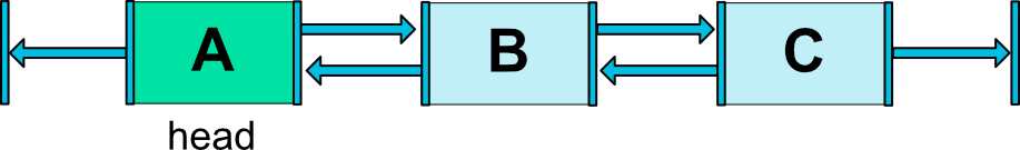
Fig. 10 - Chain Head
The head is the left-most widget for horizontal chains, and the top-most widget for vertical chains.
Chain Style
When setting the attribute layout_constraintHorizontal_chainStyle or layout_constraintVertical_chainStyle on the first element of a chain, the behavior of the chain will change according to the specified style (default is CHAIN_SPREAD).
CHAIN_SPREAD-- the elements will be spread out (default style)- Weighted chain -- in
CHAIN_SPREADmode, if some widgets are set toMATCH_CONSTRAINT, they will split the available space CHAIN_SPREAD_INSIDE-- similar, but the endpoints of the chain will not be spread outCHAIN_PACKED-- the elements of the chain will be packed together. The horizontal or vertical bias attribute of the child will then affect the positioning of the packed elements
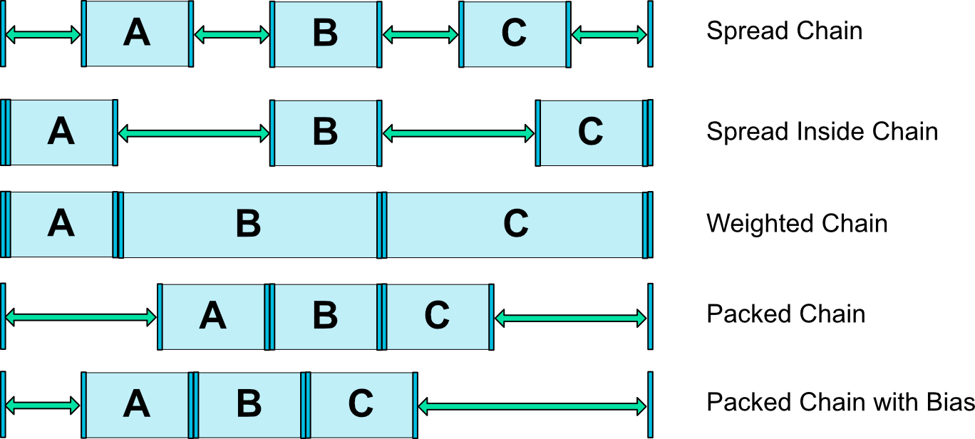
Fig. 11 - Chains Styles
横向的相当于组成了一个链chains,同时配合上weight可以实现上图所示的效果。
chains styles:
- layout_constraintHorizontal_chainStyle
- layout_constraintVertical_chainStyle
前提是需要配合app:layout_constraintHorizontal_weight
1.spread + 宽度0dp 效果既是等分的效果并且占满各自的空间
2.spread + 宽度非0

3.spread_inside + 宽度非0

4.packed + 宽度非0

以上的条件都是宽度非0的情况下实现的效果。
下面一个属性为:layout_constraintBaseline_toBaselineOf
这个属性是对其两个控件文本部分,这个属性就不在详细的去说了。
下面还有一个叫做android.support.constraint.Guideline,这个类使用起来较为简单。
所以其有个属性为:
android:orientation取值为”vertical”和”horizontal”.
除此以外,还差个属性,决定该辅助线的位置:
layout_constraintGuide_beginlayout_constraintGuide_endlayout_constraintGuide_percent
可以通过上面3个属性其中之一来确定属性值位置。
begin=30dp,即可认为距离顶部30dp的地方有个辅助线,根据orientation来决定是横向还是纵向。
end=30dp,即为距离底部。
percent=0.8即为距离顶部80%。
好了,下面看一个例子,刚才我们的浮点按钮,我决定通过两根辅助线来定位,一根横向距离底部80%,一个纵向距离顶部80%,浮点按钮就定位在他们交叉的地方。
<android.support.constraint.Guideline
        android:id="@+id/guideline_h"
        android:layout_width="wrap_content"
        android:layout_height="wrap_content"
        android:orientation="horizontal"
        app:layout_constraintGuide_percent="0.8" />


    <android.support.constraint.Guideline
        android:id="@+id/guideline_w"
        android:layout_width="wrap_content"
        android:layout_height="wrap_content"
        android:orientation="vertical"
        app:layout_constraintGuide_percent="0.8" />

    <TextView
        android:layout_width="60dp"
        android:layout_height="60dp"
        android:background="#612"
        app:layout_constraintLeft_toRightOf="@id/guideline_w"
        app:layout_constraintTop_toBottomOf="@id/guideline_h" />
看下效果图吧:

到这里constraint-layout的用法即属性总结了差不多了,后续还有一些属性的用法会陆续添加上来。


 扫一扫
扫一扫
 392
392

 被折叠的 条评论
为什么被折叠?
被折叠的 条评论
为什么被折叠?
 到【灌水乐园】发言


