


基本原理:在程序运行时加载新的资源字典,并使用新加载的资源字典代替当前的资源字典(不需要替换所有资源,只需要替换哪些用于皮肤的资源)。
有两种方式实现动态换肤:
①检索ResourceDictionary对象,并通过后台代码替换资源实现动态换肤。
②通过编写代码加载资源字典,然后通过后台代码替换资源实现动态换肤。
实例演示动态换肤:
假设有已创建用于定义同一个按钮控件模板的两个资源。一个保存在GradientButton.xaml文件中,另外一个保存在GradientButtonVariant.xaml文件中。为了更好的组织资源,将这两个文件都放在了Resources文件夹下。
GradientButton.xaml代码:
<ResourceDictionary xmlns="http://schemas.microsoft.com/winfx/2006/xaml/presentation"
    xmlns:x="http://schemas.microsoft.com/winfx/2006/xaml" x:Class="ControlTemplates.GradientButton"
    >

    <!-- Resources used by the template. -->
    <RadialGradientBrush RadiusX="1" RadiusY="5" GradientOrigin="0.5,0.3"
     x:Key="HighlightBackground">
      <GradientStop Color="White" Offset="0" />
      <GradientStop Color="Blue" Offset=".4" />
    </RadialGradientBrush>

    <RadialGradientBrush RadiusX="1" RadiusY="5" GradientOrigin="0.5,0.3"
     x:Key="PressedBackground">
      <GradientStop Color="White" Offset="0" />
      <GradientStop Color="Blue" Offset="1" />
    </RadialGradientBrush>

    <SolidColorBrush Color="Blue" x:Key="DefaultBackground"></SolidColorBrush>
    <SolidColorBrush Color="Gray" x:Key="DisabledBackground"></SolidColorBrush>

    <RadialGradientBrush RadiusX="1" RadiusY="5" GradientOrigin="0.5,0.3"
     x:Key="Border">
      <GradientStop Color="White" Offset="0" />
      <GradientStop Color="Blue" Offset="1" />
    </RadialGradientBrush>

    <!-- The button control template. -->
    <ControlTemplate x:Key="GradientButtonTemplate" TargetType="{x:Type Button}">
      <Border Name="Border" BorderBrush="{StaticResource Border}" BorderThickness="2"
       CornerRadius="2" Background="{StaticResource DefaultBackground}"
       TextBlock.Foreground="White">
        <Grid>
          <Rectangle Name="FocusCue" Visibility="Hidden" Stroke="Black"
           StrokeThickness="1" StrokeDashArray="1 2" SnapsToDevicePixels="True">
          </Rectangle>
          <ContentPresenter Margin="{TemplateBinding Padding}"
           RecognizesAccessKey="True"></ContentPresenter>
        </Grid>
      </Border>
      <ControlTemplate.Triggers>
        <Trigger Property="IsMouseOver" Value="True">
          <Setter TargetName="Border" Property="Background"
           Value="{StaticResource HighlightBackground}" />
        </Trigger>
        <Trigger Property="IsPressed" Value="True">
          <Setter TargetName="Border" Property="Background"
           Value="{StaticResource PressedBackground}" />
        </Trigger>
        <Trigger Property="IsKeyboardFocused" Value="True">
          <Setter TargetName="FocusCue" Property="Visibility"
            Value="Visible"></Setter>
        </Trigger>
        <Trigger Property="IsEnabled" Value="False">
          <Setter TargetName="Border" Property="Background"
           Value="{StaticResource DisabledBackground}"></Setter>
        </Trigger>
      </ControlTemplate.Triggers>
    </ControlTemplate>

    <!-- The style that applies the button control template. -->
    <Style TargetType="{x:Type Button}">
      <Setter Property="Control.Template"
       Value="{StaticResource GradientButtonTemplate}"></Setter>
    </Style>
  </ResourceDictionary>
<ResourceDictionary xmlns="http://schemas.microsoft.com/winfx/2006/xaml/presentation"
    xmlns:x="http://schemas.microsoft.com/winfx/2006/xaml" x:Class="ControlTemplates.GradientButtonVariant"
    >

    <RadialGradientBrush RadiusX="1" RadiusY="5" GradientOrigin="0.5,0.3" x:Key="HighlightBackground">
      <GradientStop Color="White" Offset="0" />
      <GradientStop Color="Green" Offset=".4" />
    </RadialGradientBrush>

  <RadialGradientBrush RadiusX="1" RadiusY="5" GradientOrigin="0.5,0.3" x:Key="PressedBackground">
    <GradientStop Color="White" Offset="0" />
    <GradientStop Color="Green" Offset="1" />
  </RadialGradientBrush>

  <SolidColorBrush Color="DarkGreen" x:Key="DefaultBackground"></SolidColorBrush>
  <SolidColorBrush Color="Gray" x:Key="DisabledBackground"></SolidColorBrush>

  <RadialGradientBrush RadiusX="1" RadiusY="5" GradientOrigin="0.5,0.3" x:Key="Border">
    <GradientStop Color="White" Offset="0" />
    <GradientStop Color="Green" Offset="1" />
  </RadialGradientBrush>


  <ControlTemplate x:Key="GradientButtonTemplate" TargetType="{x:Type Button}">
    <Border Name="Border" BorderBrush="{StaticResource Border}" BorderThickness="2" CornerRadius="2"
            Background="{StaticResource DefaultBackground}" TextBlock.Foreground="White">
      <Grid>
        <Rectangle Name="FocusCue" Visibility="Hidden" Stroke="Black" StrokeThickness="1" StrokeDashArray="1 2" SnapsToDevicePixels="True" ></Rectangle>
        <ContentPresenter Margin="{TemplateBinding Padding}" RecognizesAccessKey="True"></ContentPresenter>
      </Grid>
    </Border>
    <ControlTemplate.Triggers>
      <Trigger Property="IsMouseOver" Value="True">
        <Setter TargetName="Border" Property="Background" Value="{StaticResource HighlightBackground}" />
      </Trigger>
      <Trigger Property="IsPressed" Value="True">
        <Setter TargetName="Border" Property="Background" Value="{StaticResource PressedBackground}" />
      </Trigger>
      <Trigger Property="IsKeyboardFocused" Value="True">
        <Setter TargetName="FocusCue" Property="Visibility" Value="Visible"></Setter>
      </Trigger>
      <Trigger Property="IsEnabled" Value="False">
        <Setter TargetName="Border" Property="Background" Value="{StaticResource DisabledBackground}"></Setter>
      </Trigger>
    </ControlTemplate.Triggers>
  </ControlTemplate>

    <Style  TargetType="{x:Type Button}">
        <Setter Property="Control.Template" Value="{StaticResource GradientButtonTemplate}"></Setter>
    </Style>

</ResourceDictionary>
方法一:
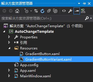
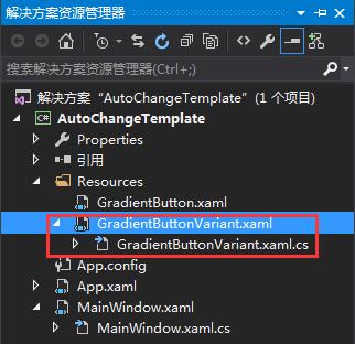
①项目目录结构
②MainWindow.xaml代码
<Window x:Class="AutoChangeTemplate.MainWindow"
xmlns="http://schemas.microsoft.com/winfx/2006/xaml/presentation"
xmlns:x="http://schemas.microsoft.com/winfx/2006/xaml"
xmlns:d="http://schemas.microsoft.com/expression/blend/2008"
xmlns:mc="http://schemas.openxmlformats.org/markup-compatibility/2006"
xmlns:local="clr-namespace:AutoChangeTemplate"
mc:Ignorable="d"
Title="MainWindow" Height="350" Width="525">
<Window.Resources>
<ResourceDictionary>
<ResourceDictionary.MergedDictionaries>
<ResourceDictionary Source="Resources/GradientButton.xaml"></ResourceDictionary>
</ResourceDictionary.MergedDictionaries>
</ResourceDictionary>
</Window.Resources>
<StackPanel>
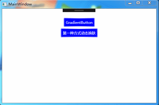
<Button HorizontalAlignment="Center" Padding="5" Margin="0 30 0 0">GradientButton</Button>
<Button HorizontalAlignment="Center" Padding="5" Margin="5" Click="Button_Click">第一种方式动态换肤</Button>
</StackPanel>
</Window>
using System;
using System.Collections.Generic;
using System.Linq;
using System.Text;
using System.Threading.Tasks;
using System.Windows;
using System.Windows.Controls;
using System.Windows.Data;
using System.Windows.Documents;
using System.Windows.Input;
using System.Windows.Media;
using System.Windows.Media.Imaging;
using System.Windows.Navigation;
using System.Windows.Shapes;

namespace AutoChangeTemplate
{
    /// <summary>
    /// MainWindow.xaml 的交互逻辑
    /// </summary>
    public partial class MainWindow : Window
    {
        public MainWindow()
        {
            InitializeComponent();
        }

        private void Button_Click(object sender, RoutedEventArgs e)
        {
            ResourceDictionary newDictionary = new ResourceDictionary();
            newDictionary.Source = new Uri("Resources/GradientButtonVariant.xaml",UriKind.Relative);
            this.Resources.MergedDictionaries[0] = newDictionary;
        }
    }
}
当如果为整个应用程序改变皮肤,代码如下:
Application.Current.Resources.MergedDictionaries[0] = newDictionary;ResourceDictionary newDictionary = new ResourceDictionary();
newDictionary.Source = new Uri("ControlTemplateLibrary;component/Resources/GradientButtonVariant.xaml",UriKind.Relative);
this.Resources.MergedDictionaries[0] = newDictionary;上面的的例子两个资源文件都是通过类型样式自动改变的按钮。但如果是手动设置了Template或Style属性来选用新模板。必须用Dynamic Resource引用,而不能使用StaticResource。若用StaticResource,当切换皮肤时不会自动更新按钮模板。
方法二:
①为资源字典创建代码隐藏类
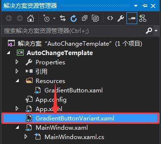
先将GradientButtonVariant.xaml文件从Resources文件夹下移到项目根目录,如下图:
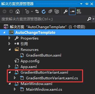
然后再创建个GradientButtonVariant.xaml.cs类文件,此时的类文件会自动放到GradientButtonVariant.xaml下。
②将定义的类链接到GradientButtonVariant.xaml资源字典,即在资源字典的根元素添加Class特性,代码如下:
x:Class="AutoChangeTemplate.GradientButtonVariant"将这个类文件改为部分类,并在构造函数中调用InitializeComponent()方法。
using System;
using System.Collections.Generic;
using System.Linq;
using System.Text;
using System.Threading.Tasks;
using System.Windows;

namespace AutoChangeTemplate
{
    public partial class GradientButtonVariant : ResourceDictionary
    {
        public GradientButtonVariant()
        {
            InitializeComponent();
        }
    }
}
⑤使用定义的类换肤,创建资源实例的时候直接new GradientButtonVariant即可,代码如下:
ResourceDictionary newDictionary = new GradientButtonVariant();
this.Resources.MergedDictionaries[0] = newDictionary;


 扫一扫
扫一扫
 734
734

 被折叠的 条评论
为什么被折叠?
被折叠的 条评论
为什么被折叠?
 到【灌水乐园】发言


