


1、display:设置flex布局
flex:布局宽度和里面的内容无关;
inline-flex:布局宽度由里面的内容撑开
2、flex-direction:设置里面内容的排列方向
row:默认,从左到右排列
row-reverse:从右到左排列
column:从上到下排列
column-reverse:从下到上排列
3、flex-wrap:设置是否换行
nowrap:默认,不换行,将子item压缩保证一行排下。
wrap:一行排不下时换到下一行排
wrap-reverse:一行排不下时换上一行排
4、flex-flow:flex-direction和flex-wrap的组合
例如,flex-flow: row nowrap
5、justify-content:设置水平方向的排列
flex-start:默认,左对齐。
flex-end:右对齐
center:居中
space-between:首尾贴边均匀排列
space-around:首尾不贴边均匀排列
6、align-items:设置垂直方向的排列
flex-start:上对齐。
flex-end:下对齐
center:居中
baseline:基线对齐
stretch:默认值,元素被拉伸以适应容器
7、align-content:设置多行内容在垂直方向的排列
flex-start:上对齐。
flex-end:下对齐
center:居中
space-between:上下贴边均匀排列
space-around:上下不贴边均匀排列
stretch:默认值
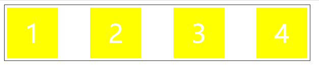
先来看一段代码:
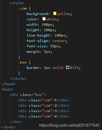
效果:
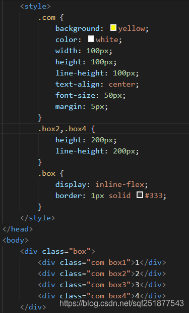
现在将box设置为flex布局(display属性设置为flex或inline-flex):
1、display属性:当属性值为flex时,box的布局宽度和里面的内容无关;当属性值为 inline-flex 时,box的布局宽度由里面的内容撑开。
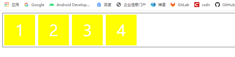
(1)display: flex
.box {
    display: flex; /*布局宽度和里面的内容无关 */
    border: 1px solid #333;
}
效果:
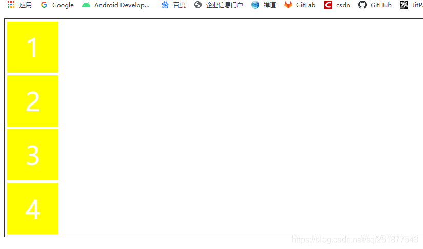
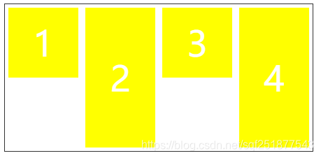
(2)display: inline-flex
.box {
    display: inline-flex; /*布局宽度由里面的内容撑开 */
    border: 1px solid #333;
}
效果:

2、flex-direction属性,取值如下:
row:默认,从左到右排列
row-reverse:从右到左排列
column:从上到下排列
column-reverse:从下到上排列
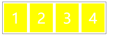
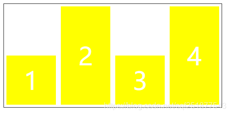
(1) flex-direction: row
.box {
    display: inline-flex;
    flex-direction: row;/* 从左到右排列 */
    border: 1px solid #333;
}
效果:

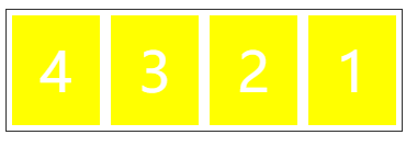
(2) flex-direction: row-reverse
.box {
    display: inline-flex;
    flex-direction: row-reverse;/* 从右到左排列 */
    border: 1px solid #333;
}
效果:

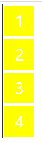
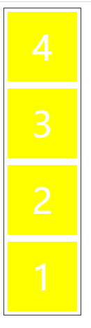
(3) flex-direction: column
.box {
    display: inline-flex;
    flex-direction: column;/* 从上到下排列 */
    border: 1px solid #333;
}
效果:
(4) flex-direction: column-reverse
.box {
    display: inline-flex;
    flex-direction: column-reverse;/* 从下到上排列 */
    border: 1px solid #333;
}
效果:
3、flex-wrap属性,取值如下:
nowrap:默认,不换行,将子item压缩保证一行排下。
wrap:一行排不下时换到下一行排
wrap-reverse:一行排不下时换上一行排
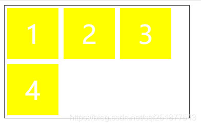
(1) flex-wrap:nowrap
.box {
    width: 360px;
    display: inline-flex;
    flex-direction: row;
    flex-wrap:nowrap;
    border: 1px solid #333;
}
效果:
(2) flex-wrap:wrap
.box {
    width: 360px;
    display: inline-flex;
    flex-direction: row;
    flex-wrap:wrap;
    border: 1px solid #333;
}
效果:
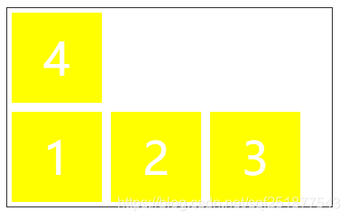
(3) flex-wrap:wrap-reverse
.box {
    width: 360px;
    display: inline-flex;
    flex-direction: row;
    flex-wrap:wrap-reverse;
    border: 1px solid #333;
}
效果:
4、flex-flow属性,其实就是flex-direction和flex-wrap的组合。eg:
.box {
    width: 360px;
    display: inline-flex;
    /* flex-direction: row; */
    /* flex-wrap:wrap-reverse; */
    flex-flow: row-reverse nowrap;
    border: 1px solid #333;
}
效果:
5、justify-content属性(设置水平方向的排列),取值如下:
flex-start:默认,左对齐。
flex-end:右对齐
center:居中
space-between:首尾贴边均匀排列
space-around:首尾不贴边均匀排列
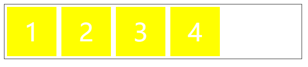
(1) flex-start
.box {
    width: 600px;
    display: flex;
    justify-content: flex-start;
    border: 1px solid #333;
}
效果:
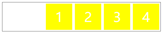
(2) flex-end
.box {
    width: 600px;
    display: flex;
    justify-content: flex-end;
    border: 1px solid #333;
}
效果:
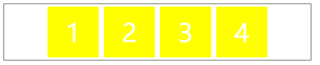
(3) center
.box {
    width: 600px;
    display: flex;
    justify-content: center;
    border: 1px solid #333;
}
效果:
(4)space-between
.box {
    width: 600px;
    display: flex;
    justify-content: space-between;
    border: 1px solid #333;
}
效果:
(5)space-around
.box {
    width: 600px;
    display: flex;
    justify-content: space-around;
    border: 1px solid #333;
}
效果:

现在改下代码:
效果:

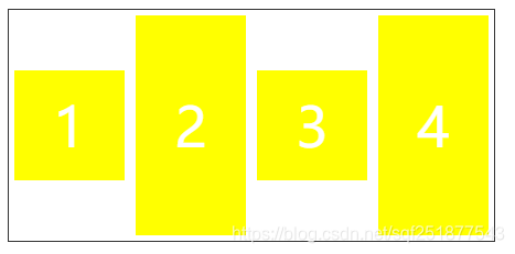
6、align-items属性(设置垂直方向的排列),取值如下:
flex-start:上对齐。
flex-end:下对齐
center:居中
baseline:基线对齐
stretch:默认值,元素被拉伸以适应容器
(1) flex-start
.box {
    display: inline-flex;
    align-items: flex-start;
    border: 1px solid #333;
}
效果:
(2) flex-end
.box {
    display: inline-flex;
    align-items: flex-end;
    border: 1px solid #333;
}
效果:
(3) center
.box {
    display: inline-flex;
    align-items: center;
    border: 1px solid #333;
}
效果:


 7352
7352


 被折叠的 条评论
为什么被折叠?
被折叠的 条评论
为什么被折叠?
 到【灌水乐园】发言


