


背景
老有人问截断坐标轴效果的图如何绘制。这类图因为不常用、不常见,一般的具有科学绘图功能的软件也通常不作为默认的功能或函数提供。而用户自己实现起来则繁琐和技巧性强。
我搜索了先看mathematica, matlab, python里面是不是有现成的,发现还是需要第三方的代码。好在很快就找到了。——我对origin软件有种族歧视或者偏见,所以想到了也不去考虑。
代码和效果
只讲某一种特定语言有广告的嫌疑,而且,不同语言的实现各有千秋,都很值得看看。我找到的matlab, mathematica, python的资源都有。个人最喜欢的是,mathematica和python。个人偏见而已:一个收费软件中性价比极高(唯一一个有丰富的简体中文文档、用户群庞大、有mathematica.stackexchange.com这样强大支持性论坛的软件),一个免费开源而且文档丰富。
推荐这三种语言不光有我个人的偏好的原因,还在于它们有庞大的用户群、有非常完整的文档(正式官方的、各种出版物、网络和论坛的等等),大部分此类问题都更容易获得快捷、充分的,来自高手的或自己自助的帮助信息。
Matlab实现方法的来源
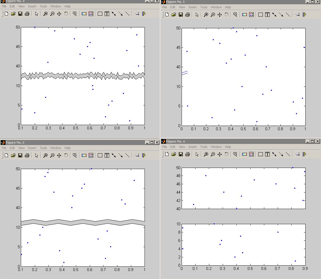
在mathworks的文件分享里面有两个这样的代码资源, 一个对纵坐标轴作切分分割, 一个对横坐标轴作切分分割。它们的代码都可以下载。介绍性文字和用法,请自己到mathworks网站上阅读。
不注册下载的话,可以分别点下面的两个链接。顺便给出了两种源代码提供者原作者给出的效果图。
Mathematica的代码和来源
我常去的是 mathematica.stackexchange.com ,这个上面的很多高手都热心而且水平高得往往出乎我的意料(这也跟mathematica的自身潜能巨大有关了)。而且,我还发现了不少高手都是普通话母语的,这个挺意外,也在意料之内了。
问问题之前,先自己搜搜、看能不能解决或能解决到什么程度;然后拿着自己的作业,不懂的地方再问别人。——随便抛出自己半生不熟的问题,是对这些热心的大牛们的不尊重。这种不负责任的态度,往往也能得到负面的反馈:冷遇、关贴等等。
Python的实现方法
如果碰上matlab之前就碰见matplotlib,很难说对matlab还能有多喜欢。matplotlib的文档和演示做得也极其漂亮。
补充
此外,原则上不接受免费答疑,您悲愤也没有用。使用过程中如果有小的问题请自行搞定。
Matlab的实现方式
代码1
代码2
Mathematica的实现方式
代码3
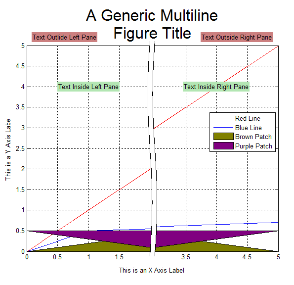
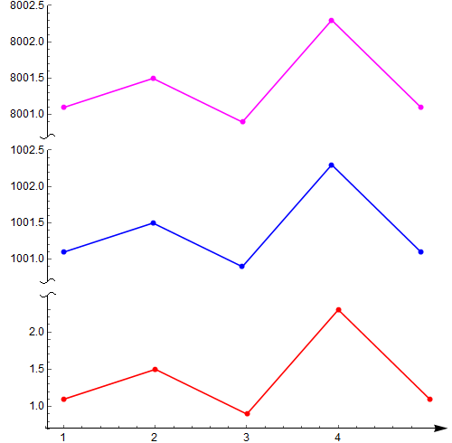
第一部分,我觉得最出彩的地方主要是,用Bezier曲线作为坐标轴分隔符,以及Arrowheads函数选项的活用。但是用Column或Grid之类合并多个figure,并不见得多好;
data1 = {{1, 1.1}, {2, 1.5}, {3, 0.9}, {4, 2.3}, {5, 1.1}};
data2 = {{1, 1001.1}, {2, 1001.5}, {3, 1000.9}, {4, 1002.3}, {5,
    1001.1}};
(*ListPlot[data1,PlotRange\[Rule]All,Joined\[Rule]True,Mesh\[Rule]\
Full,PlotStyle\[Rule]Red]
ListPlot[data2,PlotRange\[Rule]All,Joined\[Rule]True,Mesh\[Rule]Full,\
PlotStyle\[Rule]Blue]*)
snip[pos_] :=
  Arrowheads[{{Automatic, pos,
     Graphics[{BezierCurve[{{0, -(1/2)}, {1/2, 0}, {-(1/2), 0}, {0,
          1/2}}]}]}}];
getMaxPadding[p_List] :=
 Map[Max, (BorderDimensions@
        Image[Show[#, LabelStyle -> White, Background -> White]] & /@
      p)~Flatten~{{3}, {2}}, {2}] + 1
p1 = ListPlot[data1, PlotRange -> All, Joined -> True, Mesh -> Full,
   PlotStyle -> Red, AxesStyle -> {None, snip[1]},
   PlotRangePadding -> None, ImagePadding -> 30];
p2 = ListPlot[data2, PlotRange -> All, Joined -> True, Mesh -> Full,
   PlotStyle -> Blue, Axes -> {False, True},
   AxesStyle -> {None, snip[0]}, PlotRangePadding -> None,
   ImagePadding -> 30];

Column[{p2, p1} /.
  Graphics[x__] :>
   Graphics[x, ImagePadding -> getMaxPadding[{p1, p2}],
    ImageSize -> 400]]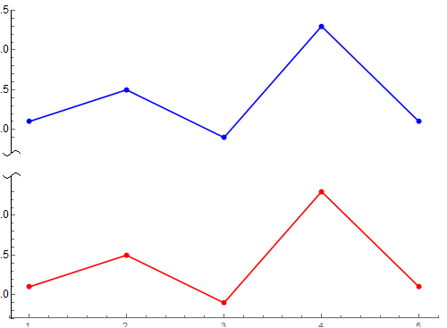
或者,这个,但都不是通用代码(使用Epilog选项拼接、使图片的确在同一幅图片里面,但Mathematica对LaTeX支持不好,有需要的情况下可以结合这个使用,需要下载的程序和配置还可以参考之前的一篇博客)。这个缺点正是上面一部分代码的优点,分割坐标轴的符号不能随着图片的放缩而等比例放缩,大缺陷。
Clear[compressYAxis];
compressYAxis[plot_, range1_, range2_] :=
 Module[{ytick1, ytick2, epilog1, target},
  ytick1 = FindDivisions[range1, 5] /.
     y_?NumericQ :> {y, y} /. {y_?NumericQ, _} /; y >= range1[[2]] :>
     Sequence[];
  ytick2 =
   FindDivisions[range2, 5] /.
     y_?NumericQ :> {y - range2[[1]] + range1[[2]],
       y} /. {y_?NumericQ, _} /; y <= range1[[2]] :> Sequence[];
  epilog = Options[plot, Epilog][[1, 2]];
  target =
   Subtract @@
     Reverse@range1/(Subtract @@ Reverse@range1 +
      Subtract @@ Reverse@range2);
  Show[plot /. {x_?NumericQ, y_?NumericQ /; y > range2[[1]]} :> {x,
      y - range2[[1]] + range1[[2]]},
   PlotRange -> {range1[[1]],
     range1[[2]] + Subtract @@ Reverse@range2},
   Ticks -> {Automatic, Join[ytick1, ytick2]},
   Epilog ->
    Join[epilog, {White,
      Rectangle[Scaled[{-0.1, 0.98 target}],
       Scaled[{1.1, 1.02 target}]], Black,
      Text[Rotate["\\", \[Pi]/2],
       Scaled[{0, 0.98 target}], {-1.5, 0}],
      Text[Rotate["\\", \[Pi]/2],
       Scaled[{0, 1.02 target}], {-1.5, 0}]}]]]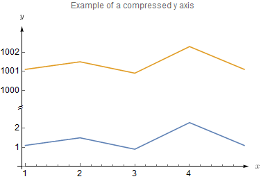
Grid[{{Plot[Sin[2 x], {x, 0, 4}, PlotRange -> {-1.1, 1.1},
      AxesOrigin -> {0, 0}, Ticks -> {{1, 2, 3, 4}, Automatic}, AspectRatio -> Full],
    Style["/", 20],
    Plot[Cos[2 x], {x, 6, 8}, PlotRange -> {-1.1, 1.1},
      Axes -> {True, False}, Ticks -> {{6, 7, 8}}, AspectRatio -> Full]}},
    ItemSize -> {{10, 1, 5}}]
尚不完美,努力中:
好了,下面的可以用了
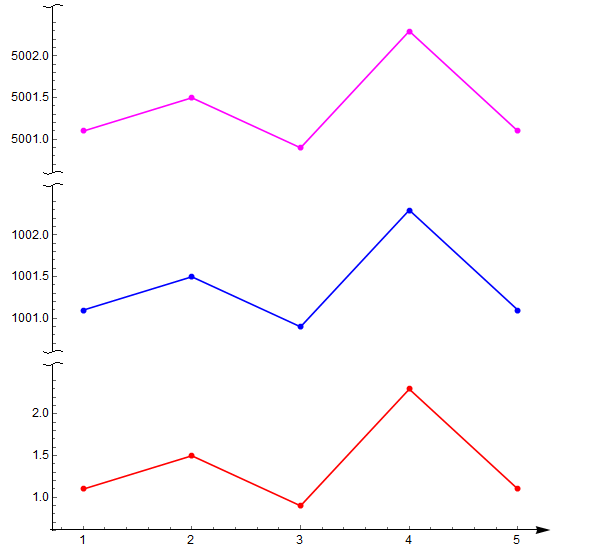
data1 = {{1, 1.1}, {2, 1.5}, {3, 0.9}, {4, 2.3}, {5, 1.1}};
data2 = {{1, 1001.1}, {2, 1001.5}, {3, 1000.9}, {4, 1002.3}, {5,
1001.1}};
data3 = {{1, 5001.1}, {2, 5001.5}, {3, 5000.9}, {4, 5002.3}, {5,
5001.1}};
ClearAll[snip]
snipCurve =
Graphics[BezierCurve[{{0, -(1/2)}, {1/4, 0}, {-1/4, 0}, {0, 1/2}}]];
snip[pos_?NumberQ, primitive_Graphics: snipCurve] :=
snip[{pos}, primitive];
snip[pos_List, primitive_Graphics: snipCurve] :=
Arrowheads[{Automatic, #, primitive} & /@ pos];
snip[pos_List, primitives_List] :=
Arrowheads[
Flatten /@ MapThread[{Automatic, ##} &, {pos, primitives}]];
(*snip[pos_]:=Arrowheads[{{Automatic,pos,Graphics[{BezierCurve[{{0,-(\
1/2)},{1/4,0},{-1/4,0},{0,1/2}}]}]}}];*)
getMaxPadding[p_List] :=
Map[Max, (BorderDimensions@
Image[Show[#, LabelStyle -> White, Background -> White]] & /@
p)~Flatten~{{3}, {2}}, {2}] + 1
p1 = ListPlot[data1, PlotRange -> All, Joined -> True, Mesh -> Full,
PlotStyle -> Red,
AxesStyle -> {{Arrowheads[.03], Directive[Black, 12]}, {snip[1],
Directive[Black, 12]}},
PlotRangePadding -> 0.3, ImagePadding -> {{50, 50}, {18, 5}},
AspectRatio -> 1/3];
p2 = ListPlot[data2, PlotRange -> All, Joined -> True, Mesh -> Full,
PlotStyle -> Blue, Axes -> {False, True},
AxesStyle -> {{None}, {snip[{0, 1}],
Directive[Black, 12]}}(*{{Arrowheads[{-0.03,.03}]},{snip[0],
Directive[Black,12](*,snip[1]*)}}*),
PlotRangePadding -> 0.3, ImagePadding -> {{50, 50}, {2, 5}},
AspectRatio -> 1/3];
p3 = ListPlot[data3, PlotRange -> All, Joined -> True, Mesh -> Full,
PlotStyle -> Magenta, Axes -> {False, True},
AxesStyle -> {{None}, {snip[{0, 1}],
Directive[Black, 12]}}(*{{Arrowheads[.03]},{snip[0],Directive[
Black,12](*,snip[1]*)}}*),
PlotRangePadding -> 0.3, ImagePadding -> {{50, 50}, {2, 5}},
AspectRatio -> 1/3];
output = Column[{p3, p2, p1} /.
Graphics[x__] :>
Graphics[x, ImagePadding -> getMaxPadding[{p1, p2}],
ImageSize -> 600]]
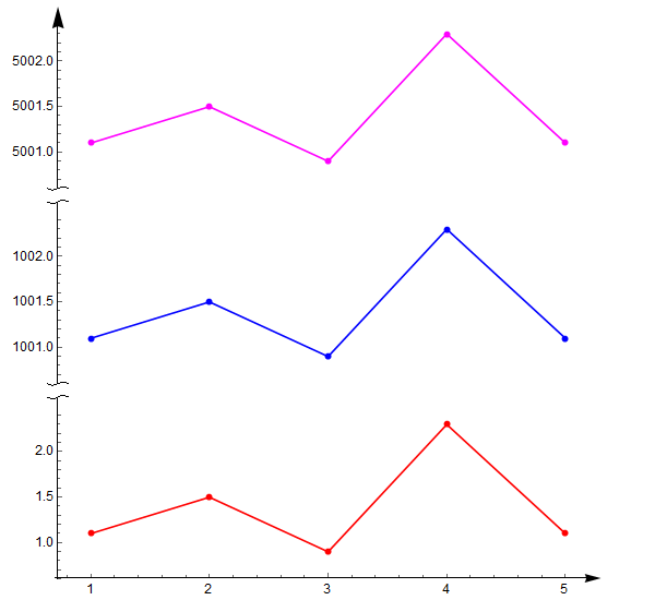
Export["testSnipAxis01.png", output]设置p2和p3的AxesStyle如下改变Axes箭头:
AxesStyle -> {
{None},
{snip[{0, 1}], Directive[Black, 12]}
}
AxesStyle -> {
{None},
{snip[{0, 1}, {snipCurve, {}}], Directive[Black, 12]}
}
Python的实现方式
http://stackoverflow.com/questions/32185411/break-in-x-axis-of-matplotlib
"""
Broken axis example, where the x-axis will have a portion cut out.
"""
import matplotlib.pylab as plt
import numpy as np


x = np.linspace(0,10,100)
x[75:] = np.linspace(40,42.5,25)

y = np.sin(x)

f,(ax,ax2) = plt.subplots(1,2,sharey=True, facecolor='w')

# plot the same data on both axes
ax.plot(x, y)
ax2.plot(x, y)

ax.set_xlim(0,7.5)
ax2.set_xlim(40,42.5)

# hide the spines between ax and ax2
ax.spines['right'].set_visible(False)
ax2.spines['left'].set_visible(False)
ax.yaxis.tick_left()
ax.tick_params(labelright='off')
ax2.yaxis.tick_right()

# This looks pretty good, and was fairly painless, but you can get that
# cut-out diagonal lines look with just a bit more work. The important
# thing to know here is that in axes coordinates, which are always
# between 0-1, spine endpoints are at these locations (0,0), (0,1),
# (1,0), and (1,1).  Thus, we just need to put the diagonals in the
# appropriate corners of each of our axes, and so long as we use the
# right transform and disable clipping.

d = .015 # how big to make the diagonal lines in axes coordinates
# arguments to pass plot, just so we don't keep repeating them
kwargs = dict(transform=ax.transAxes, color='k', clip_on=False)
ax.plot((1-d,1+d), (-d,+d), **kwargs)
ax.plot((1-d,1+d),(1-d,1+d), **kwargs)

kwargs.update(transform=ax2.transAxes)  # switch to the bottom axes
ax2.plot((-d,+d), (1-d,1+d), **kwargs)
ax2.plot((-d,+d), (-d,+d), **kwargs)

# What's cool about this is that now if we vary the distance between
# ax and ax2 via f.subplots_adjust(hspace=...) or plt.subplot_tool(),
# the diagonal lines will move accordingly, and stay right at the tips
# of the spines they are 'breaking'

plt.show()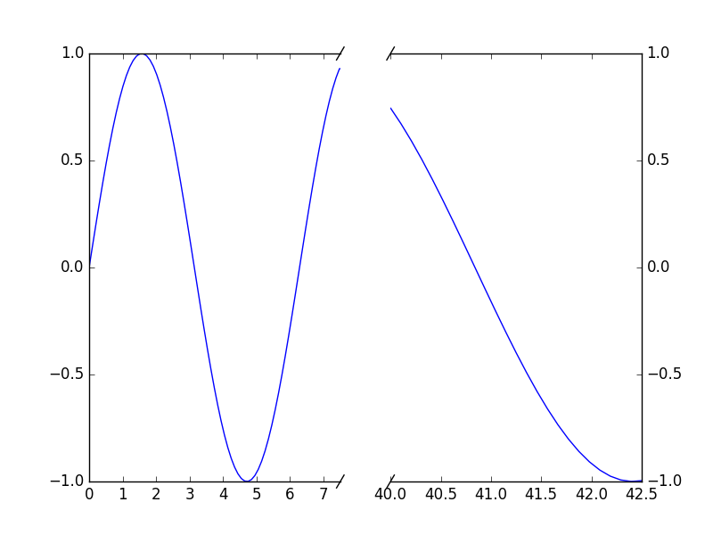
http://matplotlib.org/examples/pylab_examples/broken_axis.html
"""
Broken axis example, where the y-axis will have a portion cut out.
"""
import matplotlib.pyplot as plt
import numpy as np


# 30 points between 0 0.2] originally made using np.random.rand(30)*.2
pts = np.array([
    0.015, 0.166, 0.133, 0.159, 0.041, 0.024, 0.195, 0.039, 0.161, 0.018,
    0.143, 0.056, 0.125, 0.096, 0.094, 0.051, 0.043, 0.021, 0.138, 0.075,
    0.109, 0.195, 0.050, 0.074, 0.079, 0.155, 0.020, 0.010, 0.061, 0.008])

# Now let's make two outlier points which are far away from everything.
pts[[3, 14]] += .8

# If we were to simply plot pts, we'd lose most of the interesting
# details due to the outliers. So let's 'break' or 'cut-out' the y-axis
# into two portions - use the top (ax) for the outliers, and the bottom
# (ax2) for the details of the majority of our data
f, (ax, ax2) = plt.subplots(2, 1, sharex=True)

# plot the same data on both axes
ax.plot(pts)
ax2.plot(pts)

# zoom-in / limit the view to different portions of the data
ax.set_ylim(.78, 1.)  # outliers only
ax2.set_ylim(0, .22)  # most of the data

# hide the spines between ax and ax2
ax.spines['bottom'].set_visible(False)
ax2.spines['top'].set_visible(False)
ax.xaxis.tick_top()
ax.tick_params(labeltop='off')  # don't put tick labels at the top
ax2.xaxis.tick_bottom()

# This looks pretty good, and was fairly painless, but you can get that
# cut-out diagonal lines look with just a bit more work. The important
# thing to know here is that in axes coordinates, which are always
# between 0-1, spine endpoints are at these locations (0,0), (0,1),
# (1,0), and (1,1).  Thus, we just need to put the diagonals in the
# appropriate corners of each of our axes, and so long as we use the
# right transform and disable clipping.

d = .015  # how big to make the diagonal lines in axes coordinates
# arguments to pass plot, just so we don't keep repeating them
kwargs = dict(transform=ax.transAxes, color='k', clip_on=False)
ax.plot((-d, +d), (-d, +d), **kwargs)        # top-left diagonal
ax.plot((1 - d, 1 + d), (-d, +d), **kwargs)  # top-right diagonal

kwargs.update(transform=ax2.transAxes)  # switch to the bottom axes
ax2.plot((-d, +d), (1 - d, 1 + d), **kwargs)  # bottom-left diagonal
ax2.plot((1 - d, 1 + d), (1 - d, 1 + d), **kwargs)  # bottom-right diagonal

# What's cool about this is that now if we vary the distance between
# ax and ax2 via f.subplots_adjust(hspace=...) or plt.subplot_tool(),
# the diagonal lines will move accordingly, and stay right at the tips
# of the spines they are 'breaking'

plt.show()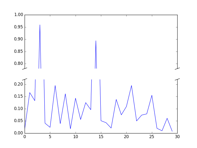


 2715
2715

 被折叠的 条评论
为什么被折叠?
被折叠的 条评论
为什么被折叠?
 到【灌水乐园】发言


