


欢迎来到@一夜看尽长安花 博客,您的点赞和收藏是我持续发文的动力
对于文章中出现的任何错误请大家批评指出,一定及时修改。有任何想要讨论的问题可联系我:3329759426@qq.com 。发布文章的风格因专栏而异,均自成体系,不足之处请大家指正。

专栏:
文章概述:对 Matplotlib之基础绘图的介绍
关键词:Matplotlib之基础绘图
本文目录:
Matplotlib
Matplotlib是Python中用于机器学习最流行和最古老的绘图库之一。在机器学习中,它有助于通过不同的可视化来理解数据,绘制最终的结果。
basic plot
import numpy as np
import matplotlib.pyplot as plt
# 需要X轴和Y轴
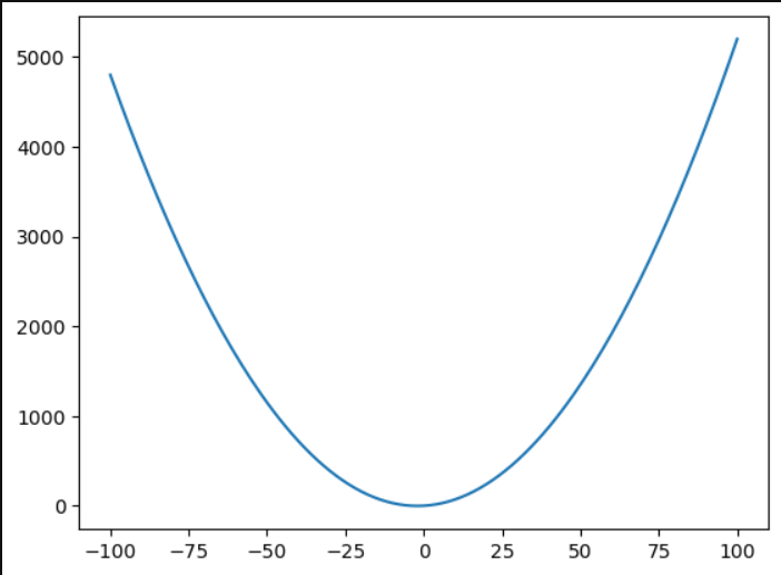
x = np.arange(-100, 101, 1)
print(x)
y = 0.5 * x ** 2 + 2*x
plt.plot(x, y)
plt.show()
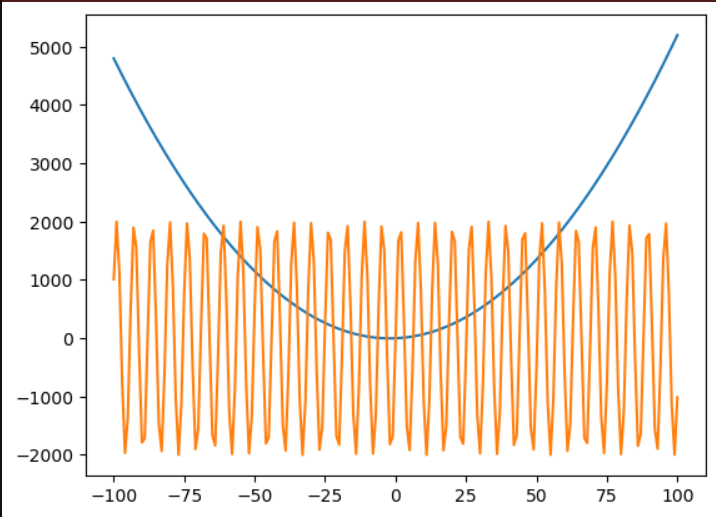
# 也可以在一张图里面画多个函数
y1 = 0.5 * x ** 2 + 2*x
y2 = np.sin(x) * 2000
y3 = np.log(x) * 1000
plt.plot(x, y1)
plt.plot(x, y2)
plt.show()
修改样式
颜色
'b':表示蓝色(blue)。'r':表示红色(red)。'g':表示绿色(green)。'y':表示黄色(yellow)。
线型和标记
'--':表示虚线(dashed line)。'-':表示实线(solid line)。'o':表示圆形标记(circle marker)。'^':表示三角形标记(triangle marker)。
x = np.arange(-100, 101, 1)
print(x)
y = 0.5 * x ** 2 + 2*x
plt.plot(x, y, 'r') # 'b' 'r--' 'go' 'y-' 'y^'
plt.show()
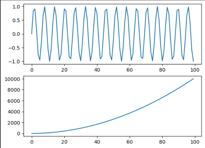
subplots
import numpy as np
import matplotlib.pyplot as plt


x = np.arange(0, 100, 1)
y1 = np.sin(x)
y2 = x**2 + 2*x


ax1 = plt.subplot(211) # rows,columns,index 221
ax2 = plt.subplot(212) # 222


ax1.plot(x,y1)
ax2.plot(x,y2)
plt.show()
good layout
plt.tight_layout()multiple windows
plt.figure(1)
ax1 = plt.subplot(211)
ax1.plot(x,y1,'g')
ax2 = plt.subplot(212)
ax2.plot(x,y2,'r')


plt.figure(2)
plt.plot(x, y1)


y3 = np.log(x)
plt.figure(3)
plt.plot(x,y3)


plt.show()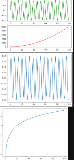
更多主题
import numpy as np
import matplotlib.pyplot as plt
from matplotlib import style
#style.use('ggplot') # 不同的主题
#style.use('fivethirtyeight')
#style.use('dark_background')
#style.use('grayscale')
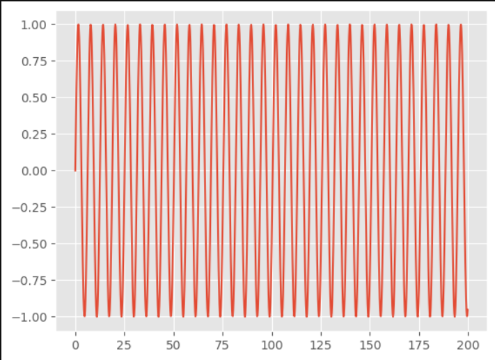
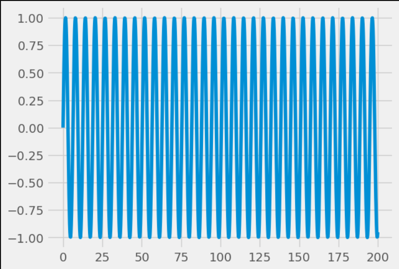
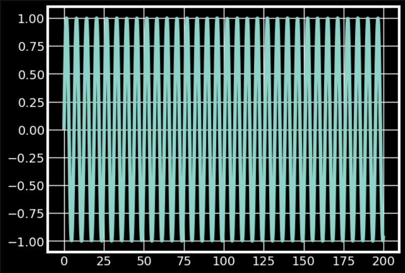
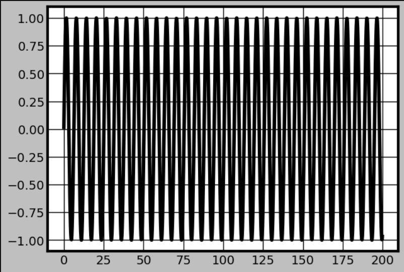
x = np.arange(0, 200, 0.2)
y = np.sin(x)
plt.plot(x,y)
plt.show()
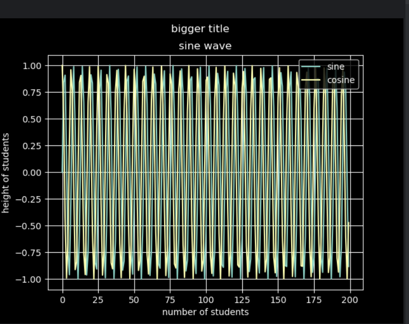
添加网格、标题、x轴y轴标题
plt.grid(True)#网格


plt.title('sine wave')
plt.suptitle('bigger title')


plt.xlabel("number of students")
plt.ylabel("height of students")
添加图例
y1 = np.sin(x)
y2 = np.cos(x)


plt.plot(x, y1, label='sine')
plt.plot(x, y2, label='cosine')


plt.legend(loc='upper right') # lower right
plt.show()
柱状图
import numpy as np
import matplotlib.pyplot as plt


python = (85, 67, 23, 98)
java = (50, 67, 89, 14)
networking = (60, 20 ,56, 22)
machine_learning = (88, 23, 40, 87)


people = ['Bob', 'Anna', 'John', 'Mark']
index = np.arange(4)


plt.bar(index, python, width=0.2, label='Python')
plt.bar(index + 0.2, java, width=0.2, label='Java')
plt.bar(index + 0.4, networking, width=0.2, label='Networking')
plt.bar(index + 0.6, machine_learning, width=0.2, label='Machine Learning')


plt.title('IT Skill Scores')
plt.xlabel('person')
plt.ylabel('scores')


plt.xticks(index+0.2, people) # x轴上面坐标数字替换
plt.legend(loc='upper right')
plt.ylim(0, 150) # 控制y轴展示范围,让图例尽量不覆盖在图上


plt.show()

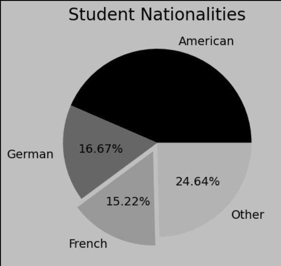
饼图
import matplotlib.pyplot as plt


nationalities = ['American', 'German', 'French', 'Other']
students = [60, 23, 21, 34]

'''
#从右侧三点钟的方向开始绘制
plt.pie(students)
plt.pie(students, labels=nationalities)
plt.pie(students, labels=nationalities, autopct='%.2f%%')
#默认是逆时针绘制
#counterclock=False顺时针  counterclock是逆时针
plt.pie(students, labels=nationalities, autopct='%.2f%%', counterclock=False)
#修改起始位置
plt.pie(students, labels=nationalities, autopct='%.2f%%', counterclock=False, startangle=90)
#有无阴影
plt.pie(students, labels=nationalities, autopct='%.2f%%', shadow=True)
'''
#突出效果
explode = [0,0,0.1,0] # 重点突出哪部分
plt.pie(students, labels=nationalities, autopct='%.2f%%', explode=explode)


plt.title("Student Nationalities")
plt.show()
排序
# pairs = zip(students, nationalities)
# pairs = sorted(list(pairs))
# students, nationalities = zip(*pairs)
假设有以下数据:
students = [ 'Bob','Alice', 'Charlie']
nationalities = [ 'Canadian','British', 'American']
要按 students 列表的字母顺序对 students 和 nationalities 进行排序,可以使用如下代码:
# 创建配对
pairs = zip(students, nationalities)

# 对配对进行排序(默认按第一个排序)
pairs = sorted(list(pairs))

# 解压配对
students, nationalities = zip(*pairs)

print(students)
print(nationalities)![]()
注意事项
sorted()返回一个新的排序列表,不会修改原列表。- 如果
students和nationalities长度不相等,zip()只会配对到较短列表的长度。 - 如果希望根据
nationalities排序students,需要调整sorted()的key参数。例如:
pairs = zip(students, nationalities)
pairs = sorted(pairs, key=lambda x: x[1])  # 按 nationalities 排序
students, nationalities = zip(*pairs)![]()
这段代码适用于按一个列表的元素对两个相关联的列表进行排序。
频率直方图 histogram
import numpy as np
import matplotlib.pyplot as plt


mu, sigma = 172, 8 # 身高cm
# 随机出来一组数据,让其服从正太分布
x = mu + sigma*np.random.randn(10000)


#plt.hist(x, 100, facecolor='blue') # 可视化x轴上100个点,颜色是蓝色
#显示的是概率密度
plt.hist(x, 100, facecolor='blue', density=True)


plt.xlabel('Heights')
plt.ylabel('Percentage of students')
plt.title('Heights of students')
plt.grid(True)

#解决中文乱码问题
plt.rcParams["font.sans-serif"]=["SimHei"] #设置字体
plt.text(145, 0.04, "μ=172, σ=8")  #将在图形上的 (145, 0.04) 位置添加文本 "μ=172, σ=8"。

plt.show()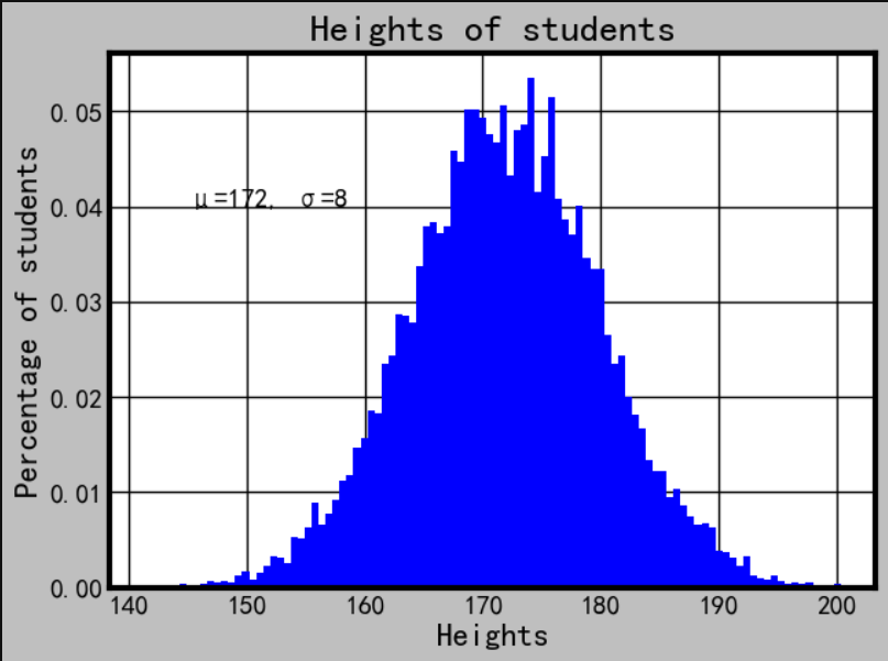
散点图
import numpy as np
import matplotlib.pyplot as plt


x = np.random.rand(50)
y = np.random.rand(50)


#x = [10,20,30,40,20]
#y = [5,7,3,2,6]


#plt.scatter(x,y)
#color   size(点的大小)
plt.scatter(x,y,c='red',marker='^', s=100)

plt.show()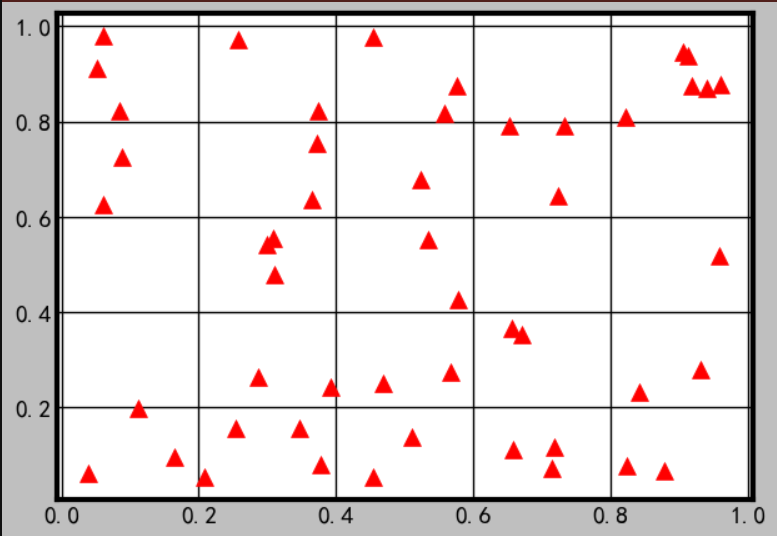
import numpy as np
import matplotlib.pyplot as plt


x = np.random.rand(50)
y = np.random.rand(50)

#当c是动态的多值的时候,会有光谱显示
m=100*(x+y)/2
plt.scatter(x,y,c=m,marker='^', s=100, cmap='Spectral')
plt.show()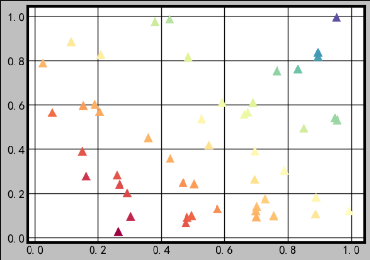
3D图
简单的点连成线
import numpy as np
import matplotlib.pyplot as plt
from mpl_toolkits import mplot3d
from matplotlib import style


style.use('dark_background')


ax = plt.axes(projection='3d')


# 一个轴作为输入,另外两个轴是根据输入计算出来的
z = np.linspace(0, 30, 100)
x = np.sin(z)
y = np.cos(z)
ax.plot3D(x, y, z)

plt.show()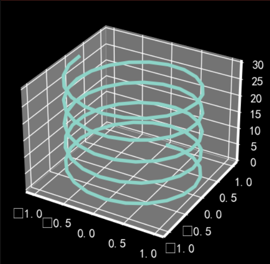
介绍一下np.meshgrid() 函数
#将已有点排列组合,得到新的坐标点
X, Y = np.meshgrid(x, y)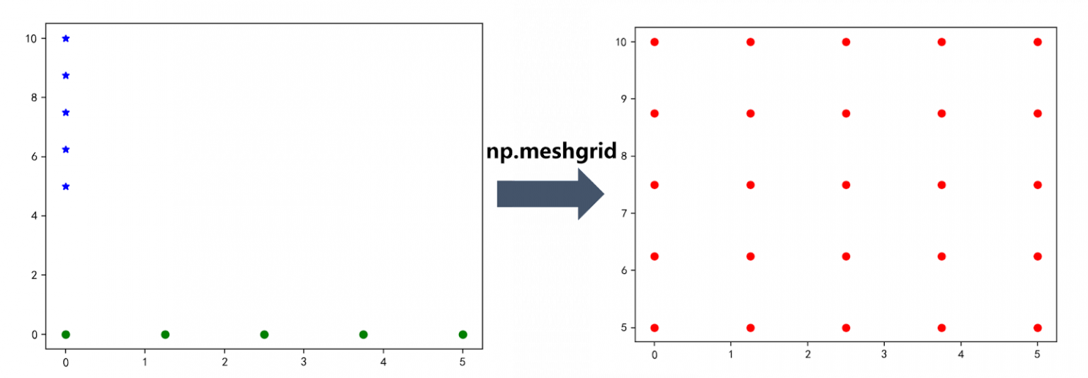
import numpy as np
import matplotlib.pyplot as plt
from mpl_toolkits import mplot3d
from matplotlib import style


style.use('dark_background')


ax = plt.axes(projection='3d')

# 两个轴作为输入,第三个轴是根据前俩个轴计算出来的
def z_function(x,y):
  return np.sin(np.sqrt(x**2 + y**2))

x = np.linspace(-5,5,100)
y = np.linspace(-5,5,100)

#将已有点排列组合,得到新的坐标点
X, Y = np.meshgrid(x, y)

Z = z_function(X,Y)


ax.plot_surface(X,Y,Z)


plt.show()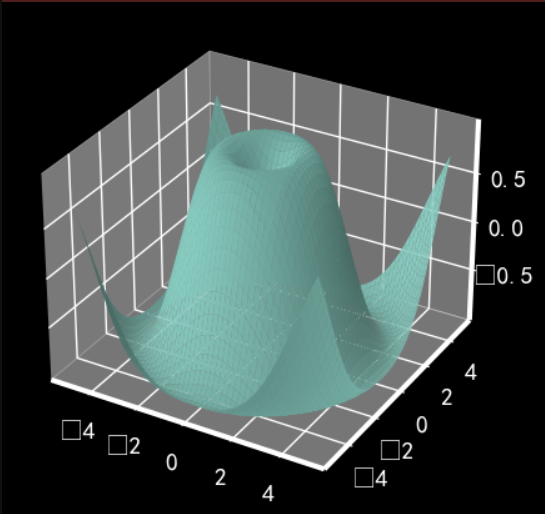


 697
697

 被折叠的 条评论
为什么被折叠?
被折叠的 条评论
为什么被折叠?
 到【灌水乐园】发言


