


折线图
我们首先导入Matplotlib库
import matplotlib.pyplot as plt
import numpy as np
然后创建了示例数据
x = np. arange(4,19)
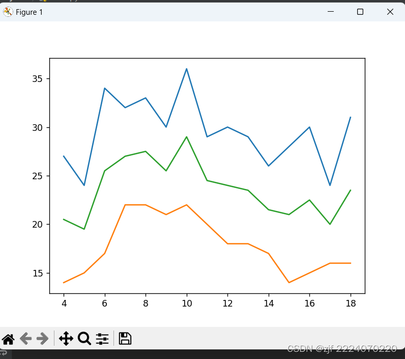
y1 = np. array([32, 33, 34, 34, 33, 31, 30, 29, 30, 29, 26, 23, 21, 25, 31])
y2 = np. array([19, 19, 20, 22, 22, 21, 22, 16, 18, 18, 17, 14, 15, 16, 16])
y3 = np.array(y1 + y2) /2.0
使用 plt.plot 函数创建折线图,设置图标尺寸
plt.plot(x,y)
plt.plot(x,y2)
plt.plot(x,y3)
最后用plt.show() 显示折线图
plt.show()运行图:
二、使用bur()来绘制柱形图
1、导入matplotlib库
import matplotlib.pyplot as plt
import numpy as np
2、插入数据
x = np.arange(1,8)
y1 = np.array([10770, 16780, 24440, 30920, 37670, 48200, 57270])
y2 = np.array([9770, 14780, 23440, 28920, 38670, 49200, 60270])
3、
bar_width = 0.3

plt.bar(x, y1, tick_label=["FY2013", "FY2014",
                           "FY2015", "FY2016",
                           "FY2017", "FY2018", "FY2019"],color="orange",width=bar_width)
plt.bar(x+bar_width, y2, color="red",width=bar_width)
4、展示图表
plt.show()以下是柱形图展示:


 1555
1555


 被折叠的 条评论
为什么被折叠?
被折叠的 条评论
为什么被折叠?
 到【灌水乐园】发言


