


本文以两段Python代码为例,介绍了雷达图在数据分析中的应用及其绘制方法。通过对比不同场景下的数据分布,雷达图能够直观地展示多变量之间的关系,为决策者提供有力的数据支持。
一、引言
雷达图,又称蜘蛛图或星形图,是一种以从同一点开始的轴上表示的三个或更多个定量变量的二维图表。在数据分析领域,雷达图因其独特的展示方式,广泛应用于各个行业。本文将通过两段Python代码,带领读者了解雷达图的绘制方法及其在实际案例中的应用。
二、雷达图的基本原理与绘制方法
基本原理
雷达图通过将多个变量的数值映射到从同一点开始的轴上,形成一个多边形。多边形的形状和面积可以反映各变量之间的相对大小和差异。以下为雷达图的基本构成:
(1)轴(Spokes):表示不同变量。
(2)数据点(Data Points):表示各变量的数值。
(3)多边形(Polygon):连接数据点形成的图形。
绘制方法
以下为两段Python代码,分别展示了如何绘制雷达图。
(1)代码一:基于Matplotlib库的雷达图绘制
此代码段通过Matplotlib库绘制了一个简单的雷达图。
import matplotlib.pyplot as plt
import pandas as pd
from math import pi
# 设置字体和负号显示问题
plt.rcParams['font.sans-serif'] = ['SimHei']
plt.rcParams['axes.unicode_minus'] = False
# 准备数据
df = pd.DataFrame({
'group': ['A', 'B', 'C', 'D'],
'专业知识': [38, 1.5, 30, 4],
'社交能力': [29, 10, 9, 34],
'领导能力': [15, 39, 23, 24],
'自我管理': [35, 31, 33, 14],
'学习能力': [32, 15, 32, 14]
})
# 计算变量数量
categories = list(df)[1:]
N = len(categories)
# 计算雷达图的角度
angles = [n / float(N) * 2 * pi for n in range(N)]
angles += angles[:1]
# 绘制雷达图
fig, ax = plt.subplots(figsize=(6, 6), subplot_kw=dict(polar=True))
ax.fill(angles, df.loc[0, categories], color='red', alpha=0.25)
# ...(此处省略其他组的绘制代码)
plt.show()
- 首先,我们导入了必要的库:matplotlib.pyplot用于绘图,pandas用于数据处理。
- 通过plt.rcParams设置字体和负号显示,确保图表中的中文和负号能正确显示。
- 创建一个DataFrame对象df,其中包含不同组别的数据。
- 计算变量数量N,并为每个变量分配一个角度,以便在雷达图上均匀分布。
- 使用plt.subplots创建一个子图,并设置其大小和极坐标属性。
- 通过ax.fill绘制填充的雷达图,其中angles是角度列表,df.loc[0, categories]是第一组的数据。
(2)代码二:自定义雷达图投影的绘制
此代码段自定义了一个雷达图投影,通过RegularPolygon类绘制多边形框架。相较于代码一,代码二提供了更多自定义选项,如设置网格线、填充颜色等。
import matplotlib.pyplot as plt
import numpy as np
from matplotlib.patches import Circle, RegularPolygon
from matplotlib.path import Path
from matplotlib.projections import register_projection
from matplotlib.projections.polar import PolarAxes
from matplotlib.spines import Spine
from matplotlib.transforms import Affine2D
def radar_factory(num_vars, frame='circle'):
"""
Create a radar chart with `num_vars` Axes.
This function creates a RadarAxes projection and registers it.
Parameters
----------
num_vars : int
Number of variables for radar chart.
frame : {'circle', 'polygon'}
Shape of frame surrounding Axes.
"""
# calculate evenly-spaced axis angles
theta = np.linspace(0, 2*np.pi, num_vars, endpoint=False)
class RadarTransform(PolarAxes.PolarTransform):
def transform_path_non_affine(self, path):
# Paths with non-unit interpolation steps correspond to gridlines,
# in which case we force interpolation (to defeat PolarTransform's
# autoconversion to circular arcs).
if path._interpolation_steps > 1:
path = path.interpolated(num_vars)
return Path(self.transform(path.vertices), path.codes)
class RadarAxes(PolarAxes):
name = 'radar'
PolarTransform = RadarTransform
def __init__(self, *args, **kwargs):
super().__init__(*args, **kwargs)
# rotate plot such that the first axis is at the top
self.set_theta_zero_location('N')
def fill(self, *args, closed=True, **kwargs):
"""Override fill so that line is closed by default"""
return super().fill(closed=closed, *args, **kwargs)
def plot(self, *args, **kwargs):
"""Override plot so that line is closed by default"""
lines = super().plot(*args, **kwargs)
for line in lines:
self._close_line(line)
def _close_line(self, line):
x, y = line.get_data()
# FIXME: markers at x[0], y[0] get doubled-up
if x[0] != x[-1]:
x = np.append(x, x[0])
y = np.append(y, y[0])
line.set_data(x, y)
def set_varlabels(self, labels):
self.set_thetagrids(np.degrees(theta), labels)
def _gen_axes_patch(self):
# The Axes patch must be centered at (0.5, 0.5) and of radius 0.5
# in axes coordinates.
if frame == 'circle':
return Circle((0.5, 0.5), 0.5)
elif frame == 'polygon':
return RegularPolygon((0.5, 0.5), num_vars,
radius=.5, edgecolor="k")
else:
raise ValueError("Unknown value for 'frame': %s" % frame)
def _gen_axes_spines(self):
if frame == 'circle':
return super()._gen_axes_spines()
elif frame == 'polygon':
# spine_type must be 'left'/'right'/'top'/'bottom'/'circle'.
spine = Spine(axes=self,
spine_type='circle',
path=Path.unit_regular_polygon(num_vars))
# unit_regular_polygon gives a polygon of radius 1 centered at
# (0, 0) but we want a polygon of radius 0.5 centered at (0.5,
# 0.5) in axes coordinates.
spine.set_transform(Affine2D().scale(.5).translate(.5, .5)
+ self.transAxes)
return {'polar': spine}
else:
raise ValueError("Unknown value for 'frame': %s" % frame)
register_projection(RadarAxes)
return theta
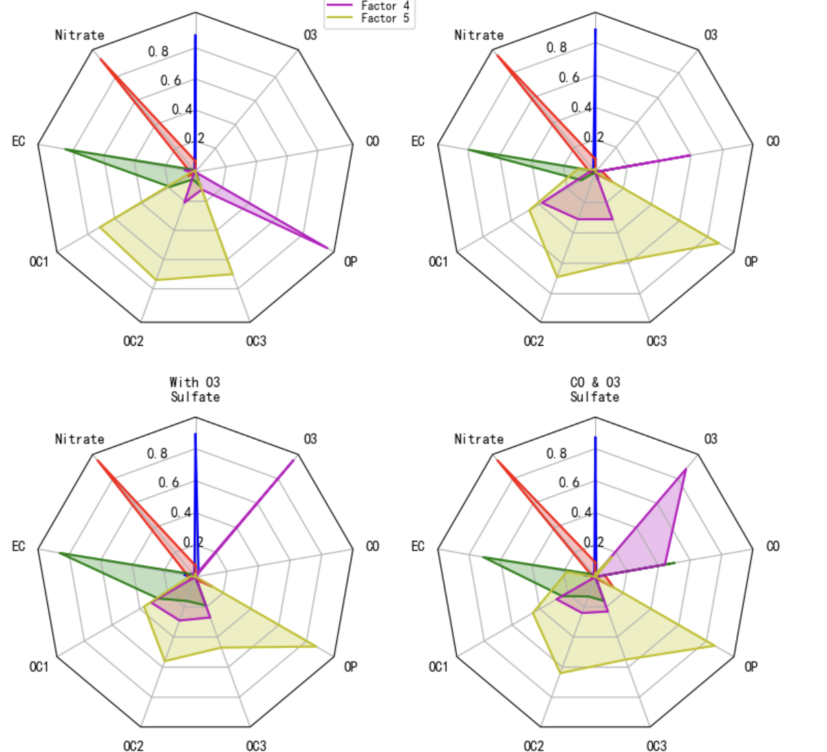
def example_data():
# The following data is from the Denver Aerosol Sources and Health study.
# See doi:10.1016/j.atmosenv.2008.12.017
#
# The data are pollution source profile estimates for five modeled
# pollution sources (e.g., cars, wood-burning, etc) that emit 7-9 chemical
# species. The radar charts are experimented with here to see if we can
# nicely visualize how the modeled source profiles change across four
# scenarios:
# 1) No gas-phase species present, just seven particulate counts on
# Sulfate
# Nitrate
# Elemental Carbon (EC)
# Organic Carbon fraction 1 (OC)
# Organic Carbon fraction 2 (OC2)
# Organic Carbon fraction 3 (OC3)
# Pyrolyzed Organic Carbon (OP)
# 2)Inclusion of gas-phase specie carbon monoxide (CO)
# 3)Inclusion of gas-phase specie ozone (O3).
# 4)Inclusion of both gas-phase species is present...
data = [
['Sulfate', 'Nitrate', 'EC', 'OC1', 'OC2', 'OC3', 'OP', 'CO', 'O3'],
('Basecase', [
[0.88, 0.01, 0.03, 0.03, 0.00, 0.06, 0.01, 0.00, 0.00],
[0.07, 0.95, 0.04, 0.05, 0.00, 0.02, 0.01, 0.00, 0.00],
[0.01, 0.02, 0.85, 0.19, 0.05, 0.10, 0.00, 0.00, 0.00],
[0.02, 0.01, 0.07, 0.01, 0.21, 0.12, 0.98, 0.00, 0.00],
[0.01, 0.01, 0.02, 0.71, 0.74, 0.70, 0.00, 0.00, 0.00]]),
('With CO', [
[0.88, 0.02, 0.02, 0.02, 0.00, 0.05, 0.00, 0.05, 0.00],
[0.08, 0.94, 0.04, 0.02, 0.00, 0.01, 0.12, 0.04, 0.00],
[0.01, 0.01, 0.79, 0.10, 0.00, 0.05, 0.00, 0.31, 0.00],
[0.00, 0.02, 0.03, 0.38, 0.31, 0.31, 0.00, 0.59, 0.00],
[0.02, 0.02, 0.11, 0.47, 0.69, 0.58, 0.88, 0.00, 0.00]]),
('With O3', [
[0.89, 0.01, 0.07, 0.00, 0.00, 0.05, 0.00, 0.00, 0.03],
[0.07, 0.95, 0.05, 0.04, 0.00, 0.02, 0.12, 0.00, 0.00],
[0.01, 0.02, 0.86, 0.27, 0.16, 0.19, 0.00, 0.00, 0.00],
[0.01, 0.03, 0.00, 0.32, 0.29, 0.27, 0.00, 0.00, 0.95],
[0.02, 0.00, 0.03, 0.37, 0.56, 0.47, 0.87, 0.00, 0.00]]),
('CO & O3', [
[0.87, 0.01, 0.08, 0.00, 0.00, 0.04, 0.00, 0.00, 0.01],
[0.09, 0.95, 0.02, 0.03, 0.00, 0.01, 0.13, 0.06, 0.00],
[0.01, 0.02, 0.71, 0.24, 0.13, 0.16, 0.00, 0.50, 0.00],
[0.01, 0.03, 0.00, 0.28, 0.24, 0.23, 0.00, 0.44, 0.88],
[0.02, 0.00, 0.18, 0.45, 0.64, 0.55, 0.86, 0.00, 0.16]])
]
return data
if __name__ == '__main__':
N = 9
theta = radar_factory(N, frame='polygon')
data = example_data()
spoke_labels = data.pop(0)
fig, axs = plt.subplots(figsize=(9, 9), nrows=2, ncols=2,
subplot_kw=dict(projection='radar'))
fig.subplots_adjust(wspace=0.25, hspace=0.20, top=0.85, bottom=0.05)
colors = ['b', 'r', 'g', 'm', 'y']
# Plot the four cases from the example data on separate Axes
for ax, (title, case_data) in zip(axs.flat, data):
ax.set_rgrids([0.2, 0.4, 0.6, 0.8])
ax.set_title(title, weight='bold', size='medium', position=(0.5, 1.1),
horizontalalignment='center', verticalalignment='center')
for d, color in zip(case_data, colors):
ax.plot(theta, d, color=color)
ax.fill(theta, d, facecolor=color, alpha=0.25, label='_nolegend_')
ax.set_varlabels(spoke_labels)
# add legend relative to top-left plot
labels = ('Factor 1', 'Factor 2', 'Factor 3', 'Factor 4', 'Factor 5')
legend = axs[0, 0].legend(labels, loc=(0.9, .95),
labelspacing=0.1, fontsize='small')
fig.text(0.5, 0.965, '5-Factor Solution Profiles Across Four Scenarios',
horizontalalignment='center', color='black', weight='bold',
size='large')
plt.show()
三、雷达图在数据分析中的应用实例
以下以一个虚构的数据集为例,展示雷达图在不同场景下的应用。
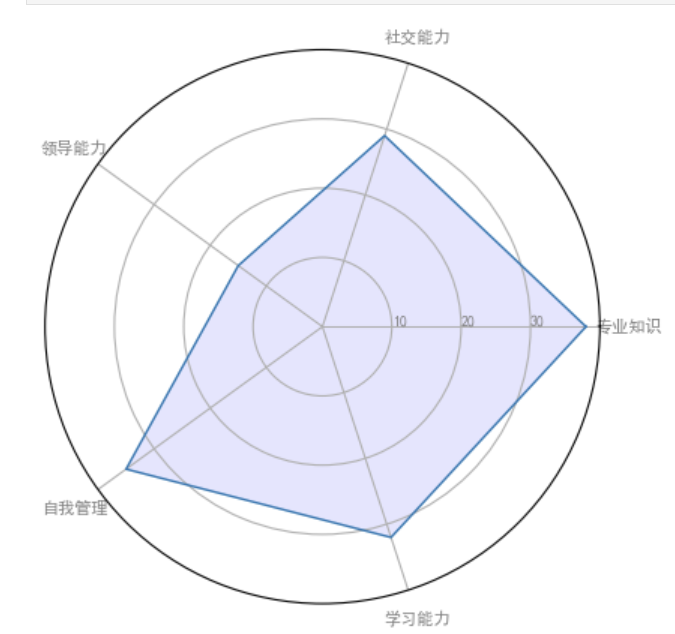
场景一:企业员工能力评估
通过雷达图,可以直观地比较不同员工在专业知识、社交能力、领导能力、自我管理和学习能力等方面的表现。如图1所示,我们可以发现员工A在专业知识方面表现较好,而员工B在社交能力方面更具优势。
场景二:环境监测数据分析
以大气污染源为例,雷达图可以展示不同污染源在不同场景下的排放情况。如图2所示,通过对比四个场景下的数据,我们可以发现二氧化碳(CO)和臭氧(O3)的排放量对污染源的影响较大。
四、总结
雷达图作为一种有效的可视化工具,在数据分析领域具有广泛的应用前景。通过本文的两段Python代码,读者可以掌握雷达图的绘制方法,并在实际工作中灵活运用,为决策提供有力支持。然而,雷达图也存在一定的局限性,如难以展示大量数据和多变量之间的复杂关系。因此,在实际应用中,还需结合其他可视化工具,以全面、准确地分析数据。


 380
380

 被折叠的 条评论
为什么被折叠?
被折叠的 条评论
为什么被折叠?
 到【灌水乐园】发言


