


文章目录
Tablayout继承自HorizontalScrollView,用作页面切换指示器
先用起来
添加依赖
implementation 'com.google.android.material:material:1.0.0'
<com.google.android.material.tabs.TabLayout
	android:id="@+id/tabLayout"
	android:layout_width="match_parent"
	android:layout_height="wrap_content" />
tabLayout = findViewById(R.id.tabLayout);
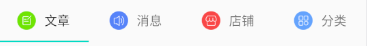
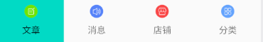
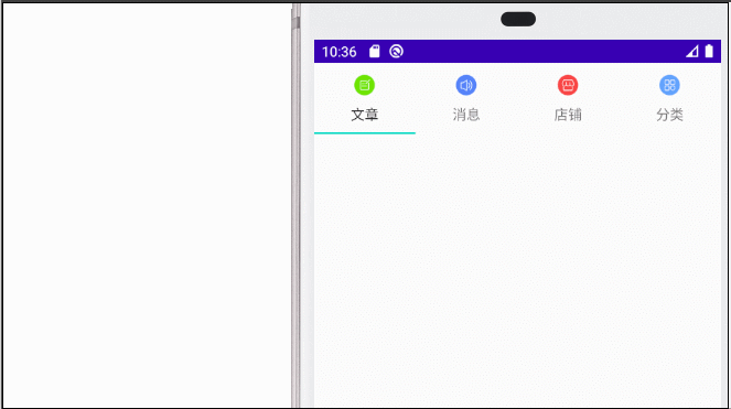
tabLayout.addTab(tabLayout.newTab().setText("文章").setIcon(R.mipmap.article));
tabLayout.addTab(tabLayout.newTab().setText("消息").setIcon(R.mipmap.message));
tabLayout.addTab(tabLayout.newTab().setText("店铺").setIcon(R.mipmap.shop));
tabLayout.addTab(tabLayout.newTab().setText("分类").setIcon(R.mipmap.category));
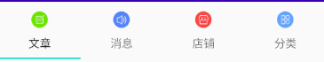
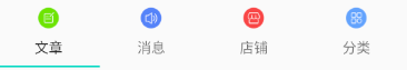
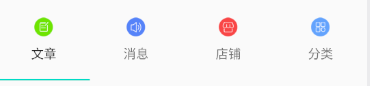
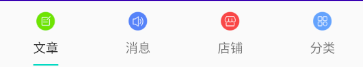
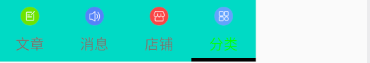
图一:
属性
常用属性
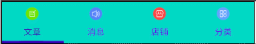
        app:tabTextColor="@color/colorPrimary"//未选中文字颜色
        app:tabSelectedTextColor="@color/colorPrimaryDark"//选中文字颜色
        app:tabBackground="@color/colorAccent"//tab背景色
        app:tabIndicatorColor="@color/colorPrimaryDark"//指示器(下划线)颜色
        app:tabIndicatorHeight="5dp"//指示器(下划线)高度
设置文字和图片
tabTextAppearance改变字体属性
app:tabTextAppearance="@style/AppTheme.TabLayout.TextAppearance"//设置style改变字体属性
<style name="AppTheme.TabLayout.TextAppearance" parent="TextAppearance.Design.Tab">
        <item name="android:textSize">16sp</item>
        <item name="android:textColor">#B2A04D4D</item>
        <item name="textAllCaps">false</item>
    </style>
tabIconTint:设置文字上面图标的颜色
app:tabIconTint="@color/colorAccent"
tabInlineLabel:设置图标和文字的方向
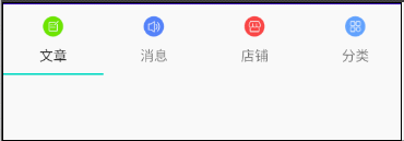
app:tabInlineLabel="true" //默认为 false,效果看图一
设置布局模式
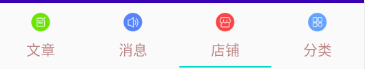
tabMode 设置 Tablayout 的布局模式:固定或可滑动
我们增加点数据来测试
app:tabMode="fixed" //固定
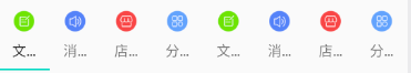
app:tabMode="scrollable" //可滑动的
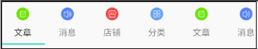
tabGravity设置 TabLayout 的布局方式:充满或居中
app:tabGravity="center" //居中
app:tabGravity="fill" //默认是fill,且只有当tabMode为fixed时才有效
设置边距、宽度等
paddingStart,paddingEnd 设置整个TabLayout的内边距
		app:tabPaddingStart="50dp"
        app:tabPaddingEnd="10dp"
tabMaxWidth、tabMinWidth 设置 tab 项最大/小的宽度
		app:tabGravity="center"
        app:tabMinWidth="80dp" //最小宽度
app:tabMaxWidth="80dp" //最大宽度
设置tab项的内边距
tabPadding,tabPaddingStart,tabPaddingEnd,tabPaddingTop,tabPaddingBottom 设置tab项的内边距
部分举例
		app:tabPaddingTop="20dp"
        app:tabPaddingBottom="20dp"
设置指示器
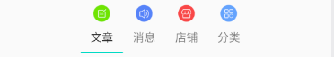
tabIndicatorFullWidth:指示器是否占满整个宽度
app:tabIndicatorFullWidth="false" //指示器是否占满整个宽度,默认为true
tabIndicatorGravity:设置指示器的方位
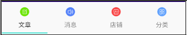
app:tabIndicatorGravity="top" //设置指示器的方位,默认为 bottom,效果图看图一
center
stretch
tabIndicatorAnimationDuration:设置指示器动画时间
app:tabIndicatorAnimationDuration="2000"
设置水波纹的属性
app:tabRippleColor:设置水波纹颜色
app:tabRippleColor="#9370DB" //水波纹颜色
tabUnboundedRipple:设置水波纹是否无边界
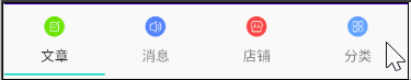
app:tabUnboundedRipple="true" //设置水波纹是否无边界(默认有边界)默认为false,效果看图一
使用style设置tablayout样式
sytle设置tablayout样式
style="@style/AppTheme.TabLayout"
<style name="AppTheme.TabLayout" parent="Widget.Design.TabLayout">
        <item name="tabMode">scrollable</item>
        <item name="tabIndicatorColor">#000000</item>
        <item name="tabIndicatorHeight">4dp</item>
        <item name="tabTextAppearance">@style/AppTheme.TabLayout.TextAppearance</item>
        <item name="tabBackground">@color/colorAccent</item>
        <item name="tabSelectedTextColor">#00ff00</item>
    </style>
还有俩属性没看懂,大神帮忙解释:tabContentStart、tabIconTintMode
设置监听
tabLayout.addOnTabSelectedListener(new TabLayout.OnTabSelectedListener() {
            @Override
            public void onTabSelected(TabLayout.Tab tab) {
                //添加选中Tab的逻辑
                Log.d("Tablayout",tab.getText().toString()+"被选中");
            }

            @Override
            public void onTabUnselected(TabLayout.Tab tab) {
                //添加未选中Tab的逻辑
                Log.d("Tablayout",tab.getText().toString()+"不被选中了");
            }

            @Override
            public void onTabReselected(TabLayout.Tab tab) {
                //再次选中tab的逻辑
                Log.d("Tablayout",tab.getText().toString()+"又被选中了");
            }
        });
与ViewPager关联
tabLayout.setupWithViewPager(viewpager);
需要注意的是,viewpager 的 adapter 中需要重写 getPageTitle(int position) 这个方法返回 tablayout 的标题,否则标题不显示


 4912
4912


 被折叠的 条评论
为什么被折叠?
被折叠的 条评论
为什么被折叠?
 到【灌水乐园】发言


