<!DOCTYPE html>
<html lang="en">
<head>
<meta charset="UTF-8">
<title></title>
<style type="text/css">
/*
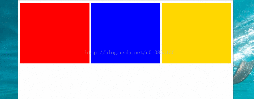
制作多列等宽自适应布局
1.父元素 display: table; width: 100%
2.布局元素(子元素 ) display: table-cell;
3.子元素之间的空隙,通过一个正常的div分割即可。
4.如果存在多行,需要在包裹一个 display: table-row(<tr>)
*/
.table-box{
display: table;
width: 100%;
}
.box {
height: 200px;
width: 33.3333333%;
display: table-cell;
}
.box1{
background-color: red;
}
.box2{
background-color: blue;
}
.box3{
background-color: gold;
}
.white-space{
height: 200px;
width: 5px;
background-color: #fff;
}
/*display: table-cell == <td>*/
</style>
</head>
<body>
<div class="table-box">
<div class="box box1"></div>
<div class="white-space"></div>
<div class="box box2"></div>
<div class="white-space"></div>
<div class="box box3"></div>
</div>
<script type="text/javascript">
</script>
</body>
</html>


 2149
2149

 被折叠的 条评论
为什么被折叠?
被折叠的 条评论
为什么被折叠?
 到【灌水乐园】发言


