


1.代码:
<!DOCTYPE html>
<html>
<head>
<meta charset="utf-8">
<title>网页title</title>
<style>
/*---范例1:响应式图片---*/
.c1 {
max-width: 100%;
height: auto;
}
/*---范例2:图片文本(在图片四周与中间添加文本信息)---*/
.container {
position: relative;
}
.c2 {
max-width: 100%;
height: auto;
opacity: 0.3; /*---设定透明程度---*/
}
.topleft {
position: absolute;
top: 8px;
left: 16px;
font-size: 18px;
}
.topright {
position: absolute;
top: 8px;
right: 16px;
font-size: 18px;
}
.bottomleft {
position: absolute;
bottom: 8px;
left: 16px;
font-size: 18px;
}
.bottomright {
position: absolute;
bottom: 8px;
right: 16px;
font-size: 18px;
}
.center {
position: absolute;
left: 0;
top: 50%;
width: 100%;
text-align: center;
font-size: 18px;
}
</style>
</head>
<body>
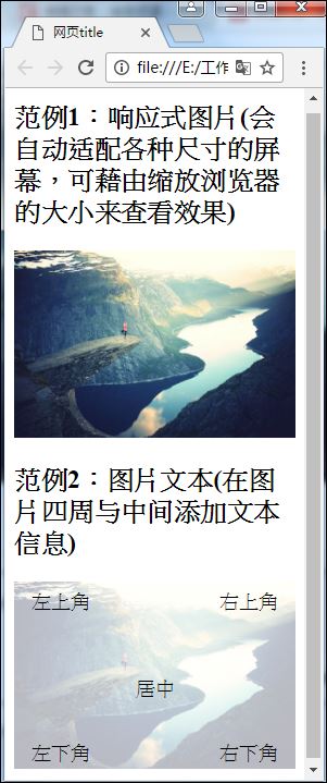
<h2>范例1:响应式图片(会自动适配各种尺寸的屏幕,可藉由缩放浏览器的大小来查看效果)</h2>
<img class="c1" src="figure.jpg" alt="Norway" width="600" height="400">
<h2>范例2:图片文本(在图片四周与中间添加文本信息)</h2>
<div class="container">
<img class="c2" src="figure.jpg" alt="Norway" width="600" height="400">
<div class="topleft">左上角</div>
<div class="topright">右上角</div>
<div class="bottomleft">左下角</div>
<div class="bottomright">右下角</div>
<div class="center">居中</div>
</div>
</body>
</html>2.本范例所需的素材:(figure.jpg)

3.结果:


 2087
2087


 被折叠的 条评论
为什么被折叠?
被折叠的 条评论
为什么被折叠?
 到【灌水乐园】发言


