


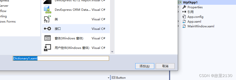
1.建立资源字典
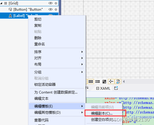
2.快速建立样式,点击编辑副本
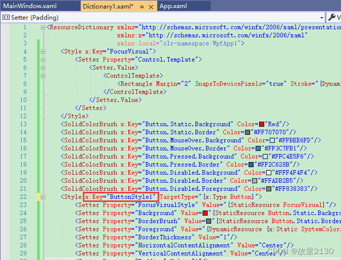
这里可以使用Blend设计,创建资源字典,资源自动就到了文件夹中,下图是blend出来的,vs2019不会出来。
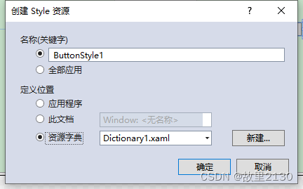
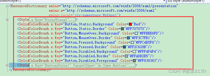
3.把2生成的样式,移动到Dictionary1.xaml
4.然后在App.xaml中引用资源
<Application x:Class="WpfApp1.App"
             xmlns="http://schemas.microsoft.com/winfx/2006/xaml/presentation"
             xmlns:x="http://schemas.microsoft.com/winfx/2006/xaml"
             xmlns:local="clr-namespace:WpfApp1"
             StartupUri="MainWindow.xaml">
    <Application.Resources>
        <ResourceDictionary>
            <ResourceDictionary.MergedDictionaries>
                <!--带文件夹-->
                <ResourceDictionary Source="pack://application:,,,/WpfApp1;component/Resource/Dictionary1.xaml"></ResourceDictionary>
                <!--不带文件夹-->
                <ResourceDictionary Source="pack://application:,,,/WpfApp1;component/Dictionary1.xaml"></ResourceDictionary>
            </ResourceDictionary.MergedDictionaries>
        </ResourceDictionary>
    </Application.Resources>

</Application>
5.可以直接在界面调用
<Button Content="Button" HorizontalAlignment="Left" Margin="176,258,0,0" VerticalAlignment="Top" Width="75" Style="{ StaticResource ButtonStyle1}"/>6.删除key,则是整个项目都应用
7.Dictionary1中不删除key,在界面上增加Window.Resources,并且不加key的话,就是这个界面所有按钮应用。
    <Window.Resources>
        <Style TargetType="{x:Type Button}" BasedOn="{StaticResource ButtonStyle1}"/>
    </Window.Resources>
以此类推,其他控件的样式也是这样增加,可以形成统一管理,统一变换。
拓展:样式和模板的区别
样式:
1.样式设置,用来为一组相同控件设置统一的样式
2.只能改变控件的已有属性值(比如颜色字体)
3.样式里面可以包含控件模板
控件模板:
1.用来为一组相同控件设置统一的外形
2.只能在Border里面增加元素。可以增加任何控件
总的来说,当控件的外观不满足要求了,这个时候就使用控件模板,因为样式只是修改具体的属性值,例如颜色,宽度等等。控件模板,可以改变控件的内部结构,进行嵌套其他的控件,因此,我们一般都是使用blend选择编辑模板,生成的就是资源字典,里面包含了控件的样式和控件模板,还可以进行事件的触发修改等等。或者再进行细化,使用样式调用控件模板,把样式和控件模板分开写,这样可以达到复用的效果。
blend生成的资源字典:
<ResourceDictionary xmlns="http://schemas.microsoft.com/winfx/2006/xaml/presentation"
                    xmlns:x="http://schemas.microsoft.com/winfx/2006/xaml">
    <Style x:Key="ButtonStyle2" TargetType="{x:Type Button}">
        <Setter Property="FocusVisualStyle" Value="{StaticResource FocusVisual}"/>
        <Setter Property="Background" Value="Blue"/>
        <Setter Property="BorderBrush" Value="{StaticResource Button.Static.Border}"/>
        <Setter Property="Foreground" Value="{DynamicResource {x:Static SystemColors.ControlTextBrushKey}}"/>
        <Setter Property="BorderThickness" Value="1"/>
        <Setter Property="HorizontalContentAlignment" Value="Center"/>
        <Setter Property="VerticalContentAlignment" Value="Center"/>
        <Setter Property="Padding" Value="1"/>
        <Setter Property="Template">
            <Setter.Value>
                <ControlTemplate TargetType="{x:Type Button}">
                    <Border x:Name="border" BorderBrush="{TemplateBinding BorderBrush}" BorderThickness="{TemplateBinding BorderThickness}" Background="{TemplateBinding Background}" SnapsToDevicePixels="true">
                        <ContentPresenter x:Name="contentPresenter" Focusable="False" HorizontalAlignment="{TemplateBinding HorizontalContentAlignment}" Margin="{TemplateBinding Padding}" RecognizesAccessKey="True" SnapsToDevicePixels="{TemplateBinding SnapsToDevicePixels}" VerticalAlignment="{TemplateBinding VerticalContentAlignment}"/>
                    </Border>
                    <ControlTemplate.Triggers>
                        <Trigger Property="IsDefaulted" Value="true">
                            <Setter Property="BorderBrush" TargetName="border" Value="{DynamicResource {x:Static SystemColors.HighlightBrushKey}}"/>
                        </Trigger>
                        <Trigger Property="IsMouseOver" Value="true">
                            <Setter Property="Background" TargetName="border" Value="{StaticResource Button.MouseOver.Background}"/>
                            <Setter Property="BorderBrush" TargetName="border" Value="{StaticResource Button.MouseOver.Border}"/>
                        </Trigger>
                        <Trigger Property="IsPressed" Value="true">
                            <Setter Property="Background" TargetName="border" Value="{StaticResource Button.Pressed.Background}"/>
                            <Setter Property="BorderBrush" TargetName="border" Value="{StaticResource Button.Pressed.Border}"/>
                        </Trigger>
                        <Trigger Property="IsEnabled" Value="false">
                            <Setter Property="Background" TargetName="border" Value="{StaticResource Button.Disabled.Background}"/>
                            <Setter Property="BorderBrush" TargetName="border" Value="{StaticResource Button.Disabled.Border}"/>
                            <Setter Property="TextElement.Foreground" TargetName="contentPresenter" Value="{StaticResource Button.Disabled.Foreground}"/>
                        </Trigger>
                    </ControlTemplate.Triggers>
                </ControlTemplate>
            </Setter.Value>
        </Setter>
    </Style>

</ResourceDictionary>


 168
168


 被折叠的 条评论
为什么被折叠?
被折叠的 条评论
为什么被折叠?
 到【灌水乐园】发言


