


图例和注解清晰连贯地解释了数据图表的内容。通过给所显示的数据进行简短的描述,可以让观察者更容易理解。
import matplotlib.pyplot as plt
import numpy as np
# generate different normal distributions
x1 = np.random.normal(30, 3, 100)
x2 = np.random.normal(20, 2, 100)
x3 = np.random.normal(10, 3, 100)

# plot them
plt.plot(x1, label='plot')
plt.plot(x2, label='2nd plot')
plt.plot(x3, label='last plot')

# generate a legend box
plt.legend(bbox_to_anchor=(0., 1.02, 1., .102), loc=0,
       ncol=3, mode="expand", borderaxespad=0.)

# annotate an important value
plt.annotate("Important value", (55,20), xycoords='data',
         xytext=(5, 38),
         arrowprops=dict(arrowstyle='->'))
plt.show()
生成的图表是这样儿的:
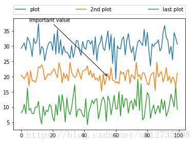
上述代码中,我们通过随机正态分布生成x1、x2、x3,并为每个plot指定一个字符串标签,这样legend()会将它们添加对条例框中。
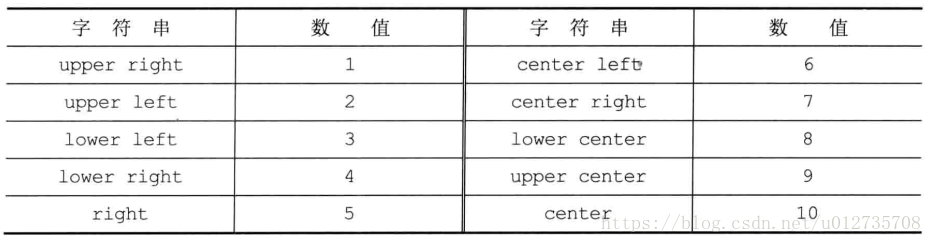
然后设置loc参数确定图例框的位置。这个参数是可选的,但是为了不让图例框覆盖图表中的线,我们会为其指定一个合适的位置,具体对应关系如下表,这里我们设置位置为3(lower left)。
接下来我们设置列数为nloc=3,指定边框的(bbox_to_anchor)的起始位置为(0.0,1.02),设置宽度为1,高度为0.102,注意这些值都是基于归一化坐标系。参数mode可以设置为None或者expand,当为expand时,图例框会水平的扩展至整个坐标轴区域。参数borderaxespad指定了坐标轴和图例边界之间的间距。
在注解的设置中,我们在plot中为xy坐标位置的数据点(annotate的第二个参数)添加了一个字符串描述。通过设置xycoord='data',注解文本的起始位置通过xytext来指定。
箭头由xytext指向xy坐标位置。arrowprops字典中定义了很多箭头的属性,在这个例子中,我们用arrowstyle来指定箭头的样式。具体样式设置请参考:https://matplotlib.org/users/annotations.html#plotting-guide-annotation


 3360
3360

 被折叠的 条评论
为什么被折叠?
被折叠的 条评论
为什么被折叠?
 到【灌水乐园】发言


