


weight属性用于设置控件长和宽所占的比例
首先看一个例子:
Example.1
<LinearLayout xmlns:android="http://schemas.android.com/apk/res/android"
    android:layout_width="match_parent"
    android:layout_height="match_parent"
    android:orientation="horizontal" >

    <Button
        android:id="@+id/button2"
        android:layout_width="wrap_content"
        android:layout_height="wrap_content"
        android:layout_weight="1"
        android:text="Button" />

    <Button
        android:id="@+id/button1"
        android:layout_width="wrap_content"
        android:layout_height="wrap_content"
        android:layout_weight="1"
        android:text="Button" />

</LinearLayout>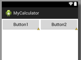
以上两个button控件的长和宽都是wrap,即自动适应;
同时设置weight为1,而其共同的母框架排列方式orientation=”horizontal”,即内部控件水平排列
那么这个时候的效果就是两个控件平分母框架的宽度,同时也是母框架的排列方向上的控件,此时若修改Linearlayout中orientation=”vertical”则会变成:
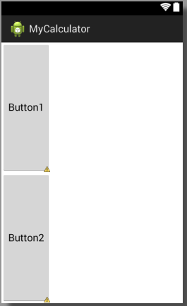
也就是两个控件平分了纵向的空间
拓展
修改weight分别为1,2:
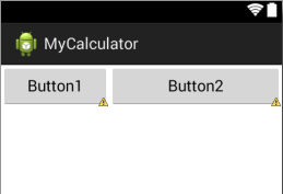
可以看到button2的宽度明显没有达到button1的3倍
这是因为button的宽度为wrap,无论如何分配都会是button内容完全显示出来,而将其所在母框架所有空间至少全部显示以后剩余的宽度才会按照weight的比例进行分配,所以button2的宽度并未达到button1的3倍;
而如果修改button1和button2的width=”0dp”,则才会完全按照比例进行分配,如图:
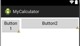
此时我们也可以看到button2的宽度基本达到button1的3倍?
所以若需要使用weight按比例分配空间,请将要分配的方向长度设为“0dp”,而这也是google官方推荐的用法。
Example.2
来看第二个例子:
<LinearLayout xmlns:android="http://schemas.android.com/apk/res/android"
    android:layout_width="match_parent"
    android:layout_height="match_parent"
    android:orientation="horizontal" >
    <Button
        android:id="@+id/button2"
        android:layout_width="match_parent"
        android:layout_height="wrap_content"
        android:layout_weight="1"
        android:text="Button1" />
    <Button
        android:id="@+id/button1"
        android:layout_width="match_parent"
        android:layout_height="wrap_content"
        android:layout_weight="3"
        android:text="Button2" />
</LinearLayout>
这里将宽度设置为match,比例仍然是1:3,,效果如图:
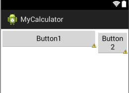
可以看到,其显示比例反而变成了3:1,这就是weight的另外一个用法,那么这种用法既然与Example1中的效果相同,那又有什么意义呢,暂时我也不得而知,但是我在实际开发中遇到了这个方法的应用场景,代码如下:
 <LinearLayout
        android:layout_width="match_parent"
        android:layout_height="wrap_content"
        android:orientation="horizontal" >
        <Button
            android:layout_margin="10dp"
            android:layout_width="0dp"
            android:layout_height="wrap_content"
            android:layout_weight="1"
            android:text="1"/>
        <Button
            android:layout_margin="10dp"
            android:layout_width="0dp"
            android:layout_height="wrap_content"
            android:layout_weight="1"
            android:text="1"/>
        <Button
            android:layout_margin="10dp"
            android:layout_width="0dp"
            android:layout_height="wrap_content"
            android:layout_weight="1"
            android:text="1"/>
    </LinearLayout>
    <LinearLayout
        android:layout_width="match_parent"
        android:layout_height="wrap_content"
        android:orientation="horizontal" >
        <Button
            android:layout_margin="10dp"
            android:layout_width="0dp"
            android:layout_height="wrap_content"
            android:layout_weight="2"
            android:text="1"/>
        <Button
            android:layout_margin="10dp"
            android:layout_width="0dp"
            android:layout_height="wrap_content"
            android:layout_weight="1"
            android:text="1"/>
    </LinearLayout>
一般为了美观,我们会为各个控件之间增加间距,即通过margin属性来设置,在这个例子中,为每个button都设置了四个方向为10dp的间隙,然后我们将上方3个button平均分配,下面两个控件按照2:1的比例进行分配,
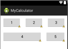
明显可以看出,button4的右边缘并未与button2的右边缘对其,同时导致button5喜爱那个做倾斜了好多,画面并不协调,这是为什呢,抱歉我也不知道。
而如果采用上述所讲的第二种用法:
即将button4和button5的宽度改为match_parent,同时设置比例为1:2,效果如图:
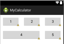
button4与button2的右边缘完全对齐了,界面是不是更加美观了?
Question
- 当为控件设置margin属性的时候,不能完全按照比例进行分配,原因不明;
- 通过第二种用法可以修复上述问题,原理不明。
如果你知道我问题的答案,欢迎留言。


 2980
2980

 被折叠的 条评论
为什么被折叠?
被折叠的 条评论
为什么被折叠?
 到【灌水乐园】发言


