


前言
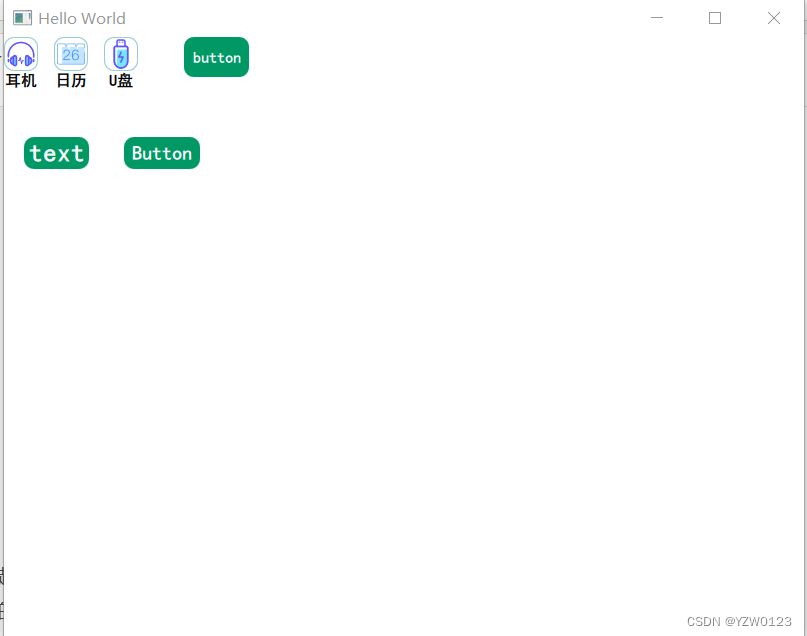
提示: 自定义Button控件如何分为带图片的Iconbutton和原生控件重写的Button。最终效果如下:
提示:以下是本篇文章正文内容,下面案例可供参考
一、图标Button
import QtQuick 2.15
import QtQuick.Controls 2.15

Item {
    id: item1
    property alias imageProperty: image_Rect
    property alias imageBasic: id_image

    property real scale: 1.0  // 图片的缩放比例

    property int imageWidth: 32 // 图片宽度
    property int imageHeight: 32 // 图片高度
    property string imageSource: ""  // 图片资源
    property int radiusSize: 10 // 圆角值
    property color bordercolor: "#99CCCC"//图标border
    property int btnSize: 16// 图标下方字体尺寸
    property string btnfontfamily: "黑体"//文字字体
    property string buttonName: "Test"//button 名称

    signal clicked  // 点击信号
    signal pressed  // 按下信号
    signal released // 松开信号

    Rectangle {

        id: image_Rect
        width: item1.imageWidth+2
        height: item1.imageHeight+2

        radius: item1.radiusSize
        border.width: 1
        border.color: bordercolor
        /*
            Image.Stretch: 将图像拉伸以填充可用空间,不保持纵横比
            Image.PreserveAspectFit: 保持图像的纵横比,将图像缩放到适合可用空间内的最大尺寸
            Image.PreserveAspectCrop: 保持图像的纵横比,将图像缩放到填充可用空间的最小尺寸,并裁剪超出可用区域的部分
            Image.Tile: 将图像平铺以填充可用空间,不进行缩放
            Image.TileVertically: 将图像垂直平铺以填充可用空间,不进行缩放
            Image.TileHorizontally: 将图像水平平铺以填充可用空间,不进行缩放
        */
        //图标
        Image {
            id: id_image
            source: item1.imageSource
            fillMode: Image.PreserveAspectFit
            anchors.centerIn: parent
            smooth: true  // 使用平滑插值显示图像
            asynchronous: true  // 异步加载图像,不阻塞QML引擎执行其他任务
            transform: Scale {
                xScale: image_Rect.scale
                yScale: image_Rect.scale
            }
            state: "released"
            states: [
                State {
                    name: "released"
                    PropertyChanges { target: id_image; scale: 1 }
                    PropertyChanges { target: id_image; rotation: 0 }
                },
                State {
                    name: "clicked"
                    PropertyChanges { target: id_image; scale: 0.6 }
                    PropertyChanges { target: id_image; rotation: 180 }
                },
                State {
                    name: "hovered"
                    PropertyChanges { target: id_image; scale: 1.2 }
                }
            ]
            transitions: [
                Transition
                {
                    from: "released"; to: "clicked"
                    NumberAnimation { target: id_image; properties: "scale"; duration: 100 }
                    RotationAnimation { target: id_image; properties: "rotation"; duration: 100 }
                },
                Transition
                {
                    from:"clicked" ; to: "released"
                    NumberAnimation { target: id_image; properties: "scale"; duration: 100 }
                    RotationAnimation { target: id_image; properties: "rotation"; duration: 100 }
                },
                Transition
                {
                    from:"released" ; to: "hovered"
                    NumberAnimation { target: id_image; properties: "scale"; duration: 100 }
                }
            ]
        }

        //文字
        Text {
            id: btnName
            text: buttonName
            font.bold: true
            font.pixelSize:btnSize
            font.family:btnfontfamily
            anchors.topMargin: 2
            anchors.top: id_image.bottom
            anchors.horizontalCenter: id_image.horizontalCenter

            states: [
                State {
                    name: "released"
                    PropertyChanges { target: btnName; scale: 1   }
                },
                State {name: "clicked"
                    PropertyChanges { target: btnName; scale: 0.85 }
                }
            ]
            transitions: [
                Transition
                {
                    from: "released"; to: "clicked"
                    NumberAnimation { target: btnName; properties: "scale"; duration: 100 }
                },
                Transition
                {
                    from:"clicked" ; to: "released"
                    NumberAnimation { target: btnName; properties: "scale"; duration: 100 }
                }
            ]

        }

        //鼠标事件以及信号发送
        MouseArea {
            id: mouseArea
            hoverEnabled: true
            anchors.fill: parent
            // 发射信号,外部实现具体需求
            onClicked:
            {
                item1.clicked()
                //console.log("clicked")
            }
            //鼠标按下
            onPressed: {
                item1.pressed()
                id_image.state="clicked"
                btnName.state="clicked"
                //console.log("Pressed")
            }
            //鼠标松开
            onReleased: {
                item1.released()
                id_image.state="released"
                btnName.state="released"
                //console.log("released")
            }
            //鼠标进入
            onEntered: {
                id_image.scale=1.2
                //id_image.state="hovered"
                //console.log("mouse in")
            }
            //鼠标退出
            onExited: {
                id_image.scale=1
                //console.log("mouse out")
            }
        }

    }
}
二、字体Button
1.重写Background和ContentItem
将Button的Background和contentItem重写就可以完全改造Button。Background负责button外观,contentItem负责显示内容。
import QtQuick 2.15
import QtQuick.Controls 2.15

Button{
    id:control


    background:  Rectangle{
        id:back
        anchors.fill: parent
        anchors.centerIn: parent
        radius: 10
        scale:control.hovered? 1.1 :1
        color: control.pressed ?"#006633" : "#009966"
        Behavior on scale { NumberAnimation{duration:200 }}
        Behavior on color { ColorAnimation{duration:200 }}
    }

    contentItem:Text {
        id: contentText
        text: qsTr("Button")
        anchors.centerIn: back
        font.bold:true
        font.family: "黑体"
        font.pixelSize: 20
        scale:control.hovered? 1.3 :1
        color:control.pressed ?"#996699" : "#FFFFFF"
        Behavior on scale { NumberAnimation{duration:200 }}
        Behavior on color { ColorAnimation{duration:200 }}
    }


}
2.采用ButtonStyle
另外一种方式需要改写buttonStyle,这种方法需要 import QtQuick.Controls.Styles ,不像上面那种方便快捷
import QtQuick 2.9
import QtQuick.Controls 1.5
import QtQuick.Controls.Styles 1.4

Button {
    id:control

    style: ButtonStyle {
        background: Rectangle {
            implicitWidth: 64
            implicitHeight: 32
            scale:control.hovered? 1.2 :1
            color: control.pressed ?"#006633" : "#009966"
            border.width:  0
            radius: 10
            Behavior on scale { NumberAnimation{duration:200 }}
            Behavior on color { ColorAnimation{duration:200 }}
            Text {
                id: name
                font.bold: true
                font.family: "黑体"
                font.pointSize: 16
                scale:control.hovered? 1.1 :1
                color:/*control.hovered?"#003333":*/"#FFFFFF"
                anchors.centerIn: parent
                text: qsTr("text")
                Behavior on scale { NumberAnimation{duration:200 }}
                Behavior on color { ColorAnimation{duration:200 }}
            }
        }
    }

}


 1万+
1万+


 被折叠的 条评论
为什么被折叠?
被折叠的 条评论
为什么被折叠?
 到【灌水乐园】发言


