


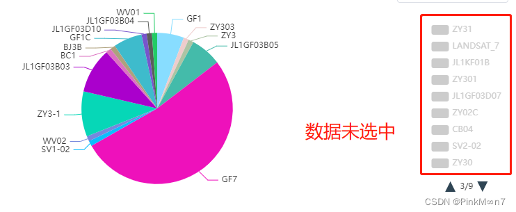
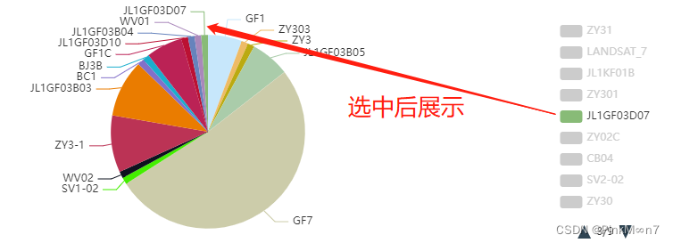
之前的一个项目 用到了echarts饼图,客户那边一张图数据量太大了,整的这个饼图变成了丑东西,完事就说让饼图默认勾选十五个数据,剩下的整个分页,让用户自己选

实现效果:
首先先给饼图整出来(这是基础的饼图)
export const optionPie = {
  chart: {
    type: "pie",
    options3d: {
      enabled: true,
      alpha: 45,
      beta: 0
    }
  },
  colors: ["#5890FE", "#00D7E9", "#F56C6C", "#E6A23C", "#67C23A", "rgb(140, 197, 255)"],
  title: {
    show: false,
    text: ""
  },

  plotOptions: {
    pie: {
      allowPointSelect: true,
      cursor: "pointer",
      depth: 35,
      dataLabels: {
        enabled: true,
        format: "{point.name}"
      }
    }
  },

  series: [
    {
      type: "pie",
      name: "",
      data: [],
      label: {
        avoidLabelOverlap: true,
        normal: {
          textStyle: {
            color: "#333" // 改变标示文字的颜色
          }
        }
      }
    }
  ]
};
//之前是有多个饼图 使用组件的页面已经把echartData穿过来了

          <pie-echart v-show="type == 0" :echartData="myChartData.length > 0 ? myChartData[0] : null"></pie-echart>


//这个是pie-echart组件的样式,接下来都是在pie-echart里的内容

      <Echarts :option="echartOption" />
//echartData 即为饼图数据
props: {
    echartData: {
      type: Object,
      default: null
    },}

//监听到饼图数据

  watch: {
    echartData(newVal) {
      if (newVal) {
        this.name = newVal.name;
        this.size = newVal.size;
        this.count = newVal.count;
        if (newVal.childs.length > 0) {
          this.$nextTick(() => {

//其实主要的就是调用这个函数方法

           this.initCharts(newVal.childs);
          });
        }
      }
    }
  },

//方法

initCharts(echartBardata) {
      let that = this;
      echartBardata.forEach((item) => {
        item.value = item.size;
      });
      this.echartOption.series[0].itemStyle = {
        normal: {
          color: function (colors) {
//这是个随机生成颜色的方法
            let colorList = that.getcolor();
            return colorList[colors.dataIndex];
          }
        }
      };
      this.echartOption.tooltip = {
        formatter(params) {
          return `${params.name}:<br> ${(params.value / 1024).toFixed(3)}GB,${params.data.count}条`;
        }
      };

//此处画重点,当超过20条数据的时候,先展示15个
      if (echartBardata.length > 20) {
        let selectedData = echartBardata.reduce((acc, cur, index) => {
          if (index < 15) {
            acc[cur.name] = true;
          } else {
            acc[cur.name] = false;
          }
          return acc;
        }, {});
//对饼图显示进行设置

        this.echartOption.legend = {
          type: "scroll",
          orient: "vertical",
          right: 10,
          top: 20,
          bottom: 20,
          data: echartBardata,
          selected: selectedData
        };
        this.echartOption.series[0].minAngle = 4;
        this.echartOption.series[0].center = [260, 145];
      }

      this.echartOption.series[0].data = echartBardata;
}具体设置:a. 创建一个对象
selectedData,用于跟踪哪些数据项应该被选中以显示在图表的图例中。前15个数据项被选中,其余的被忽略。b. 设置图表的图例配置,包括类型、方向、位置以及选中的数据项。
c. 设置系列的最小角度为4度。
d. 设置系列的中心点坐标为(260, 145)。
7.this.echartOption.series[0].data = echartBardata;:设置图表系列的数据源为echartBardata数组。
以下是获得随机颜色的方法
   getcolor() {
      let arr = [];
      for (let i = 0; i < window.colorListLength; i++) {
        arr.push(this.randomColor());
      }
      return arr;
    },
    randomColor() {
      const color = ["a", "b", "c", "d", "e", "f", "A", "B", "C", "D", "E", "0", "1", "2", "3", "4", "5", "6", "7", "8", "9"];
      // 三位和六位,都是有用的二进制颜色  设置type为奇数就是3,偶数就是6位
      const type = ~~(Math.random() * 10 + 1);
      // 循环的长度
      let len = type % 2 == 0 ? 3 : 6;
      // 存放结果
      let ans = "";
      for (let i = 0; i < len; i++) {
        //这里循环随机得到数组下标
        let index = ~~(Math.random() * color.length);
        ans += color[index];
      }
      return "#" + ans;
    },


 3985
3985

 被折叠的 条评论
为什么被折叠?
被折叠的 条评论
为什么被折叠?
 到【灌水乐园】发言


