


HTML代码
<section>
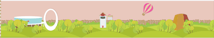
<div class="stage">
<div class="skyline"></div>
<div class="beans"></div>
<div class="ground back"></div>
<div class="ground mid"></div>
<div class="ground front"></div>
<div class="dowEventCenter"></div>
<div class="planetarium"></div>
<div class="friendshipShell"></div>
<div class="glockenspiel"></div>
<!--汽球-->
<div class="balloon"></div>
</div>
</section>CSS代码
body {margin:0; padding:0; background-color:#ddf5f7;}
/*-------- 天空背景以及动画 --------*/
.stage {
	position: relative;
	overflow: hidden;
	height: 600px;
	background: #ddf5f7;
	animation: beijing 20s infinite linear;
}
/* 背景色改变 */
@keyframes beijing{
	0%{
		background: lightblue;
	}
	25%{
		background: peachpuff;
	}
	50%{
		background: slateblue;
	}
	75%{
		background: darkgrey;
	}
	100%{
		background: lightblue;
	}
}
/*-------- 气球以及动画 --------*/
.balloon {
	position: absolute;
	z-index: 3;
	top: 5%;
	right: -157px;
	background: url(images/balloon.png) no-repeat no-repeat center;
	height: 227px;
	width: 157px;
	/* 先给需要的动画起个名字 在设置运动轨迹  infinite ease alternate 循环先慢在快轮流交换 */
	animation: qiqiu 20s infinite ease alternate;
}
/* 气球的动画效果用关键针@keyframes transform:rotate()旋转函数; */
 @keyframes qiqiu{
 	0%{
		right: -157px;
		transform: rotate(0deg);
	}
	25%{
		right: 25%;
		transform: rotate(30deg);
	}
	50%{
		right: 50%;
		transform: rotate(60deg);
	}

	75%{
		right: 75%;
		transform: rotate(30deg);
	}
	100%{
		right: 100%;
		transform: rotate(0deg);
	}
 }

/*-------- 城市场景图片 --------*/
.skyline {
	position: absolute;
	z-index: 5;
	width: 100%;
	bottom: 26%;
	background: url(images/skyline.png) repeat no-repeat;
	height: 147px;
}
.beans {
	position: absolute;
	z-index: 4;
	height: 201px;
	width: 88px;
	bottom: 30%;
	left: 50%;
	background: url(images/beans.png) no-repeat no-repeat;
}
.ground {
	position: absolute;
	width: 100%;
	bottom: 0;
}
.ground.front {
	z-index: 30;
	background: url(images/groundFront.png) repeat no-repeat center;
	height: 301px;
}
.ground.mid {
	z-index: 20;
	background: url(images/groundMid.png) repeat no-repeat;
	height: 299px;
}
.ground.back {
	z-index: 10;
	background: url(images/groundBack.png) repeat no-repeat center;
	height: 281px;
}
.dowEventCenter {
	position: absolute;
	z-index: 12;
	bottom: 20%;
	left: 5%;
	background: url(images/dowEventCenter.png) no-repeat no-repeat center;
	height: 236px;
	width: 524px;
}
.planetarium {
	position: absolute;
	z-index: 12;
	bottom: 18%;
	right: 10%;
	background: url(images/Planetarium.png) no-repeat no-repeat center;
	height: 285px;
	width: 347px;
}
.friendshipShell {
	position: absolute;
	z-index: 21;
	bottom: 18%;
	left: 20%;
	background: url(images/friendshipShell.png) no-repeat no-repeat center;
	height: 370px;
	width: 231px;
}
.glockenspiel {
	position: absolute;
	z-index: 11;
	bottom: 26%;
	right: 50%;
	background: url(images/Glockenspiel.png) no-repeat no-repeat center;
	height: 263px;
	width: 137px;
}

</style>
动画效果


 3402
3402


 被折叠的 条评论
为什么被折叠?
被折叠的 条评论
为什么被折叠?
 到【灌水乐园】发言


