


一、UI框架
1、所有用户界面
(1)提供了一部分Component和ComponentContainer的具体子类,即创建用户界面(UI)的各类组件,包括一些常用的组件(比如:文本、按钮、图片、列表等)和常用的布局(比如:DirectionalLayout和DependentLayout)(2)用户可通过组件进行交互操作,并获得响应(3)所有的UI操作都应该在主线程进行设置
2、组件分类
(1)布局类组件: 也被称为布局或组件容器,为用户界面的“骨架”(2)显示类组件: 用于显示数据内容,一般不承担用户交互功能,包括文本(Text)、图像(Image)、进度条(ProgressBar)、圆形进度条(RoundProgressBar)等(3)交互类组件: 用于用户交互,同时也可以展示部分数据内容,包括文本框(TextField)、按钮(Button)、复选框(Checkbox)、单选框(RadioButton)、开关(Switch)、滑块(Slider)等
3、组件的类型
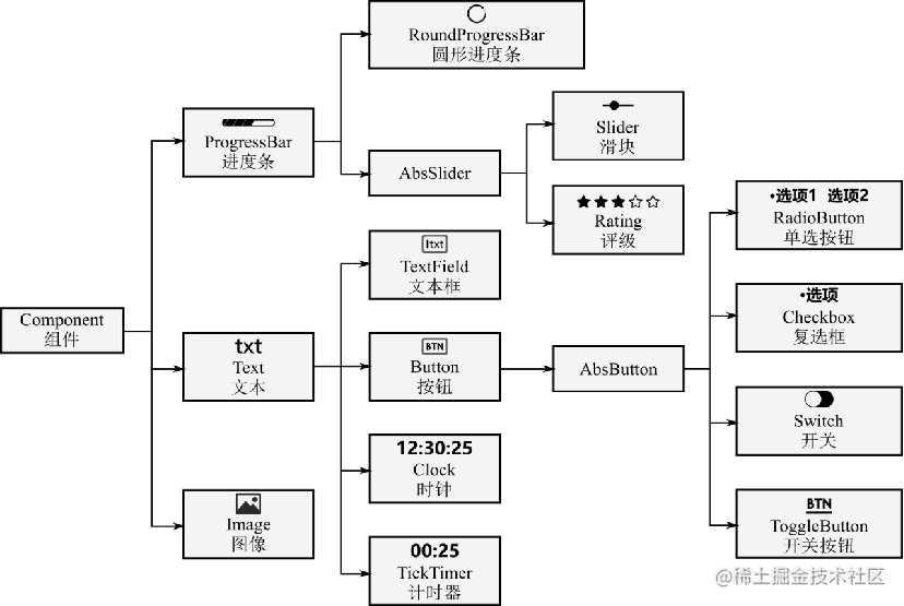
二、显示类组件
1、文本Text
(1)使用xml进行页面的构建文本标签,常见属性介绍如下: 
(2)组件的属性及特征
text:显示文本
hint:提示文本
multiple_lines:多行模式设置,设置true/false
max_text_lines:文本最大行数
auto_font_size:是否支持文本自动调整文本字体大小,设置true/false
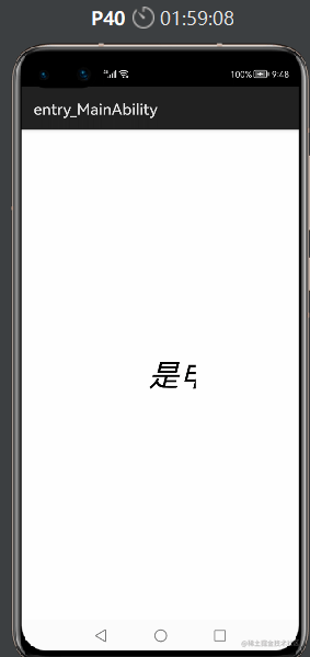
(3)走马灯效果①ability_main.xml文件
<?xml version="1.0" encoding="utf-8"?>
<DirectionalLayoutxmlns:ohos="http://schemas.huawei.com/res/ohos"ohos:height="match_parent"ohos:width="match_parent"ohos:alignment="center"ohos:orientation="vertical">
 <Textohos:id="$+id:text"ohos:height="match_content"ohos:width="90vp"ohos:text="是申小兮呀"ohos:text_size="40vp"ohos:italic="true"/>

</DirectionalLayout>
②MainAbilitySlice.java文件
package com.example.csdn.slice;

import com.example.csdn.ResourceTable;
import ohos.aafwk.ability.AbilitySlice;
import ohos.aafwk.content.Intent;
import ohos.agp.components.Component;
import ohos.agp.components.Text;

public class MainAbilitySlice extends AbilitySlice {@Overridepublic void onStart(Intent intent) {
 super.onStart(intent);super.setUIContent(ResourceTable.Layout_ability_main);Text text = (Text) findComponentById(ResourceTable.Id_text);text.setTruncationMode(Text.TruncationMode.AUTO_SCROLLING);text.setAutoScrollingCount(Text.AUTO_SCROLLING_FOREVER);text.startAutoScrolling();text.setClickedListener(component -> {text.setText(text.getText()+"T");});
 }
 @Overridepublic void onActive() {super.onActive();}
 @Overridepublic void onForeground(Intent intent) {super.onForeground(intent);}
}
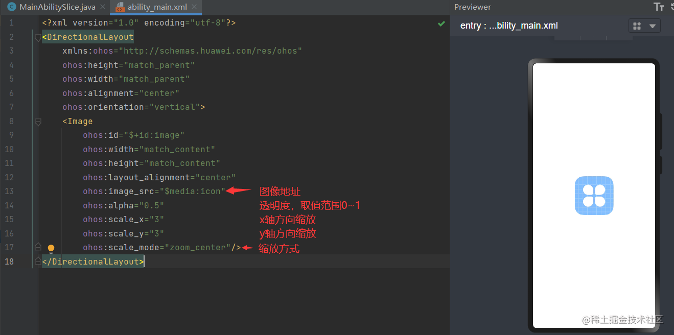
2、图像Image
(1)Image显示图片的组件注意: 图片的资源一般存放到base目录下的media文件夹中(2)组件的属性及特征
<?xml version="1.0" encoding="utf-8"?>
<DirectionalLayoutxmlns:ohos="http://schemas.huawei.com/res/ohos"ohos:height="match_parent"ohos:width="match_parent"ohos:alignment="center"ohos:orientation="vertical"><Imageohos:id="$+id:image"ohos:width="match_content"ohos:height="match_content"ohos:layout_alignment="center"ohos:image_src="$media:icon"ohos:alpha="0.5"ohos:scale_x="3"ohos:scale_y="3"ohos:scale_mode="zoom_center"/>
</DirectionalLayout>
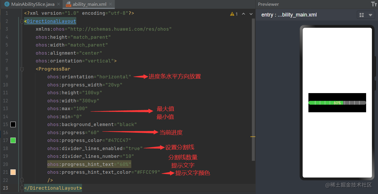
3、进度条
(1)条形进度条
<?xml version="1.0" encoding="utf-8"?>
<DirectionalLayoutxmlns:ohos="http://schemas.huawei.com/res/ohos"ohos:height="match_parent"ohos:width="match_parent"ohos:alignment="center"ohos:orientation="vertical"><ProgressBarohos:orientation="horizontal"ohos:progress_width="20vp"ohos:height="100vp"ohos:width="300vp"ohos:max="100"ohos:min="0"ohos:background_element="black"ohos:progress="60"ohos:progress_color="#47CC47"ohos:divider_lines_enabled="true"ohos:divider_lines_number="10"ohos:progress_hint_text="60%"ohos:progress_hint_text_color="#FFCC99"/>
</DirectionalLayout>
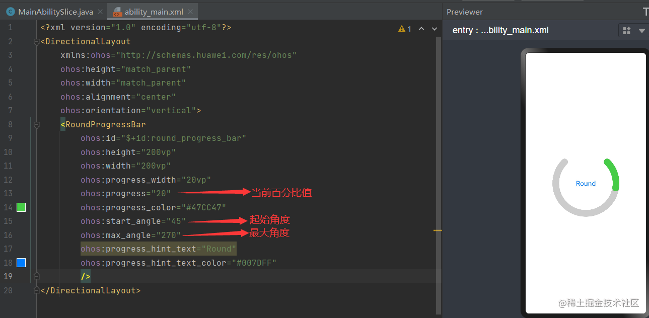
(2)圆形进度条
<?xml version="1.0" encoding="utf-8"?>
<DirectionalLayoutxmlns:ohos="http://schemas.huawei.com/res/ohos"ohos:height="match_parent"ohos:width="match_parent"ohos:alignment="center"ohos:orientation="vertical"><RoundProgressBarohos:id="$+id:round_progress_bar"ohos:height="200vp"ohos:width="200vp"ohos:progress_width="10vp"ohos:progress="20"ohos:progress_color="#47CC47"/>
</DirectionalLayout>
三、交互类组件
用于用户交互,同时也可以展示部分数据内容
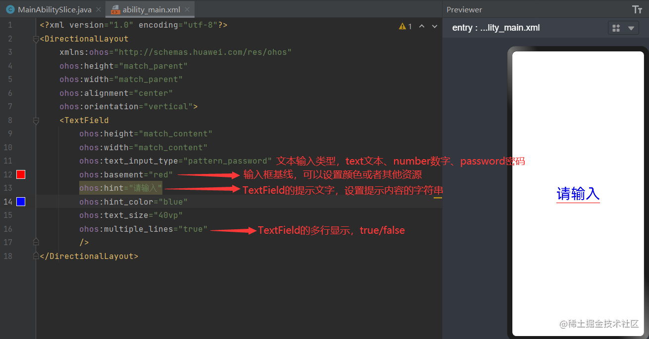
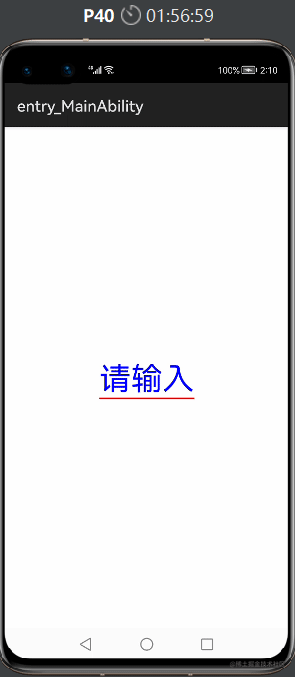
1、TextField文本框
(1)提供了一种文本输入框,共有XML属性继承自:Text,其常用属性如下:
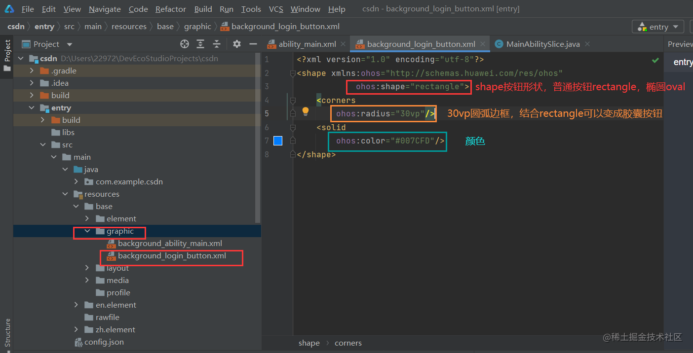
2、Button按钮
(1)特点: 无自有的XML属性,共有XML属性继承自Text,自带的背景如文本背景、按钮背景,通常采用XML格式放置在graphic目录下(2)可以在graphic文件夹下,选择New -> File,命名为background_login_button.xml,来写按钮自有属性
(3)ability_main.xml文件
<?xml version="1.0" encoding="utf-8"?>
<DirectionalLayoutxmlns:ohos="http://schemas.huawei.com/res/ohos"ohos:height="match_parent"ohos:width="match_parent"ohos:alignment="center"ohos:orientation="vertical"><Buttonohos:id="$+id:id_toLogin"ohos:height="45vp"ohos:width="200vp"ohos:text="登录"ohos:text_size="18fp"ohos:text_color="#ffffff"ohos:top_margin="50vp"ohos:background_element="$graphic:background_login_button"/>
</DirectionalLayout>
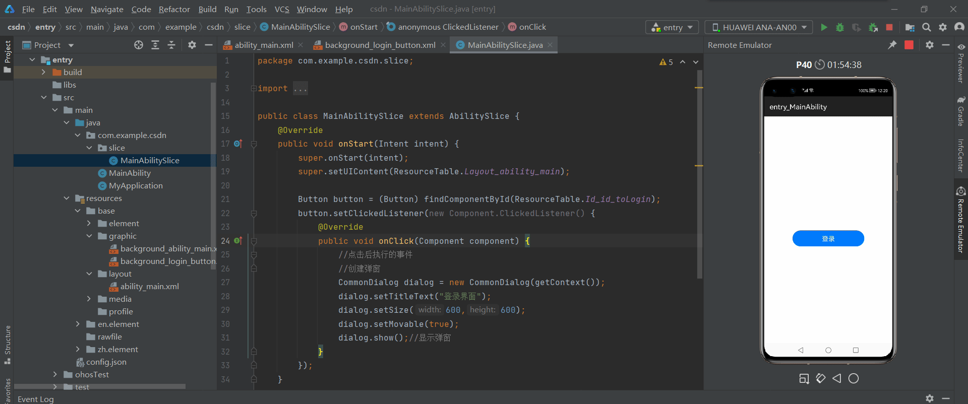
(4)按钮简单的点击事件,MainAbilitySlice.java文件
package com.example.csdn.slice;

import com.example.csdn.ResourceTable;
import ohos.aafwk.ability.AbilitySlice;
import ohos.aafwk.content.Intent;
import ohos.agp.components.Button;
import ohos.agp.components.Component;
import ohos.agp.components.Text;
import ohos.agp.components.TextField;
import ohos.agp.window.dialog.CommonDialog;
import ohos.hiviewdfx.HiLog;

import javax.tools.Tool;

public class MainAbilitySlice extends AbilitySlice {@Overridepublic void onStart(Intent intent) {super.onStart(intent);super.setUIContent(ResourceTable.Layout_ability_main);
 Button button = (Button) findComponentById(ResourceTable.Id_id_toLogin);button.setClickedListener(new Component.ClickedListener() {@Overridepublic void onClick(Component component) {//点击后执行的事件//创建弹窗CommonDialog dialog = new CommonDialog(getContext());dialog.setTitleText("登录界面");dialog.setSize(600,600);dialog.setMovable(true);dialog.show();//显示弹窗}});}
 @Overridepublic void onActive() {super.onActive();}
 @Overridepublic void onForeground(Intent intent) {super.onForeground(intent);}
}
3、CheckBox复选框
(1)特点: 实现选中和取消选中的功能,多个元素的时候就需要用到多选框组件(2)基础属性继承自Text,自有属性如下表:
| 属性名称 | 中文描述 | 属性值 |
|---|---|---|
| marked | 当前状态(选中或取消选中) | boolean类型 |
| text_color_on | 处于选中状态的文本颜色 | color类型 |
| text_color_off | 处于未选中状态的文本颜色 | color类型 |
| check_element | 状态标志样式 | Element类型 |
<?xml version="1.0" encoding="utf-8"?>
<DirectionalLayoutxmlns:ohos="http://schemas.huawei.com/res/ohos"ohos:height="match_parent"ohos:width="match_parent"ohos:alignment="center"ohos:orientation="vertical"><Checkboxohos:height="match_content"ohos:width="match_content"ohos:text="敲代码"ohos:text_size="20vp"ohos:text_color_on="#00AAEE"ohos:text_color_off="#000000"ohos:marked="true"/><Checkboxohos:height="match_content"ohos:width="match_content"ohos:text="跳舞"ohos:text_size="20vp"ohos:text_color_on="#00AAEE"ohos:text_color_off="#000000"ohos:marked="false"/><Checkboxohos:height="match_content"ohos:width="match_content"ohos:text="唱歌"ohos:text_size="20vp"ohos:text_color_on="#00AAEE"ohos:text_color_off="#000000"ohos:marked="false"/>
</DirectionalLayout>
4、RadioButton单选框
(1)特点: 用于多选一的操作,需要搭配RadioContainer使用,实现单选效果**(2)RadioContainer:** 是RadioButton的容器,在其包裹下的RadioButton保证只有一个被选项(3)基础属性继承自Text,自有属性如下表:
| 属性名称 | 中文描述 | 属性值 |
|---|---|---|
| marked | 当前状态 | boolean类型 |
| text_color_on | 处于选中状态的文本颜色 | color类型 |
| text_color_off | 处于未选中状态的文本颜色 | color类型 |
| check_element | 状态标志样式 | Element类型 |
<?xml version="1.0" encoding="utf-8"?>
<DirectionalLayoutxmlns:ohos="http://schemas.huawei.com/res/ohos"ohos:height="match_parent"ohos:width="match_parent"ohos:alignment="center"ohos:orientation="vertical"><RadioContainerohos:height="match_content"ohos:width="match_content"ohos:orientation="horizontal"><RadioButtonohos:height="match_content"ohos:width="match_content"ohos:text="敲代码"ohos:text_size="20vp"ohos:text_color_on="#00BFFF"ohos:text_color_off="#808080"ohos:marked="true"/><RadioButtonohos:height="match_content"ohos:width="match_content"ohos:text="唱歌"ohos:text_size="20vp"ohos:text_color_on="#00BFFF"ohos:text_color_off="#808080"ohos:marked="false"/><RadioButtonohos:height="match_content"ohos:width="match_content"ohos:text="跳舞"ohos:text_size="20vp"ohos:text_color_on="#00BFFF"ohos:text_color_off="#808080"ohos:marked="false"/></RadioContainer>
</DirectionalLayout>
5、Switch开关
(1)特点:切换单个设置开/关两种状态的组件,实际开发中一般作为某些功能的开关
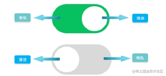
(2)基础属性继承自Text,自有属性如下表:
| 属性名称 | 中文描述 | 属性值 |
|---|---|---|
| text_state_on | 开启时显示的文本 | string类型 |
| text_state_off | 关闭时显示的文本 | string类型 |
| track_element | 轨迹样式 | Element类型 |
| thumb_element | thumb样式 | Element类型 |
| marked | 当前状态 | boolean类型 |
| check_element | 状态标志样式 | Element类型 |
<?xml version="1.0" encoding="utf-8"?>
<DirectionalLayoutxmlns:ohos="http://schemas.huawei.com/res/ohos"ohos:height="match_parent"ohos:width="match_parent"ohos:alignment="center"ohos:orientation="vertical"><Switchohos:height="match_content"ohos:width="match_content"ohos:text="今天敲代码了吗"ohos:text_size="20vp"ohos:text_state_off="OFF"ohos:text_state_on="ON"ohos:marked="false"ohos:thumb_element="$media:icon"/>
</DirectionalLayout>
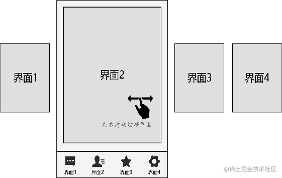
6、Slider滑块
(1)特点: 用于页面之间切换的组件,它通过响应滑动事件完成页面间的切换
(2)PageSlider组件: 每一页都基本是一个布局,就是一个XML布局里面的一个组件,可以通过PageSliderProvider适配器,适配器本身也是一个布局,可以直接添加一个界面layout到适配器中,并在layout对应的AbilitySlice初始化数据
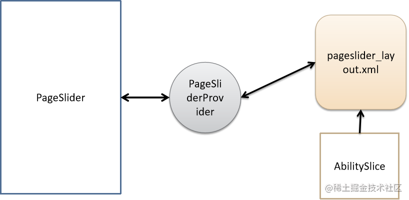
(3)PageSliderIndicator: 主要用于展示pageslider页面滚动时对应的圆点导航
具体的代码事例在介绍适配器后,再给出吧🧐
7、Picker选择组件
(1)特点: 滑动选择器,允许用户从预定义范围中进行选择(2)共有XML属性继承自DirectionalLayout(3)设置要显示的字符串数组,对于不直接显示数字的组件,该方法可以设置字符串与数字一一对应,注意: 字符串数组长度必须等于取值范围内的值总数
Picker还有很多不同组件:DatePicker、TimePicker,因此具体的功能使用,在后续具体介绍🧐
8、TabList和Tab页签栏
(1)特点: 可以实现多个页签栏的切换,Tab为某个页签,子页签通常放在内容区上方,展示不同的分类,页签名称应该简洁明了,清晰描述分类的内容(2)Tablist的自有XML属性,见下表: 
(3)具体使用
<TabListohos:id="$+id:tab_list"ohos:top_margin="10vp"ohos:tab_margin="24vp"ohos:tab_length="140vp"ohos:text_size="20fp"ohos:height="36vp"ohos:width="match_parent"ohos:layout_alignment="center"ohos:orientation="horizontal"ohos:text_alignment="center"ohos:normal_text_color="#999999"ohos:selected_text_color="#FFFFFF"ohos:selected_tab_indicator_color="#FFFFFF"ohos:selected_tab_indicator_height="2vp"
/>
TabList中添加Tab
TabList tabList = (TabList) findComponentById(ResourceTable.Id_tab_list);
TabList.Tab tab = tabList.new Tab(getContext());
tab.setText("Image");
tabList.setFixedMode(true); //Tab较少的情况下tab自动分配宽度
tabList.addTab(tab,1); //添加tab到tablist中,在第二个位置加入tabList.setTabLength(60); // 设置Tab的宽度
tabList.setTabMargin(26); // 设置两个Tab之间的间距
最后
最近找到一个VUE的文档,它将VUE的各个知识点进行了总结,整理成了《Vue 开发必须知道的36个技巧》。内容比较详实,对各个知识点的讲解也十分到位。


有需要的小伙伴,可以点击下方卡片领取,无偿分享


 3065
3065

 被折叠的 条评论
为什么被折叠?
被折叠的 条评论
为什么被折叠?
 到【灌水乐园】发言


