


SwiftUI 2 introduced a new TabView style called PageTabViewStyle that enables developers to easily create horizontal Pagers (aka Paging) with dots at the bottom to show users where they are. This is the equivalent of UIPageViewController from UIKit.
SwiftUI 2引入了一种新的TabView样式,称为PageTabViewStyle ,该样式使开发人员可以轻松创建水平的分页器(又名Paging),该分页器的底部带有点,以向用户显示其位置。 这等效于UIKit中的UIPageViewController 。
Today, we will cover how to use the new style for TabView and how to create a custom IndexView component.
今天,我们将介绍如何为TabView使用新样式以及如何创建自定义IndexView组件。

入门 (Getting Started)
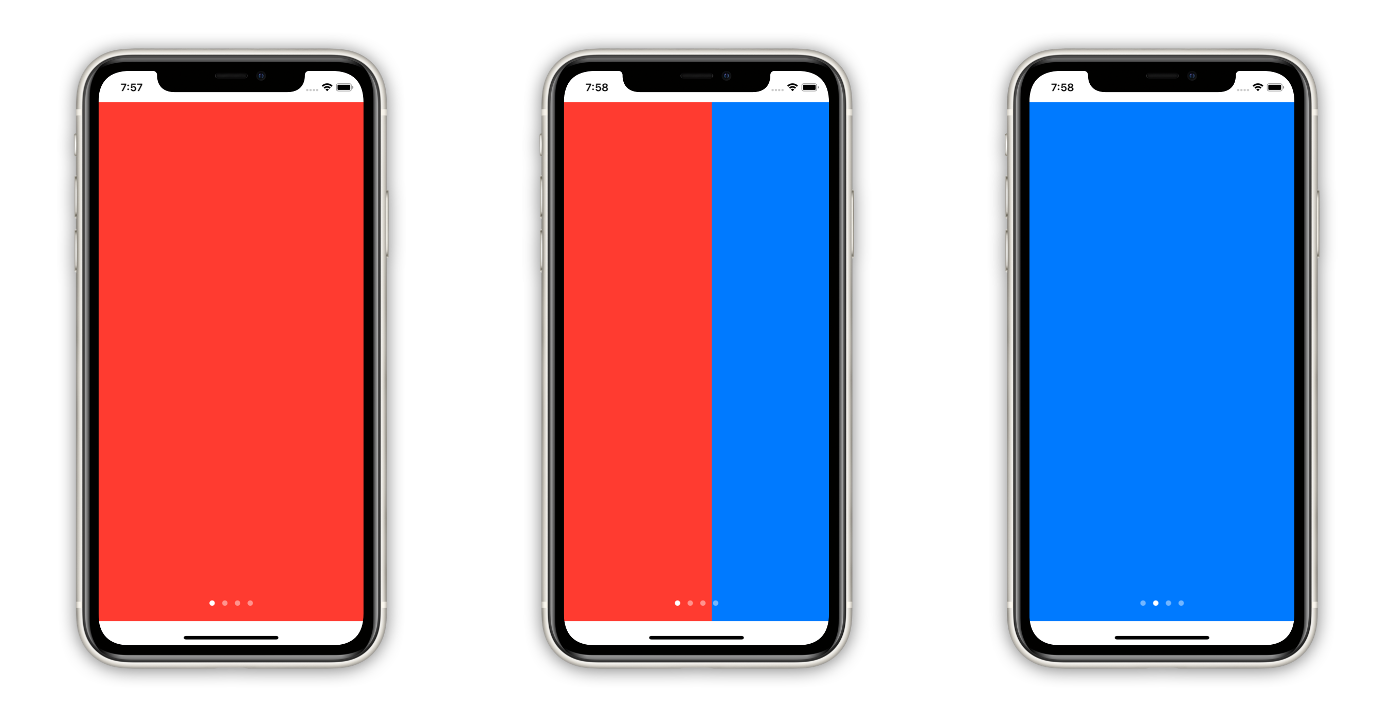
Using the new API is as simple as setting the new PageTabViewStyle:
使用新的API就像设置新的PageTabViewStyle一样简单:
Here, I have an array of colors — with each color being a page — and I am also tagging every Color view with its desired index. The TabView initializer has a selection binding that represents the current page.
在这里,我有一个颜色数组-每个颜色都是一个页面-并且我还在每个“ Color视图中标记了所需的索引。 TabView初始化程序具有一个表示当前页面的selection绑定。
A couple of things to keep in mind:
请记住以下几点:
- The paging dots are white and translucent. Therefore, if your background is also white, you won’t see them (tested on iOS/Xcode Beta 3). 寻呼点是白色且半透明的。 因此,如果您的背景也是白色,那么您将看不到它们(在iOS / Xcode Beta 3上进行了测试)。
The contents of the
TabViewcannot be drawn over the safe area insets (Tested on iOS/Xcode Beta 3).TabView的内容不能在安全区域插图上绘制(在iOS / Xcode Beta 3上测试)。
创建一个自定义IndexView (Creating a Custom IndexView)
Now that we have the basics covered, we can quickly create any custom component to represent the current page and update it accordingly with our currentIndex state property.
现在我们已经涵盖了基础知识,我们可以快速创建任何自定义组件来表示当前页面,并使用currentIndex state属性相应地对其进行更新。
We are going to take a stab at making a more dynamic version of the system dots. This index component will present at most three dots and animate the insertion/removal as you swipe through the pages.
我们将努力使系统点的版本更加动态。 当您在页面上滑动时,此索引组件最多显示三个点,并为插入/移除动画。

That’s quite a bit of code, so let’s go through it step by step:
那是相当多的代码,所以让我们逐步进行一下:
1. ForEach and shouldShowIndex() — Display only three dots or less (for the current page and its adjacent pages).
1. ForEach和shouldShowIndex() -仅显示三个或更少的点(对于当前页面及其相邻页面)。
2. .fill() and .scale() — Apply different styling to showcase which Circle is focused.
2. .fill()和.scale() -应用不同的样式来展示哪个Circle聚焦。
3. .transition() — Animate the insertion and removal of each Circle with opacity and scale.
3. .transition() —使用不透明度和比例为每个Circle的插入和移除动画。
4. .id(index) — Create unique Circle instances for each index.
4. .id(index) —为每个索引创建唯一的Circle实例。
最后一步 (Final Step)
Now we just need to update ContentView to make use of the new Fancy3DotsIndexView:
现在,我们只需要更新ContentView即可使用新的Fancy3DotsIndexView :
Add an implicit animation for every change that happens to the
currentIndexbinding.为
currentIndex绑定发生的每个更改添加一个隐式动画。Overlay the new
IndexViewcomponent and plug in the necessary properties.覆盖新的
IndexView组件并插入必要的属性。
Voilà!
瞧!

结论 (Conclusion)
Making animations in SwiftUI was already insanely easy, and now with the new TabView style, you can create any kind of index view! Stay tuned for my upcoming articles!
在SwiftUI中制作动画已经非常简单,现在有了新的TabView样式,您可以创建任何类型的索引视图! 请继续关注我即将发表的文章!
If you are feeling brave enough, I encourage you to try to make your own animations!
如果您足够勇敢,建议您尝试制作自己的动画!
翻译自: https://medium.com/better-programming/custom-paging-ui-in-swiftui-13f1347cf529


 776
776

 被折叠的 条评论
为什么被折叠?
被折叠的 条评论
为什么被折叠?
 到【灌水乐园】发言


