


ios swiftui
SwiftUI’s second iteration didn’t give us an out-of-the-box implementation for UICollectionView, but it did gift us with two powerful components, LazyVGrid and LazyHGrid, to build powerful grid-based layouts.
SwiftUI的第二次迭代并没有为UICollectionView提供现成的实现,但是它为我们提供了两个强大的组件LazyVGrid和LazyHGrid ,以构建基于网格的强大布局。
In the next few sections, we’ll explore:
在接下来的几节中,我们将探讨:
- How to build SwiftUI grids 如何构建SwiftUI网格
- How to set up items of a grid 如何设置网格项目
- How to construct different kinds of grid layouts 如何构造不同种类的网格布局
- How to define sections in SwiftUI grids 如何在SwiftUI网格中定义部分
Let’s get started.
让我们开始吧。
SwiftUI网格 (SwiftUI Grids)
As the name suggests, LazyVGrid is used to position views vertically, whereas LazyHGrid is used to set them in a horizontal direction. It’s important to note that the items are loaded lazily on demand.
顾名思义, LazyVGrid用于垂直LazyHGrid视图,而LazyHGrid用于在水平方向设置视图。 重要的是要注意,这些项目是按需延迟加载的。
To set up the type of grid layout, we need to specify an array of grid items in the initializer.
要设置网格布局的类型,我们需要在初始化程序中指定网格项目的数组。
GridItem basically lets you specify the individual item size, the spacing between them, and the alignment within rows for LazyHGrid and for columns in a LazyVGrid.
GridItem基本上可以指定单个项目的大小,它们之间的间距,并为行中的对齐LazyHGrid和在列LazyVGrid 。
Let’s look at the different ways of creating grid items.
让我们看一下创建网格项目的不同方法。
如何设置网格项目 (How to Set Up Grid Items)
The following code shows one way of creating a grid layout with a two-element row or two-element column based on where we’re passing it in.
以下代码显示了一种基于传递元素的位置来创建带有两元素行或两元素列的网格布局的方法。
private var columns: [GridItem] = [
    GridItem(.fixed(50)),
    GridItem(.fixed(100))
]
The above GridItem array can be passed into a LazyVGrid or LazyHGrid. Let’s see how:
上面的GridItem数组可以传递到LazyVGrid或LazyHGrid 。 让我们看看如何:
LazyVGrid(columns: columns, alignment: .center, spacing: 10)Essentially, the SwiftUI grid created from the above layout would have two elements in each column of a row, with the first one sized 50 and the other one at 100. The spacing defined inside the LazyVGrid initializer above is between each row.
本质上,从上述布局创建的SwiftUI网格在一行的每一列中将包含两个元素,第一个元素的大小为50,另一元素的大小为100。上面的LazyVGrid初始化器内部定义的间距在每行之间。
We can set the interspacing between columns in the following way:
我们可以通过以下方式设置列之间的间隔:
private var columns: [GridItem] = [
    GridItem(.fixed(50), spacing: 50),
    GridItem(.fixed(100)),
    GridItem(.fixed(100))
]
Let’s look at the SwiftUI grids in action with the above two column types:
让我们看一下上面两种列类型的SwiftUI网格:

如何调整网格项目的大小 (How to Size Grid Items)
What we saw previously was the most basic way of setting up grid items by defining a fixed size.
我们之前看到的是通过定义固定大小来设置网格项目的最基本方法。
But you might not want to hardcode the item sizes every time, considering there are so many devices with different sizes and across orientations.
但是考虑到有这么多不同尺寸和方向的设备,您可能不想每次都对项目大小进行硬编码。
Fortunately, besides using fixed to define GridItem sizes, we can also use adaptive and flexible.
幸运的是,除了使用fixed的定义GridItem大小之外,我们还可以使用adaptive 和 flexible 。
自适应项目大小 (Adaptive item sizing)
As the name suggests, adaptive items let us place items that adapt to the parent view’s width or height based on the constraints we specify.
顾名思义, adaptive项允许我们根据指定的约束放置适合于父视图的宽度或高度的项。
For example:
例如:
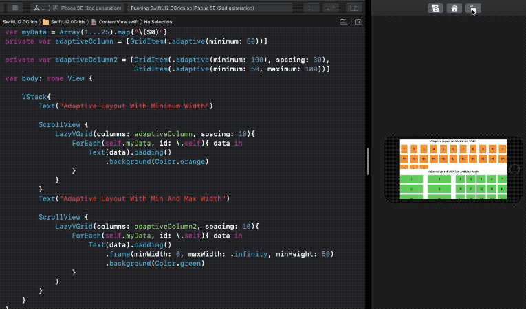
GridItem(.adaptive(minimum: 100))GridItem(.adaptive(minimum: 50, maximum: 100))The first line of code indicates that with a minimum width specified, as many items would be fitted in each row or columns of the LazyVGrid or LazyHGrid, respectively.
代码的第一行指示在指定最小宽度的情况下, LazyVGrid或LazyHGrid每一行或每一列LazyHGrid分别LazyVGrid许多项目。
The second line sets an upper limit on the maximum width or height of each item in the row or column. Let’s compare both of these in a LazyVGrid:
第二行设置行或列中每个项目的最大宽度或高度的上限。 让我们在LazyVGrid比较这两个:
灵活的项目尺寸 (Flexible item sizing)
This one lets us specify the number of columns in the grid, each of which takes equal spaces by default.
这使我们可以指定网格中的列数,默认情况下,每列均具有相等的空格。
But you can also customize it by setting minimum and maximum width, which will automatically take care of expanding and shrinking that item.
但是您也可以通过设置最小和最大宽度来自定义它,这将自动照顾到该项目的扩展和收缩。
See how we’ve set a flexible three-column grid layout below:
在下面查看我们如何设置flexible三列网格布局:
Array(repeating: GridItem(.flexible(), spacing: 10), count: 3)
Notice that in the second grid layout, we’ve set the alignment to the left. Also, the items do not occupy all the available space on the screen, like adaptive layouts. This is a key difference between adaptive and flexible layouts.
注意,在第二个网格布局中,我们将对齐方式设置为左侧。 此外,这些项目不会像adaptive布局一样占用屏幕上的所有可用空间。 这是adaptive布局和flexible布局之间的主要区别。
You can also mix flexible, adaptive, and fixed types in building your grid items.
您还可以在构建网格项目时混合使用flexible , adaptive和fixed类型。
如何在SwiftUI网格中设置节 (How to Set Sections in SwiftUI Grids)
We saw how to create grid layouts, size items, set spacing, and alignment. Now let's look into another interesting feature — creating sections.
我们看到了如何创建网格布局,尺寸项目,设置间距和对齐方式。 现在,让我们看一下另一个有趣的功能-创建部分。
To define a header, we can simply wrap the grid layout in a section. And to define a footer, we can simply put it beneath the layout code, as shown below:
要定义标题,我们可以简单地将网格布局包装在section 。 要定义页脚,我们可以将其简单地放在布局代码下,如下所示:

This seems fairly straightforward, but sometimes, you’ll want to stick the section header or footer in, let's say, a paginated grid layout.
这似乎很简单,但是有时候,您需要将节的页眉或页脚粘贴在一个分页的网格布局中。
Fortunately, the LazyVGrid and LazyHGrid initializer possesses an optional argument pinnedViews that lets you specify pinning of the section at the top or bottom or both, as shown below:
幸运的是, LazyVGrid和LazyHGrid初始化器拥有一个可选参数pinnedViews ,可用于指定该部分的顶部或底部或两者固定,如下所示:
//pins at top
LazyVGrid(columns: columns, pinnedViews: [.sectionHeaders])//pins at bottom
LazyVGrid(columns: columns, pinnedViews: [.sectionFooters])//both
LazyVGrid(columns: columns, pinnedViews: [.sectionHeaders, .sectionFooters])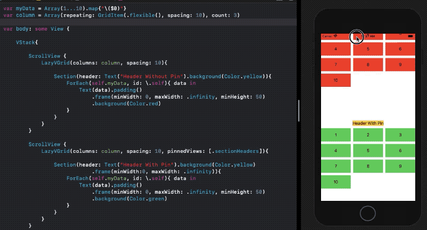
The above SwiftUI code for the sticky and non-sticky header is available in this Gist.
上面的用于粘性和非粘性标头的SwiftUI代码在此Gist中可用。
You can also set nested for loops for populating items in each grid section.
您还可以设置嵌套for循环在每个网格部分填充的项目。
结论 (Conclusion)
So, we built LazyVGrid layouts with different GridItem types and sizes. Subsequently, we constructed sections and saw how to pin them. You can also set a LazyHGrid as a section of LazyVGrid to build an Instagram Stories kind of layout.
因此,我们构建了具有不同GridItem类型和大小的LazyVGrid布局。 随后,我们构造了部分并了解了如何固定它们。 您还可以设置一个LazyHGrid作为的一部分LazyVGrid建立一个Instagram故事布局的一种。
That’s it for this one. Thanks for reading.
就这个。 谢谢阅读。
翻译自: https://medium.com/better-programming/swiftui-grids-in-ios-14-49df6aa28541
ios swiftui


 855
855

 被折叠的 条评论
为什么被折叠?
被折叠的 条评论
为什么被折叠?
 到【灌水乐园】发言


