


 本文探讨了SwiftUI中的列表视图控件,并将其与Android平台的相应控件进行了比较,旨在帮助开发者理解不同平台上的界面构建方式。
列表视图控件
您一直在等待的完整SwiftUI 2文档 (The Complete SwiftUI 2 Documentation You’ve Been Waiting For)
At the start of 2020, I wrote a long Medium post called The Complete SwiftUI Documentation You’ve Been Waiting For.
在2020年初,我写了一篇很长的中篇文章,名为《您一直在等待的完整SwiftUI文档》 。
This was my way of sharing what I learned when I tried to fill in the gaps left by the insufficient documentation provided by Apple. Although my post seemed to help a lot of people, I also wrote it six months late.
这是我分享我尝试填补Apple提供的文档不足所留下的空白时所学到的知识的方式。 尽管我的帖子似乎对很多人都有帮助,但我也写了六个月才写完。
Now that Apple’s 2020 developer conference is over, SwiftUI has been given some new capabilities, so hopefully this update will make my documentation more helpful than ever before.
既然Apple的2020年开发者大会已经结束,SwiftUI已经提供了一些新功能,因此希望此更新将使我的文档比以往任何时候都更有帮助。
This will be released as a series, with one chapter per post.
这将作为系列发布,每个帖子一个章节。
The names of these chapters correspond with the chapter names in Apple’s SwiftUI documentation.
这些章节的名称与Apple的SwiftUI文档中的章节名称相对应。
I can guarantee that none of them will be as long as this one, if that’s something you’re worried about!
我可以保证,如果您担心这件事,那么他们中的任何一个都不会像现在这样长。
- App Structure and Behavior 应用结构和行为
- View Layout and Presentation 查看布局和演示
- Drawing and Animation 绘画与动画
- Framework Integration 框架整合
- State and Data Flow 状态和数据流
- Gestures 手势
- Preview 预习
I encourage you to contact me in a response below or on my Twitter profile if you spot any mistakes or a subject you think I should cover in more detail.
如果您发现任何错误或您认为我应该更详细介绍的主题,我鼓励您在下面的回复中或在我的Twitter个人资料中与我联系。
The View Protocol @ViewBuilderNew and Updated ViewsColorPicker (NEW in 2.0)SpriteView (NEW in 2.0)TextEditor (NEW in 2.0)SignInWithAppleButton (NEW in 2.0)ProgressView (NEW in 2.0)GaugeView (NEW in 2.0)Label (NEW in 2.0)Link (NEW in 2.0)Menu (NEW in 2.0)MenuButton (Deprecated in 2.0)Text (Updated in 2.0)Image (Updated in 2.0)Button (Updated in 2.0)PasteButton (Updated in 2.0)Toggle (Updated in 2.0)DatePicker (Updated in 2.0)New and Updated View Modifiers.matchedGeometryEffect (NEW in 2.0).help (NEW in 2.0).accessibility(inputLabels:) (NEW in 2.0).accessibility(selectionIdentifier:) (Deprecated in 2.0).scaleEffect (Updated in 2.0).imageScale (NEW in 2.0).accentColor (Updated in 2.0).preferredColorScheme (Updated in 2.0).textContentType (NEW in 2.0).listItemTint (NEW in 2.0).listRowPlatterColor (Deprecated in 2.0).onLongPressGesture (Updated in 2.0).onOpenURL (NEW in 2.0).onPasteCommand (NEW in 2.0).onDrag and .onDrop (Updated in 2.0).onChange (NEW in 2.0).keyboardShortcut (NEW in 2.0).focusedValue and @FocusedBinding (NEW in 2.0).prefersDefaultFocus and .focusScope (NEW in 2.0).fullScreenCover (NEW in 2.0).defaultAppStorage (NEW in 2.0).appStoreOverlay (NEW in 2.0).toolbar (NEW in 2.0).previewContext (NEW in 2.0)
.userActivity, .onContinueUserActivity (NEW in 2.0).tabItem (Updated in 2.0).contextMenu (Updated in 2.0).navigationTitle and .navigationSubtitle (NEW in 2.0).navigationViewStyle (Updated in 2.0).navigationBarTitle (Deprecated in 2.0).navigationBarItems (Deprecated in 2.0)Styles on iOS, iPadOS, Mac Catalyst and tvOS (NEW in 2.0)Styles Only on macOS (NEW in 2.0)Next Steps
查看协议 (The View Protocol)
If you aren’t already aware, SwiftUI uses the View protocol to create reusable interface elements. Views are value types, which means they use a Struct instead of a Class definition.
如果您还不了解,SwiftUI会使用View协议来创建可重用的界面元素。 视图是值类型,这意味着它们使用Struct而不是Class定义。
What does this actually mean, in practice?
实际上,这实际上意味着什么?
Structs do not allow inheritance. Although your structs conform to the View protocol, they do not inherit from a base class called View that Apple has provided.
结构不允许继承。 尽管您的结构符合View协议,但它们并不继承自Apple提供的称为View的基类。
This makes it different from UIView, from which almost everything in UIKit inherits. A UIView basically cannot be seen without being assigned a frame and being added as a subview of a UIViewController subclass.
这使其与UIView有所不同,后者几乎继承了UIKit中的所有内容。 没有分配框架并作为UIViewController子类的子视图添加,基本上看不到UIView 。
If you create a new Xcode project that uses SwiftUI instead of Storyboard as the basis of its user interface, you’ll automatically be given an example of a SwiftUI View called ContentView.
如果您创建一个新的Xcode项目,该项目使用SwiftUI而不是Storyboard作为其用户界面的基础,则会自动为您提供一个名为ContentView的SwiftUI View的示例。
You’ll notice that inside the ContentView struct, there is a variable called body. This is the sole requirement of the View protocol, and it makes use of the some keyword, which is brand new to Swift 5.1.
您会注意到,在ContentView结构中,有一个名为body的变量。 这是View协议的唯一要求,它使用了Swift 5.1全新的some关键字。
You can rely on a Stack Overflow thread to explain what this keyword means better than I ever could:
您可以依靠Stack Overflow线程来解释此关键字的含义比我能做到的更好:
“You can think of this as being a “reverse” generic placeholder. Unlike a regular generic placeholder which is satisfied by the caller… An opaque result type is an implicit generic placeholder satisfied by the implementation… The main thing to take away from this is that a function returning
some Pis one that returns a value of a specific single concrete type that conforms toP.”“您可以将其视为“反向”通用占位符。 不像调用方满意的常规通用占位符…不透明的结果类型是实现满足的隐式通用占位符…要摆脱的主要问题是,返回
some P的函数是返回特定值的函数。符合P单一混凝土类型。”
@ViewBuilder (@ViewBuilder)
This is a kind of function builder that allows you to construct a single View from multiple Views. If you add this attribute above your View body, cmd-click it, and choose Jump to definition, you’ll see a bunch of interesting stuff. Perhaps the most important part is this:
这是一种函数生成器,允许您从多个视图构造一个视图。 如果将此属性添加到View主体上方,请cmd单击它,然后选择“跳转到定义”,您会看到很多有趣的东西。 也许最重要的部分是:
public static func buildBlock<C0, C1, C2, C3, C4, C5, C6, C7, C8, C9>(_ c0: C0, _ c1: C1, _ c2: C2, _ c3: C3, _ c4: C4, _ c5: C5, _ c6: C6, _ c7: C7, _ c8: C8, _ c9: C9) -> TupleView<(C0, C1, C2, C3, C4, C5, C6, C7, C8, C9)> where C0 : View, C1 : View, C2 : View, C3 : View, C4 : View, C5 : View, C6 : View, C7 : View, C8 : View, C9 : ViewThis is the function that runs when you put ten Views inside a VStack to lay them out vertically. The fact that there isn’t a buildBlock that takes eleven Views is the reason you can’t keep adding children to a VStack indefinitely. There’ll be more about this in the View Layout and Presentation chapter of this documentation, but I’m mentioning it for a specific reason.
当您在VStack放置十个视图以垂直放置它们时,将运行此功能。 没有需要11个Views的buildBlock的事实是您无法继续无限期地将子级添加到VStack的原因。 在本文档的“视图布局和表示”一章中将有更多关于此的信息,但是出于特定原因而提及它。
In Xcode 12, the body property is assumed to be @ViewBuilder.
在Xcode 12中,body属性假定为 @ViewBuilder 。
Why does this matter? Now you can put up to ten Views as children directly in your body property. Previously, this was only possible by putting your Views inside a Group, which is a way to get the benefits of @ViewBuilder without the layout implications of VStack, HStack, or ZStack. This is no longer necessary in the new version of SwiftUI, and the uses of Group will become more niche as a result.
为什么这么重要? 现在,您可以直接在您的身体属性中放置多达十个“视图”作为子视图。 以前,这只能通过将视图放置在一个Group ,这是一种在不涉及VStack , HStack或ZStack布局的情况下获得@ViewBuilder好处的@ViewBuilder 。 在新版本的SwiftUI中,这不再是必须的,因此使用Group会更加利基。
You should still probably lay your Views out in a VStack or HStack, as putting them directly in a body property is ambiguous when you come to use it.
您仍然应该将视图放置在VStack或HStack ,因为使用它们时将它们直接放在body属性中是模棱两可的。
查看修改器 (View Modifiers)
Before we dive into the Views that are new in 2020, let’s do a refresher on what View Modifiers are. They’ll be shown alongside the new Views, so it doesn’t really make sense to wait to explain what they are until later.
在深入探讨2020年新增的Views之前,让我们先回顾一下View Modifiers是什么。 它们将与新的Views一起显示,因此等到以后再解释它们并没有什么意义。
All Views can be modified by structs that conform to the ViewModifier protocol. All the protocol requires is a function called body (content: Content) that returns a generic View. Because View cannot be created directly, the type that we pass to the ViewModifier is unknown until the modifier is called. Content acts as a proxy for that concrete type. The return type, like the body of any View, is inferred from the implementation.
所有视图都可以通过符合ViewModifier协议的结构进行修改。 协议所需要的只是一个称为body(内容:内容)的函数,该函数返回通用View。 由于无法直接创建View,因此在调用修饰符之前,传递给ViewModifier的类型是未知的。 内容充当该具体类型的代理。 返回类型,就像任何View的主体一样,都是从实现中推断出来的。
Let’s see an example of a custom modifier so you can see what’s happening under the surface with these:
让我们看一个自定义修饰符的示例,以便您可以查看这些修饰符在表面下发生的情况:
As you can see, it would be possible to add .modifier(YourModifier()) to call a ViewModifier, but it makes a lot more sense to use a View extension and give a clean call site.
如您所见,可以添加.modifier(YourModifier())来调用ViewModifier,但是使用View扩展并给出干净的调用站点更加有意义。
The first method, blue(_:), does essentially what .modifier(YourModifier()) does. By constructing ModifiedContent, we end up with a View that has the modifier applied. But we can make this less complicated by calling the instance method .modifier(YourModifier()) on our View to get the same result.
第一种方法blue(_:)基本上执行.modifier(YourModifier())操作。 通过构造ModifiedContent ,我们最终得到一个应用了修饰符的View 。 但是我们可以通过在View上调用实例方法.modifier(YourModifier())来获得相同的结果,从而减少复杂性。
The second method, b(_:), removes the need to call .modifier(YourModifier()) every time we need it. This is the way the standard modifiers look, and it reduces the amount of code inside our View.
第二种方法b(_:)消除了我们每次需要调用.modifier(YourModifier()) 。 这是标准修饰符的外观,它减少了View内部的代码量。
Obviously b(_:) is a pretty terrible name for a property, method or ViewModifier, but I made the identifiers gradually shorter to indicate which one is the simplest.
显然, b(_:)对于属性,方法或ViewModifier是一个非常糟糕的名称,但是我使标识符逐渐变短以指示哪个是最简单的。
First we’ll see all of the Views that are completely new in 2020, then the Views from 2019 that have been updated this year.
首先,我们将看到2020年所有全新的视图,然后是今年已更新的2019年视图。
Then, we’ll see what View Modifiers are new or updated at the end.
然后,我们将在最后查看哪些视图修改器是新的或已更新。
2.0中的新功能:ColorPicker (NEW in 2.0: ColorPicker)
There has never been a colour picker included for iOS developers. I’ve used third-party ones before, but dependencies lead to a reliance on other developers to ensure compatibility with all your future projects and deployment targets. In the final weeks before WWDC, I finally decided to create every kind of colour picker control I could think of in SwiftUI. This would allow me to create colour pickers from a Swift Package of these controls and make a colour picker for any project.
从来没有为iOS开发人员提供颜色选择器。 我以前使用过第三方开发人员,但是依赖导致依赖其他开发人员来确保与您所有未来的项目和部署目标兼容。 在WWDC之前的最后几周,我终于决定创建我可以在SwiftUI中想到的每种颜色选择器控件。 这将允许我从这些控件的Swift包中创建颜色选择器,并为任何项目创建颜色选择器。
Then WWDC came along, and now we have ColorPicker for iOS 14. This new control seems very capable and has features such as an eyedropper that allows you to pick colours from anywhere. You can even use the eyedropper to pick colours from the ColorPicker’s UI itself, so it seems clear that this is a powerful new capability that we get for free. But as far as I can work out, the new colour picker has a very rigid set of controls that cannot be changed. Unless the official documentation has not been updated yet, it would appear that there is no way to change what the ColorPicker offers, such as restricting it to only a canvas, a palette or only sliders.
然后WWDC出现了,现在我们有了iOS 14的ColorPicker。这个新控件似乎功能强大,并具有诸如吸管的功能,可让您从任何地方选择颜色。 您甚至可以使用吸管从ColorPicker的UI本身中选择颜色,因此很明显,这是我们免费获得的强大功能。 但据我所知,新的颜色选择器具有一组非常僵化的控件,无法更改。 除非官方文档尚未更新,否则似乎无法更改ColorPicker提供的功能,例如将其限制为仅画布,调色板或滑块。
Instead, these three options are selected with a segmented picker by the user.
而是由用户使用分段选择器选择这三个选项。
For some useful screenshots and animated GIFs of how the ColorPicker will look in your app, check out Using a ColorPicker with SwiftUI.
有关ColorPicker在您的应用程序中的外观的一些有用的屏幕截图和GIF动画,请查看使用带有SwiftUI的ColorPicker 。
2.0版的新功能:SpriteView (NEW in 2.0: SpriteView)
SpriteKit is Apple’s framework for making 2D games. Sprites are small bitmaps that are used to represent players, enemies, and projectiles, among other things. Since you may have many sprites on the screen at once in a game, it makes sense to use tools that are designed to do this with performance in mind. It is now possible to create a SwiftUI View that will show a SKScene from SpriteKit, allowing you to create a game and then put that game anywhere you would put a SwiftUI View.
SpriteKit是Apple制作2D游戏的框架。 子画面是小的位图,用于表示玩家,敌人和弹丸等。 由于游戏中可能一次在屏幕上显示许多精灵,因此使用专门为实现此目的而设计的工具是很有意义的。 现在可以创建一个SwiftUI查看,将显示一个SKScene从SpriteKit,允许您创建一个游戏,然后把那场比赛中的任何地方,你会放一个SwiftUI查看。
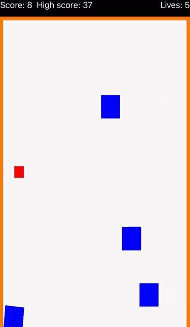
In my example, I have a simple square sprite that fires projectiles at enemies that come from the right. If they get all the way to the left, you lose a life. If you take one of them down, your score increases.
在我的示例中,我有一个简单的方形精灵,可以向右边的敌人发射弹丸。 如果他们一路向左走,您将失去生命。 如果您将其中之一记下来,您的分数就会增加。
Let’s look at the SwiftUI first, which requires a SpriteKit scene that we’ll create later.
首先让我们看一下SwiftUI,它需要一个SpriteKit场景,稍后我们将创建它。
We have an ObservableObject called GameModel that stores our data, and a ContentView struct that displays our game. At the top of a VStack we’re displaying the HUDView, which tells us what the score currently is, how many lives we have, and what high score has been previously recorded. When we run out of lives, the restart button appears. All this does is alter a @Published property in the GameModel object that we are observing with the new .onChange modifier in ContentView.
我们有一个名为GameModel的ObservableObject存储我们的数据,还有一个显示我们的游戏的ContentView结构。 在VStack的顶部,我们将显示HUDView ,它告诉我们当前的分数,我们有多少生命以及之前已记录的最高分数。 当我们用尽生命时,将显示重新启动按钮。 这一切都是通过使用ContentView的新.onChange修饰符更改GameModel对象中的@Published属性。
Essentially we’re saying when restartGame is true, we want to send a message to our GameScene that it should unpause and reload the game from the beginning.
本质上,我们说的是当restartGame为true时,我们想向GameScene发送一条消息,它应该从一开始就取消暂停并重新加载游戏。
The high score is recorded using the @AppStorage property wrapper, which saves data to UserDefaults in a convenient way. I will give more information about the new property wrappers in another chapter of this documentation, but the important thing is that properties with this wrapper are saved persistently, and can be recalled easily the next time the app is loaded. When the player is out of lives, there is also a game over state, that requires the player to tap a restart button in order to begin the game again. This resets the score, removes the enemies, and restarts the spawning of enemies as the beginning of the game did.
高得分使用@AppStorage属性包装器记录,该包装器以方便的方式将数据保存到UserDefaults 。 我将在本文档的另一章中提供有关新属性包装器的更多信息,但重要的是该包装器的属性将永久保存,并且可以在下次加载应用程序时轻松调用。 当玩家失去生命时,还会出现游戏结束状态,该状态要求玩家点击重新启动按钮才能再次开始游戏。 这将重置分数,移除敌人,并像游戏开始时一样重新开始生成敌人。
Here’s the SpriteKit code:
这是SpriteKit代码:
Don’t worry too much about the logic of the game, as this is a SpriteKit game written in Swift. If you don’t know much about SpriteKit, as I clearly don’t, there are many tutorials that will help you to get started.
不必太担心游戏的逻辑,因为这是用Swift编写的SpriteKit游戏。 如果您不太了解SpriteKit,而我显然不了解,那么有很多教程可以帮助您入门。
The important thing to know about SpriteView is it gives you an easy way to embed 2D games in your SwiftUI.
要了解SpriteView ,重要的一点是它为您提供了一种将2D游戏嵌入您的SwiftUI的简便方法。
2.0中的新增功能:TextEditor (NEW in 2.0: TextEditor)
Before WWDC 2020, we were only able to handle text editing in iOS with TextField or SecureTextField. These are basically the same text field, only the SecureTextField obscures what you are typing by replacing the characters with black circles as any password field would. The important similarity between these text fields is that they only allow a single line. This meant that the only option for multiline editing was to use UIViewRepresentable to convert UITextView from UIKit:
在WWDC 2020之前,我们只能使用TextField或SecureTextField在iOS中处理文本编辑。 这些基本上是相同的文本字段,只有SecureTextField可以像使用任何密码字段一样用黑眼圈替换字符,从而使您键入的内容SecureTextField难懂。 这些文本字段之间的重要相似之处在于它们仅允许一行。 这意味着多行编辑的唯一选择是使用UIViewRepresentable从UIKit转换UITextView :
This is relatively complicated, but it also allows many more properties. UITextView allows changes to dataDetectorTypes, which create tappable URLs from the typed text. The current text can be replaced by new text using clearsOnInsertion, and we can scroll until a specified string is visible by calling scrollRangeToVisible. For more information, check out the UITextView documentation.
这是相对复杂的,但是它也允许更多的属性。 UITextView允许对dataDetectorTypes进行更改,这些操作可以从键入的文本创建可点击的URL。 目前的案文通过新的文本使用替代clearsOnInsertion ,我们可以滚动,直到一个指定的字符串是通过调用可见scrollRangeToVisible 。 有关更多信息,请查看UITextView文档 。
Although we don’t have access to these properties, the new TextEditor is a big upgrade from TextField.
尽管我们无权访问这些属性,但新的TextEditor是TextField的重大升级。
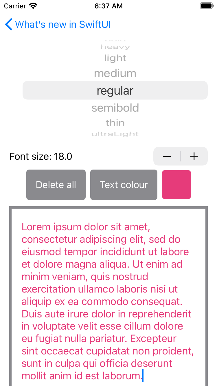
We can now create a multiline TextEditor just as easily as we create a single line TextField.
现在,我们可以像创建单行TextField一样轻松地创建多行TextEditor 。
Anything that can be applied to Text can be applied to TextEditor. When I tried to use the new Dynamic Type syntax with a custom font, the text didn’t seem to scale according to the TextStyle. This could be a bug with the first beta or a problem with the way I did it. Either way, the best example I could make of the capabilities of TextEditor was to allow changing the font size with a Stepper and the font-weight with a Picker. A ColorPicker can be used to select the foreground (font) colour, but be aware that the background does not seem to work at the moment.
可以应用于Text任何内容都可以应用于TextEditor 。 当我尝试使用带有自定义字体的新Dynamic Type语法时,文本似乎没有根据TextStyle缩放。 这可能是第一个测试版的错误,也可能是我的操作方式存在问题。 无论哪种方式,我都能利用TextEditor的功能的最佳示例是允许使用Stepper更改字体大小,并使用Picker更改字体粗细。 可以使用ColorPicker选择前景色(字体),但是请注意,当前背景似乎不起作用。
TextEditor seems to have an opaque background of the systemBackground colour, and adding a background to it just puts a background behind this.
TextEditor似乎具有systemBackground颜色的不透明背景,向其添加背景只会在其后放置背景。
Your background will not be visible at all.
您的背景将完全不可见。
There is a workaround, which is probably all we can do for now:
有一种解决方法,这可能是我们目前所能做的:
TextEditor does support a border, though, as shown in the screenshot below.
但是,TextEditor确实支持边框,如下面的屏幕快照所示。
2.0中的新增功能:SignInWithAppleButton (NEW in 2.0: SignInWithAppleButton)
Sign in with Apple was introduced in iOS 13 as a way to securely sign in to apps without having to give an email and password. Sign in with Apple uses biometrics to authenticate that you are the person who owns your Apple ID, and then sends the app an automatically generated forwarding address and password to the app.
iOS 13中引入了使用Apple登录,这是一种无需输入电子邮件和密码即可安全登录应用的方法。 通过Apple登录使用生物识别技术来验证您是拥有Apple ID的人,然后将自动生成的转发地址和密码发送给该应用程序。

The following example displays the SignInWthAppleButton at the maximum size its constraints allowed (width ≤ 375). You heard right: this View has constraints. It seems that Apple just wrapped the existing ASAuthorizationAppleIDButton inUIViewRepresentable, which is exactly what we needed to do to get the button into SwiftUI last year. But if you see what steps were required to implement sign in with Apple in iOS 13, we are spared the extra task of setting up the delegate protocols in the coordinator.
下面的示例以其限制允许的最大大小(宽度SignInWthAppleButton显示SignInWthAppleButton 。 您没听错:此视图有约束。 看来Apple只是将现有的ASAuthorizationAppleIDButton包装在UIViewRepresentable ,这正是去年我们将按钮放入SwiftUI所需要的。 但是,如果您看到在iOS 13中使用Apple实施登录需要采取什么步骤,那么我们就省去了在协调器中设置委托协议的额外任务。
My version, adapted from Apple’s example, outputs the result of the authentication to a Text in the app as well as printing it. You might notice that the sign-in button doesn’t do anything the first time you try; that was certainly my experience.
我的版本(从Apple的示例改编而来)将身份验证的结果输出到应用程序中的Text并进行打印。 您可能会注意到,登录按钮在您第一次尝试时没有任何作用。 那当然是我的经验。
Tapping a second time should show the output as expected.
再次点击将显示预期的输出。
ProgressView(2.0中的新增功能) (ProgressView (NEW in 2.0))
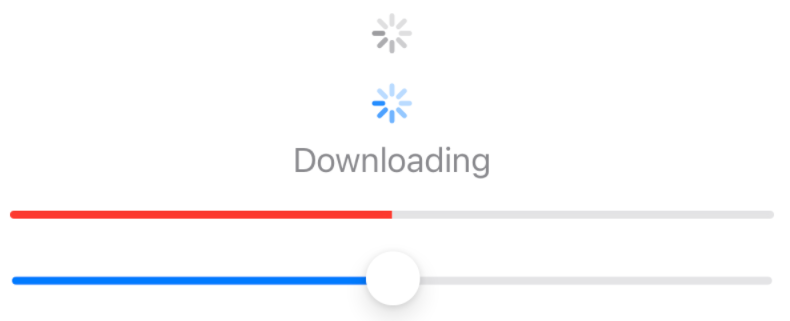
UIActivityIndicatorView is a UIKit control that allows you to show a spinner for a loading state that is indeterminate. We were unable to use this directly without wrapping it in UIViewRepresentable, but now we have an equivalent! Constructing ProgressView without any parameters causes it to display a spinner, but passing it a progress value allows it to be shown as a horizontal progress bar.
UIActivityIndicatorView是一个UIKit控件,可让您显示不确定的加载状态的微调器。 如果不将其包装在UIViewRepresentable中,我们将无法直接使用它,但是现在我们有了一个等效的产品! 构造没有任何参数的ProgressView会使它显示微调器,但是将进度值传递给它可以将其显示为水平进度条。
The progress bar form resembles the UIProgressView, which is often used in combination with WKWebView when a webpage is loading.
进度条的形式类似于UIProgressView ,它在加载网页时经常与WKWebView结合使用。
You may notice that the middle example has a name, a value, and a total parameter. Normally this would cause the ProgressView to be displayed as a horizontal progress bar, like the bottom example. However, you’ll notice that I have applied the .progressViewStyle modifier, passing it to the CircularProgressViewStyle with a tint that matches the default accentColor. Instead of being a progress bar, the result is a blue circular spinner.
您可能会注意到中间的示例具有名称,值和总计参数。 通常,这将导致ProgressView显示为水平进度条,如底部示例所示。 但是,您会注意到我已经应用了.progressViewStyle修饰符,并将其传递给带有与默认accentColor匹配的色度的CircularProgressViewStyle 。 结果不是蓝色的进度条,而是蓝色的圆形微调器。
This is an illustration of the fact that while the “Downloading” label is preserved when a style is applied, the ProgressView must become circular, and this cancels out the automatic behaviour.
这说明了以下事实:应用样式时保留了“下载”标签,而ProgressView必须变为圆形,这会抵消自动行为。
GaugeView(2.0中的新增功能) (GaugeView (NEW in 2.0))
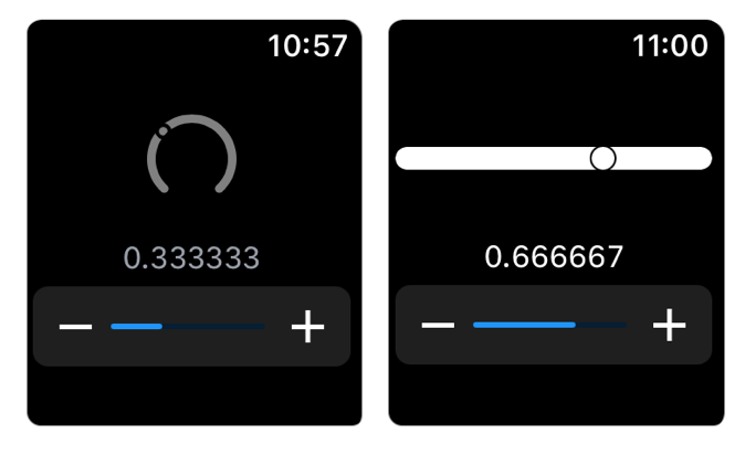
GaugeView is the only new View that is exclusive to WatchOS 7. This is a relatively simple indicator for showing where a value is on a scale. In my example below, I have also added a Slider for changing the value that the Gauge is displaying. This looks a bit strange, as the Slider actually displays where the current value is on its own blue bar. Styling a Gauge is pretty difficult. The default gauge style, which is also called LinearGaugeStyle, uses Color.primary as its foreground colour, and using the .foregroundColor or .accentColor modifiers will not change this. Similarly, the CircularGaugeStyle uses Color.gray, and this cannot be changed.
GaugeView是WatchOS 7独有的唯一新View 。这是一个相对简单的指示器,用于显示值在刻度上的位置。 在下面的示例中,我还添加了一个Slider用于更改Gauge显示的值。 这看起来有点奇怪,因为“滑块”实际上在其自己的蓝色条上显示当前值的位置。 量规的样式非常困难。 默认的量规样式也称为LinearGaugeStyle ,它使用Color.primary作为其前景色,并且使用.foregroundColor或.accentColor修饰符不会对此进行更改。 同样, CircularGaugeStyle使用Color.gray ,无法更改。
The thumb or circle that indicates where the current value is on the Gauge looks like a mask, at least in the case of LinearGaugeStyle. Adding .background(Color.blue) changes the colour of the circle.
至少在LinearGaugeStyle情况下,指示当前值在Gauge上的位置的拇指或圆圈看起来像一个蒙LinearGaugeStyle 。 添加.background(Color.blue)更改圆圈的颜色。
标签(2.0版中的新增功能) (Label (NEW in 2.0))
This is a relatively simple way to combine a symbol from Apple’s now even larger SF Symbols collection of free icons with some text that gives greater context. In my example, I am comparing a Label with the equivalent using an HStack. There was a bug in the first Xcode 12 beta that caused the alignment of a Label's Image to be misaligned with the text, but this has now been fixed. There are two options for the .labelStyle, one of which shows only the Text and one of which only shows the Image.
这是一种相对简单的方法,可以将来自Apple现在更大的SF Symbols集合的免费图标中的符号与提供更大上下文的某些文本进行组合。 在我的示例中,我正在使用HStack将Label与等效Label进行比较。 在第一个Xcode 12 beta中存在一个错误,该错误导致Label Image对齐方式与文本对齐,但是现在已修复。 .labelStyle有两个选项,一个选项仅显示Text ,另一个选项仅显示Image 。
链接(2.0版中的新增功能) (Link (NEW in 2.0))
I always thought it was a bit of a shame that hyperlinks were not possible in iOS apps. Of course, you can create a button with blue text that opens a URL, but this requires more code than you necessarily want to write every time. In this example, I’m using the convenience initialiser of Button that only takes a title string (or localized string key), as this is as small as I could get the code in its original form.
我一直以为在iOS应用程序中无法建立超链接有点可惜。 当然,您可以创建带有蓝色文本的按钮来打开URL,但这需要的代码比每次都要编写的要多。 在此示例中,我使用的是Button的便捷初始化程序,该初始化程序仅接受标题字符串(或本地化的字符串键),因为它是如此之小,以至于我可以获得原始形式的代码。
In iOS 14, we now have Link, which does the action part of the Button above for us. I didn’t like how Apple’s documentation unsafely unwraps a URL using the ‘!’ operator, because this is an extremely bad practice that I’m surprised they would encourage in a code sample. Sure, they may know that this particular URL is created successfully because they link to example.com/TOS.html, a site owned by the Internet Assigned Numbers Authority (IANA) that convert URLs to IP addresses.
在iOS 14中,我们现在有了Link ,它为我们完成了上面Button的操作部分。 我不喜欢Apple的文档如何使用'!'不安全地解开URL。 运算符,因为这是一种非常糟糕的做法,令我惊讶的是,他们会在代码示例中鼓励这样做。 当然,他们可能知道成功创建了此特定的URL,因为它们链接到example.com/TOS.html ,这是Internet分配号码授权机构(IANA)拥有的站点,该站点将URL转换为IP地址。
But if you leave it up to your human certainty that a URL string is valid, sooner or later you’re going to make a mistake.
但是,如果您完全可以确定URL字符串是有效的,那么您迟早会犯错。
Any app that unexpectedly finds nil when unsafely unwrapping an optional will crash instantly.
任何在不安全地展开可选组件时意外发现nil的应用程序都将立即崩溃。
That’s why my example above takes a few more lines than Apple’s example, but it does it safely. This example is really hampered by the lack of optional binding (if let or guard let) in the first version of SwiftUI, as I am instead restricted to comparing my URL to nil to ensure it exists. When this comparison confirms that the URL is not nil, this still doesn’t mean I can use it in the Button without unwrapping it first. This is why there’s a slightly confusing additional step in the Button action, which optionally binds the URL to ensure that it is not nil.
这就是为什么我上面的示例比Apple的示例多了几行,但是这样做确实安全。 在第一个SwiftUI版本中,由于缺少可选绑定( if let或guard let ),此示例确实受到了阻碍,因为我只能将URL与nil进行比较以确保它存在。 当此比较确认URL不为nil时,这仍然并不意味着我可以在Button使用它而无需先对其进行拆包。 这就是在Button操作中有一个稍微令人困惑的附加步骤的原因,该操作可以有选择地绑定URL以确保它不是nil。
I could have put the assertionFailure in an else statement after the if let in the Button action, but I wanted to add the EmptyView for consistency with my Link example. An else statement containing EmptyView is not required, as any if statement around the only occupant of a ViewBuilder closure will return EmptyView when the if condition is false. But I wanted to add this explicitly to show what would happen if our URL was nil. The user would see nothing, but an assertion would be triggered for the developer in debug mode.
我可以在Button操作中的if let之后将assertionFailure放在else语句中,但是我想添加EmptyView以便与我的Link示例保持一致。 不需要包含EmptyView的else语句,因为如果if条件为false,则围绕ViewBuilder闭包的唯一占用者的任何if语句将返回EmptyView 。 但是我想明确地添加它,以显示如果我们的URL为零会发生什么。 用户将看不到任何内容,但是将在调试模式下为开发人员触发一个断言。
This would allow us to be aware that the URL was nil, but without causing a crash for the end-user.
这将使我们知道该URL为零,但不会导致最终用户崩溃。
Now that SwiftUI supports if let, I can directly create properties like the URL and create Views that use that data. Just as before, the link is only shown when the URL can be created, but we don’t need to do multiple checks just to make sure that’s the case.
既然SwiftUI支持,我可以直接创建URL之类的属性,并创建使用该数据的View。 和以前一样,仅当可以创建URL时才会显示该链接,但是我们无需进行多次检查就可以确保是这种情况。
菜单(2.0中的新增功能) (Menu (NEW in 2.0))
MenuButton has been replaced by Menu. The original was a drop-down menu, and the replacement isn’t too different. The main thing the new name adds is clarity, as we are talking about a menu and the items inside it, so calling it a button doesn’t make much sense. Menu comes with a few different options for styles. The default style is BorderedButtonMenuStyle, which is why the DefaultButtonMenuStyle on the right looks the same, while the BorderlessButtonMenuStyle in the middle looks different.
MenuButton已由Menu取代。 原来是一个下拉菜单,但替换没有太大不同。 新名称添加的主要内容是清晰度,因为我们正在谈论菜单及其中的项目,因此称其为按钮没有多大意义。 Menu带有一些样式的不同选项。 默认样式是BorderedButtonMenuStyle ,这就是为什么右边的DefaultButtonMenuStyle看起来相同,而中间的BorderlessButtonMenuStyle看起来不同的原因。
Aside from the new styles, which remove any reference to the fact that it is a “pull down” menu, the only changes are that MenuButton is called Menu and the .menuButtonStyle modifier is now called .menuStyle.
除了新样式删除了对“下拉菜单”这一事实的引用之外,唯一的变化是MenuButton称为Menu ,而.menuButtonStyle修饰符现在称为.menuStyle 。
In the first beta Menu was only available on macOS, just like the control it replaces.
在第一个beta版本中, Menu仅在macOS上可用,就像它所取代的控件一样。
However, beta 3 added support for Menu on iOS too.
但是, beta 3也增加了对iOS上Menu的支持 。
MenuButton(2.0版弃用) (MenuButton (Deprecated in 2.0))
See Menu above, which replaces MenuButton, but serves many of the same functions.
请参阅上方的Menu ,该Menu取代了MenuButton ,但具有许多相同的功能。
文字(在2.0中更新) (Text (Updated in 2.0))
Text is perhaps the simplest building block for creating Views. In most cases, you’ll be passing a String to create it, and that will be the content it displays. The original version of this documentation included all of the other ways to create it, including from localisations, ObservableObjects, and substrings. Those can be found at the bottom of this example, but we also have many new initialisers in 2020 that are included at the top of the example.
文本也许是创建视图的最简单的构建块。 在大多数情况下,您将传递一个String来创建它,这将是它显示的内容。 本文档的原始版本包括所有其他创建方式,包括来自本地化,ObservableObjects和子字符串的方式。 这些可以在示例的底部找到,但是示例顶部还包含了2020年的许多新初始化程序。
The first one is quite exciting, as it can take any generic object and any class that inherits from Formatter. This could be any of the Formatter types that Apple provides or, as in my example, a Formatter that you create specifically for your custom type. I wasn’t exactly sure how a Formatter is implemented, so I just optionally bound the object to an instance of my custom class, and returned nil in all other situations.
第一个非常令人兴奋,因为它可以接受任何通用对象和从其继承的任何类 Formatter 。 这可能是任何 Formatter 苹果提供的类型,或者在我的示例中 Formatter 您专门为自定义类型创建的内容。 我不确定如何 Formatter 已实现,因此我可以选择将该对象绑定到自定义类的实例,并在所有其他情况下返回nil。
Note that the one that takes a LocalizedStringKey, tableName, bundle, and comment requires a separate file that uses the .strings file extension. As is mentioned in Apple’s documentation for this initializer, the only required parameter is the string for the key. I gave a verbose example mostly so that you can see what these other parameters require.
请注意,带有LocalizedStringKey , tableName , bundle和comment的文件需要使用.strings文件扩展名的单独文件。 如Apple在此初始化程序的文档中所述,唯一需要的参数是密钥的字符串。 我主要给出了一个详细的示例,以便您可以了解其他参数的要求。
The default of tableName is Localizable, the standard name for a strings file. I deliberately named mine Local to show why I would need this parameter. The bundle is the main bundle by default, so passing Bundle.main is redundant in this case. The comment should give contextual information, but in this example, I’ve just given it the string Comment.
tableName的默认值为Localizable ,这是字符串文件的标准名称。 我故意将其命名为Local以说明为什么需要此参数。 默认情况下,捆绑包是主捆绑包,因此在这种情况下,传递Bundle.main是多余的。 该注释应该提供上下文信息,但是在此示例中,我只是给它提供了字符串Comment 。
Text can now include an Image using interpolation, or represent a Date. There are three new fonts: caption2, title2 and title3. These were available as part of UIFont, so it’s not surprising that they’ve made it to SwiftUI. New modifiers allow you to select whether the text is uppercase or lowercase and whether it uses a monospaced or serif design.
现在, Text可以使用插值包含Image ,或表示Date 。 共有三种新字体: caption2 , title2和title3 。 这些作为UIFont的一部分可用 ,因此它们已经成为SwiftUI并不奇怪。 新的修饰符使您可以选择文本是大写还是小写,以及是否使用等宽或衬线设计。
I haven’t included the new way to use Dynamic Type to make your custom fonts as accessible as the system styles. For that, I’ll link to Hacking With Swift’s Dynamic Type guide, as I would only be repeating what was said there.
我没有包括使用动态类型使您的自定义字体像系统样式一样易于访问的新方法。 为此,我将链接至Hacking With Swift的Dynamic Type指南 ,因为我只会重复那里所说的内容。
图像(在2.0中更新) (Image (Updated in 2.0))
SF Symbols 2 brings support for use in Mac apps. Attempting to use Image(systemNamed:) to use an SF Symbol in Xcode 11 causes the error “Extraneous argument label ‘systemNamed:’ in call”. This means that you could not use SF Symbols in any native Mac app or even a Catalyst app, as macOS had no way of displaying them. Presumably, the SF Symbols Mac apps that ran on macOS Catalina used PNG for the thumbnails for the symbols, as they could not have been using Image(systemNamed:).
SF Symbols 2支持在Mac应用程序中使用。 尝试在Xcode 11中使用Image(systemNamed:)使用SF Symbol会导致错误“调用中的外部参数标签'systemNamed:'”。 这意味着您无法在任何本机Mac应用程序甚至Catalyst应用程序中使用SF Symbols,因为macOS无法显示它们。 据推测,在macOS Catalina上运行的SF Symbols Mac应用程序将PNG用于符号的缩略图,因为它们可能没有使用Image(systemNamed:) 。
Anyway, as of Xcode 12 and macOS 11 Big Sur, you will not get those warnings and can use Image(systemNamed:) in native macOS and Mac Catalyst apps.
无论如何,从Xcode 12和macOS 11 Big Sur开始,您将不会收到这些警告,并且可以在本机macOS和Mac Catalyst应用程序中使用Image(systemNamed:) 。
按钮(在2.0中更新) (Button (Updated in 2.0))
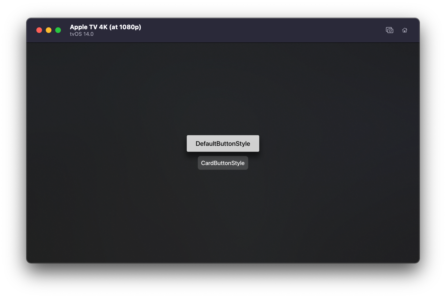
There is now a CardButtonStyle option on tvOS, which makes a smaller button that is less prominently coloured. The example above shows a Button that was created without any style whatsoever, and so it takes on the DefaultButtonStyle, so you can see the difference. The new Button is much more subtle and could be used for options that are less important than those that are given the brighter colour.
现在,tvOS上有一个CardButtonStyle选项,它可以使较小的按钮上色不太明显。 上面的示例显示了一个创建时没有任何样式的Button ,因此它具有DefaultButtonStyle ,因此您可以看到区别。 新的Button更加微妙,可以用于那些不如那些被赋予鲜艳颜色的选项重要的选项。
I had to add padding to the CardButtonStyle Button, as it for some reason has no padding otherwise. This may change in later betas, as I am only testing this on Xcode 12 beta 2.
我必须向CardButtonStyle Button添加填充,因为某些原因它没有填充。 这可能会在以后的beta中有所变化,因为我仅在Xcode 12 beta 2上对此进行测试。
PasteButton(在2.0中更新) (PasteButton (Updated in 2.0))
This control allows you to paste information on MacOS, but it is not available on iOS. It can take a variety of data types, which are expressed as UTIs. To quote Apple’s documentation, “Uniform Type Identifiers declares common types for resources to be loaded, saved, or opened from other apps.” In Xcode 11, it was necessary to provide these strings in an array when creating a PasteButton.
此控件使您可以在MacOS上粘贴信息,但在iOS上不可用。 它可以采用表示为UTI的各种数据类型。 为了引用Apple的文档,“统一类型标识符声明了要从其他应用程序加载,保存或打开的资源的通用类型。” 在Xcode 11中,创建PasteButton时必须在数组中提供这些字符串。
I’ve included a function in my example that lets you find the UTI string for any type, which will probably help you when implementing this button.
我在示例中包含一个函数,该函数可让您找到任何类型的UTI字符串,这可能会在实现此按钮时为您提供帮助。
Now we have a new structure called UTType, which makes it a lot easier to create the types that you want to support. You can either pass the initializer for this structure a string that would’ve worked in Xcode 11, or you can use one of the many system-declared types that are provided.
现在,我们有了一个名为UTType的新结构,这使创建想要支持的类型变得容易UTType 。 您可以为该结构传递一个在Xcode 11中可以使用的字符串的初始化程序,也可以使用提供的许多系统声明的类型之一。
The initializer that takes a string returns an optional, so if you use it you have to be sure that the string you use is correct. I have used UTType.text for my example, but I included an example below that constructed it manually from a string. Note that it is not recommended to force unwrap an optional using the exclamation mark. I just wanted to show that the UTType you get from the system declared type is not nil, so neither would the equivalent constructed from a string.
带有字符串的初始化程序返回一个可选参数,因此,如果使用它,则必须确保使用的字符串正确。 我在示例中使用了UTType.text ,但下面包含一个示例,该示例是根据字符串手动构造的。 请注意,不建议使用感叹号强行打开可选包装。 我只是想表明您从系统声明的类型中获得的UTType不是nil,所以从字符串构造的UTType也不会。
Once you have decided what type identifiers you need, you will need to handle the data that you get from the NSItemProvider. My example only pastes the first item in the array, but hopefully, it makes it clear how you could handle other data types and multiple items.
一旦确定了所需的类型标识符,就需要处理从NSItemProvider获得的数据。 我的示例仅将第一个项目粘贴到数组中,但是希望它可以使您清楚地知道如何处理其他数据类型和多个项目。
Here’s a list of the types that conform to NSItemProviderWriting, and can therefore be used for pasting with the PasteButton:
这是符合NSItemProviderWriting的类型的列表,因此可以用于PasteButton粘贴:
You can also conform to this protocol with your own custom types, allowing you to paste custom types of data.
您还可以使用自己的自定义类型来遵守此协议,从而可以粘贴自定义类型的数据。
切换(在2.0中更新) (Toggle (Updated in 2.0))
The default style on iOS, SwitchToggleStyle, now allows us to choose a tint colour that is only shown when the bool the Toggle has a Binding to is true. While the default Toggle tint on iOS and iPadOS is green, on Mac Catalyst it is blue. Using the new SwitchToggleStyle with the tint colour option in a native Mac app currently displays a switch as we would expect, but the tint colour is still the default blue.
iOS上的默认样式SwitchToggleStyle现在允许我们选择一种色调,仅当Toggle的Binding绑定为true时才显示该色调。 iOS和iPadOS上的默认切换色调为绿色,而Mac Catalyst上的默认切换色调为蓝色。 当前,在本机Mac应用程序中将新的SwitchToggleStyle与“ tint color”选项一起使用时,会像我们期望的那样显示一个开关,但“ tint color”仍然是默认的蓝色。
The top Toggle, which I added without a ToggleStyle for comparison, is displayed in the macOS default of CheckboxToggleStyle. This is a checkbox that displays a checkmark when on and does not have tint colour options. I’ve added an accentColor modifier to this Toggle, which shows that macOS actually does allow the Toggle tint to be changed when the user has not selected ‘Accent Color’ in the Highlight Colour dropdown menu in the General section of their System Preferences.
我添加的没有ToggleStyle进行比较的顶部Toggle在macOS默认CheckboxToggleStyle 。 这是一个复选框,在启用时会显示一个选中标记,并且没有色调颜色选项。 我已向此Toggle添加了accentColor修饰符,该修饰符表明当用户未在系统偏好设置的“常规”部分的“突出显示颜色”下拉菜单中选择“强调颜色”时,macOS确实允许更改Toggle色彩。
This can be used to change either style of Toggle; I just didn’t add the accentColor modifier to the second one to show how the SwitchToggleStyle with tint colour has no effect.
这可以用于改变Toggle风格; 我只是没有将accentColor修饰符添加到第二个修饰符中,以显示具有浅色的SwitchToggleStyle如何无效。
DatePicker(在2.0中更新) (DatePicker (Updated in 2.0))
There are now two new styles for DatePicker, called GraphicalDatePickerStyle and CompactDatePickerStyle.
DatePicker现在有两种新样式,称为GraphicalDatePickerStyle和CompactDatePickerStyle 。
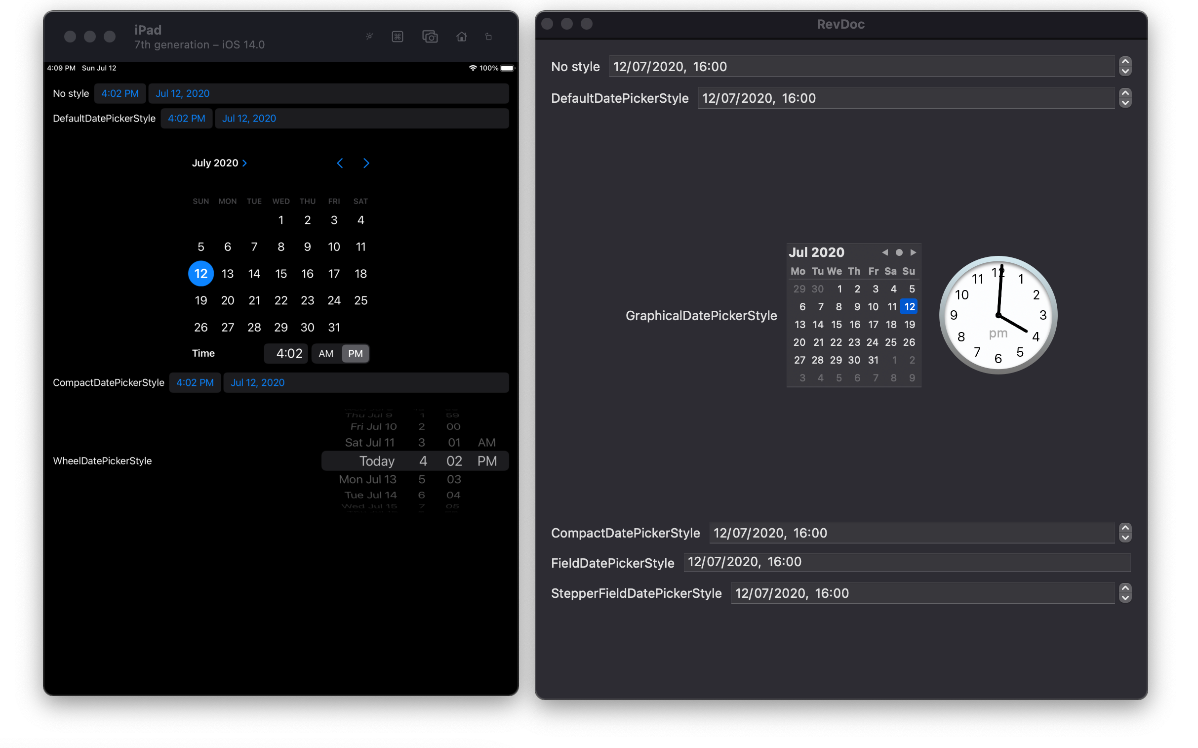
You might notice that the version of GraphicalDatePickerStyle on macOS on the right is much smaller than the one that is shared by iOS, iPadOS, and Mac Catalyst on the left. I could only get the DatePicker to display correctly when I allowed it a minimum height of 400. Any less and the DatePicker clips some of the text — in particular, the part that is used to set a time.
您可能会注意到,右侧macOS上GraphicalDatePickerStyle的版本比左侧iOS,iPadOS和Mac Catalyst共享的版本小得多。 当我允许它的最小高度为400时,我只能使DatePicker正确显示。减小它的大小, DatePicker一些文本,特别是用于设置时间的部分。
This causes the width to scale proportionally, meaning that on a small device like iPhone 8, the DatePicker exceeds the screen width. Perhaps this will be fixed in a future beta, as I was using Xcode 12 beta 2. Unfortunately, it seems that the WheelDatePickerStyle, which is available on iOS, iPadOS and Mac Catalyst but not a native macOS app, still continues to have a minimum width that leaves very little space for its label on small screens.
这会导致宽度按比例缩放,这意味着在像iPhone 8这样的小型设备上, DatePicker超出屏幕宽度。 也许这将在以后的Beta中修复,因为我正在使用Xcode 12 beta2。不幸的是,似乎WheelDatePickerStyle(仍可在iOS,iPadOS和Mac Catalyst上使用,但不适用于本机macOS应用)仍保持最低水平宽度可以在小屏幕上为其标签留出很少的空间。
CompactDatePickerStyle is now the default on iOS, iPadOS and Mac Catalyst. This is essentially a button that displays the current value, and displays a tiny calendar similar to the GraphicalDatePickerStyle when the button is tapped. This allows you to have a very compact display for the current date, without needing to display an entire calendar at all times.
现在, CompactDatePickerStyle是iOS,iPad OS和Mac Catalyst上的默认设置。 本质上,这是一个显示当前值的按钮,并在轻按该按钮时显示一个类似于GraphicalDatePickerStyle的小日历。 这样一来,您就可以以非常紧凑的格式显示当前日期,而无需始终显示整个日历。
My example has the conditional compilation flag #if os(iOS) || targetEnvironment(macCatalyst) around the WheelDatePickerStyle example.
我的示例具有条件编译标志#if os(iOS) || targetEnvironment(macCatalyst) WheelDatePickerStyle示例周围的#if os(iOS) || targetEnvironment(macCatalyst) 。
This means that no matter what platform you build it for, you will see all of the DatePicker variations that are supported on that platform.
这意味着,无论您针对其构建何种平台,都将看到该平台支持的所有DatePicker变体。
2.0中的新视图和更新视图修改器 (New and Updated View Modifiers in 2.0)
.matchedGeometryEffect(2.0中的新增功能) (.matchedGeometryEffect (NEW in 2.0))
As you might be able to tell from the name, .matchedGeometryEffectt is an animation effect that animates changes in size and position.
可以从名称中.matchedGeometryEffect t , .matchedGeometryEffect t是一种动画效果,可对大小和位置的变化进行动画处理。
Like Sarun’s example, I used a Text and a Shape, but mine is a Circle instead of a RoundedRectangle (totally different). Instead of a VStack that turns into an HStack on the basis of a bool, I thought it would be interesting to position two views in a variety of configurations. These configurations are relative to the TextPosition enum, and you can guess what the value of that means. The values are left, centre, right, top and bottom. When the Text is in the centre, the Circle adjusts for this by reducing its opacity, making it easier to see the text that is layered on top of it in a ZStack.
像Sarun的示例一样,我使用了Text和Shape ,但是我的是Circle而不是RoundedRectangle ( 完全不同)。 我认为将两个视图放置在各种配置中会很有趣,而不是将VStack基于bool变成HStack 。 这些配置是相对于TextPosition枚举而言的,您可以猜测其含义。 值为左,中,右,上和下。 当Text居中时, Circle通过降低其不透明度来对此进行调整,从而更易于在ZStack查看位于其上方的文本。
My example is relatively basic, so check out these better sources:
我的示例是相对基本的,因此请查看以下更好的资源:
.help(2.0中的新增功能) (.help (NEW in 2.0))
The accessibility modifier .help provides tooltips in MacOS and an accessibility hint that works on both MacOS and iOS. My example shows how this new modifier actually overrides any accessibility hint that was previously applied and vice versa. When I ran this on iOS, VoiceOver read the first text as “Label 1, Help 1” because the help modifier was added after the hint. The second Text is read as “Label 2, Hint 2” because the hint was added after the help modifier.
可访问性修饰符.help提供MacOS中的工具提示以及可在MacOS和iOS上使用的可访问性提示。 我的示例显示了此新修饰符实际上是如何覆盖以前应用的任何可访问性提示的,反之亦然。 当我在iOS上运行此命令时,VoiceOver会将第一个文本读取为“标签1,帮助1”,因为在提示之后添加了帮助修饰符。 第二个文本被读取为“标签2,提示2”,因为提示是在help修饰符之后添加的。
This behaviour is similar on MacOS, except that a tooltip displaying the help text is displayed, regardless of whether help is overridden by an accessibility hint. In other words, although the second Text is still read by VoiceOver as “Label 2, Hint 2”, hovering over it with the mouse still displays “Help 2”.
在MacOS上,此行为与之类似,不同之处在于,无论是否由辅助功能提示覆盖了帮助,都会显示显示帮助文本的工具提示。 换句话说,尽管VoiceOver仍将第二个文本读取为“标签2,提示2”,但用鼠标悬停在其上仍显示“帮助2”。
In Mac Catalyst, it seems that neither the help modifier or the accessibility hint are read.
在Mac Catalyst中,似乎没有读取帮助修饰符或可访问性提示。
The tooltip functionality of help also seems absent from Catalyst.
Catalyst似乎也缺少帮助的工具提示功能。
.accessibility(inputLabels :)(2.0中的新增功能) (.accessibility(inputLabels:) (NEW in 2.0))
Input labels are used by Voice Control (NOT VoiceOver) and Full Keyboard Access. When Voice Control is enabled, speaking a command such as ‘tap Input’ would press this Button. This gives you an array of different labels for your UI elements that are not visible to VoiceOver.
语音控制(NOT VoiceOver)和完全键盘访问使用输入标签。 启用语音控制后,说出“轻按输入”之类的命令会按此 Button 。 这为您的UI元素提供了一系列不同的标签,这些标签对VoiceOver不可见。
In other words, they are ways that someone can describe the Button verbally.
换句话说,它们是某人可以口头描述Button的方式。
.accessibility(selectionIdentifier :)(在2.0中已弃用) (.accessibility(selectionIdentifier:) (Deprecated in 2.0))
This identifier was previously used by Picker to identify the current selection.
Picker先前使用此标识符来标识当前选择。
.scaleEffect(在2.0中更新) (.scaleEffect (Updated in 2.0))
This isn’t new, but one of the original modifiers has been fixed. In Xcode 11, .scaleEffect(x: 2) causes Y to be scaled to zero. In Xcode 12, the default parameters are both 1, which means you can keep one the same and scale one of them without setting both.
这不是新内容,但已修复了其中一个原始修饰符。 在Xcode 11中,.scaleEffect(x:2)使Y缩放为零。 在Xcode 12中,默认参数均为1,这意味着您可以保持相同并缩放其中一个,而无需同时设置两者。
Calling .scaleEffect() in Xcode 11 scaled the entire View to zero!
在Xcode 11中调用.scaleEffect()会将整个View缩放为零!
Try the example above in each version of Xcode and you’ll see what I mean.
在每个版本的Xcode中尝试上面的示例,您将明白我的意思。
In Xcode 11, both rectangles are invisible, whereas in Xcode 12 they appear as a square and a rectangle.
在Xcode 11中,两个矩形都不可见,而在Xcode 12中,它们显示为正方形和矩形。
.imageScale(2.0中的新增功能) (.imageScale (NEW in 2.0))
imageScale seems to only apply to symbols. I have tried passing the name of an image file into the initializer for Image, but the imageScale seems to have no effect.
imageScale似乎仅适用于符号。 我尝试将图像文件的名称传递到Image的初始化程序中,但是imageScale似乎没有任何作用。
It will, however, work on Label, which also has an initializer that takes a system name for one of the provided SF Symbols.
但是,它将在Label工作, Label还具有一个初始化程序,该初始化程序采用提供的SF Symbols之一的系统名称。
.accentColor(在2.0中更新) (.accentColor (Updated in 2.0))
The first example below was possible on iOS 13, macOS Catalyst 13, tvOS 13, and watchOS 6. The only platform it wasn’t supported on was macOS, but that has changed in 2020. With a Button this changes the font colour, which wasn’t possible before on that platform.
下面的第一个示例可能在iOS 13,macOS Catalyst 13,tvOS 13和watchOS 6上实现。唯一不支持的平台是macOS,但在2020年发生了变化。使用Button更改字体颜色,在那个平台上以前是不可能的。
In my second example, I’ve used foregroundColor to change the font colour of a Button on Mac. This works, but it is no longer necessary in Xcode 12.
在第二个示例中,我使用foregroundColor来更改Mac上Button的字体颜色。 这可以工作,但是在Xcode 12中不再需要。
Now we can use accentColor to change the font colour on all platforms, which allows me to use the version of Button that takes a string and doesn’t require me to create a Text.
现在我们可以使用 accentColor 更改所有平台上的字体颜色,这使我可以使用 Button 它需要一个字符串,不需要我创建一个 Text 。
.preferredColorScheme(在2.0中更新) (.preferredColorScheme (Updated in 2.0))
The existing colorScheme(_ colorScheme: ColorScheme) modifier is now deprecated in the current versions of Apple operating systems. The purpose of this modifier was to override the system colour scheme for a single View and its subviews, while preferredColorScheme was used to override the colour scheme for the entire presentation. This refers to the popover or window that the View is being presented in.
The existing colorScheme(_ colorScheme: ColorScheme ) modifier is now deprecated in the current versions of Apple operating systems. The purpose of this modifier was to override the system colour scheme for a single View and its subviews, while preferredColorScheme was used to override the colour scheme for the entire presentation. This refers to the popover or window that the View is being presented in.
While this modifier is not new, the new addition in 2020 is the fact that the parameter is now optional. To illustrate this, my example contains a Toggle that changes whether the sheet should be dark or not. With colorScheme, it was impossible to have the ternary expression sheetIsDark ? .dark : nil, but now we can with preferredColorScheme.
While this modifier is not new, the new addition in 2020 is the fact that the parameter is now optional. To illustrate this, my example contains a Toggle that changes whether the sheet should be dark or not. 用 colorScheme , it was impossible to have the ternary expression sheetIsDark ? .dark : nil , but now we can with preferredColorScheme 。
It might seem like a disadvantage that preferredColorScheme only applies to the presentation, not each individual View, but I’m not sure why you’d want to apply a colour scheme to only one View.
It might seem like a disadvantage that preferredColorScheme only applies to the presentation, not each individual View, but I'm not sure why you'd want to apply a colour scheme to only one View.
You either want a screen of your app to use the system colour scheme, or you want to override it with your own.
You either want a screen of your app to use the system colour scheme, or you want to override it with your own.
If you do want individual Views to act as if the colour scheme is different, you can just change the colours they would be in either scheme.
If you do want individual Views to act as if the colour scheme is different, you can just change the colours they would be in either scheme.
.textContentType (NEW in 2.0) (.textContentType (NEW in 2.0))
This modifier tells the device what kind of suggestions would be helpful when a user is typing.
This modifier tells the device what kind of suggestions would be helpful when a user is typing.
You might notice that this modifier takes a different type on Mac compared to the other platforms. Not only is Mac incapable of using any of the UITextContentType declarations, but it is also restricted to using NSTextContentType which currently only has three options. When I tried them out, I couldn’t see any difference in the suggestions they offer on the MacBook Touch Bar, but maybe I was doing it wrong somehow.
You might notice that this modifier takes a different type on Mac compared to the other platforms. Not only is Mac incapable of using any of the UITextContentType declarations, but it is also restricted to using NSTextContentType which currently only has three options. When I tried them out, I couldn't see any difference in the suggestions they offer on the MacBook Touch Bar, but maybe I was doing it wrong somehow.
I noticed that there were no suggestions for usernames and passwords, which is probably unnecessary.
I noticed that there were no suggestions for usernames and passwords, which is probably unnecessary.
I didn’t have time to go through them all and note the intricacies of each, but I’ve provided an array of them so that my code sample isn’t too long.
I didn't have time to go through them all and note the intricacies of each, but I've provided an array of them so that my code sample isn't too long.
See what differences you can find and let me know!
See what differences you can find and let me know!
.listItemTint (NEW in 2.0) (.listItemTint (NEW in 2.0))
Changing the tint of a list item has a different effect depending on the platform. To quote Apple’s official documentation on the new .listItemTint modifier:
Changing the tint of a list item has a different effect depending on the platform. To quote Apple's official documentation on the new .listItemTint modifier:
The containing list’s style will apply that tint as appropriate. watchOS uses the tint color for its background platter appearance. Sidebars on iOS and macOS apply the tint color to their
ItemLabelicons, which otherwise use the accent color by default.The containing list's style will apply that tint as appropriate. watchOS uses the tint color for its background platter appearance. Sidebars on iOS and macOS apply the tint color to their
ItemLabelicons, which otherwise use the accent color by default.
After looking for something called ItemLabel, I realised that this does not seem to be something that exists. However, any item in a List can be a Label, so I tried that and it worked.
After looking for something called ItemLabel , I realised that this does not seem to be something that exists. However, any item in a List can be a Label , so I tried that and it worked.
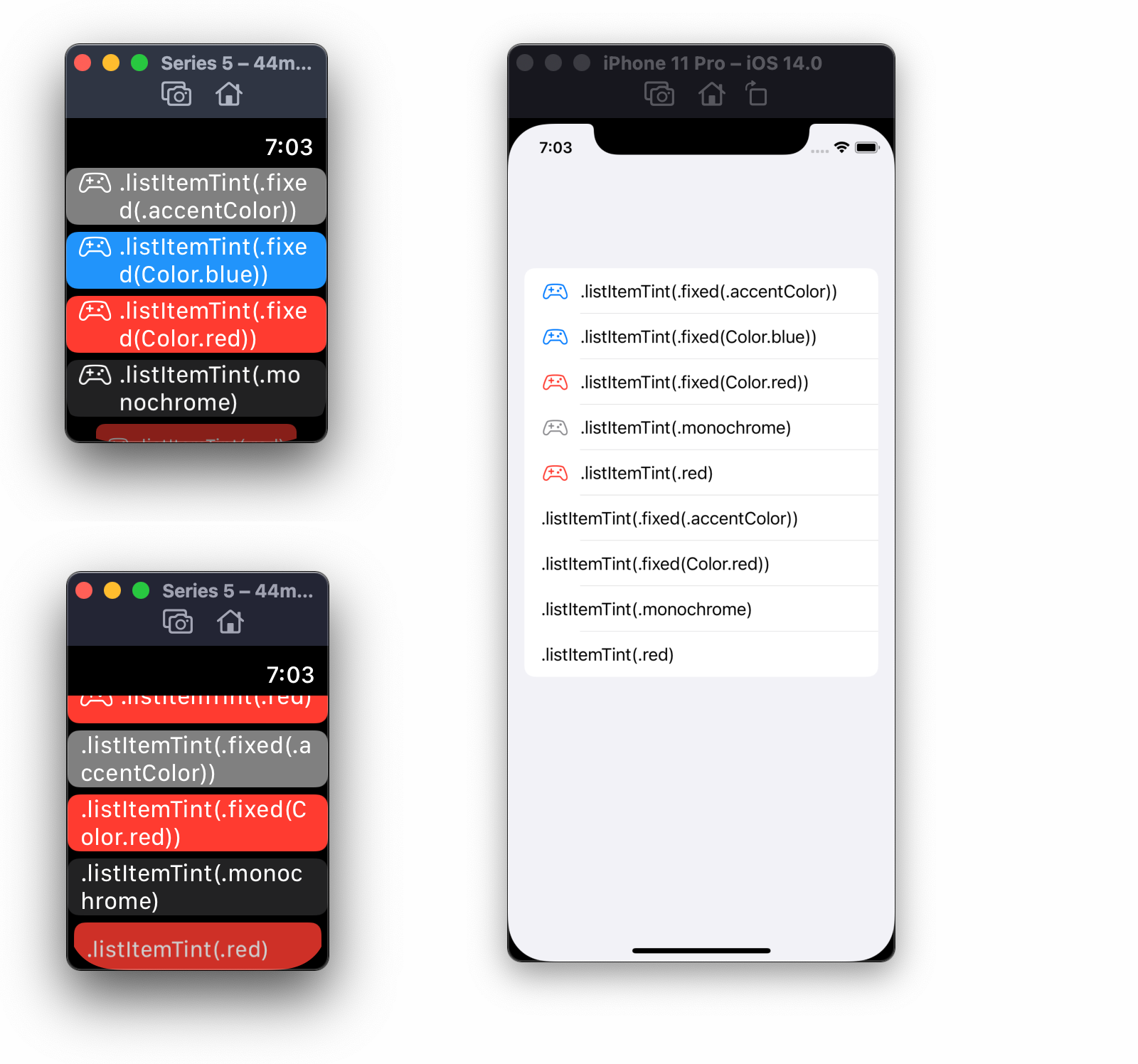
I’m not sure why they specified “Sidebars on iOS and macOS” either as it seems to work universally for any List, and iOS doesn’t have sidebars.
I'm not sure why they specified “Sidebars on iOS and macOS” either as it seems to work universally for any List , and iOS doesn't have sidebars.
That’s iPadOS, it’s totally different!
That's iPadOS, it's totally different!
The fact that watchOS uses the tint for the background is a huge difference. The Label icon is not tinted at all, and the tint is used for any item, not just Label. The .listItemTint modifier can directly take a colour, but it can also take a structure called ListItemTint (with a capital letter). You can give it a .preferred variety, which can be overridden by a parent, or a .fixed variety, which cannot. While the .monochrome style of ListItemTint makes icons grey on iOS, on watchOS it makes the background of the list item black. On iOS, you’ll notice that the .accentColor and Color.blue variations are the same, while on watchOS the accent colour is grey and not blue.
The fact that watchOS uses the tint for the background is a huge difference. The Label icon is not tinted at all, and the tint is used for any item, not just Label . 的 .listItemTint modifier can directly take a colour, but it can also take a structure called ListItemTint (with a capital letter). You can give it a .preferred variety, which can be overridden by a parent, or a .fixed variety, which cannot. While the .monochrome style of ListItemTint makes icons grey on iOS, on watchOS it makes the background of the list item black. On iOS, you'll notice that the .accentColor and Color.blue variations are the same, while on watchOS the accent colour is grey and not blue.
.listRowPlatterColor (Deprecated in 2.0) (.listRowPlatterColor (Deprecated in 2.0))
The new .listItemTint modifier above replaces .listRowPlatterColor.
The new .listItemTint modifier above replaces .listRowPlatterColor .
This deprecated modifier was only available on WatchOS, and took only a colour. With .listItemTint, you can use ListItemTint, so you aren’t just limited to a colour. The new modifier overrides the old one too, so even if .listRowPlatterColor is used after .listItemTint, the colour passed to .listRowPlatterColor will be used instead.
This deprecated modifier was only available on WatchOS, and took only a colour. With .listItemTint , you can use ListItemTint , so you aren't just limited to a colour. The new modifier overrides the old one too, so even if .listRowPlatterColor is used after .listItemTint , the colour passed to .listRowPlatterColor will be used instead.
.onLongPressGesture (Updated in 2.0) (.onLongPressGesture (Updated in 2.0))
It is now possible to use SwiftUI to add a long press gesture to a View on tvOS.
It is now possible to use SwiftUI to add a long press gesture to a View on tvOS.
You need to be able to add focus to your View, so I’ve used the focusable() modifier. You can use this modifier with no parameters, but I’ve used it with a closure in order to change the colour of my custom buttons to show when they have focus. If I didn’t do this, there would be no indication of which button is selected at any given time. I’ve used an enum to contain four button states: unfocused, focused, pressing, and pressed. It isn’t necessary to have a closure for the pressing state, but I made this to show that you can run code before a long press has reached its minimum duration. The default duration is 0.5 seconds, so you probably only need to make changes to the UI if you also increase this duration.
You need to be able to add focus to your View, so I've used the focusable() modifier. You can use this modifier with no parameters, but I've used it with a closure in order to change the colour of my custom buttons to show when they have focus. If I didn't do this, there would be no indication of which button is selected at any given time. I've used an enum to contain four button states: unfocused, focused, pressing, and pressed. It isn't necessary to have a closure for the pressing state, but I made this to show that you can run code before a long press has reached its minimum duration. The default duration is 0.5 seconds, so you probably only need to make changes to the UI if you also increase this duration.
This code will work on any platform from 2019, but will only work on tvOS 14.0 from 2020.
This code will work on any platform from 2019, but will only work on tvOS 14.0 from 2020.
.onOpenURL (NEW in 2.0) (.onOpenURL (NEW in 2.0))
This modifier has nothing to do with opening URLs for websites. These URLs are solely the ones that can be opened by your app, and your app alone.
This modifier has nothing to do with opening URLs for websites. These URLs are solely the ones that can be opened by your app, and your app alone.
The onOpenURL modifier is for SwiftUI apps that use the new SwiftUI App lifecycle that does not use AppDelegate or SceneDelegate. If your project has these files in it, you probably won’t be able to get this modifier to work, like I couldn’t. When creating a project, be sure to choose ‘SwiftUI App’ as the Life Cycle option instead of ‘UIKit App Delegate’.
的 onOpenURL modifier is for SwiftUI apps that use the new SwiftUI App lifecycle that does not use AppDelegate or SceneDelegate. If your project has these files in it, you probably won't be able to get this modifier to work, like I couldn't. When creating a project, be sure to choose 'SwiftUI App' as the Life Cycle option instead of 'UIKit App Delegate'.
To create a unique URL scheme for your app, select the Info tab of your project settings, whether that be for an iOS or macOS target. Without changing the Custom Target Properties at the top of the screen, you’ll see that there is already a URL types section at the bottom of the screen. Opening this and clicking the ‘+’ button will allow you to create a new URL scheme for your app, providing that it is unique and not the same as any other app on a user’s device. For the purposes of this example I have called it my-scheme, but you can choose anything.
To create a unique URL scheme for your app, select the Info tab of your project settings, whether that be for an iOS or macOS target. Without changing the Custom Target Properties at the top of the screen, you'll see that there is already a URL types section at the bottom of the screen. Opening this and clicking the '+' button will allow you to create a new URL scheme for your app, providing that it is unique and not the same as any other app on a user's device. For the purposes of this example I have called it my-scheme , but you can choose anything.
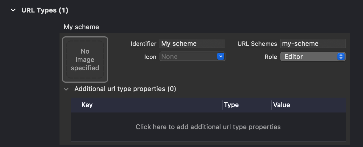
The Identifier field is optional, but you may want to use it, as the URL type is simply referred to as Untitled in this menu without it.
The Identifier field is optional, but you may want to use it, as the URL type is simply referred to as Untitled in this menu without it.
Now that we have a URL scheme in place, we can do the rest in code. In the example below, I’ve added the ability to use a TextField to change what link is opened. The URL scheme you set up needs to be set as a constant in the ContentView struct. If you are using my-scheme as I was, you don’t need to do anything. I’ve extended URL, Character and String in order to filter the input from the TextField.
Now that we have a URL scheme in place, we can do the rest in code. In the example below, I've added the ability to use a TextField to change what link is opened. The URL scheme you set up needs to be set as a constant in the ContentView struct. If you are using my-scheme as I was, you don't need to do anything. I've extended URL, Character and String in order to filter the input from the TextField.
Because characters that are allowed in a URL are set as a constant called allowedCharacters, we can be certain that any text added to the TextField can successfully create a URL. If a URL was created with nothing but illegal characters, this code would filter them all out, leaving us with an empty string. This is one way that the code could fail, as a URL cannot be created with an empty string. Luckily we are applying the URL scheme separately, and the URL can be constructed with only the scheme and nothing else, so an empty string is fine in this case.
Because characters that are allowed in a URL are set as a constant called allowedCharacters , we can be certain that any text added to the TextField can successfully create a URL. If a URL was created with nothing but illegal characters, this code would filter them all out, leaving us with an empty string. This is one way that the code could fail, as a URL cannot be created with an empty string. Luckily we are applying the URL scheme separately, and the URL can be constructed with only the scheme and nothing else, so an empty string is fine in this case.
Whether you type a URL or not, the link that says “Open” will open that URL, and the onOpenURL modifier will add that URL to a list. Since we are doing this inside the app that those URLs are opened in, we don’t actually go anywhere. If you want to see a link actually do something, try entering a URL that starts with the URL scheme you set in Safari. This will ask you if you want to open the URL in your app, and then you will be taken back to the app.
Whether you type a URL or not, the link that says “Open” will open that URL, and the onOpenURL modifier will add that URL to a list. Since we are doing this inside the app that those URLs are opened in, we don't actually go anywhere. If you want to see a link actually do something, try entering a URL that starts with the URL scheme you set in Safari. This will ask you if you want to open the URL in your app, and then you will be taken back to the app.
If everything is working, the URLs you enter in Safari should also be added to the opened URLs list.
If everything is working, the URLs you enter in Safari should also be added to the opened URLs list.
.onPasteCommand (NEW in 2.0) (.onPasteCommand (NEW in 2.0))
This one took a long time to figure out. The official documentation for onPasteCommand says the modifier adds “an action to perform in response to the system’s Paste command.” But don’t go thinking that the closure you give to it will run when you paste into a TextField. The modifier only seems to work on SwiftUI Views, rather than the ones like TextField that wrap UIKit controls with UIViewRepresentable.
This one took a long time to figure out. The official documentation for onPasteCommand says the modifier adds “an action to perform in response to the system's Paste command.” But don't go thinking that the closure you give to it will run when you paste into a TextField 。 The modifier only seems to work on SwiftUI Views, rather than the ones like TextField that wrap UIKit controls with UIViewRepresentable 。
But how do you allow a View to accept pasting if it’s not a TextField? After all, trying to do this without a TextField causes an error sound, and the Edit > Paste option in the default menu bar is greyed out. The answer lies in a transcript from Session 231 of WWDC 2019, when the original version of this modifier was released:
But how do you allow a View to accept pasting if it's not a TextField ? After all, trying to do this without a TextField causes an error sound, and the Edit > Paste option in the default menu bar is greyed out. The answer lies in a transcript from Session 231 of WWDC 2019 , when the original version of this modifier was released:
However, I want to point out something that really makes onPaste different than onDrop. The first part is that there’s no location parameter in the closure. And that’s a key to what’s really going on here. When you do drag and drop, user is directly targeting via the cursor or the touch location which view should accept the drop but a paste command is more indirect. The user is either choosing paste from the menu or is perhaps using a keyboard shortcut or the great new gestures that exist in iOS. The way we solve the problem of knowing which view that the paste command should go to is with the focus system.
However, I want to point out something that really makes onPaste different than onDrop. The first part is that there's no location parameter in the closure. And that's a key to what's really going on here. When you do drag and drop, user is directly targeting via the cursor or the touch location which view should accept the drop but a paste command is more indirect. The user is either choosing paste from the menu or is perhaps using a keyboard shortcut or the great new gestures that exist in iOS. The way we solve the problem of knowing which view that the paste command should go to is with the focus system.
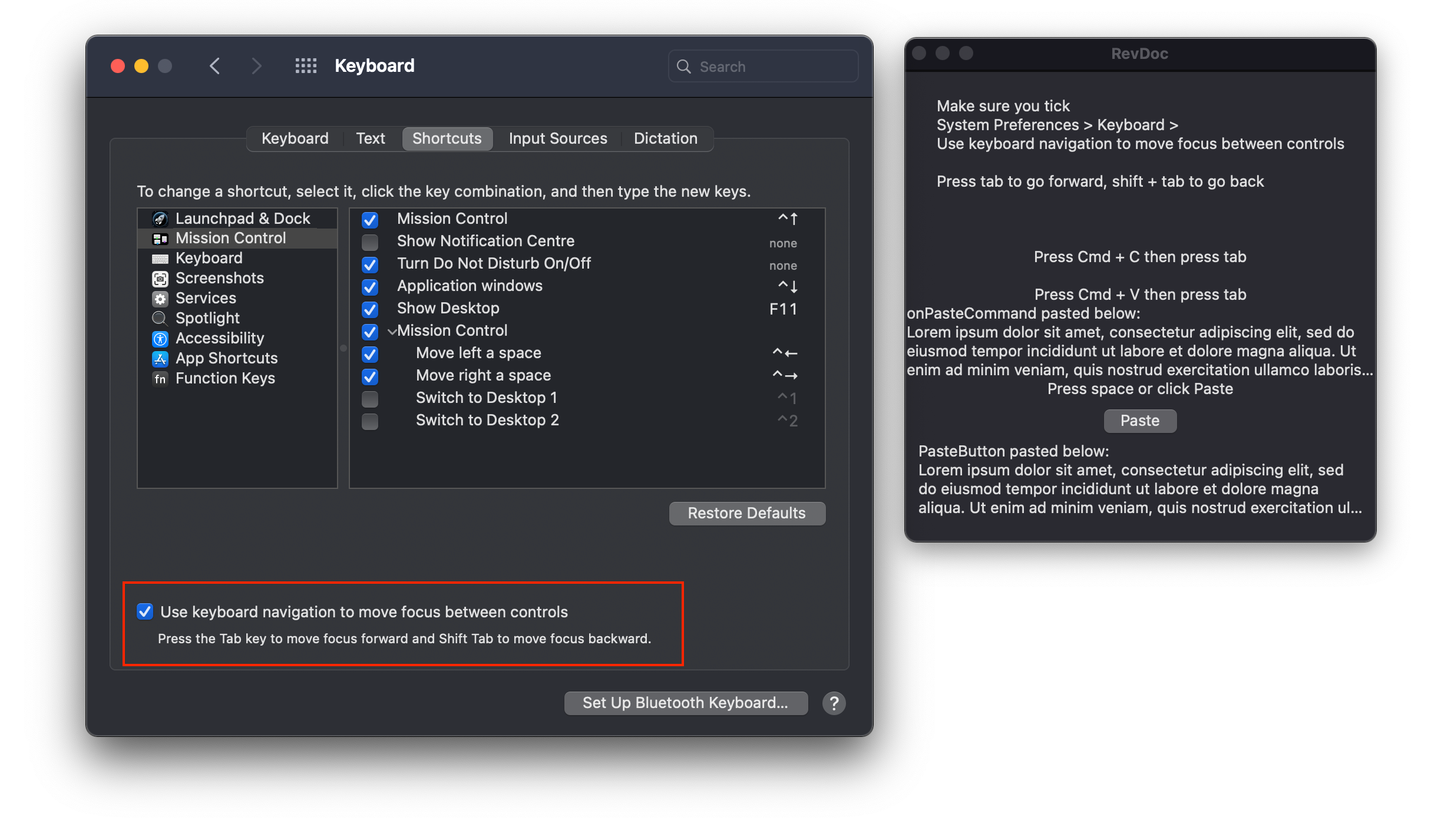
If you follow the link the official documentation for onPasteCommand, you’ll notice that there is absolutely no mention of the focus system whatsoever. So what is the focus system? SwiftUI’s guide to Focus does a good job of explaining it, so I’ll just summarise the important parts that relate to this modifier. As shown on the left window of the screenshot above, focus requires the setting in System Preferences on macOS that allows you to navigate between focusable items with the tab button.
If you follow the link the official documentation for onPasteCommand , you'll notice that there is absolutely no mention of the focus system whatsoever. So what is the focus system? SwiftUI's guide to Focus does a good job of explaining it, so I'll just summarise the important parts that relate to this modifier. As shown on the left window of the screenshot above, focus requires the setting in System Preferences on macOS that allows you to navigate between focusable items with the tab button .
Now that you have that enabled, my code example should work.
Now that you have that enabled, my code example should work.
Essentially, we have a Text at the top, and this automatically takes focus when the app runs. You’ll notice that it’s surrounded by a blue outline, assuming you have the default Accent colour of ‘Multicolor’ selected in System Preferences > General. If you have chosen a different Accent colour, the Text will be outlined in that colour. Now when you select Edit > Copy from the menu bar, or press the equivalent cmd+C key combination, we run a closure for copying to the clipboard.
Essentially, we have a Text at the top, and this automatically takes focus when the app runs. You'll notice that it's surrounded by a blue outline, assuming you have the default Accent colour of 'Multicolor' selected in System Preferences > General. If you have chosen a different Accent colour, the Text will be outlined in that colour. Now when you select Edit > Copy from the menu bar, or press the equivalent cmd+C key combination, we run a closure for copying to the clipboard.
This isn’t strictly necessary for using onPasteCommand, but it’s an easier way to control the Uniform Type Identifier for the data in the pasteboard. The main difference between onPasteCommand in 2020 and the original from 2019 is the existence of the UTType structure. In 2019, the types that the closure would accept were given as strings like “public.utf8-plain-text”.
This isn't strictly necessary for using onPasteCommand , but it's an easier way to control the Uniform Type Identifier for the data in the pasteboard. The main difference between onPasteCommand in 2020 and the original from 2019 is the existence of the UTType structure. In 2019, the types that the closure would accept were given as strings like “public.utf8-plain-text”.
This leaves a high probability of human error when typing the strings, and it is also not easy to find what strings apply to the type you want.
This leaves a high probability of human error when typing the strings, and it is also not easy to find what strings apply to the type you want.
With the UTType structure, we have a huge number of constants that will likely cover anything you’re likely to want to paste. You can also make your own by conforming to the UTTypeContent and/or UTTypeData protocols. I’ve included a constant that shows an array of all the provided data types if you want to take a look. In the onCopyCommand closure, you might notice that we’re converting the string we want to copy to NSString.
With the UTType structure, we have a huge number of constants that will likely cover anything you're likely to want to paste. You can also make your own by conforming to the UTTypeContent and/or UTTypeData protocols. I've included a constant that shows an array of all the provided data types if you want to take a look. In the onCopyCommand closure, you might notice that we're converting the string we want to copy to NSString .
Here’s a list of the types that conform to NSItemProviderWriting, and can, therefore, be used for pasting with an NSItemProvider:
Here's a list of the types that conform to NSItemProviderWriting , and can, therefore, be used for pasting with an NSItemProvider :
Once you have copied when the first Text has focus, you can press tab to cycle focus to the next Text. Pasting while this Text is highlighted runs the onPasteCommand closure, which receives an array of NSItemProvider instances. To convert the data from the latest item back into a string, we first need to load the data representation of the item and convert it to a string. Then we use a binding to the string displayed by the Text underneath, so we can immediately see that the operation was successful.
Once you have copied when the first Text has focus, you can press tab to cycle focus to the next Text . Pasting while this Text is highlighted runs the onPasteCommand closure, which receives an array of NSItemProvider instances. To convert the data from the latest item back into a string, we first need to load the data representation of the item and convert it to a string. Then we use a binding to the string displayed by the Text underneath, so we can immediately see that the operation was successful.
I’ve also included an example of PasteButton so that you can see how similar onPasteCommand is.
I've also included an example of PasteButton so that you can see how similar onPasteCommand is.
The closure takes exactly the same array of UTType instances, although the parameter is labelled supportedContentTypes instead.
The closure takes exactly the same array of UTType instances, although the parameter is labelled supportedContentTypes instead.
.onDrag and .onDrop (Updated in 2.0) (.onDrag and .onDrop (Updated in 2.0))
The two Views below have no awareness of one another. They don’t share an ObservableObject. The top one does not pass a Binding<String> to the bottom one, nor does it pass a constant to its initialiser. The only link between them is that the top applies an .onDrag modifier that provides data of the UTType.utf8PlainText variety, and the bottom applies an .onDrop modifier that expects UTType.utf8PlainText.
The two Views below have no awareness of one another. They don't share an ObservableObject. The top one does not pass a Binding<String> to the bottom one, nor does it pass a constant to its initialiser. The only link between them is that the top applies an .onDrag modifier that provides data of the UTType.utf8PlainText variety, and the bottom applies an .onDrop modifier that expects UTType.utf8PlainText 。
For more info about UTType, see .onPasteCommand above.
For more info about UTType, see .onPasteCommand above.
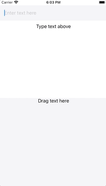
The TextField is used to generate a string, which is something unique that only one View knows about. Once it has been generated, it is displayed as an orange rectangle with rounded corners. This orange shape has been given an .onDrag modifier that provides an NSItemProvider for the underlying data, which has been converted to NSString because this class conforms to the NSItemProviderWriting protocol.
The TextField is used to generate a string, which is something unique that only one View knows about. Once it has been generated, it is displayed as an orange rectangle with rounded corners. This orange shape has been given an .onDrag modifier that provides an NSItemProvider for the underlying data, which has been converted to NSString because this class conforms to the NSItemProviderWriting protocol.
Providing some sort of NSItemProvider is all your View needs to do in order to become draggable, but you have to have somewhere to drop it in order for dragging to be useful.
Providing some sort of NSItemProvider is all your View needs to do in order to become draggable, but you have to have somewhere to drop it in order for dragging to be useful.
That’s where .onDrop comes in.
That's where .onDrop comes in.
In DragView, we have a similar TextWithBackground which is hidden initially due to it having a clear background and no text.
In DragView , we have a similar TextWithBackground which is hidden initially due to it having a clear background and no text.
Unlike .onDrag, .onDrop requires a delegate that conforms to the DropDelegate protocol. Unlike some delegate types, DropDelegate can be a structure and does not need to be a class. The only mandatory requirement of this protocol is that it has a function called performDrop, which does exactly what it sounds like. You attempt to read the data and, if successful, you return true to confirm that dragging happened. If there is an error at any point, you return false.
Unlike .onDrag , .onDrop requires a delegate that conforms to the DropDelegate protocol. Unlike some delegate types, DropDelegate can be a structure and does not need to be a class. The only mandatory requirement of this protocol is that it has a function called performDrop , which does exactly what it sounds like. You attempt to read the data and, if successful, you return true to confirm that dragging happened. If there is an error at any point, you return false.
This is the only part of my code that is slightly complicated, but it bears a lot of similarity to the code used in PasteButton and .onPasteCommand above.
This is the only part of my code that is slightly complicated, but it bears a lot of similarity to the code used in PasteButton and .onPasteCommand above.
.onChange (NEW in 2.0) (.onChange (NEW in 2.0))
One of the annoying things about the original version of SwiftUI is the lack of property observers. The only way to use something like didSet, which allows you to run a closure every time a property’s value changes, is to use it in an ObservableObject class. Since these are regular Swift classes, they cannot use the @State property wrapper, which only works on structures. But they can use property observers in the usual way that we expect, even on properties that are marked as @Published and are therefore accessible from SwiftUI.
One of the annoying things about the original version of SwiftUI is the lack of property observers . The only way to use something like didSet , which allows you to run a closure every time a property's value changes, is to use it in an ObservableObject class. Since these are regular Swift classes, they cannot use the @State property wrapper, which only works on structures . But they can use property observers in the usual way that we expect, even on properties that are marked as @Published and are therefore accessible from SwiftUI.
Because structures are value types, and self is immutable, the structure needs to be completely recreated when changes occur. In the case of @State, the property is already being observed. Changes to this property cause the structure to be completely recreated since it cannot be mutated.
Because structures are value types, and self is immutable, the structure needs to be completely recreated when changes occur. In the case of @State , the property is already being observed. Changes to this property cause the structure to be completely recreated since it cannot be mutated.
To quote the official documentation for the @State property wrapper:
To quote the official documentation for the @State property wrapper :
A
Stateinstance isn’t the value itself; it’s a means of reading and writing the value. To access a state’s underlying value, use its variable name, which returns thewrappedValueproperty value.A
Stateinstance isn't the value itself; it's a means of reading and writing the value. To access a state's underlying value, use its variable name, which returns thewrappedValueproperty value.
So the property inside your structure is not actually the value you think it is — it’s a wrapper that actually saves it inside a totally separate and invisible structure. That’s why the documentation of the wrapper declares it as @propertyWrapper struct State<Value>, because it's not just modifying the behaviour of the property, it's storing it elsewhere. That’s why trying to use the didSet property observer doesn’t work: your instance of the property wrapper doesn’t ever change, only its wrappedValue property does.
So the property inside your structure is not actually the value you think it is — it's a wrapper that actually saves it inside a totally separate and invisible structure. That's why the documentation of the wrapper declares it as @propertyWrapper struct State<Value> , because it's not just modifying the behaviour of the property, it's storing it elsewhere. That's why trying to use the didSet property observer doesn't work: your instance of the property wrapper doesn't ever change, only its wrappedValue property does.
So how do we do anything on the basis of these changes?
So how do we do anything on the basis of these changes?
In the first year of SwiftUI’s existence, using property wrappers in an ObservableObject was about the only way. In 2020, we have a new modifier called .onChange, and this allows any View in your structure to run a closure when a @State property’s value changes. If a TextField has a Binding<String>, it can use the modifier to run code when the string is changed. But the View observing the changes does not need a direct Binding to react to changes, and the .onChange modifier for a Button in another part of the layout would have no more or less access to this ability.
In the first year of SwiftUI's existence, using property wrappers in an ObservableObject was about the only way. In 2020, we have a new modifier called .onChange , and this allows any View in your structure to run a closure when a @State property's value changes. If a TextField has a Binding<String> , it can use the modifier to run code when the string is changed. But the View observing the changes does not need a direct Binding to react to changes, and the .onChange modifier for a Button in another part of the layout would have no more or less access to this ability.
To make things a bit more interesting, my example uses a Binding instead of a State as the property for onChange to observe. The value that .onChange observes can actually be any type that conforms to Equatable. For a great look at all the ways that Equatable affects SwiftUI Views, check out SwiftUI Lab’s tutorial on EquatableView. Notice how ContentView, which does not contain an .onChange modifier, is still affected by the logic in the modifier of its child OnChangeView.
To make things a bit more interesting, my example uses a Binding instead of a State as the property for onChange to observe. The value that .onChange observes can actually be any type that conforms to Equatable . For a great look at all the ways that Equatable affects SwiftUI Views, check out SwiftUI Lab's tutorial on EquatableView . Notice how ContentView , which does not contain an .onChange modifier, is still affected by the logic in the modifier of its child OnChangeView .
For instance, the TextField in ContentView is emptied when the Toggle in OnChangeView is turned off, despite it having no Binding to that control or even knowledge of its existence.
For instance, the TextField in ContentView is emptied when the Toggle in OnChangeView is turned off, despite it having no Binding to that control or even knowledge of its existence.
This is perhaps one of the most powerful capabilities of this new modifier, as it allows Views anywhere in the hierarchy to judge the situation and require that Views elsewhere should also be redrawn according to the properties that it cares about.
This is perhaps one of the most powerful capabilities of this new modifier, as it allows Views anywhere in the hierarchy to judge the situation and require that Views elsewhere should also be redrawn according to the properties that it cares about.
.keyboardShortcut (NEW in 2.0) (.keyboardShortcut (NEW in 2.0))
To quote Apple’s documentation for .keyboardShortcut:
To quote Apple's documentation for .keyboardShortcut :
Pressing the control’s shortcut while the control is anywhere in the frontmost window or scene, or anywhere in the macOS main menu, is equivalent to direct interaction with the control to perform its primary action.
Pressing the control's shortcut while the control is anywhere in the frontmost window or scene, or anywhere in the macOS main menu, is equivalent to direct interaction with the control to perform its primary action.
Below is an example of two Buttons with associated keyboard shortcuts. The first button has .upArrow as the key, but no modifier is specified. You might think that this means pressing the up arrow will perform the action of the Button, but that would be wrong. The Command button is the default modifier, and so this Button actually requires the Cmd + Up combination to be pressed.
Below is an example of two Button s with associated keyboard shortcuts. The first button has .upArrow as the key, but no modifier is specified. You might think that this means pressing the up arrow will perform the action of the Button , but that would be wrong. The Command button is the default modifier, and so this Button actually requires the Cmd + Up combination to be pressed.
The second button does explicitly state a modifier, allowing it to use the shift key instead of command. If you read about the onPasteCommand modifier above, you would’ve read that on macOS there is a System Preferences option that enables navigating through focusable items with the tab key. If that option is enabled, you will find the top Button is highlighted by default. Tab will move focus to the second button, and Shift + Tab will move it back to the first.
The second button does explicitly state a modifier, allowing it to use the shift key instead of command. If you read about the onPasteCommand modifier above, you would've read that on macOS there is a System Preferences option that enables navigating through focusable items with the tab key. If that option is enabled, you will find the top Button is highlighted by default. Tab will move focus to the second button, and Shift + Tab will move it back to the first.
No matter which Button is focused, the keyboard shortcuts you set will still work.
No matter which Button is focused, the keyboard shortcuts you set will still work.
This is perhaps the most useful aspect of these shortcuts, as they continue to work despite the fact that the spacebar will perform the function of the currently focused Button.
This is perhaps the most useful aspect of these shortcuts, as they continue to work despite the fact that the spacebar will perform the function of the currently focused Button .
.focusedValue and @FocusedBinding (NEW in 2.0) (.focusedValue and @FocusedBinding (NEW in 2.0))
This is a new way to pass data between Views. Instead of having an ObservableObject, we save data using a FocusedValueKey.
This is a new way to pass data between Views. Instead of having an ObservableObject , we save data using a FocusedValueKey .
In the following example, DisplayTextView is able to show the text you type into TextFieldView, despite the fact that a Binding<String> or String constant is not passed between the Views.
In the following example, DisplayTextView is able to show the text you type into TextFieldView , despite the fact that a Binding<String> or String constant is not passed between the Views.
The magic here is enabled by the structure and extension at the bottom.
The magic here is enabled by the structure and extension at the bottom.
The FocusedValueKey protocol requires that conforming structures have a typealias for the value they store.
The FocusedValueKey protocol requires that conforming structures have a typealias for the value they store.
Once you have a structure that defines a typealias for your key, you’ll need to define a getter and setter for that value. This extension of FocusedValue defines \.text as the key that we will use to read and write the value. Notice that the getter and setter both use the FocusedTextKey type as a subscript for FocusedValues. Now we just need to write a value to the key in TextFieldView, and then we need to read from it in DisplayTextView.
Once you have a structure that defines a typealias for your key, you'll need to define a getter and setter for that value. This extension of FocusedValue defines \.text as the key that we will use to read and write the value. Notice that the getter and setter both use the FocusedTextKey type as a subscript for FocusedValues 。 Now we just need to write a value to the key in TextFieldView , and then we need to read from it in DisplayTextView 。
The .focusedValue(\.text, $text) modifier on the TextField saves the value to the key.
The .focusedValue(\.text, $text) modifier on the TextField saves the value to the key.
The @FocusedBinding(\.text) var text: String? property in DisplayTextView subscribes it to changes in the associated value. Notice that it is an optional, because the value does not have to be set. As Apple’s official documentation says, “Unlike EnvironmentKey, FocusedValuesHostKey has no default value requirement, because the default value for a key is always nil.” I assume the original name was FocusedValuesHostKey, because the documentation still mentions this despite the fact it no longer exists.
The @FocusedBinding(\.text) var text: String? property in DisplayTextView subscribes it to changes in the associated value. Notice that it is an optional, because the value does not have to be set. As Apple's official documentation says, “Unlike EnvironmentKey , FocusedValuesHostKey has no default value requirement, because the default value for a key is always nil .” I assume the original name was FocusedValuesHostKey , because the documentation still mentions this despite the fact it no longer exists.
In other words, you can set up a key without giving it a value, and your code will still run.
In other words, you can set up a key without giving it a value, and your code will still run.
When you do set up a value, you will need to unwrap it as I did using the nil coalescing operator ‘??’.
When you do set up a value, you will need to unwrap it as I did using the nil coalescing operator '??'.
The next question you might have is why these values would be needed. After all, they seem to be global, at least in the context of a single window. We wouldn’t want to keep all our data at this scope, and having a lot of them might make it hard to debug. A more complex example by an Apple Frameworks Engineer on the Apple Developer Forums shows an interesting use case. When a Mac app has separate commands, such as Shift, Cmd + D in that example, you may still want to access data in the app despite the fact that the commands are at the WindowGroup scope.
The next question you might have is why these values would be needed. After all, they seem to be global, at least in the context of a single window. We wouldn't want to keep all our data at this scope, and having a lot of them might make it hard to debug. A more complex example by an Apple Frameworks Engineer on the Apple Developer Forums shows an interesting use case. When a Mac app has separate commands, such as Shift, Cmd + D in that example, you may still want to access data in the app despite the fact that the commands are at the WindowGroup scope.
Now you can!
现在你可以!
.prefersDefaultFocus and .focusScope (NEW in 2.0) (.prefersDefaultFocus and .focusScope (NEW in 2.0))
On tvOS 14 and watchOS 7, we now have the ability to declare what user interface element we want to be focused by default. On tvOS, this matters because pressing the Touch surface of the Siri remote performs the action of the Button with focus. On watchOS, the focused element is controlled by moving the Digital Crown.
On tvOS 14 and watchOS 7, we now have the ability to declare what user interface element we want to be focused by default. On tvOS, this matters because pressing the Touch surface of the Siri remote performs the action of the Button with focus. On watchOS, the focused element is controlled by moving the Digital Crown.
In a VStack, the top View will always gain focus by default, unless we take steps to prevent this behaviour.
In a VStack , the top View will always gain focus by default, unless we take steps to prevent this behaviour.
To do this, we need to define the scope in which the focus system can be overridden. Declaring a focus scope requires a @Namespace, a subject on which there’s more detail in the .matchedGeometryEffect section above. The important thing is that I gave a Namespace.ID with my property, which I also called namespace. I passed this to the .focusScope modifier on the VStack, and now we have our scope.
To do this, we need to define the scope in which the focus system can be overridden. Declaring a focus scope requires a @Namespace , a subject on which there's more detail in the .matchedGeometryEffect section above. The important thing is that I gave a Namespace.ID with my property, which I also called namespace . I passed this to the .focusScope modifier on the VStack, and now we have our scope.
The only other thing I need to do is use the .prefersDefaultFocus modifier on the bottom Button, passing it the namespace.
The only other thing I need to do is use the .prefersDefaultFocus modifier on the bottom Button , passing it the namespace.
Now the bottom Button will be focused by default, despite the fact that it is not at the top of the VStack.
Now the bottom Button will be focused by default, despite the fact that it is not at the top of the VStack .
.fullScreenCover (NEW in 2.0) (.fullScreenCover (NEW in 2.0))
You probably won’t be shocked to learn that, unlike .sheet, the .fullScreenCover modifier presents a modal View that covers the full screen. I made an example that allows you to infinitely create sheets and full-screen covers, as this shows you important information about how they work. A sheet can be swiped to dismiss it, but a full-screen cover cannot. A View can allow both kinds of modal, and the modal itself can be identical in either case.
You probably won't be shocked to learn that, unlike .sheet , the .fullScreenCover modifier presents a modal View that covers the full screen. I made an example that allows you to infinitely create sheets and full-screen covers, as this shows you important information about how they work. A sheet can be swiped to dismiss it, but a full-screen cover cannot. A View can allow both kinds of modal, and the modal itself can be identical in either case.
I have provided the @Environment(\.presentationMode) property in the modal, as without swiping to dismiss, the full-screen cover could not be dismissed.
I have provided the @Environment(\.presentationMode) property in the modal, as without swiping to dismiss, the full-screen cover could not be dismissed.
.defaultAppStorage (NEW in 2.0) (.defaultAppStorage (NEW in 2.0))
This modifier .defaultAppStorage changes what UserDefaults an entire View’s @AppStorage properties are saved to. If you’re unfamiliar with @AppStorage or UserDefaults, this is a way of saving simple information that persists after the user has quit the app. The @AppStorage property wrapper will not be covered specifically here, but it will be covered as part of the State and Data Flow chapter of this revised version of my documentation.
This modifier .defaultAppStorage changes what UserDefaults an entire View's @AppStorage properties are saved to. If you're unfamiliar with @AppStorage or UserDefaults , this is a way of saving simple information that persists after the user has quit the app. The @AppStorage property wrapper will not be covered specifically here, but it will be covered as part of the State and Data Flow chapter of this revised version of my documentation.
To quote Axel Kee’s post When to use UserDefaults, Keychain, or Core Data:
To quote Axel Kee's post When to use UserDefaults, Keychain, or Core Data :
Previously, we have explained that UserDefaults saves data into plist. Using apps such as iExplorer, users can access the Library/Preferences folder of their iPhone and read / modify the UserDefaults plist data easily (eg: Change the boolean value of “boughtProVersion” from false to true, or change the amount of coins). Don’t ever store a boolean for checking if user has bought in-app purchase in UserDefaults! User can change it very easily (without jailbreaking) and get your goodies for free! 😬
Previously, we have explained that UserDefaults saves data into plist. Using apps such as iExplorer , users can access the Library/Preferences folder of their iPhone and read / modify the UserDefaults plist data easily (eg: Change the boolean value of “boughtProVersion” from false to true, or change the amount of coins). Don't ever store a boolean for checking if user has bought in-app purchase in UserDefaults ! User can change it very easily (without jailbreaking) and get your goodies for free! 😬
Other than in-app purchase status, you shouldn’t store user password / API Keys in UserDefaults for the same reason as well.
Other than in-app purchase status, you shouldn't store user password / API Keys in UserDefaults for the same reason as well.
.appStoreOverlay (NEW in 2.0) (.appStoreOverlay (NEW in 2.0))
In order to recommend an app made by yourself or others, you need to know the 10-digit App ID. This is relatively easy if you own the app, as you’ll find it in the App Information section of App Store Connect. However, if you don’t know the App ID for an app, head to iTunes Link Maker and search for it, making sure to change the Media Type to Apps so you don’t just get a bunch of music. Whatever app you choose will give you a direct link, which ends in a number followed by a query.
In order to recommend an app made by yourself or others, you need to know the 10-digit App ID. This is relatively easy if you own the app, as you'll find it in the App Information section of App Store Connect. However, if you don't know the App ID for an app, head to iTunes Link Maker and search for it, making sure to change the Media Type to Apps so you don't just get a bunch of music. Whatever app you choose will give you a direct link, which ends in a number followed by a query.
The 10-digit code is found between the letters ‘id’ and the question mark ‘?’.
The 10-digit code is found between the letters 'id' and the question mark '?'.
For instance, the Apple Developer app has the link: https://apps.apple.com/us/app/apple-developer/id640199958?mt=8
For instance, the Apple Developer app has the link: https://apps.apple.com/us/app/apple-developer/id 640199958 ?mt=8
The App ID is therefore 640199958.
The App ID is therefore 640199958.
There’s a screenshot of my example at the start of this section. I added a TextField, into which you can type or paste an App ID, a Button to toggle the appearance of the App Store overlay, and a Toggle to change the position.
There's a screenshot of my example at the start of this section. I added a TextField , into which you can type or paste an App ID, a Button to toggle the appearance of the App Store overlay, and a Toggle to change the position.
There are only two positions for an App Store overlay: .bottom and .bottomRaised, hence the name for the Toggle being ‘raised’.
There are only two positions for an App Store overlay: .bottom and .bottomRaised , hence the name for the Toggle being 'raised'.
.toolbar (NEW in 2.0) (.toolbar (NEW in 2.0))
Toolbars can now be easily created on all platforms using ToolBarItems. These can be Buttons or any View.
Toolbars can now be easily created on all platforms using ToolBarItem s. These can be Button s or any View.
In terms of placing a ToolBarItem, there are many options.
In terms of placing a ToolBarItem, there are many options.
Instead of rewording what he said, I’m going to quote Majid’s excellent post Mastering toolbars in SwiftUI:
Instead of rewording what he said, I'm going to quote Majid's excellent post Mastering toolbars in SwiftUI :
automatic — The item is placed in the default section that varies depending on the current platform.
automatic — The item is placed in the default section that varies depending on the current platform.
primaryAction — The item represents a primary action. Usually, SwiftUI places this item in the navigation bar on iOS or on top of other views on watchOS.
primaryAction — The item represents a primary action. Usually, SwiftUI places this item in the navigation bar on iOS or on top of other views on watchOS.
There are placement options that we can use only in toolbars presented by a modal view.
There are placement options that we can use only in toolbars presented by a modal view.
confirmationAction — The item represents a confirmation action for a modal interface. You can use it in your sheets to confirm saving action.
confirmationAction — The item represents a confirmation action for a modal interface. You can use it in your sheets to confirm saving action.
cancellationAction — The item represents a cancellation action for a modal interface.
cancellationAction — The item represents a cancellation action for a modal interface.
destructiveAction — The item represents a destructive action for a modal interface. You can use it in your modal screens that delete some data.
destructiveAction — The item represents a destructive action for a modal interface. You can use it in your modal screens that delete some data.
There are also a bunch of platform-specific placement options.
There are also a bunch of platform-specific placement options.
bottomBar — The item is placed in the bottom toolbar. It is available only on iOS.
bottomBar — The item is placed in the bottom toolbar. It is available only on iOS.
navigationBarLeading — The item is placed in the leading area of the navigation bar. It is available only on iOS and macOS.
navigationBarLeading — The item is placed in the leading area of the navigation bar. It is available only on iOS and macOS.
navigationBarTrailing — The item is placed in the trailing area of the navigation bar. It is available only on iOS and macOS.
navigationBarTrailing — The item is placed in the trailing area of the navigation bar. It is available only on iOS and macOS.
.previewContext (NEW in 2.0) (.previewContext (NEW in 2.0))
When you want to preview one of the widgets that you can make with the new WidgetKit framework, you run into a problem. The previews that might work for other SwiftUI views show a full-screen app on a device, or a custom size and shape if you choose .previewLayout(.fixed(width: 300, height: 300)).
When you want to preview one of the widgets that you can make with the new WidgetKit framework, you run into a problem. The previews that might work for other SwiftUI views show a full-screen app on a device, or a custom size and shape if you choose .previewLayout(.fixed(width: 300, height: 300)) .
Instead of us needing to manually choose a size that matches what a widget looks like, we now have a new modifier that allows us to choose from the three sizes that widgets can be.
Instead of us needing to manually choose a size that matches what a widget looks like, we now have a new modifier that allows us to choose from the three sizes that widgets can be.
As far as I know, these are the only options for .previewContext:
As far as I know, these are the only options for .previewContext :
.previewContext(WidgetPreviewContext(family: .systemSmall)).previewContext(WidgetPreviewContext(family: .systemSmall)).previewContext(WidgetPreviewContext(family: .systemMedium)).previewContext(WidgetPreviewContext(family: .systemMedium)).previewContext(WidgetPreviewContext(family: .systemLarge)).previewContext(WidgetPreviewContext(family: .systemLarge))
As you can see, we are required to initialise WidgetPreviewContext, which conforms to the PreviewContext protocol. We pass in a case of the WidgetFamily enum, and this provides configuration that the preview needs. Instead of making a complete widget, I decided to use my example to make a normal View. I did this because this requires less code, but also to show that previewContext can work for any View.
As you can see, we are required to initialise WidgetPreviewContext , which conforms to the PreviewContext protocol. We pass in a case of the WidgetFamily enum, and this provides configuration that the preview needs. Instead of making a complete widget, I decided to use my example to make a normal View. I did this because this requires less code, but also to show that previewContext can work for any View.
I made an example that includes an actual widget, if you want to see the code for that.
I made an example that includes an actual widget , if you want to see the code for that.
My example above uses a Date extension to get a string for the time. There isn’t much reason for this, but in a real widget you are required to have a Date object in your TimelineEntry structures. The rest of the View uses the environment variable \.widgetFamily to access the value we passed to the WidgetPreviewContext. I am able to use computed properties based on this value forbackgroundColor and text, so the View ends up completely different in each case.
My example above uses a Date extension to get a string for the time. There isn't much reason for this, but in a real widget you are required to have a Date object in your TimelineEntry structures. The rest of the View uses the environment variable \.widgetFamily to access the value we passed to the WidgetPreviewContext . I am able to use computed properties based on this value for backgroundColor and text , so the View ends up completely different in each case.
When I tried on Xcode 12 beta 2, I was unable to use a switch statement inside the body property. When I did, even if I had the same View based on the computed properties in each case of the switch statement, I would get the ‘medium’ colour and text for each of the previews, even though they were all displayed as differently sized widgets. This might be fixed by the time you read this.
When I tried on Xcode 12 beta 2, I was unable to use a switch statement inside the body property. When I did, even if I had the same View based on the computed properties in each case of the switch statement, I would get the 'medium' colour and text for each of the previews, even though they were all displayed as differently sized widgets. This might be fixed by the time you read this.
What about if you want to make your own PreviewContext? I tried my best, but it’s somewhat difficult due to the inaccessible nature of Apple’s WidgetPreviewContext implementation. The protocol requires that you allow subscripts from instances of a structure that conforms to PreviewContextKey, and you return a value that matches the typealias inside that key structure. That type could be literally anything, as it has no protocol requirements or restrictions of any kind.
What about if you want to make your own PreviewContext ? I tried my best, but it's somewhat difficult due to the inaccessible nature of Apple's WidgetPreviewContext implementation. The protocol requires that you allow subscripts from instances of a structure that conforms to PreviewContextKey , and you return a value that matches the typealias inside that key structure. That type could be literally anything, as it has no protocol requirements or restrictions of any kind.
When I tried to make my own PreviewContext, I wanted the ability to make widgets way too big. Widgets have a maximum size, so I thought it would be interesting to try and display them larger than they could ever be. To do this, I used an enum, just like the WidgetFamily. The enum has a computed property called size, and this will be used to define the size of my widget previews. Instead of using the subscript, I decided to just make a new version of the previewContext modifier.
When I tried to make my own PreviewContext, I wanted the ability to make widgets way too big. Widgets have a maximum size, so I thought it would be interesting to try and display them larger than they could ever be. To do this, I used an enum, just like the WidgetFamily . The enum has a computed property called size , and this will be used to define the size of my widget previews. Instead of using the subscript, I decided to just make a new version of the previewContext modifier.
After all, we have no way of knowing how the original modifier actually works.
After all, we have no way of knowing how the original modifier actually works.
My custom version of .previewContext optionally binds the custom value passed to it, casting it to the my LargePreviewContext type. When this succeeds, I get the size for the preview from the Custom enum case stored there, and return the view with a custom preview of that size and shape. If the optional binding fails, I simply use the regular version of previewContext.
My custom version of .previewContext optionally binds the custom value passed to it, casting it to the my LargePreviewContext type. When this succeeds, I get the size for the preview from the Custom enum case stored there, and return the view with a custom preview of that size and shape. If the optional binding fails, I simply use the regular version of previewContext.
You might notice that my PreviewProvider at the bottom uses both kinds of previewContext. Using the system version, my custom PreviewContext is completely ignored. Using my custom version, it is made successfully. This was my attempt at replicating the basic underlying principles of these protocols. It may be that Apple doesn’t store any size information in these structures, as accessing the WidgetFamily enum case inside might provide the system with enough information to provide the size from elsewhere.
You might notice that my PreviewProvider at the bottom uses both kinds of previewContext . Using the system version, my custom PreviewContext is completely ignored. Using my custom version, it is made successfully. This was my attempt at replicating the basic underlying principles of these protocols. It may be that Apple doesn't store any size information in these structures, as accessing the WidgetFamily enum case inside might provide the system with enough information to provide the size from elsewhere.
However it works under the surface, .previewContext is a mysterious new capability that might lead to more ways to customise previews in the future.
However it works under the surface, .previewContext is a mysterious new capability that might lead to more ways to customise previews in the future.
If you figure out a better way to make use of it, let me know!
If you figure out a better way to make use of it, let me know!
.userActivity and .onContinueUserActivity (NEW in 2.0) (.userActivity and .onContinueUserActivity (NEW in 2.0))
Now that we can make make SwiftUI apps without an App Delegate, we need to be able to add the functionality that would usually be there. That is, assuming we do not take steps to add App Delegate to a SwiftUI app. The .onOpenURL modifier is anexample of another closure that takes an action when the app resumes.
Now that we can make make SwiftUI apps without an App Delegate , we need to be able to add the functionality that would usually be there. That is, assuming we do not take steps to add App Delegate to a SwiftUI app . The .onOpenURL modifier is anexample of another closure that takes an action when the app resumes.
The main use for .onContinueUserActivity that I found was opening the app from a Spotlight search. The example below creates a list displaying 10 UUIDs. These unique identifiers will be used to identify each item when they become searchable. When the app starts, the UUIDs are generated and saved to UserDefaults.
The main use for .onContinueUserActivity that I found was opening the app from a Spotlight search. The example below creates a list displaying 10 UUIDs. These unique identifiers will be used to identify each item when they become searchable. When the app starts, the UUIDs are generated and saved to UserDefaults .
Only when a Button in the List is tapped is the UUID indexed, creating a CSSearchableItem and assigning it a CSSearchableIndex.
Only when a Button in the List is tapped is the UUID indexed, creating a CSSearchableItem and assigning it a CSSearchableIndex .
If this function prints “saved successfully”, the UUID you chose has been indexed.
If this function prints “saved successfully”, the UUID you chose has been indexed.
I found it difficult to get my UUIDs to appear in search, but that might be because I didn’t add search terms. To do this, use the keywords property of your CSSearchableItemAttributeSet, which is just an optional array of strings. Without doing that, I managed to still find my UUIDs by searching the name of my app. Although the app itself will come up, you will also see an option to search within the app, shown as a search result with your your app’s name next to a magnifying glass icon.
I found it difficult to get my UUIDs to appear in search, but that might be because I didn't add search terms. To do this, use the keywords property of your CSSearchableItemAttributeSet , which is just an optional array of strings. Without doing that, I managed to still find my UUIDs by searching the name of my app. Although the app itself will come up, you will also see an option to search within the app, shown as a search result with your your app's name next to a magnifying glass icon.
Tapping this should bring up any UUIDs you have indexed.
Tapping this should bring up any UUIDs you have indexed.
When you tap an item that has been indexed, the app will open. Without an App Delegate, how do we know what to do when it does? The .onContinueUserActivity modifier does exactly that, giving a function that will run when any search activity opens the app. I didn’t need to pass a function though, as I could easily have used a trailing closure instead. The important thing is that I optionally bind the ID of the item so that I can be sure I have a UUID.
When you tap an item that has been indexed, the app will open. Without an App Delegate, how do we know what to do when it does? The .onContinueUserActivity modifier does exactly that, giving a function that will run when any search activity opens the app. I didn't need to pass a function though, as I could easily have used a trailing closure instead. The important thing is that I optionally bind the ID of the item so that I can be sure I have a UUID.
I set the UUID to a State property and present an alert that displays that data for you to see. The UUID should match the description of the item you selected in search.
I set the UUID to a State property and present an alert that displays that data for you to see. The UUID should match the description of the item you selected in search.
I have provided an empty implementation of the version of .onContinueUserActivity that takes a string for activityType instead, although I was unable to get it working.
I have provided an empty implementation of the version of .onContinueUserActivity that takes a string for activityType instead, although I was unable to get it working.
The .userActivity modifier “advertises” an NSUserActivity. You can see that this updates when the UUID changes. In my case, I found there was a long delay of about 30 seconds before the change was printed here. This is when your activity, whatever it is, would be available for handoff if that was implemented.
The .userActivity modifier “advertises” an NSUserActivity. You can see that this updates when the UUID changes. In my case, I found there was a long delay of about 30 seconds before the change was printed here. This is when your activity, whatever it is, would be available for handoff if that was implemented.
In any case, the important thing to know about these modifiers is that they relate to NSUserActivity, Handoff and Spotlight Search.
In any case, the important thing to know about these modifiers is that they relate to NSUserActivity, Handoff and Spotlight Search.
.tabItem (Updated in 2.0) (.tabItem (Updated in 2.0))
There isn’t a lot to say about this one, so I’ll post Apple’s example with the addition of the @available attribute at the top.
There isn't a lot to say about this one, so I'll post Apple's example with the addition of the @available attribute at the top.
Notice anything?
注意到什么了吗?
TabView, along with the modifier .tabItem that allows you to create the icon that represents that page on the tab bar, is new to WatchOS. Although it was available on Mac, iOS, iPadOS and tvOS last year, it has only just come to the Watch this year. What form could it possibly take, you might ask? It resembles a UIPageViewController from UIKit, with each page requiring you to swipe horizontally from one to the other. The although the .tabItem modifier exists, neither the Text nor the Image that Apple’s example provides are visible.
TabView , along with the modifier .tabItem that allows you to create the icon that represents that page on the tab bar, is new to WatchOS. Although it was available on Mac, iOS, iPadOS and tvOS last year, it has only just come to the Watch this year. What form could it possibly take, you might ask? It resembles a UIPageViewController from UIKit, with each page requiring you to swipe horizontally from one to the other. The although the .tabItem modifier exists, neither the Text nor the Image that Apple's example provides are visible.
Instead we get dots, much in the same way that UIPageViewController makes use of a UIPageControl, which Apple describes as "a horizontal series of dots, each of which corresponds to a page in the app’s document or other data-model entity.”
Instead we get dots, much in the same way that UIPageViewController makes use of a UIPageControl , which Apple describes as "a horizontal series of dots, each of which corresponds to a page in the app's document or other data-model entity.”
.contextMenu (Updated in 2.0) (.contextMenu (Updated in 2.0))
Like .tabItem above, .contextMenu was new last year but has come to a new platform this year, and like .tabItem above, I've used one of Apple’s examples. This time I put in a little more effort, as adapting their example for tvOS actually requires that the Text be made .focusable, which is covered in detail earlier in this post. Once a View can become the focused element on the screen, it can also receive a long press gesture. If it has a .contextMenu modifier, this brings up the list of options you provided to it.
Like .tabItem above, .contextMenu was new last year but has come to a new platform this year, and like .tabItem above, I've used one of Apple's examples. This time I put in a little more effort, as adapting their example for tvOS actually requires that the Text be made .focusable , which is covered in detail earlier in this post. Once a View can become the focused element on the screen, it can also receive a long press gesture. If it has a .contextMenu modifier, this brings up the list of options you provided to it.
The fact that I was able to use a Text means that you don’t need a Button to do this, but as I said the View you use must use the .focusable() modifier for this to work.
The fact that I was able to use a Text means that you don't need a Button to do this, but as I said the View you use must use the .focusable() modifier for this to work.
Here’s how I did it.
Here's how I did it.
.navigationTitle and .navigationSubtitle (NEW in 2.0) (.navigationTitle and .navigationSubtitle (NEW in 2.0))
I can’t do much better than Apple’s official documentation for navigationTitle this time:
I can't do much better than Apple's official documentation for navigationTitle this time:
A view’s navigation title is used to visually display the current navigation state of an interface. On iOS and watchOS, when a view is navigated to inside of a navigation view, that view’s title is displayed in the navigation bar. On iPadOS, the primary destination’s navigation title is reflected as the window’s title in the App Switcher. Similarly on macOS, the primary destination’s title is used as the window title in the titlebar, Windows menu and Mission Control.
A view's navigation title is used to visually display the current navigation state of an interface. On iOS and watchOS, when a view is navigated to inside of a navigation view, that view's title is displayed in the navigation bar. On iPadOS, the primary destination's navigation title is reflected as the window's title in the App Switcher. Similarly on macOS, the primary destination's title is used as the window title in the titlebar, Windows menu and Mission Control.
And here’s Apple’s official documentation for navigationSubtitle:
And here's Apple's official documentation for navigationSubtitle :
A view’s navigation subtitle is used to provide additional contextual information alongside the navigation title. On macOS, the primary destination’s subtitle is displayed with the navigation title in the titlebar.
A view's navigation subtitle is used to provide additional contextual information alongside the navigation title. On macOS, the primary destination's subtitle is displayed with the navigation title in the titlebar.
My example goes through the options for navigationBarTitleDisplayMode with a Picker, so you can see what they all look like. I restricted this example to iOS, because NavigationBarItem.TitleDisplayMode options are compatible with macOS.
My example goes through the options for navigationBarTitleDisplayMode with a Picker , so you can see what they all look like. I restricted this example to iOS, because NavigationBarItem.TitleDisplayMode options are compatible with macOS.
.navigationViewStyle (Updated in 2.0) (.navigationViewStyle (Updated in 2.0))
WatchOS now has the ability to use .navigationViewStyle, but it seems the only provided value for it is StackNavigationViewStyle. The only other option on any platform isDoubleColumnNavigationViewStyle, and you can bet that's not coming to WatchOS any time soon!
WatchOS now has the ability to use .navigationViewStyle , but it seems the only provided value for it is StackNavigationViewStyle . The only other option on any platform is DoubleColumnNavigationViewStyle , and you can bet that's not coming to WatchOS any time soon!
.navigationBarTitle (Deprecated in 2.0) (.navigationBarTitle (Deprecated in 2.0))
There is, in fact, no navigation bar on macOS, which is one of the reasons why the more generic .navigationTitle is replacing .navigationBarTitle. Not all of the pages of the documentation where .navigationBarTitle appears show it as deprecated, but the one for Text does. It seems like there may be mistakes where it isn’t deprecated everywhere even though it should be. For instance, it is currently not deprecated on Mac Catalyst 13.0, but this seems to make little sense if it’s deprecated on iOS 13.0.
There is, in fact, no navigation bar on macOS, which is one of the reasons why the more generic .navigationTitle is replacing .navigationBarTitle . Not all of the pages of the documentation where .navigationBarTitle appears show it as deprecated, but the one for Text does. It seems like there may be mistakes where it isn't deprecated everywhere even though it should be. For instance, it is currently not deprecated on Mac Catalyst 13.0, but this seems to make little sense if it's deprecated on iOS 13.0.
.navigationBarItems (Deprecated in 2.0) (.navigationBarItems (Deprecated in 2.0))
To add a Button to the leading or trailing positions of a navigation bar, use a toolbar with ToolbarItem(placement: .navigationBarLeading) and/or a ToolbarItem(placement: .navigationBarTrailing).
To add a Button to the leading or trailing positions of a navigation bar, use a toolbar with ToolbarItem(placement: .navigationBarLeading) and/or a ToolbarItem(placement: .navigationBarTrailing) .
Styles on iOS, iPadOS, Mac Catalyst and tvOS (NEW in 2.0) (Styles on iOS, iPadOS, Mac Catalyst and tvOS (NEW in 2.0))
Here’s an example that uses both .labelStyle and .indexViewStyle, which are both new in 2020 and unavailable on macOS:
Here's an example that uses both .labelStyle and .indexViewStyle, which are both new in 2020 and unavailable on macOS:
Here are the options for PageIndexViewStyle, which is the only thing you can pass to .indexViewStyle at the moment:
Here are the options for PageIndexViewStyle , which is the only thing you can pass to .indexViewStyle at the moment:
.automatic: Background will use the default for the platform.automatic: Background will use the default for the platform.interactive: Background is only shown while the index view is interacted with.interactive: Background is only shown while the index view is interacted with.always: Background is always displayed behind the page index view.always: Background is always displayed behind the page index view.never: Background is never displayed behind the page index view.never: Background is never displayed behind the page index view
Styles Only on macOS (NEW in 2.0) (Styles Only on macOS (NEW in 2.0))
I couldn’t get them to work, but here they are! These styles relate to the window that is presented, so I can only assume that it’s the window you present in front of your View. The .groupBoxStyle modifier is new, but we can only use DefaultGroupBoxStyle with it unless we make our own custom ones.
I couldn't get them to work, but here they are! These styles relate to the window that is presented, so I can only assume that it's the window you present in front of your View. The .groupBoxStyle modifier is new, but we can only use DefaultGroupBoxStyle with it unless we make our own custom ones.
The names of these are at least clear enough that you can imagine roughly what they do, even if I couldn’t give a working example.
The names of these are at least clear enough that you can imagine roughly what they do, even if I couldn't give a working example.
下一步 (Next Steps)
SwiftUI is only a year old as I’m writing this, and there are already a wealth of resources out there. My writing would not be possible without the following websites:
SwiftUI is only a year old as I'm writing this, and there are already a wealth of resources out there. My writing would not be possible without the following websites:
If you’ve got a great resource to share with the community, let me know and I’ll gladly add it to this list.
If you've got a great resource to share with the community, let me know and I'll gladly add it to this list.
As I said at the start of the post, If you have requests for more detail on a subject, or if you think I’ve made a mistake, let me know in a response below.
As I said at the start of the post, If you have requests for more detail on a subject, or if you think I've made a mistake, let me know in a response below.
Thanks for reading!
谢谢阅读!
列表视图控件


 2939
2939

 被折叠的 条评论
为什么被折叠?
被折叠的 条评论
为什么被折叠?
 到【灌水乐园】发言


