


Buttons are some of the most frequently used components in our apps.
按钮是我们应用程序中最常用的组件。
It’s important to make them look appropriate to the action they trigger. They should be consistent and accessible across the app and give visual feedback to users.
使它们看起来适合于触发的动作很重要。 它们应在应用程序中保持一致且可访问,并向用户提供视觉反馈。
In my previous article, I talked about view modifiers and how they can be used to create a stylish UI for our SwiftUI apps.
在上一篇文章中,我讨论了视图修饰符以及如何使用它们为SwiftUI应用程序创建时尚的UI。
Here, I’ll present how to apply them to create reusable styles for buttons. It’s going to be a long and enjoyable ride.
在这里,我将介绍如何应用它们为按钮创建可重复使用的样式。 这将是一个漫长而愉快的旅程。
SwiftUI按钮 (SwiftUI Buttons)
Creating a button in SwiftUI is pretty simple. It requires an action and the actual content displayed to be tappable.
在SwiftUI中创建按钮非常简单。 它需要一个动作,并且所显示的实际内容是可轻敲的。
Of course, to style this Button view you have to add view modifiers. You have two options:
当然,要设置此Button视图的样式,您必须添加视图修饰符。 您有两种选择:
- Apply the modifiers to (each of) the views inside the content 将修饰符应用于内容中的(每个)视图
- Apply the modifiers to the button view — that will apply the modifiers to all the views inside the content 将修饰符应用于按钮视图-将修饰符应用于内容内的所有视图
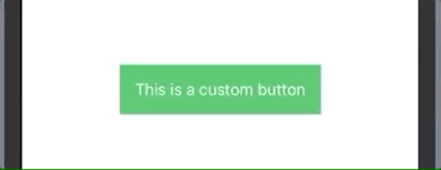
Both will have the same result:
两者将具有相同的结果:

The difference, however, can be seen whenever you have multiple views inside the content:
但是,只要您在内容中具有多个视图,就可以看到区别:
As you can see, in the first button the Image view is left out, but it's still tappable.
如您所见,在第一个按钮中,“ Image视图被省略,但是仍然可以点击。

注意事项 (Some things to keep in mind)
As I noted in my previous article about view modifiers, usually the order matters
paddingshould be (again, usually) put before anything regarding the background or border of the button. Let the button breathe — give it some space. We wouldn't want something like:通常应再次在按钮的背景或边框之前放置
padding。 让按钮呼吸-给它一些空间。 我们不想要这样的东西:

“ ButtonStyle”修饰符 (The ‘ButtonStyle’ Modifier)
There are two types of view modifiers:
有两种类型的视图修饰符:
与“视图”协议捆绑在一起的修饰符,可用于任何视图 (Modifiers bundled with the ‘View’ protocol, available to any view)
Example: padding or background— both of which you can be apply to any view.
示例: padding或background您都可以将其应用于任何视图。
特定于类型的修饰符,仅适用于该类型的实例 (Modifiers specific to a type, available only to instances of that type)
These are used to take advantage of specific traits of that view. And buttons are a perfect example for this. For example, we may want to change the look and feel whenever the user taps on the button.
这些用于利用该视图的特定特征。 按钮就是一个很好的例子。 例如,每当用户点击按钮时,我们可能希望更改外观。
We have ButtonStyle view modifier that accepts a struct that implements the ButtonStyle protocol.
我们拥有ButtonStyle视图修饰符,该修饰符接受实现ButtonStyle协议的struct 。
By default, we have three predefined styles.
默认情况下,我们有三种预定义的样式。

But what if we want to customize our buttons further — like by changing the opacity when the button is pressed?
但是,如果我们想进一步自定义按钮(例如通过在按下按钮时更改不透明度),该怎么办?
That’s where the ButtonStyle protocol comes in.
那就是ButtonStyle协议的用武之地。
构建自己的“ ButtonStyle”修饰符 (Build Your Own ‘ButtonStyle’ Modifier)
As I was stating before, the view modifier specific to buttons gives us access to specific traits. This is done through the Configuration (which is, in fact, a typealias Configuration = ButtonStyleConfiguration).
如前所述,按钮特有的视图修饰符使我们可以访问特定特征。 这是通过Configuration (实际上是typealias Configuration = ButtonStyleConfiguration )完成的。
What we can access are:
我们可以访问的是:
label: The button content as a whole viewlabel:按钮内容整体视图isPressed: a boolean variable that becomestruewhenever the button is pressedisPressed:一个布尔变量,只要按下按钮,该变量就为true
Let’s do a more interesting example: When the button is pressed, scale it down and decrease the opacity to give it a highlight effect. And, as a bonus, let’s animate these changes.
让我们做一个更有趣的示例:按下按钮时,将其按比例缩小并减小不透明度以使其具有突出显示效果。 而且,作为奖励,让我们为这些变化添加动画效果。
And the result:
结果:
React Native UI库 (React Native UI libraries)
短篇故事 (Short backstory)
In 2019, I started a sabbatical year and a half from native iOS development. I started to develop mobile apps using React Native as my main job.
在2019年,我从原生iOS开发开始了一个半休假。 我开始使用React Native作为主要工作来开发移动应用程序。
I learned a lot, but what amazed me was the power to quickly prototype apps with existing UI libraries. Where I came from (the native-development world) that wasn’t even a thought.
我学到了很多东西,但是令我惊讶的是使用现有UI库快速对应用程序进行原型制作的能力。 我来自哪里(本地开发世界)根本就没有想法。
What I used back then was Callstack’s React Native Paper (Material Design) and then NativeBase.
那时我使用的是Callstack的React Native Paper(材料设计) ,然后是NativeBase 。
Importing, using, and still being able to customize was mind-blowing to me. I started to understand the power and noise around React Native.
导入,使用并仍然能够自定义对我来说是令人难以置信的。 我开始了解React Native的功能和噪声。
以NativeBase为例 (NativeBase as an Example)
The NativeBase library is made from prebuild components, which help every developer build stuff faster and more consistently across all screens. And buttons aren’t an exception to this.
NativeBase库由预构建组件组成,可帮助每个开发人员在所有屏幕上更快,更一致地构建内容。 而且按钮也不例外。
They offer a long list of props — inputs for the button component that tell it how to look or to behave — like outlined, transparent, bordered, rounded, large, or small.
它们提供了很长的道具列表(用于指示按钮组件外观或行为的按钮组件的输入),例如outlined , transparent , bordered , rounded , large或small 。
No more @IBOutlets. No more subclassing. No more CustomButtons eating another UIButton.
没有更多@IBOutlets 。 没有更多的子类化。 再也没有CustomButton吃掉另一个UIButton 。
Note: I’m aware that in React Native, you end up doing the same thing when implementing your custom styles, but it’s nowhere near as hard using UIKit.
注意:我知道在React Native中,实现自定义样式时最终会做同样的事情,但是使用UIKit却很难。
Fast-forward to today: I’m happy I rediscovered my love of developing beautiful things using SwiftUI.
快速发展到今天:我很高兴重新发现了我对使用SwiftUI开发美丽事物的热爱。
Let’s see how can we develop a themed UI library for our buttons similar to the ones from NativeBase.
让我们看看如何为按钮创建主题UI库,类似于NativeBase的按钮。

创建一个UI库 (Create a UI Library)
Below, I’ll summarize the buttons described based on the NativeBase examples.
下面,我将总结基于NativeBase示例描述的按钮。
种类 (Types)
lightlightprimaryprimarysuccesssuccessinfoinfowarningwarningdangerdangerdarkdark
款式 (Styles)
default(color fill)default(颜色填充)transparenttransparentoutlineoutlinerounded(color fill)rounded(颜色填充)full widthfull width
州 (States)
enabled(default)enabled(默认)disableddisabled
大小 (字体大小) (Sizes (font sizes))
smallsmalldefaultdefaultlargelarge
What I wanted to achieve was to be as close as possible to declaring:
我想要实现的是尽可能地声明:
So it’d be something like this with all the variables in place:
因此,所有的变量都将是这样的:
Now looking at these requirements and the NativeBase examples, we can see there are common traits that describe this UI:
现在查看这些要求和NativeBase示例,我们可以看到描述此UI的共同特征:
foreground color(the text color)foreground color(文本颜色)background colorbackground colorborder color(for outlined buttons)border color(用于概述的按钮)border radius(for both default and rounded buttons)border radius(适用于默认按钮和圆形按钮)border widthborder width
按钮样式配置 (Button-Style Configuration)
So let’s create a protocol called ButtonStyleConfig.
因此,让我们创建一个称为ButtonStyleConfig的协议。
Looking at the designs, we can see most of the buttons don’t have a border and have the same corner radius. As an arbitrary value, I chose 6 for the corner radius.
查看设计,我们可以看到大多数按钮没有边框并且具有相同的拐角半径。 作为一个任意值,我选择6作为拐角半径。
Another thing we can notice is no matter what type of buttons there are, all of them have two colors: a primary and a secondary one.
我们可以注意到的另一件事是,无论按钮的类型是什么,它们都有两种颜色:主按钮和辅助按钮。
For example, for the default success button, we have the primary color green and the secondary color white. In fact, most of them have the secondary color white, so let’s make that the default value.
例如,对于默认的成功按钮,我们的主要颜色为green ,次要颜色为white 。 实际上,大多数颜色都具有white ,因此我们将其设为默认值。
Now, let’s create specific structs that describe each color for each style:
现在,让我们创建描述每种样式的每种颜色的特定结构:
Note: Of course, there are a lot of ways of doing this instead of using structs — like PLIST or JSON files.
注意:当然,有很多方法可以执行此操作而不是使用结构-例如PLIST或JSON文件。
Let’s make the styles easier to use and create an enum for them:
让我们使样式更易于使用,并为它们创建一个枚举:
显示样式 (Display Styles)
Now let’s use an enum to describe the display styles — default, transparent, outline, and rounded — and to specify the button-style configurations by implementing the ButtonStyleConfig protocol.
现在,让我们使用一个枚举来描述显示样式( default , transparent , outline和rounded ,并通过实现ButtonStyleConfig协议来指定按钮样式的配置。
As you can see, having the type returning the primary and secondary colors helps us a lot when switching these for the transparent/outline styles.
如您所见,在将这些颜色切换为transparent / outline样式时,使类型返回原色和辅助色对我们有很大帮助。
Is there something we missed? Oh, yes, the size of the button, which is, in fact, the font size. So we can create a simple enum:
有什么我们想念的吗? 哦,是的,按钮的大小,实际上是字体大小。 因此,我们可以创建一个简单的枚举:
With all these components, we can start creating our custom button styles.
使用所有这些组件,我们可以开始创建我们的自定义按钮样式。
主题按钮 (Theme the Buttons)
Let’s use the CustomButtonStyle we created earlier and add a custom init. Like I described in the previous article, we can pass parameters to our custom view modifier.
让我们使用我们先前创建的CustomButtonStyle并添加一个自定义init。 就像我在上一篇文章中描述的那样,我们可以将参数传递给自定义视图修饰符。
As a subtle touch, I added a shadow component to give the buttons a little depth.
作为一种微妙的触感,我添加了一个阴影组件以使按钮略有深度。
Let’s see it in action:
让我们来看看它的作用:
This is how it looks by default:
.buttonStyle(CustomButtonStyle())默认情况下是这样的:
.buttonStyle(CustomButtonStyle())

CustomButtonStyle(.rounded(type: .success))CustomButtonStyle(.rounded(type: .success))

CustomButtonStyle(.transparent(type: .success)CustomButtonStyle(.transparent(type: .success)

CustomButtonStyle(.outline(type: .success))CustomButtonStyle(.outline(type: .success))
Wait, what? Shouldn’t it be outlined? But where’s the border? Let’s fix it!
等一下 不应该概述吗? 但是边界在哪里? 让我们修复它!
边框 (Borders)
Let’s fix it! We can add the border by adding a RoundedRectangle as an overlay view:
让我们修复它! 我们可以通过添加RoundedRectangle作为覆盖视图来添加边框:
The outlined style is fixed!
概述的样式是固定的!

到目前为止我们取得的成就 (What We’ve Achieved So Far)
Let’s see what we can do so far:
让我们看看到目前为止我们能做些什么:

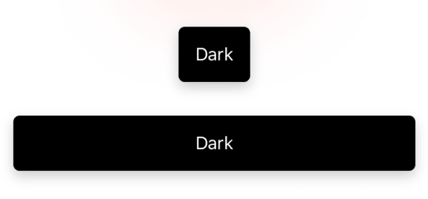
全屏宽度 (Full Width)
Right now, our buttons take the minimum width needed.
现在,我们的按钮采用所需的最小宽度。
But what if we want to use a submit button for our form and want it to take the full width available?
但是,如果我们想对表单使用一个提交按钮,并希望它采用可用的全部宽度怎么办?
怎么样 (How)
To make a view take the full width available, we can use the .frame view modifier, like this:
要使视图采用可用的全部宽度,我们可以使用.frame视图修饰符,如下所示:
.frame(maxWidth: .infinity).
.frame(maxWidth: .infinity) 。
哪里 (Where)
In the previous article, I emphasized that the order of modifiers matters.
在上一篇文章中,我强调了修饰符的顺序很重要。
What we want to achieve isn’t only a full width. We want to make the corners, backgrounds, shadows, and overlays impact the entire view and keep the proportions.
我们想要实现的不仅仅是全宽。 我们要使拐角,背景,阴影和覆盖层影响整个视图并保持比例。
To do that, we need to specify the frame before the background modifier.
为此,我们需要在background修饰符之前指定frame 。
And the result is this:
结果是这样的:

Now, this isn’t something I always want. I’d like to specify through a boolean something like: CustomButtonStyle(.default(type: .dark), isFullWidth: true).
现在,这不是我一直想要的东西。 我想通过一个布尔值来指定: CustomButtonStyle(.default(type: .dark), isFullWidth: true) 。
So specify the flag in the init method, and apply the frame modifier only if it’s true in the makeBody method.
因此,请在init方法中指定该标志,并仅在makeBody方法中为true应用frame修饰符。
If we’re here, let’s create a small custom modifier that’ll make a view to have full width.
如果我们在这里,让我们创建一个小的自定义修饰符,该修饰符将使视图具有全宽。
Unfortunately, at this moment, there isn’t a method to conditionally apply a modifier. But we can create it!
不幸的是,目前还没有一种方法有条件地应用修饰符。 但是我们可以创建它!
In googling this issue, we find this excellent article on view modifiers. There we can find a very useful extension that applies a specified modifier only if the condition is true.
在搜寻此问题时,我们发现了这篇关于视图修饰符的出色文章 。 在那里,我们可以找到一个非常有用的扩展,该扩展仅在条件为true时才应用指定的修饰符。
Now we have all the building blocks we need:
现在,我们有了所需的所有构造块:
As an example of usage, let’s see it applied to the same button:
作为用法的示例,让我们看看将其应用于相同的按钮:
疯狂的动画 (Crazy Animations)
As you can see, the only way we indicate the buttons are pressed is through a highlight effect: .opacity(configuration.isPressed ? 0.7 : 1).
如您所见,指示按钮被按下的唯一方法是突出显示效果: .opacity(configuration.isPressed ? 0.7 : 1) 。
Let’s add back the scaleEffect modifier, but this time, change the animation effect to make it bounce. And to make it even crazier, let’s change the radius when it’s pressed:
让我们重新添加scaleEffect修改器,但是这次更改动画效果以使其反弹。 为了使它更加疯狂,让我们在按下时更改半径:
Voilà!
瞧!

Do we really need that in a real-life scenario? Probably not, but we need to animate our lives sometimes.
在现实生活中,我们真的需要吗? 可能不是,但有时我们需要使我们的生活充满活力。
恭喜你! (Congratulations!)
You made it this far, and the reward is your own button-component library that’s easy to extend and customize. For example, what you can do is enhance the button component to support loading states, display a spinner, or make the button untappable.
您已经做到了这一点,而所获得的奖励是您自己的易于扩展和自定义的按钮组件库。 例如,您可以做的是增强按钮组件以支持加载状态,显示微调器或使按钮不可应用。


 扫一扫
扫一扫
 461
461

 被折叠的 条评论
为什么被折叠?
被折叠的 条评论
为什么被折叠?
 到【灌水乐园】发言


