


Long live the King: UIKit is not yet dead, and creating greatUICollectionView layouts is certinly part of that.
King:万岁: UIKit尚未消亡,而创建出色的UICollectionView布局无疑是其中的一部分。
Here I’m going to re-create the App Store using Compositional Layouts. Oh, and DiffableDataSource. This is going to be ace!
在这里,我将使用合成布局重新创建App Store。 哦,还有DiffableDataSource 。 这将是王牌!
Difficulty: Beginner | Easy | Normal | Challenging
难度:初学者| 容易| 普通 | 具有挑战性的
This article has been developed using Xcode 11.4.1, and Swift 5.2.2
本文是使用Xcode 11.4.1和Swift 5.2.2开发的。
先决条件: (Prerequisites:)
You will be expected to create a Single View Application and be comfortable with UICollectionView
您将被期望创建一个Single View Application,并熟悉UICollectionView
术语: (Terminology:)
UICollectionViewCell: The on-screen cell for the UICollectionView type
UICollectionViewCell:UICollectionView类型的屏幕单元格
UICollectionView: An object that manages an ordered collection of data items and presents them using customizable layouts
UICollectionView:一个对象,该对象管理数据项的有序集合,并使用可自定义的布局显示它们
该方法 (The Approach)
UICollectionFlowLayout is great and is a concrete Layout given to you for use creating your Apps. But what if you want to create a more complex layout (the App Store layout is an often-chosen example of this) including multiple scrolling sections you’re likely to run into a problem (or two). In steps *Compositional Layouts* to help you with just that.
UICollectionFlowLayout很棒,它是给您的具体布局,可用于创建您的Apps。 但是,如果您想创建一个更复杂的布局(App Store布局是这种情况的一个经常选择的示例),它会包含多个滚动部分,那么您可能会遇到一个(或两个)问题。 分步* 构图 *可以帮助您。
*Compositional Layouts* are a peer of UICollectionFlowLayout so we can take the theory we already know from that layout here — Composition instead of subclassing.
* 合成布局 *是UICollectionFlowLayout的同级UICollectionFlowLayout因此我们可以采用此处已经从该布局中了解的理论-合成而不是子类化。
So UICollectionViewCompositionalLayout has Groups that allow different layouts within a section in a UICollectionView.
所以UICollectionViewCompositionalLayout有Groups允许在一个区间内不同的布局UICollectionView 。
排版布局的类 (The classes for compositional layouts)
NSCollectionLayoutSize The size
NSCollectionLayoutSize的大小
NSCollectionLayoutItem The cell that is rendered on screen
NSCollectionLayoutItem在屏幕上呈现的单元格
NSCollectionLayoutGroup The group that contains the NSCollectionLayoutItem
NSCollectionLayoutGroup包含组NSCollectionLayoutItem
NSCollectionLayoutSection Sections compose composational layouts
NSCollectionLayoutSection节组成组合布局
可扩散数据源 (Diffable data source)
The data source for this solution is a DiffableDataSource (sorry for those not familiar with this). However since UITableViewDataSource replaced by DiffableDataSource this is a more declarative way of using the UICollectionView API.
此解决方案的数据源是DiffableDataSource (对不熟悉此方法的DiffableDataSource感到抱歉)。 但是,由于将UITableViewDataSource替换为DiffableDataSource这是使用UICollectionView API的更具声明性的方式。
Diffable data source uses NSDiffableDataSourceSnapshot and sections are appended to it before the result is rendered to the screen. The UICollectionViewDiffableDataSource itseld allows you to render the cells for the UICollectionView. There is a full guide for DiffableDataSource that you can peruse.
可扩散数据源使用NSDiffableDataSourceSnapshot并在将结果呈现到屏幕之前将节附加到该数据源。 UICollectionViewDiffableDataSource字段允许您渲染UICollectionView的单元格。 您可以仔细阅读DiffableDataSource的完整指南。
You’ll see how these are used, right below!
您将在下面看到如何使用它们!
代码 (The code)
The UIViewController where I have placed the code for the Apps page is in AppsCompositionalLayout.swift in the repo.
我在其中放置了“ 应用程序”页面代码的UIViewController在repo的 AppsCompositionalLayout.swift中。
在导航栏上放置一个按钮 (Placing a button on the navigation bar)
An initial issue with creating this — the large navbar title disappears when the user scrolls, and the profile image slides up.
创建此文件的最初问题-用户导航时大导航栏标题消失,个人资料图像向上滑动。
Know what I mean? Here is the animated GIF:
明白我的意思了吗? 这是动画GIF:
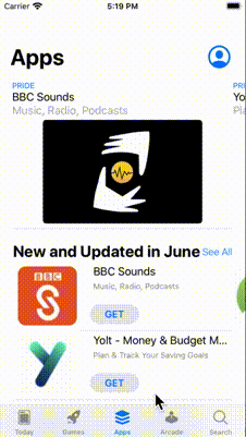
This is using SF Symbols (so UIImage(systemName: “person.crop.circle”) works) to provide the icon on the top right hand corner.
这是使用SF符号(因此UIImage(systemName: “person.crop.circle”)起作用)在右上角提供图标。
My approach has been to create a function to setupNavBar() as an extension on the relevant view controller. The icon is then pinned to the UILabel so it can slide nicely.
我的方法是创建一个函数setupNavBar()作为相关视图控制器上的扩展。 然后将图标固定到UILabel以便可以很好地滑动。
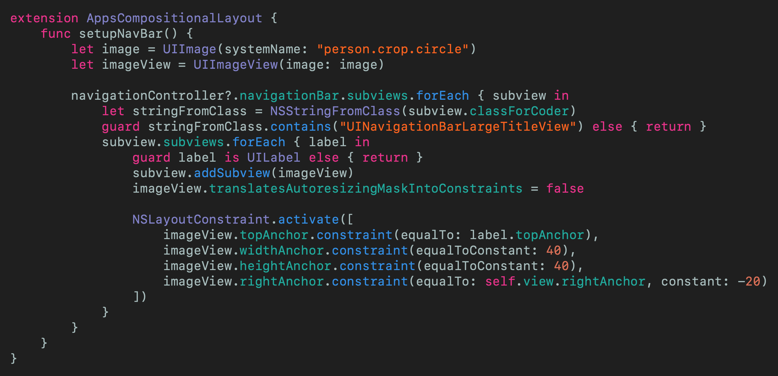
In the repo I’ve named this rather attractively as AppsCompositionalLayout-setupNavBar.swift, for your convenience.
为了方便起见,在存储库中,我将其命名为AppsCompositionalLayout-setupNavBar.swift 。
栏目 (Sections)
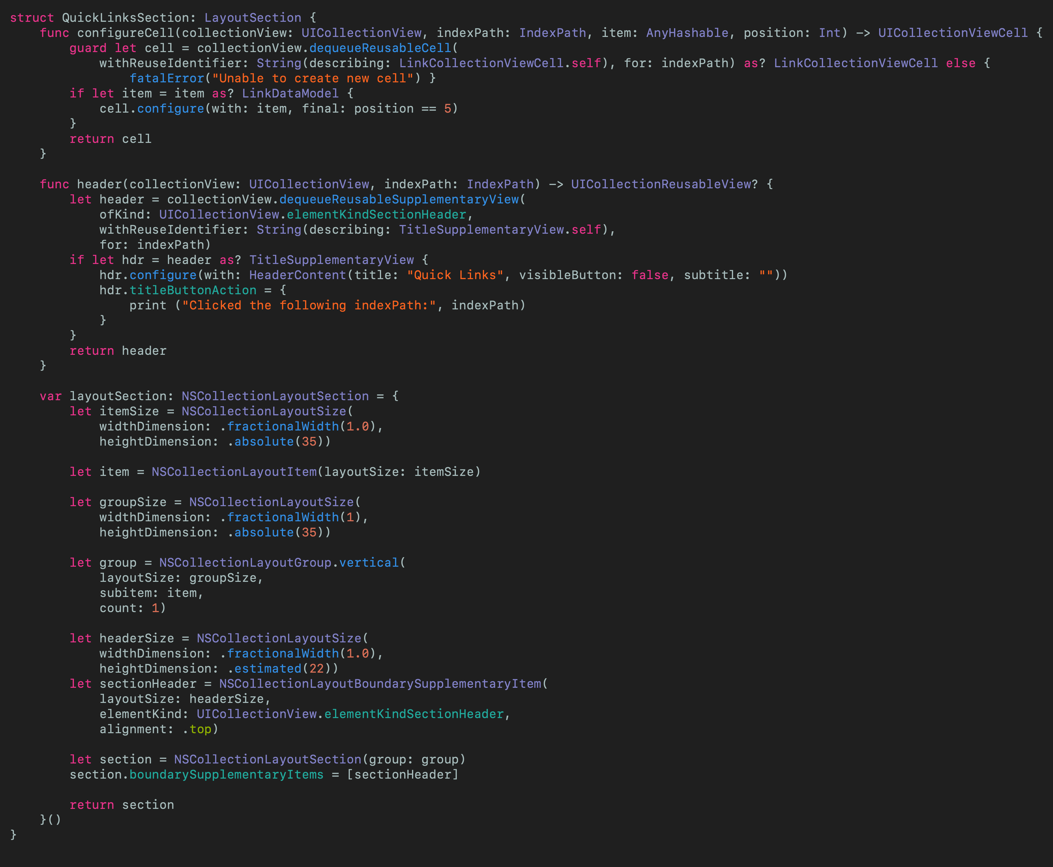
I’ve created a protocol called LayoutSection that each section of my little App store will conform to. By section I mean in the following image there are two sections — the red section is FeatureSection and the purple section is NewUpdatedSection
我创建了一个名为LayoutSection的protocol ,我的小App Store的每个部分都将遵循该protocol 。 通过部分,我的意思是在下图中有两个部分-红色部分是FeatureSection ,紫色部分是NewUpdatedSection

So each of these conforms to the protocol as shown here:
因此,这些都符合如下所示的protocol :

Which announces that anything conforming to the protocol means it must return an NSCollectionLayoutSection which will inform the UICollectionViewCompositionalLayout which layout is going to be used (it will be called from the view controller, more on that later). If a particular LayoutSection does not have a header the protocol extension will return nil — and we don’t have to declare the header function to conform to the protocol.
它宣布符合协议的所有内容意味着它必须返回一个NSCollectionLayoutSection ,它将通知UICollectionViewCompositionalLayout将要使用的布局(它将在视图控制器中调用,稍后再介绍)。 如果特定的LayoutSection没有标题,则protocol extension名将返回nil,并且我们不必声明header函数以符合protocol 。
Now I have 7 sections that conform to this protocol, and of course they are all available in the repo that I really recommend you download.
现在,我有7个符合该protocol部分,当然,它们都可以在我真的建议您下载的回购中找到。
Within AppsCompositionalLayout.swift an enum has been defined to indicate these 7 sections
在AppsCompositionalLayout.swift ,已定义一个enum以指示这7个部分

which are then placed in a lazy var which also derives the order of the sections
然后将其放置在lazy var ,该变量也可以得出各节的顺序

Let us see how an individual LayoutSection can be created, as shown in the code snippet below:
让我们看看如何创建一个单独的LayoutSection ,如下面的代码片段所示:

This is a practical example (yes!) of formulating the section.
这是制定该部分的实际示例(是!)。
But what of the other sections? Some of these need headers and footers. These conform to UICollectionReusableView but look much like any UIView I’ve made this reusable so it is quite long for something that appears to create just a title as a heading. Take a look at the repo for details — The file name is TitleSupplementaryView.swift (but you must remember to register it like a UICollectionViewCell.
但是其他部分呢? 其中一些需要页眉和页脚。 它们符合UICollectionReusableView但与我使它可重用的任何UIView都非常相似,因此对于似乎只创建标题作为标题的东西来说,它已经相当长了。 查看回购的详细信息-文件名为TitleSupplementaryView.swift (但您必须记住要像UICollectionViewCell一样注册它。
Notice here we declare the estimated height of the header — included in the layout size.
请注意,这里我们声明了标头的估计高度-包括在布局大小中。
数据源 (The datasource)
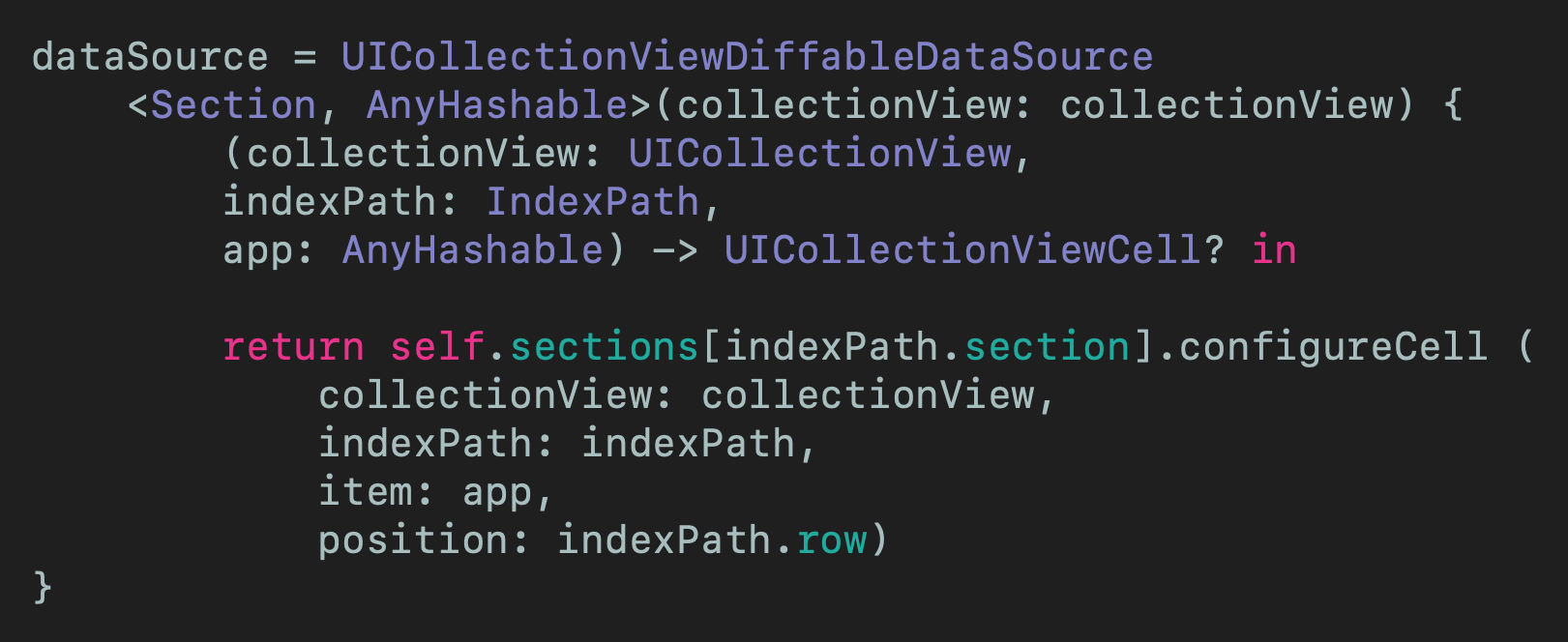
The UICollectionViewDiffableDataSource leverages the sections enum defined, and the Sections protocol that allows us to configure each cell for the relevant index path. The use of AnyHashable is covered in the why why why section below!
UICollectionViewDiffableDataSource利用定义的部分enum以及允许我们为相关索引路径配置每个单元的Sections protocol 。 下面的“为什么为什么为什么”部分介绍了AnyHashable的使用!
配置头 (Configuring the header)
The header is a property of the dataSource, as in this example we can return the appropriate header for each Section that is available from the enum here featured in the relevant UIViewController. I did put this into a function that is called in viewDidLoad()
标头是dataSource的属性,在本示例中,我们可以为每个Section返回相应的标头,这些标头可从相关UIViewController的enum中获得。 我确实将其放入了在viewDidLoad()调用的函数中

快照 (The snapshot)
Once the header has been set up (this, one again, has been performed in viewDidLoad()). As you can see a snapshot has been set up and each Section is appended to to it — before being applied to the dataSource.
设置标头后(再次在viewDidLoad()执行此操作)。 如您所见,在将快照应用于dataSource之前,已经设置了快照并将每个Section附加到快照。

细胞 (Cells)
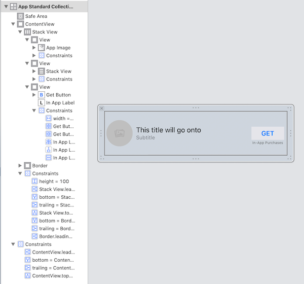
I’d put the UICollectionViewCell instances in the pot as “nothing interesting”. I have created some programatically with constraints, and raised others from the xib file.
我将UICollectionViewCell实例放入锅中作为“没什么有趣的事”。 我以编程方式创建了一些带有约束的文件,并从xib文件中提出了其他文件。
This isn’t the focus of this article, but to save everyone having to download from the repo here is how I created the standard App Cell:
这不是本文的重点,但是为了节省每个人都必须从仓库下载的内容,这是我创建标准App Cell的方式:
with the code (including a closure for clicking on the button of the cell).
代码(包括用于单击单元格按钮的闭包)。
Oh, the cell modifies it’s own size so needs func preferredLayoutAttributesFitting(_ layoutAttributes: UICollectionViewLayoutAttributes) -> UICollectionViewLayoutAttributes in the .swift file.
哦,单元格会修改它自己的大小,因此需要在.swift文件中使用func preferredLayoutAttributesFitting(_ layoutAttributes: UICollectionViewLayoutAttributes) -> UICollectionViewLayoutAttributes .swift 。

为什么为什么为什么 (WHY WHY WHY)
This is an article rather than production code. I developed this for an iPhone SE, and some of the padding for the Layout is absolute no matter the size of the device — this is something that should be thought about if you are thinking of doing something like this for production code.
这是一篇文章,而不是生产代码。 我是为iPhone SE开发的,无论设备的大小如何, Layout某些填充都是绝对的-如果您正在考虑为生产代码执行此类操作,则应考虑这一点。
AnyHashable has been chosen for the type in the snapshot and datasource: var dataSource: UICollectionViewDiffableDataSource<Section, AnyHashable>! . Now usually instead of choosing AnyHashable it would be pertinent to choose the model type of the data being displayed. However, in this case I have used AnyHashable to be able to display any type of data in the cells (so display both single links and the more complex App types). Would you use AnyHashable in production code? Probably not, and might come up with a protocol that all the display types could conform to. In this case, however, it is probably easier to read and understand AnyHashable for beginners. You can should me on Twitter any time you’d like.
已为快照和数据源中的类型选择了AnyHashable : var dataSource: UICollectionViewDiffableDataSource<Section, AnyHashable>! 。 现在通常不用选择AnyHashable ,而是选择要显示的数据的模型类型。 但是,在这种情况下,我已经使用AnyHashable来显示单元格中的任何类型的数据(因此既显示单个链接又显示更复杂的App类型)。 您会在生产代码中使用AnyHashable吗? 可能不是,并且可能会提出所有显示类型都可以遵循的protocol 。 但是,在这种情况下,对于初学者来说,阅读和理解AnyHashable可能会更容易。 你可以要我的Twitter的任何时候你想。
Oh, and I didn’t implement all of the buttons one each cell (or on the UINavigationBar), but indicated how that might be done with the closures on one or two of the cells.
哦,我并没有实现所有的按钮各一个单元格(或上的UINavigationBar ),但表示怎么可能与关闭一个或两个细胞来完成。
Yes, the way I’ve created the data to be displayed makes me feel sick. It will make you feel sick to. In real life this will come from an API and be decoded in Swift.
是的,我创建要显示的数据的方式让我感到恶心。 这会让您感到恶心。 在现实生活中,这将来自API,并在Swift中进行解码 。
These in totality would be a great extension to this, as would producing all of the other tabs of the project — perhaps someone wants to help me out with this (or not!)
总的来说,这将是对它的一个很好的扩展,将产生该项目的所有其他选项卡-也许有人想帮我解决这个问题(或者不是!)
结论 (Conclusion)
This article uses UICollectionViewDiffableDataSource AND UICollectionViewDiffableDataSource to create a clone of the Apple App Store. This has given a good opportunity to use features of iOS13 in quite a creative way.
本文使用UICollectionViewDiffableDataSource和UICollectionViewDiffableDataSource创建Apple App Store的副本。 这提供了一个很好的机会来以创新的方式使用iOS13的功能。
What really surprised me is my main UIViewController AppsCompositionalLayout is so small — there is a great separation of concerns here and this is a really easy project to debug and add to.
真正令我惊讶的是我的主UIViewController AppsCompositionalLayout是如此之小-这里的关注点分离很大,这是一个非常容易调试和添加的项目。
Isn’t this what we are all looking for when we produce software? This is why these APIs are so nice and we should think about incorporating them into a project. At least consider it, and having this type of example will only help us all (I hope).
这不是我们在生产软件时都在寻找的东西吗? 这就是为什么这些API如此好,我们应该考虑将它们合并到项目中的原因。 至少考虑一下,拥有这样的例子只会对我们所有人有帮助(我希望)。
I hope this article has been of use to you, and that you have enjoyed reading it.
希望本文对您有所帮助,并且您喜欢阅读它。
The code from this is included in the attached Repo.
此代码包含在随附的Repo中 。
If you’ve any questions, comments or suggestions please hit me up on Twitter
如果您有任何疑问,意见或建议,请在Twitter上打我


 1525
1525

 被折叠的 条评论
为什么被折叠?
被折叠的 条评论
为什么被折叠?
 到【灌水乐园】发言


