


I had a lot of fun when explore the new API so I decided to make a post to share with you guys what I’ve learned. Let’s get started.
在探索新的API时,我玩得很开心,所以我决定发表一篇文章,与大家分享我所学到的东西。 让我们开始吧。
无聊的介绍(但值得阅读) (A boring introduction (but it’s worth to read))
Compositional Layout has been introduced in WWDC 2019 event which contains a lot of power that helps developer build more complex collection layout but much less code.
合成布局已在WWDC 2019活动中引入,它包含许多功能,可帮助开发人员构建更复杂的集合布局,但代码更少。
On the one hand, if you just need a simple layout like a collection of identical items UICollectionViewFlowLayout is the best candidate for the job, it’s simple, it’s easy to implement. On the other hand, if you need more complex layout (I think most of the app nowadays), before Compositional Layouts you’ll need to create your own custom layout by subclass a bunch of classes, calculate rows, cells and stuff which is not easy to implement.
一方面,如果您只需要简单的布局(例如相同项目的集合),则UICollectionViewFlowLayout是该工作的最佳人选,它很简单,很容易实现。 另一方面,如果您需要更复杂的布局(我认为是当今的大多数应用程序),那么在“合成布局”之前,您需要通过子类化一堆类来创建自己的自定义布局,计算行,单元格和其他东西易于实现。
But Compositional Layout come to save. Now it becomes much easier to us to build whatever layout we wanted. Only thing I’m very sorry to say is it only support iOS 13.0 or above.
但是合成版面可以节省下来。 现在,我们可以轻松地构建所需的布局。 我很抱歉只能说它仅支持iOS 13.0或更高版本。
Advantages:
优点 :
- Composable 可组合
- Flexible 灵活
- Fast 快速
缺点: (Disadvantages:)
- Only support iOS13.0 or above. 仅支持iOS13.0或更高版本。
Now let take a look under the hood to better understand how it works.
现在,让我们来了解一下它的工作原理。
布局:幕后花絮 (Compositional Layouts: Under the Hood)
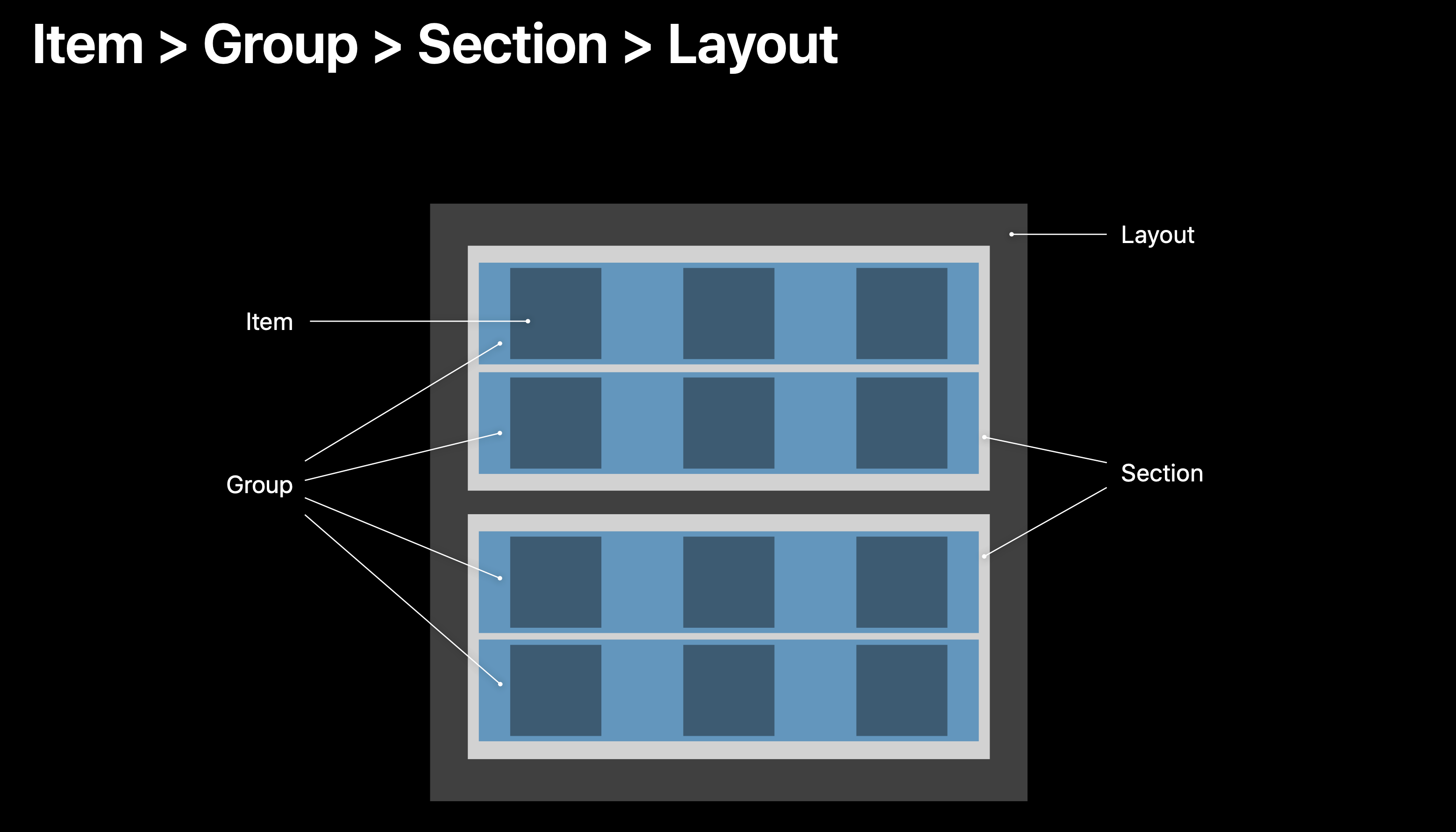
Compositional Layout compose small layout groups together as you can see in the photo above. A layout consists of sections. Each section consists of groups, every group consists of items .
如上图所示,合成版面组成小的版面组。 布局由多个sections组成。 每一部分都包括的groups ,每个组由items 。
核心概念 (Core Concepts)
To build any compositional layout, the following four classes need to be implemented:
要构建任何布局,都需要实现以下四个类:
NSCollectionLayoutSize— The width and height dimensions are of the typeNSCollectionLayoutDimensionwhich can be defined by setting the fractional width/height of the layout (percentage relative to its container), or by setting the absolute or estimated sizes.NSCollectionLayoutSize—宽度和高度尺寸为NSCollectionLayoutDimension类型,可以通过设置布局的宽度的宽度/高度(相对于其容器的百分比)或设置绝对或估计的尺寸来定义。NSCollectionLayoutItem— This is your layout’s cell that renders on the screen based on the size.NSCollectionLayoutItem—这是基于大小在屏幕上呈现的布局的单元格。NSCollectionLayoutGroup— It holds theNSCollectionLayoutItemin either horizontal, vertical, or custom forms.NSCollectionLayoutGroup—它以水平,垂直或自定义形式保存NSCollectionLayoutItem。NSCollectionLayoutSection— This is used to initialize the section by passing along theNSCollectionLayoutGroup.Sections eventually compose the compositional layouts.NSCollectionLayoutSection—用于通过传递NSCollectionLayoutGroup.来初始化部分NSCollectionLayoutGroup.各节最终构成了构图。
Notice that all the classes above have prefix NS not UI. That’s because the new API is universal API which can be use not just on iOS but MacOS, WatchOS, iPadOS.
请注意,以上所有类的前缀都是NS而不是UI 。 这是因为新的API是通用API,不仅可以在iOS上使用,而且可以在MacOS,WatchOS和iPadOS上使用。
有趣的实施代码 (Interesting Implementation Code)
水平分页布局 (Horizontal paging layout)
Take a look at the snippet of code bellow :
看看下面的代码片段:
init(){ let layout = UICollectionViewCompositionalLayout { (section, env) -> NSCollectionLayoutSection? in // 1 let item = NSCollectionLayoutItem(layoutSize: .init(widthDimension: .fractionalWidth(1.0), heightDimension: .absolute(200))) // 2 let group = NSCollectionLayoutGroup.horizontal(layoutSize: NSCollectionLayoutSize(widthDimension: .fractionalWidth(1.0), heightDimension: .absolute(200)), subitems: [item]) // 3 let section = NSCollectionLayoutSection(group: group) return section } super.init(collectionViewLayout: layout) }1. Declare item with size.
fractionalWidth(1.0)means items will take up full width of its container which is the group.absolute(200)means items are 200 point height.1.声明尺寸的物品。
fractionalWidth(1.0)表示项目将占据其容器(即组)的整个宽度。absolute(200)表示项的高度为200。2. The group will take up full width of the section and 200p height. It holds a list of items and because we want to build a horizontal list of item so we use
horizontalclass function.2.组将占用部分的整个宽度和200p的高度。 它包含一个项目列表,并且因为我们要构建项目的水平列表,所以我们使用
horizontal类功能。- 3. Lastly, we initialize section contain the group created above. 3.最后,我们初始化部分包含上面创建的组。
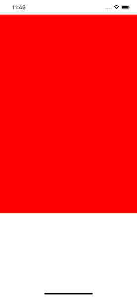
Just few lines of code. Everything seem correct but if you run your application, this is what we got:
只需几行代码。 一切似乎都正确,但是如果您运行应用程序,这就是我们得到的:
It’s a bit hard to see, so add this line of code bellow the line we declare item
很难看,所以在下面的代码行中添加我们声明项目的行
item.contentInsets = .init(top: 10, leading: 10, bottom: 10, trailing: 10)Run your application again:
再次运行您的应用程序:
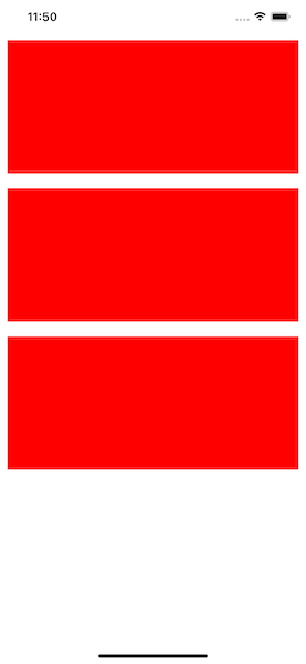
Uhm… It layouts vertically instead of horizontally, why is that ? Behind the scene the section create 3 group instead of one. Each row you see on your screen is a group, and each group contains an item. That’s because section always try to keep items inside its frame by default. To tell section scroll horizontally we need to add this line of code bellow where you declare section:
嗯……它是垂直布置,而不是水平布置,为什么? 在幕后,该section创建3组而不是一组。 您在屏幕上看到的每一行都是一个组,每个组都包含一个项目。 这是因为section默认情况下总是尝试将项目保留在其框架内。 为了告诉section滚动,我们需要在声明横断面的地方添加以下代码行:
section.orthogonalScrollingBehavior = .continuousRun your application, now we got what we expected:
运行您的应用程序,现在我们得到了预期的结果:
结论 (Conclusion)
This article is a bit long so I decided to split it into multiple parts, we’ll build a really interesting layout in the next part. So if you want to get more about don’t forget to follow me 😉 (and sorry for my poor english).
本文有点长,所以我决定将其分为多个部分,我们将在下一部分中构建一个非常有趣的布局。 因此,如果您想了解更多信息,请别忘了跟我来(对不起我的英语不好)。
Compositional Layout is a very powerful API. I’m very glad that it’s been released. Throughout this introduction article I hope you guys enjoy it and understand the basic concept of how Compositional Layout works. See you in the next part.
合成布局是一个非常强大的API。 我很高兴它已经发布。 我希望在本入门文章中,大家喜欢它并了解“合成版面”工作原理的基本概念。 下一部分见。
了解更多和参考 (Learn more & References)
翻译自: https://medium.com/@tungvuduc2805/compositional-layout-in-uicollectionview-432f942249b6


 604
604

 被折叠的 条评论
为什么被折叠?
被折叠的 条评论
为什么被折叠?
 到【灌水乐园】发言


