


数据可视化 信息可视化
Data visualizations can be a tricky thing. You want your data to shine, but most programming languages (including the Wolfram Language) provide a very basic look to their default visualizations. The process of dressing up a visualization to maximize its appeal is usually one of trial and error. This story explores how to make an appealing visualization using a few tips and tricks to make things easy.
数据可视化可能是一件棘手的事情。 您希望数据发光,但是大多数编程语言(包括Wolfram语言)为它们的默认可视化提供了非常基本的外观。 修饰可视化效果以使其吸引力最大化的过程通常是反复试验之一。 本故事探讨了如何使用一些使操作变得简单的技巧来进行有吸引力的可视化。
Let’s start off with the simplest plot of them all, a simple sin(x) plot where x spans the range from zero to 2π:
让我们从它们中最简单的图开始,一个简单的sin(x)图,其中x跨越从零到2π的范围:
Plot[ Sin[x], {x,0,Pi} ]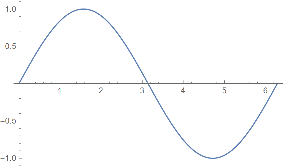
Clearly this is a useful and effective rendering of a sine plot, but it is a bit bare. Adding a frame, labels, and filling provide context to the visualization and helps the viewer with interpreting what is important:
显然,这是正弦图的有用且有效的渲染,但是有点裸露。 添加框架,标签和填充可为可视化提供上下文,并帮助查看者解释重要内容:
Plot[Sin[x], {x, 0, 2 Pi},
 Frame -> True, Filling -> Axis,
 PlotLabel -> "f(x) = sin(x)", FrameLabel -> {"x", "sin(x)"}]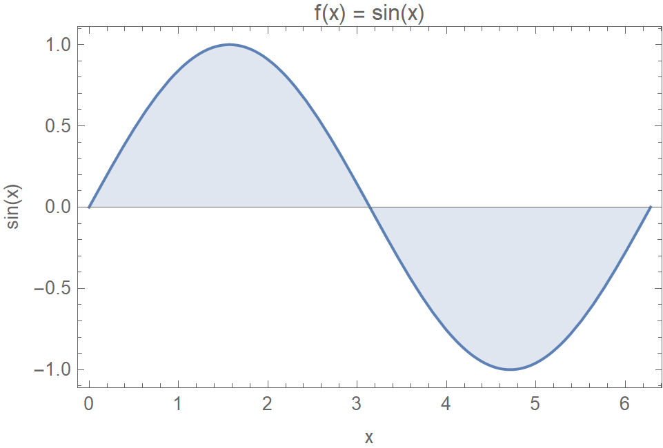
Finally adding gridlines and a change of colors give the plot a custom look and make it easy to embed in online dashboards with a given style:
最后添加网格线并更改颜色,使图具有自定义外观,并易于以给定样式嵌入在线仪表板中:
Plot[Sin[x], {x, 0, 2 Pi},
 Frame -> True, Filling -> Axis,
 PlotLabel -> "f(x) = sin(x)", FrameLabel -> {"x", "sin(x)"},
 GridLines -> Automatic, Background -> Black, PlotStyle -> Orange]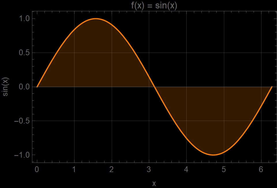
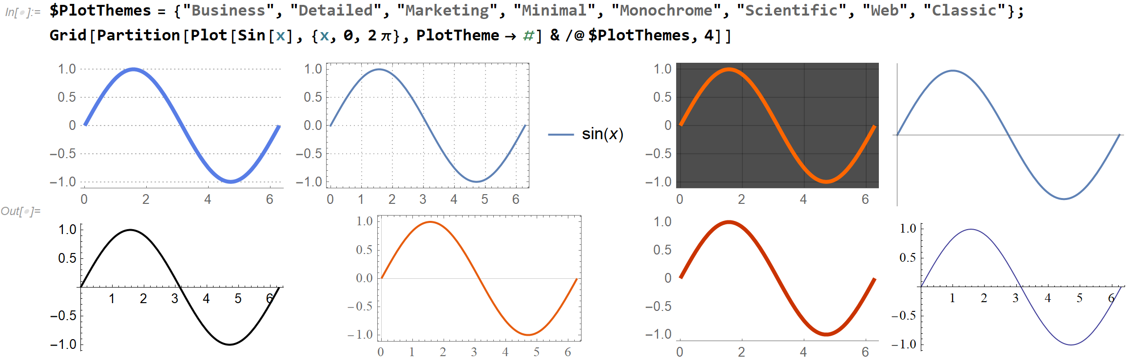
To make this even easier, the Wolfram Language comes preloaded with eight themes. Each theme has a unique set of appearance settings to create common styles of plots:
为了使之更加容易,Wolfram语言预载了八个主题。 每个主题都有一组独特的外观设置,以创建常见的绘图样式:
Let’s take this a few more steps further and work with an actual dataset. I am using the Wolfram Data Repository to select one. This repository has over 800 datasets that have been contributed by Wolfram and its user community. I picked a very nice dataset called “Hadley Center Central England Temperature (HadCET)”:
让我们再进一步一些步骤,并使用实际的数据集。 我正在使用Wolfram数据存储库来选择一个。 该存储库拥有Wolfram及其用户社区提供的800多个数据集。 我选择了一个非常不错的数据集,称为“英格兰中部哈德利中心温度(HadCET)”:
You can get this dataset by simply referring to its name. To reduce jitteriness in the plot, I run the data through a moving average computation:
您只需引用其名称即可获得此数据集。 为了减少绘图中的抖动,我通过移动平均值计算来运行数据:
data = ResourceData["Hadley Center Central England Temperature (HadCET) Dataset"];
data = MovingAverage[data, Quantity[5, "Years"]]
The result is a TimeSeries object, which can be used directly with visualization functions such as DateListPlot:
结果是一个TimeSeries对象,可以直接与可视化功能(如DateListPlot)一起使用:

As before with Plot, the basic DateListPlot is very simple:
与之前的Plot一样,基本的DateListPlot非常简单:
DateListPlot[data]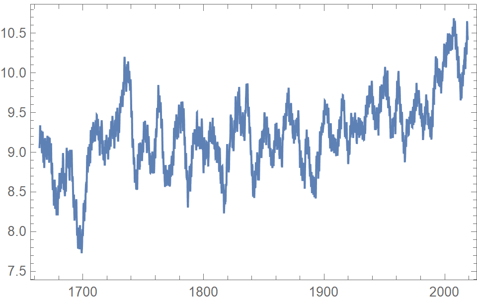
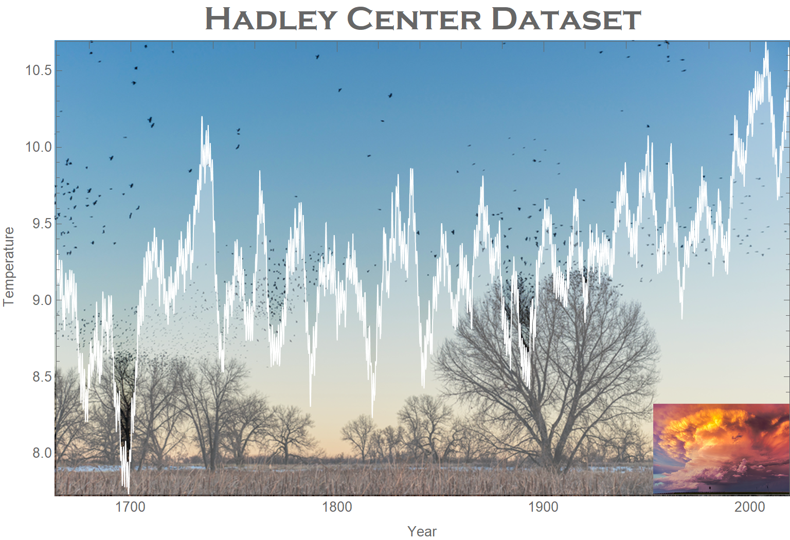
We can add the same stylings as we did before with the sine plot, but there are two more interesting options called Prolog and Epilog. The Prolog option lets you insert graphics primitives (lines, polygons, images) after the axes and frames are rendered but before the data is drawn. The Epilog option lets you draw final graphics primitives that sit on top of everything else including the data layer.
我们可以添加与以前使用正弦图相同的样式,但是还有两个更有趣的选项,称为Prolog和Epilog 。 Prolog选项可让您在绘制轴和框架之后但在绘制数据之前插入图形基元(线,多边形,图像)。 Epilog选项使您可以绘制最终的图形基元,这些基元位于包括数据层在内的所有其他事物之上。
DateListPlot[data,
 PlotStyle -> {White, AbsoluteThickness[1]},
 Prolog -> Inset[image1, Center, Center, Scaled[{1.2, 1.2}]],
 Epilog -> Inset[image2, Scaled[{1, 0}], {Right, Bottom}, Scaled[{0.2, 0.2}]],
 Filling -> Axis,
 FillingStyle -> Opacity[.3],
 PlotLabel -> Style["Hadley Center Dataset", Bold, 24, FontFamily -> "Copperplate Gothic"],
 FrameLabel -> {"Year", "Temperature"},
 PlotRangePadding -> None
]
Here image1 and image2 are:
这里的image1和image2是:

The resulting plot shows the various layers:
结果图显示了各个层:
It’s that easy! For more details on all the Wolfram Language data visualization functions, check out this guide page in the reference documentation.
翻译自: https://towardsdatascience.com/dressing-up-your-data-visualization-da7b41b15c6f
数据可视化 信息可视化


 被折叠的 条评论
为什么被折叠?
被折叠的 条评论
为什么被折叠?
 到【灌水乐园】发言


