


数据可视化 颜色 映射


数据分析+应用色彩理论 (DATA ANALYSIS + APPLIED COLOR THEORY)
The objective of data visualization is to communicate hidden patterns uncovered during analysis. And while a visualization must look aesthetically appealing, its primary objective is not to ‘look pretty’.
数据可视化的目的是传达在分析过程中发现的隐藏模式。 尽管可视化必须在美学上看起来很吸引人,但其主要目的不是“看起来很漂亮”。
Use of color in visualisation should be to help disseminate key findings and not to chase some artistic endeavor
在可视化中使用颜色应有助于传播关键发现,而不是追求某些艺术上的努力
颜色越多,效果越好 (More is not better when it comes to color)
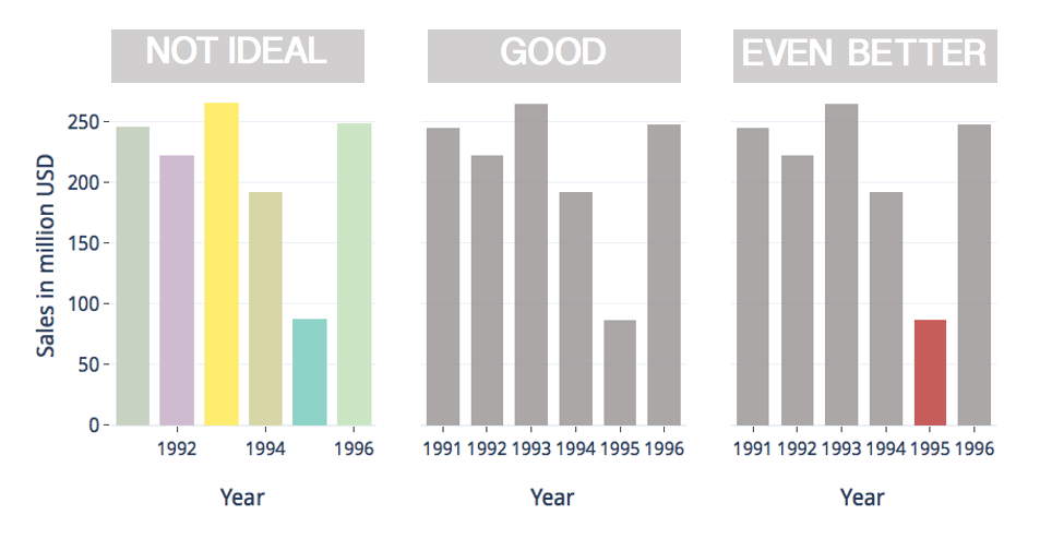
Use of color must be carefully strategized to communicate key findings and this decision, therefore, cannot be left for automated algorithms to make. Most data should be in neutral colors like grey with bright colors reserved for directing attention to significant or atypical data points.
必须仔细计划使用颜色的方式以传达关键发现,因此,不能将这一决定留给自动化算法来制定。 大多数数据应为中性色(如灰色),并保留明亮的颜色,以便将注意力转移到重要或非典型的数据点上。
颜色可以帮助对相关数据点进行分组 (Colour can help to group related data points)
Color can be used to group data points of similar value and to render the extent of this similarity using the following two color palettes :
可以使用以下两个调色板使用颜色将相似值的数据点分组并渲染这种相似程度:

A sequential color palettes is composed of varying intensities of a single hue of color at uniform saturation. Variability in luminance of adjacent colors corresponds to the variation in data values that they are used to render.
顺序彩色调色板 由在均匀的饱和度变化的颜色的单一色调的强度。 相邻颜色的亮度变化与它们用于渲染的数据值的变化相对应。
 最低0.47元/天 解锁文章


 123
123

 被折叠的 条评论
为什么被折叠?
被折叠的 条评论
为什么被折叠?
 到【灌水乐园】发言


