


c# 浮动图标展开
Earlier I wrote about what the Expandable Floating Action Button is (henceforth ExpandableFab) and why you should be using it in your Android applications.
早些时候,我写了什么是Expandable Floating Action Button (此后称为ExpandableFab ),以及为什么要在Android应用程序中使用它。
In this article we’ll cut through the marketing fluff and dig right into how you as a developer/designer can actually use the ExpandableFab and customize it to your (and your user’s) needs.
在本文中,我们将简要介绍营销方面的内容,并深入研究您作为开发人员/设计人员如何实际使用ExpandableFab并根据您(和您的用户)的需求对其进行自定义。
Follow along using the example app on the library’s GitHub repo, or pull it into your own project using:
继续使用库的GitHub存储库上的示例应用程序,或使用以下方法将其拉入您自己的项目中:
Gradle: implementation 'com.nambimobile.widgets:expandable-fab:X.X.X'
Gradle : implementation 'com.nambimobile.widgets:expandable-fab:XXX'
or Maven:
或Maven :
<dependency>
  <groupId>com.nambimobile.widgets</groupId>
  <artifactId>expandable-fab</artifactId>
  <version>X.X.X</version>
  <type>aar</type>
</dependency>Note: replace X.X.X with the latest version seen on our GitHub or in Maven Central’s release repo.
ñOTE:替换XXX与上看到的最新版本,我们的GitHub或Maven的中央的发布回购。
ExpandableFabLayout (ExpandableFabLayout)
All components of the ExpandableFab widget must be wrapped in an ExpandableFabLayout element. This element is just your typical ViewGroup (specifically, it extends from CoordinatorLayout), so you can have it as the root element of your layout, or just as a child. It controls the bulk of the widget’s functionality, from coordinating opening and closing animations to handling screen orientation changes and more.
ExpandableFab小部件的所有组件必须包装在ExpandableFabLayout元素中。 该元素只是典型的ViewGroup (具体来说,它是从CoordinatorLayout扩展的),因此您可以将其作为布局的根元素,也可以作为子元素。 它控制着小部件的大部分功能,从协调打开和关闭动画到处理屏幕方向更改等等。
Let’s make it the root view of our layout, so our layout file will currently look like:
让我们将其作为布局的根视图,这样我们的布局文件将如下所示:
ExpandableFab (ExpandableFab)
Next, lets add an ExpandableFab as a child of our ExpandableFabLayout. The ExpandableFab is the focal point for the ExpandableFab widget’s functionality from the end-user’s perspective, as it is the button the user must click in order to have all of the available actions animate outwards.
接下来,让我们来添加一个ExpandableFab作为我们的孩子ExpandableFabLayout 。 从最终用户的角度来看, ExpandableFab是ExpandableFab小部件功能的焦点,因为它是用户必须单击以使所有可用动作向外动画的按钮。
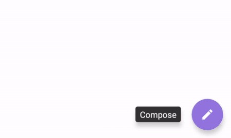
We’ll customize our ExpandableFab to be placed in the bottom right of our screen, with some margins so it isn’t flush against the sides. Lets also change its color, icon, icon rotation (for animations) and closing anticipate tension (which is used to mimic an AnticipateInterpolator). Finally, let’s give it a label.
我们将自定义ExpandableFab放置在屏幕的右下角,并留有一些边距,使其不会与侧面齐平。 我们还可以更改其颜色,图标,图标旋转(用于动画)和关闭预期张力(用于模拟AnticipateInterpolator)。 最后,让我们给它贴上标签。
Our layout file will now look like this:
现在,我们的布局文件将如下所示:
and if you ran the app now, you’d get this:
如果您现在运行该应用程序,则会得到以下信息:

FabOption (FabOption)
Currently, we have an ExpandableFab that doesn’t expand to reveal any actions. So, let’s add some. An action in this library is represented by a FabOption.
当前,我们有一个ExpandableFab,它不会扩展以显示任何操作。 因此,让我们添加一些。 该库中的操作由FabOption表示。
We’re going to add 3 FabOptions to our ExpandableFabLayout. Let’s customize the colors and icons of each FabOption, then give them labels which we will also customize.
我们将在ExpandableFabLayout中添加3个FabOptions。 让我们自定义每个FabOption的颜色和图标,然后为它们提供我们还将自定义的标签。
Now, our layout file will look like this:
现在,我们的布局文件将如下所示:
and produce the following widget:
并产生以下小部件:
覆盖 (Overlay)
Say you want the current content on the screen to be slightly or fully obscured so that the emitted actions of the ExpandableFab grabs the user’s attention. That’s where the Overlay comes in.
假设您希望屏幕上的当前内容稍微或完全被遮盖,以使ExpandableFab的发出的动作引起用户的注意。 这就是Overlay来源。
Let’s add an Overlay and customize it to be black with a 75% alpha/opacity (which will make it appear dark gray). Let’s also set the Overlay’s opening animation duration to 1 second, so it transitions in smoothly.
让我们添加一个叠加层,并将其自定义为具有75%的alpha /不透明度的黑色(这将使其显示为深灰色)。 我们还将“叠加层”的打开动画持续时间设置为1秒,以便平滑过渡。
Our layout file will now look like the following:
现在,我们的布局文件将如下所示:
and produce the widget below when we run the app:
并在运行应用程序时生成以下小部件:
At this point we have a fully designed ExpandableFab. We can simply assign some onClick behavior to our FabOptions (and the ExpandableFab itself too!) and be on our way. But there are even more cool features of the widget to discover.
至此,我们有了一个完整设计的ExpandableFab。 我们可以简单地将一些onClick行为分配给我们的FabOptions(以及ExpandableFab本身!),然后继续进行。 但是,还有许多更酷的功能可供发现。
屏幕方向感知 (Screen Orientation Aware)
The ExpandableFab widget is screen orientation aware, meaning it can display different elements between portrait and landscape. By default, all components of the widget will show in both portrait and landscape. Tilt your device into landscape orientation right now and you will see the same widget that we created above.
ExpandableFab小部件可感知屏幕方向,这意味着它可以显示纵向和横向之间的不同元素。 默认情况下,小部件的所有组件都将以纵向和横向显示。 立即将设备倾斜到横向,您将看到我们在上面创建的相同的小部件。
In order to set different views to be shown in landscape, you must explicitly specify an orientation of landscape on the views you want to appear in landscape orientation.
在在景观显示,以设置不同的看法,你必须明确指定的orientation上要显示在横向视图景观。
Overlay: app:overlay_orientation ExpandableFab: app:efab_orientation FabOption: app:fab_orientation
叠加层: app:overlay_orientation ExpandableFab: app:efab_orientation FabOption: app:fab_orientation
Why use this feature? Imagine having 7 actions defined to show in portrait orientation when the ExpandableFab is clicked. Unless the user has a tablet, they will not have enough screen height to show all 7 actions in landscape. Instead, we can set a separate widget for landscape mode that only shows, say, a single action. This single action, when clicked, can open an AlertDialog that cleanly displays the full 7 actions for the user to choose from.
为什么要使用此功能? 想象一下,当单击ExpandableFab时,定义了7个动作以纵向显示。 除非用户使用平板电脑,否则他们将没有足够的屏幕高度以横向显示所有7个动作。 相反,我们可以为横向模式设置一个单独的小部件,该小部件仅显示一个动作。 单击此单个操作可以打开AlertDialog,该对话框完全显示完整的7个操作供用户选择。
There are a number of different use cases for defining separate portrait and landscape widgets. And remember, the library automatically handles showing the correct one for you. Try editing the layout we created above to include a separate set of Views to be shown in landscape only, then tilt your device and see it in action!
有许多不同的用例来定义单独的纵向和横向小部件。 请记住,该库会自动为您显示正确的内容。 尝试编辑我们在上面创建的布局,以包括仅在横向视图中显示的单独的一组视图,然后倾斜您的设备并对其进行操作!
实用的实用方法 (Helpful Utility Methods)
If you have many views within the ExpandableFab widget, it can be a pain keeping a reference to each one. Especially if you’re now taking advantage of its screen orientation awareness.
如果ExpandableFab小部件中有很多视图,那么保留对每个视图的引用可能会很麻烦。 特别是如果您现在正在利用其屏幕方向意识。
Luckily for you, the ExpandableFabLayout (remember, it’s the container for all of our components) not only keeps track of this, but exposes it through a clean interface in an object called OrientationConfiguration. Each OrientationConfiguration has accessible references to the ExpandableFab, Overlay and FabOptions shown in that orientation.
幸运的是,ExpandableFabLayout(请记住,它是我们所有组件的容器)不仅跟踪此情况,而且通过名为OrientationConfiguration的对象中的干净接口将其公开。 每个OrientationConfiguration都具有对该方向所示的ExpandableFab,Overlay和FabOptions的可访问引用。
To get the configuration for portrait orientation, call expandableFabLayout.portraitConfiguration. To get it for landscape, callexpandableFabLayout.landscapeConfiguration.
要获取纵向方向的配置,请调用expandableFabLayout.portraitConfiguration 。 要获取横向景观,请调用expandableFabLayout.landscapeConfiguration 。
If you don’t know (or don’t care) which orientation the device is currently in, simply call expandableFabLayout.getCurrentConfiguration() and the library will give you the correct OrientationConfiguration for the current device orientation.
如果您不知道(或不在乎)设备当前处于哪个方向,只需调用expandableFabLayout.getCurrentConfiguration() ,该库将为您提供当前设备方向的正确OrientationConfiguration。
Now in your code, if you want to change the color of the first FabOption shown in portrait orientation, you can simply call: expandableFabLayout.portraitConfiguration.fabOptions[0].fabOptionColor. Nice, simple, easy.
现在,在您的代码中,如果要更改以纵向显示的第一个FabOption的颜色,可以简单地调用: expandableFabLayout.portraitConfiguration.fabOptions[0].fabOptionColor 。 很好,简单,容易。
There are many other properties you can customize on your ExpandableFab, as well as many other helpful utility methods included in the library that will make your life easier while developing. We hope you find use of the library in one of your projects.
您可以在ExpandableFab上自定义许多其他属性,以及库中包含的许多其他有用的实用程序方法,这些方法可以使您的开发工作变得更轻松。 我们希望您可以在您的一个项目中找到该库的使用。
If you end up using the library, let us know so we can showcase your app!
如果您最终使用了该库,请告诉我们,以便我们展示您的应用!
Thanks for reading!
谢谢阅读!

GitHub: https://github.com/nambicompany/expandable-fab
GitHub: https : //github.com/nambicompany/expandable-fab
Project Website (with links to JavaDoc and KDoc): https://nambicompany.github.io/expandable-fab
项目网站(带有指向JavaDoc和KDoc的链接): https ://nambicompany.github.io/expandable-fab
Gallery: https://github.com/nambicompany/expandable-fab/tree/master/docs/gallery
画廊: https : //github.com/nambicompany/expandable-fab/tree/master/docs/gallery
Feature Requests & Issues: https://github.com/nambicompany/expandable-fab/issues
功能请求和问题: https : //github.com/nambicompany/expandable-fab/issues
翻译自: https://uxdesign.cc/how-to-use-the-expandable-floating-action-button-9c6fdedc4169
c# 浮动图标展开


 739
739

 被折叠的 条评论
为什么被折叠?
被折叠的 条评论
为什么被折叠?
 到【灌水乐园】发言


