


数据可视化 (Data Visualization)
Visualizing data provides better understanding in exploratory data analysis. Frequencies, correlations, proportions of data can be interpreted easily. These statistics also play an important role in deciding machine learning methods. Especially understanding relations between variables. Therefore, scatter-plot is one of the most used techniques to understand the distributions or relations of one or more variables on certain locations. The challenge of scatter-plot is visualizing high dimensional data. Understandable dimension by humans can only be maximum 3 as x, y and z. It means that we can only visualize three variables in the same plot as points. Besides, interpreting 3D plots is harder than 2D plots. Therefore, we might try to add colors, shapes and sizes as other dimensions to 2D plots. However, another solution for this problem is scatter-plot matrix. Scatter-plot matrix is a method that creates 2D scatter-plots with each pair of variables and displays them on matrix structure. Thanks to that we can see all scatter-plots in the same visual.
可视化数据可以更好地理解探索性数据分析。 频率,相关性,数据比例可以轻松解释。 这些统计数据在决定机器学习方法方面也起着重要作用。 特别是了解变量之间的关系。 因此,散点图是了解某些位置上一个或多个变量的分布或关系的最常用技术之一。 散点图的挑战在于可视化高维数据。 人类可理解的维数最多只能为3,如x,y和z。 这意味着我们只能在同一图中将三个变量可视化为点。 此外,解释3D图要比2D图难。 因此,我们可能尝试将颜色,形状和大小作为其他尺寸添加到2D图中。 但是,针对此问题的另一种解决方案是散点图矩阵。 散点图矩阵是一种使用每对变量创建2D散点图并将其显示在矩阵结构上的方法。 因此,我们可以在同一视觉中看到所有散点图。
There is also one more option for visualizing high dimensional data on 2D called “circle segments” which is suggested by Ankerst, M. et al. in 2001 [1]. In this article I am going to explain; what is Circle Segments Visualization and how to apply it on “matplotlib”. We will see following sections;
Ankerst,M.等人提出了另一种在2D上可视化高维数据的选项,称为“ 圆弧段 ”。 在2001年[1]。 在本文中,我将进行解释; 什么是圆弧段可视化以及如何将其应用于“ matplotlib ”。 我们将看到以下部分;
- What is Circle Segments visualization 什么是圆弧段可视化
- How Circle Segments Algorithms Works 圆弧段算法如何工作
- Application of Circle Segments with “matplotlib” 圆弧段在“ matplotlib”中的应用
什么是圆弧段可视化 (What is Circle Segments Visualization)
As it’s known, color is one of the major components of visualization. It can be used for visualizing another dimension of data without adding any axis to plotting. Circle Segments visualization technique mostly depends on colors. It basically slices the circle to amounts of variables (dimensions). Every slice represents variable values as pixels from first observation to last observation. Algorithms assign colors to every pixel according to the observed value. For instance; we set the highest value of the variable as blue and lowest value as red. Let’s suppose, values of X variable increase from first observation to last observation and values of Y variable decrease from first observation to last observation. Therefore, colors of pixels in slice X will start from blue and will turn to red at the end of the slice and colors in slice Y will start from red and will turn to blue at the end. Plus, we can add more slices (variable) and compare them on 2D plotting.
众所周知,颜色是可视化的主要组成部分之一。 它可以用于可视化数据的另一个维度,而无需在绘图中添加任何轴。 圆弧段的可视化技术主要取决于颜色。 它基本上将圆切成变量(尺寸)的数量。 每个切片将变量值表示为从第一次观察到最后一次观察的像素。 算法根据观察值为每个像素分配颜色。 例如; 我们将变量的最大值设置为蓝色,将最小值设置为红色。 让我们假设,X变量的值从第一次观察到最后一个观察增加,而Y变量的值从第一次观察到最后一个观察减小。 因此,切片X中像素的颜色将从蓝色开始,并在切片末尾变为红色,切片Y中像素的颜色将从红色开始,并在末尾变为蓝色。 另外,我们可以添加更多切片(变量),并在2D绘图上进行比较。

How Circle Segments Algorithm Works
圆弧段算法如何工作
Circle Segments visualization technique processes the pixels stay under the slices. Therefore, if there is more observation the visual will have much more pixels. The pixels under the slice of the variable are processed according to the values of that variable. However, it is also important to define the direction that shows pixels are colored throughout to which line. While comparing different slices, direction plays an important role.
圆弧段可视化技术可处理留在切片下的像素。 因此,如果有更多的观察,则视觉将具有更多的像素。 变量切片下的像素根据该变量的值进行处理。 但是,定义显示像素在哪一行上都着色的方向也很重要。 在比较不同切片时,方向起着重要作用。
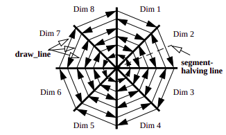
The figure above shows how pixels are colored with circle segment technique. First observations start from the center of the circle and last observations end on the circle border. This approach has been suggested in the research [1]. But, when there are too many data points it might be difficult to track every pixel for understanding correlations between variables . Therefore, in another research [2], lines between slice’s borders have been colored instead of pixels. This approach draws lines between slice borders and color them according to values. In this article we will create circle segment visualization by following the second approach.
上图显示了如何使用圆弧段技术对像素进行着色。 第一个观测值从圆的中心开始,最后一个观测值在圆的边界上结束。 该方法已在研究中提出[1]。 但是,当数据点太多时,可能很难跟踪每个像素以了解变量之间的相关性。 因此,在另一项研究中[2],切片边界之间的线已着色,而不是像素。 此方法在切片边界之间绘制线条,并根据值为其着色。 在本文中,我们将按照第二种方法创建圆弧段可视化。
圆弧段在“ matplotlib”中的应用 (Application of Circle Segments with “matplotlib”)
There is not any method in “matplotlib” that creates circle segments visualization automatically. Therefore, we will create an algorithm on “matplotlib” from scratch in this section. Before you start please make sure that you have “matplotlib” installed in your system. We will use the Wine Quality data set, you can also download it from Kaggle.
“ matplotlib ”中没有任何方法可以自动创建圆线段可视化。 因此,本节将从头开始在“ matplotlib ”上创建一个算法。 在开始之前,请确保已在系统中安装了“ matplotlib ”。 我们将使用“ 葡萄酒质量”数据集,也可以从Kaggle下载它。
As it’s mentioned before, we will draw lines between slice borders instead of pixel. This method is easier and more understandable. Therefore, we need to define how many variables will be used in visualization in order to decide how many slices there will be in the circle. In order to do that, we need to complete following steps;
如前所述,我们将在切片边界之间绘制线条,而不是像素。 这种方法更容易理解。 因此,我们需要定义在可视化中使用多少个变量,以便确定圆中将有多少个切片。 为此,我们需要完成以下步骤;
- Import required packages 导入所需的软件包
- Read data file and drop missing values 读取数据文件并删除缺失值
- Select variables that will be displayed on visualization 选择将在可视化中显示的变量
- Get number of observation and variables 获取观察数和变量
- Get variable names (in order to display nearby slices) 获取变量名称(以显示附近的切片)
import numpy as np
import pandas as pd
import matplotlib as mpl
import matplotlib.pyplot as plt
import math


## Read data set
wine = pd.read_csv('winequalityN.csv')


## Drop missing values
wine = wine.dropna()


## Display data
wine.head()


## Select coloumns will be visualized
df = wine[['alcohol', 'quality', 'volatile acidity' , 'chlorides'  ,
             'free sulfur dioxide', 'total sulfur dioxide',
             'sulphates', 'pH' ]]


## Number of observations
r = df.shape[0]


## Number of variables (slices)
var = df.shape[1]


## Variable Names
columns = df.columns
After completing this step, we know how many slices will be in use (“var” at #26) and how many parallel lines will be drawn in slices (“r” at #23). Now, we can create a method that finds the lines will be drawn between every slice and coordinates that will be drawn as parallel to each other within slices in order to represent every value in variables. We can also find the coordinates for variable names in order to display which slice belongs to which variable.
完成此步骤后,我们知道将使用多少个切片(在#26处为“ var”),并在切片中绘制多少平行线(在#23处为“ r”)。 现在,我们可以创建一个方法,该方法将查找将在每个切片之间绘制的线和将在切片内彼此平行绘制的坐标,以便表示变量中的每个值。 我们还可以找到变量名称的坐标,以显示哪个切片属于哪个变量。
## Method that finds slices positions
def slices(num:int , radius:float):

        ## Coordinates for every lines within slices
        points = []


        ## Angles of slices
        angle = 360/num
        angles = np.arange(0 , 360 , angle)


        ## Angles of slices' labels
        angleLabel = 360/(num*2)
        labelAngles = np.arange(angleLabel , 360 , angle)

        ## Create units till radius by increasing 1
        ## A line will be drawn for every unit
        units = np.arange(0 , radius , 1)


        ## Lines coordinate drawn between slices
        lines = [ np.column_stack(((units * np.cos(angle * math.pi/180))
                                      + radius ,
                                    (units * np.sin(angle * math.pi/180))
                                      + radius)) \
                                    for angle in angles]

        ## Lines coordinates will be drawn between slices
        pointXs = radius * np.cos(angles*math.pi/180) + radius
        pointYs = radius * np.sin(angles*math.pi/180) + radius
        points = np.column_stack((pointXs , pointYs ))


        ## Label point for variable names
        labelPointXs = radius * np.cos(labelAngles*math.pi/180) + radius
        labelPointYs = radius * np.sin(labelAngles*math.pi/180) + radius
        labelPoints = np.column_stack((labelPointXs , labelPointYs))

        return points  , lines , labelPoints
“slices” method takes two argument as “num” and “radius”. “num” represents how many slices will be in a circle and “radius” represents how many lines will be drawn. So, “radius” will be equal to the number of observations and “num” will be equal to the number of variables. This method returns 3 arrays as “points”, “lines” and “labelPoints”. “points” is the coordinates for lines that will be drawn between slices, “lines” is the coordinates for lines in every slice that represent each value and “labelPoints” is the coordinates for locating variable names.
“切片”方法采用两个参数,分别为“ num ”和“ radius”。 “ num ”表示一个圆中将有多少个切片,“ radius ”表示将绘制多少条线。 因此,“半径”将等于观测值的数量,“ num ”将等于变量的数量。 此方法返回3个数组作为“ 点 ”,“ 线 ”和“ labelPoints ”。 “点”是将在切片之间绘制的线的坐标,“线”是每个切片中代表每个值的线的坐标,“ labelPoints ”是用于定位变量名的坐标。
We also need to create two more methods. One of them is for calculating which color should be used for a single value of a variable and the other one for creating RGB data from variables by using the first method. This process is also known as linear color interpolation. “matplotlib” has its own color interpolation methods but it does not match the requirements for our visualization algorithm. That’s why, we will create it from scratch.
我们还需要创建两个方法。 其中一个用于计算哪种颜色应用于变量的单个值,另一种用于通过使用第一种方法从变量创建RGB数据。 此过程也称为线性颜色插值。 “ matplotlib ”具有自己的颜色插值方法,但不符合我们的可视化算法的要求。 因此,我们将从头开始创建它。
# Color Fader for Variables
# This method convert numbers to colors according to their values


# colorFader method has taken from answer by Markus Dutschke in stackoverflow
# see in detail:  https://stackoverflow.com/a/50784012


def colorFader(c1,c2,c3,mix=0): #fade (linear interpolate) from color c1 (at mix=0) to c2 (mix=1)
    # Lowest value color
    c1=np.array(mpl.colors.to_rgb(c1))

    # Middle value color
    c2=np.array(mpl.colors.to_rgb(c2))

    # Highest value color
    c3=np.array(mpl.colors.to_rgb(c3))

    ## Calculate color according to value
    result = [ c2*i*2.0 + c1*(0.5-i)*2.0 if i<=0.5 else c3 * (i - 0.5)*2.0 + c2 * (1.0-i)*2.0 for i in mix]


    return np.array(result)


## Create new data with RGB colors faded
def colorGenarator(df , low , middle , high):
        data  = df.to_numpy()
        newData = np.zeros([df.shape[0] , df.shape[1] , 3])
        for i in range(data.shape[1]):
            ## Min max normalization / varialbe values between 0 and 1
            data[: , i] =  (data[: , i]  - data[: , i].min()) / (data[: , i].max() - data[: , i].min()  )
            newData[: , i] = colorFader(high ,  middle , low  , data[: , i])
        return newData
The method “colorFader” takes three colors as HEX format. First color represents the lowest, second represents middle and third represents the highest value in the variable. What it does is take a single value between 0 and 1 and convert it to RGB code. For example, if one of the values of a variable is 1 then, RGB will be equal to the color of highest value. If it is 0.75, RGB color will be the color of mixing middle and highest color.`
“ colorFader ”方法采用三种颜色作为十六进制格式。 第一种颜色代表最低值,第二种代表中间值,第三种代表最高值。 它的作用是取0到1之间的单个值并将其转换为RGB代码。 例如,如果变量的值之一为1,则RGB将等于最高值的颜色。 如果为0.75,则RGB颜色将是混合中间颜色和最高颜色的颜色。
The method “colorGenarator”, takes four arguments as, “df”, “low”, “middle” and “high”. “df” is the Pandas data frame which includes all variables and other argument colors codes (string type HEX) for lowest, middle and highest values. Most important part is that we need to normalize every variable between 0 and 1 by using the Min-Max Normalization method. Because “colorFader” assigns colors to values which are between 0 and 1. After normalization, it converts every value in the data frame in order to get their RGB codes.
“ colorGenarator ”方法采用四个参数,分别为“ df ”,“ low ”,“ middle ”和“ high ”。 “ df ”是Pandas数据框,其中包括所有变量以及其他用于最低,中间和最高值的自变量颜色代码(字符串类型HEX)。 最重要的部分是,我们需要使用Min-Max Normalization方法对0到1之间的每个变量进行标准化。 因为“ colorFader ”将颜色分配给介于0和1之间的值。归一化后,它将转换数据帧中的每个值以获取其RGB代码。
Okay! Now our all methods are ready to create circle segments visualization. All we need to do is apply these methods to our data and draw/color lines on the polar coordinate system by using “matplotlib”. You can execute the following codes to create the plotting.
好的! 现在,我们所有的方法都准备好创建圆弧段可视化。 我们需要做的就是通过使用“ matplotlib ”将这些方法应用于我们的数据并在极坐标系上绘制/绘制颜色线。 您可以执行以下代码来创建绘图。
## Convert all values in data frame to RGB colors
data = colorGenarator(df , "#e74c3c" , "#27ae60" , '#2980b9')


## Get all coordinates for plotting
pointes = slices(var,r)


fig,ax = plt.subplots(figsize = (12,12))
circle = plt.Circle((r, r), r , fill=False , color = "black")
ax.add_artist(circle)


## Get lines coordinates
lines = pointes[1]


## Get label coordinates
labels = pointes[2]


## Draw paralel lines in slices adn color
for i in range(len(lines)):


    if i != len(lines)-1:
      after = i + 1
    else:
      after = 0
    ax.text(labels[i][0] , labels[i][1] , columns[i] )
    for k in range(lines[i].shape[0]):
        startX = lines[i][k][0]
        startY = lines[i][k][1]
        endX   = lines[after][k][0]
        endY   = lines[after][k][1]
        ax.plot([startX , endX] , [startY , endY] , color = data[k , i])


## Draw lines between slices
for point in pointes[0]:
    ax.plot([point[0] , r] , [point[1] , r] , color = 'white')


ax.set_xlim([-100 , r*2 + 100])
ax.set_ylim([-100,  r*2 + 100])
plt.show()
After running codes above you should get the following visual. According to data size it might take some time to render the visual. Blue color represents highest values, green color represents middle values and red color represents the lowest values. For example, while the values of volatile acidity start from highest and go to middle value, the values of total sulfur dioxide start from middle and go to highest. It means when volatile acidity increases, total sulfur dioxide decreases. So, we can say that there is a negative correlation between volatile acidity and total sulfur dioxide. We can also inspect other variables by considering color patterns in detail. You can also add more variables and change the colors.
在运行完上面的代码后,您将获得以下视觉效果。 根据数据大小,渲染视觉效果可能需要一些时间。 蓝色代表最高值,绿色代表中间值,红色代表最低值。 例如,当挥发性酸度的值从最高值开始到中间值时,总二氧化硫的值从中间值开始到最高值。 这意味着当挥发性酸度增加时,总二氧化硫减少。 因此,可以说挥发性酸度与总二氧化硫之间呈负相关。 我们还可以通过详细考虑颜色图案来检查其他变量。 您还可以添加更多变量并更改颜色。

结论 (Conclusions)
In this article we learned how to visualize high dimensional data on 2D space by using circle segments visualization technique. We discussed what is circle segment visualization technique, how its algorithm works and how to apply this algorithm with “matplotlib”. As you can see from output of technique, by using color interpolations we can easily compare different variables. Although, the technique allows to us increase number variable. Thanks to that we can inspect more variables in same plotting.
在本文中,我们学习了如何使用圆线段可视化技术在2D空间上可视化高维数据。 我们讨论了什么是圆弧段可视化技术,其算法如何工作以及如何通过“ matplotlib ”应用该算法。 从技术输出中可以看到,通过使用颜色插值,我们可以轻松比较不同的变量。 虽然,该技术允许我们增加数量变量。 因此,我们可以在同一图中检查更多变量。
If you any question please feel free to ask. Hope it helps…
如果您有任何疑问,请随时提问。 希望能帮助到你…
翻译自: https://towardsdatascience.com/circle-segments-high-dimensional-data-on-2d-de67380db55f


 950
950

 被折叠的 条评论
为什么被折叠?
被折叠的 条评论
为什么被折叠?
 到【灌水乐园】发言


