


 本文档介绍如何使用Plotly Chart Studio创建云托管的交互式图表。首先介绍了Plotly Chart Studio的作用,它允许用户创建可公开访问的图表。接着,通过一个实例展示了从IEX Cloud获取股票数据,使用Pandas解析数据,最后通过Chart Studio创建Candlestick图表的流程。文章详细讲解了设置账户、初始化Chart Studio、从API获取和准备数据以及如何在Plotly Studio中创建和保存图表的过程。
Given the success of Plotly Dash and Plotly Express, it’s easy to forget that Plotly’s rise to success began with a product that was neither of these household names. Dash has cornered the interactive dashboard market, while Plotly Express has become the defacto Python library generating inline charts, particularly for Jupyter notebooks. What we don’t get from either of these tools is a way to create data visualizations for any other scenario, such as creating a single chart to serve publicly as an image or interactive plot.
鉴于Plotly Dash和Plotly Express的成功,很容易忘记Plotly的成功之路始于这两个家喻户晓的产品。 Dash垄断了交互式仪表板市场,而Plotly Express已成为事实上的Python库,可生成嵌入式图表 ,特别是对于Jupyter笔记本而言。 从这两个工具中,我们没有得到的是一种为任何其他场景创建数据可视化的方法,例如创建单个图表以公开用作图像或交互式绘图。
Plotly Chart Studio shines as a tool to instantly create cloud-hosted data visualizations. The syntax will appear familiar to those who have used Plotly Express (or any other Python data vis library), but Plotly Chart Studio stands alone how these charts are created: on a publicly accessible cloud. With a Chart Studio account, each chart you plot is saved to a public chart studio profile, like mine:
Plotly Chart Studio可以作为一种工具来立即创建云托管的数据可视化。 语法会出现熟悉的那些谁使用Plotly快递(或可见库的任何其他Python数据),但Plotly图表工作室代表单独如何将这些图表创建:在可公开访问的云。 使用Chart Studio帐户,您绘制的每个图表都保存到公共Chart Studio个人资料中,例如我的:
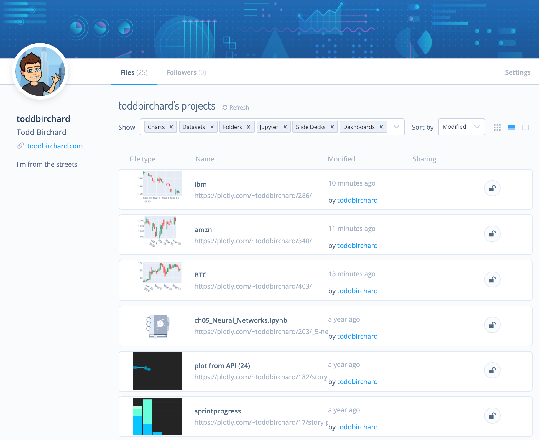
Each chart in my profile is publicly accessible as your choice of an embedded plot, an image, raw HTML, etc. Here’s an example chart as an iFrame:
您可以选择嵌入图表,图像,原始HTML等来公开访问我个人资料中的每个图表。这是一个iFrame示例图表:
Every chart created with Plotly studio automatically generates interactive plots along with static image varieties like PNGs. This opens the door to possibilities for us to create charts on demand, like creating dumb Discord bots, for example:
使用Plotly studio创建的每个图表都将自动生成交互式图表以及PNG等静态图像。 这为我们按需创建图表打开了可能性之门,例如创建笨拙的Discord机器人,例如:

This tutorial will demonstrate plot creation in Chart Studio with a fairly common real-life scenario. We’ll be fetching stock price data from IEX Cloud, transforming the data in a Pandas DataFrame, and outputting a Candlestick chart. This same workflow can be applied to create any of Plotly’s many chart types.
本教程将通过一个相当常见的真实场景演示在Chart Studio中创建绘图的过程。 我们将从IEX Cloud
 最低0.47元/天 解锁文章


 597
597

 被折叠的 条评论
为什么被折叠?
被折叠的 条评论
为什么被折叠?
 到【灌水乐园】发言


