


uber 数据可视化
Perhaps, dear reader, you are too young to remember that before, the only way to request a particular transport service such as a taxi was to raise a hand to make a signal to an available driver, who upon seeing you would stop if he was not busy to transport you to your destination, not without first asking how far you go, to assess whether or not to take the task. And without stars with which to let the driver know your satisfaction as a passenger with the trip.
亲爱的读者,也许您还太年轻,以至于您以前还不记得要求出租车之类的特殊运输服务的唯一方法是举手向可用的驾驶员发出信号,如果您看到他,他会停下来。不忙于将您运送到目的地,而不是首先询问您要走多远,以评估是否要执行任务。 而且没有星星,可以让驾驶员知道您对这次旅行的满意程度。
Just seven years ago, at least in Mexico before Uber’s arrival, that’s how things were. The arrival of the most famous Mobility-as-a-service App in the world changed many of our habits, opening the market, and great opportunities for many.
就在七年前,至少在Uber到达墨西哥之前,情况就是这样。 世界上最著名的移动即服务应用程序的到来改变了我们的许多习惯,打开了市场,并为许多人带来了巨大的机会。
Rarely do we stop for a moment to analyze our consumption habits and answer questions such as How much have I spent? What places do I go to on Uber are the most frequent? With the distance traveled until today, could I have reached China? Uber, like many other applications, offers you the possibility of requesting a copy of your data, which includes the complete history of your trips. We will take advantage of this to analyze and visualize some interesting personal data.
我们很少停下来分析一下我们的消费习惯并回答一些问题,例如我花了多少钱? 我在Uber上最常去哪些地方? 到今天为止,我能到达中国吗? 与许多其他应用程序一样,Uber为您提供了请求数据副本的可能性,其中包括行程的完整历史记录。 我们将利用此优势来分析和可视化一些有趣的个人数据。
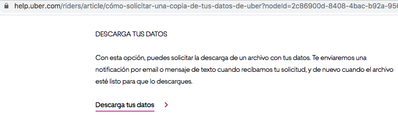
从哪里获得我的数据的副本? (Where to get a copy of my data?)
You can request your copy from this URL which is the section of the official Uber help center and that talks about it: https://help.uber.com/riders/article/request-a-copy-of-your-uber-data?nodeId=2c86900d-8408–4bac-b92a-956d793acd11. At the bottom of that page, you have to click on the link that says “Download your data”
您可以从该URL(这是Uber官方帮助中心的一部分)中获取有关副本的信息,该URL涉及该内容: https : //help.uber.com/riders/article/request-a-copy-of-your-uber- data?nodeId = 2c86900d-8408–4bac-b92a-956d793acd11 。 在该页面底部,您必须点击显示“下载数据”的链接
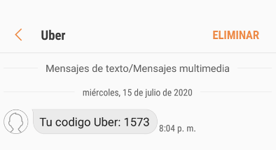
Clicking will redirect you to a new window to log in with your account. Also, Uber to make sure that you are requesting the data will send you an SMS to the phone number associated with your account, with a 4-digit code that you must enter to authenticate yourself. Once successfully authenticated you will now find a new button with the title “Request data” to which you must click.
单击会将您重定向到新窗口,以使用您的帐户登录。 此外,Uber要确保您正在请求数据,将向您的帐户关联的电话号码发送一条SMS,其中包含您必须输入的4位数字以进行身份验证。 成功通过身份验证后,您现在将找到一个标题为“请求数据”的新按钮,您必须单击该按钮。

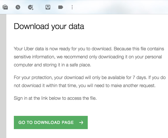
By clicking, Uber will be sending you an email notifying you that a copy of your data is being prepared and will be sent to you as requested. Approximately 12 to 24 hours later, a new email should be arriving inviting you to log in again to download your copy, in .zip format.
通过单击,Uber将向您发送一封电子邮件,通知您正在准备数据副本,并将按要求发送给您。 大约12到24小时后,将会收到一封新电子邮件,邀请您再次登录以下载.zip格式的副本。
资料读取 (Data Reading)
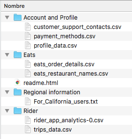
By unzipping the .zip file you will find a structure of files and folders. We are interested in the CSV file named “trips_data.csv”, contained in the “Rider” folder. This CSV file contains the data of your trips made since your first trip, until your last trip today. It will provide you with information such as the type of product (UberX VIP, UberX, Uber Eats, etc.), order status (Completed, Canceled, etc.), the fee paid, dates, latitudes and longitudes, distance traveled, among other data.
通过解压缩.zip文件,您将找到文件和文件夹的结构。 我们对“ Rider”文件夹中包含的名为“ trips_data.csv”的CSV文件感兴趣。 该CSV文件包含自您的第一次旅行到今天的最后一次旅行之间的旅行数据。 它将为您提供信息,例如产品类型(UberX VIP,UberX,Uber Eats等),订单状态(已完成,已取消等),所支付的费用,日期,纬度和经度,旅行距离,其他数据。
Now, you can create a new script in R to import and read the CSV file and work it to analyze and visualize some interesting data.
现在,您可以在R中创建一个新脚本,以导入和读取CSV文件并对其进行分析和可视化一些有趣的数据。
# REQUIRED LIBRARIES
library(dygraphs)
library(tidyquant)
library(tidyverse)
library(dygraphs)
library(plyr)
library(quantmod)
library(ggthemes)
library(ggplot2)
library(RColorBrewer)
library(sp)
library(ggmap)
library(lubridate)
library(leaflet)
library(plotly)
library(dplyr)
library(mgsub)
library(xts)# DATA READING
myTrips <- read.csv("my_trips_uber_history.csv", stringsAsFactors = FALSE)myTrips$Request.Time <- as.Date(myTrips$Request.Time, "%Y-%m-%d")
myTrips$Year <- as.Date(cut(myTrips$Request.Time, breaks="month"))
各城市旅行时间表 (Trips timeline by City)
You can take a first look at the cities you’ve used Uber in, and explore how much you’ve traveled with Uber over time in each city, given the availability of the “City” variable in the CSV data file.
您可以首先查看使用过Uber的城市,并在CSV数据文件中提供“城市”变量的情况下,探索每个城市随时间推移使用Uber的旅行次数。
# TRIPS TIMELINE BY CITY
timeline <- ggplot(myTrips, aes(Year, City))+
geom_line(color = "#006790", size = 6) +
labs(x= "Year", y= "City") +
ggtitle("Cities where I have requested Uber services", "Full history timeline")
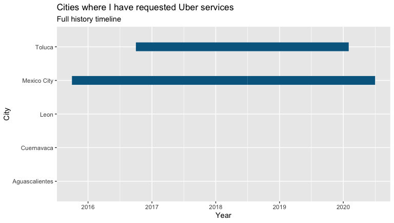
timelineIn my case, I can see that since 2015, when I started using the Uber app, the trips made in Mexico City (where I live) and Toluca (a place where I visit family regularly) stand out, compared to the rest of cities where I haven’t done more than a couple of trips.
以我为例,自2015年以来,当我开始使用Uber应用程序时,与其他城市相比,在墨西哥城(我居住的地方)和托卢卡(我经常拜访家人的地方)进行的旅行脱颖而出在这里我只做了几次旅行。
按城市划分的Uber请求的最终状态 (Final Status of Uber requests by City)
Another variable that we can collect is the final status of the requested order to Uber, identified as “Trip.or.Order.Status”. That is if it was canceled by you, or canceled by the driver, or the fare was divided, or the trip was completed. With which you can see if the number of times that the driver cancels is related to the city of origin, for example.
我们可以收集的另一个变量是向Uber请求的订单的最终状态,标识为“ Trip.or.Order.Status” 。 那是如果您取消了它,或者被驾驶员取消了,或者票价被分割了,或者旅程已经完成了。 例如,通过它您可以查看驾驶员取消的次数是否与原籍城市有关。
# FINAL STATUS OF THE ORDER
orderStatus<-ggplot(myTrips, aes(City,fill = Trip.or.Order.Status)) +
labs(x = "City", y = "Number of requests") +
ggtitle("Final status of Uber service requests", "Order status by city") +
geom_bar() +
theme(axis.text.x = element_text(angle = 45, hjust = 1)) +
scale_fill_brewer(name = "Final status", palette="Set1")
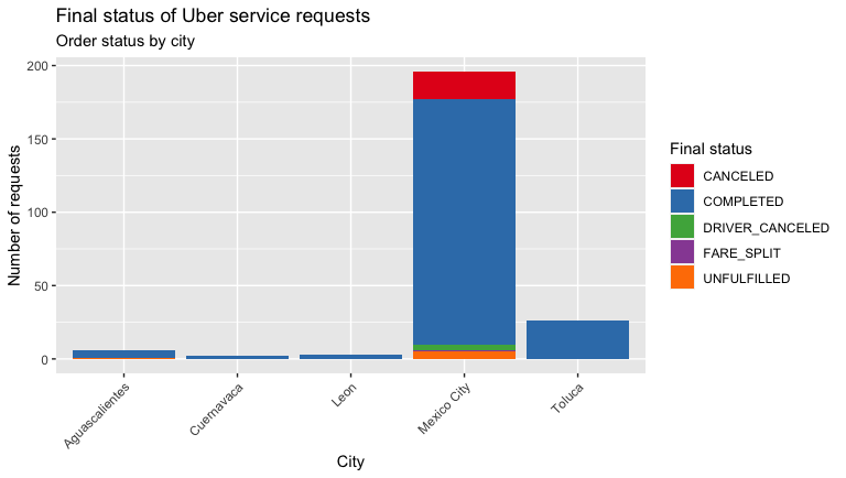
orderStatusYou will get a plot similar to the following. From the outset in my case, I could not be very objective answering the previous question, because as you can see I don’t have at least a comparable quantity of trips per city.
您将获得类似于以下内容的图。 从我的案例开始,我就不能很客观地回答上一个问题,因为如您所见,我每个城市的出行次数至少没有可比性。
与产品类型相关的Uber请求的最终状态 (The final status of Uber requests related to Product type)
Uber, as you know, is characterized by having different product categories (UberX, VIP, Eats, etc.). You can also see the relationship between the final status of the service with the Product Type you requested. If your history is older than 4 years, you will surely find some inconsistencies in the column “Product.Type” as null, empty, or described as “All”. Or that the category “Pool” or others were named at some point with other variations. You have to regularize and homogenize this type of inconsistency first, before visualizing the data.
如您所知,Uber具有不同的产品类别(UberX,VIP,Eats等)。 您还可以查看服务的最终状态与您请求的产品类型之间的关系。 如果您的历史记录已经超过4年,那么您肯定会在“ Product.Type”列中发现一些不一致的地方,它们为空,空或描述为“全部”。 或者,“ Pool”或其他类别在某些时候以其他变体命名。 在可视化数据之前,您必须首先对这种类型的不一致进行规范化和均质化。
# FINAL STATUS OF THE ORDER CONCERNING THE PRODUCT TYPE
productType =
myTrips %>%
# HOMOGENIZING INCONSISTENCIES IN PRODUCT TYPE NAMES
filter(Product.Type != "All" & Product.Type != "" )productType <- mgsub::mgsub(productType, c("uberX", "UberEATS Marketplace", "Pool"), c("UberX", "UberEATS - Marketplace", "uberPOOL"))
productType <- mgsub::mgsub(productType, c("uberPOOL: MATCHED"), c("uberPOOL"))orderProductType <- qplot(Trip.or.Order.Status, data=productType, geom="bar", fill= Product.Type) +
scale_fill_brewer(name = "Product type", palette="Set1")+
labs(x = "Final order status", y = "Number of requests") +
ggtitle("Final status of Uber service requests", "Order status concerning the Product type") +
theme(axis.text.x = element_text(angle = 45, hjust = 1))
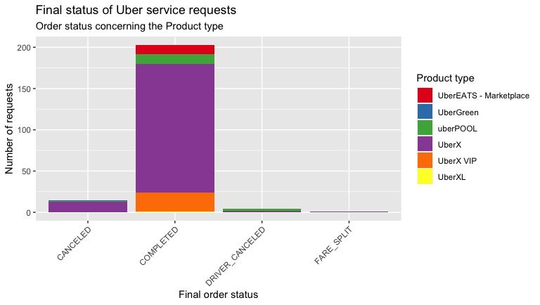
orderProductTypeIn my case, it’s visible that I mostly travel on UberX, so I had more cancellations of my own. And that drivers have canceled more times in Uber Pool than in UberX. Does Uber Green still exist in your cities? In Mexico City, this category spent a short time operating. Having an eco-friendly category was not a bad idea.
就我而言,可见我大部分时间都是在UberX上旅行,所以我有更多的取消订单。 与UberX相比,该司机在Uber Pool中取消的次数更多。 您的城市中仍然存在Uber Green吗? 在墨西哥城,该类别花费了很短的时间。 拥有环保类别并不是一个坏主意。
请求Uber的地点地图 (Map of locations where Uber was requested)
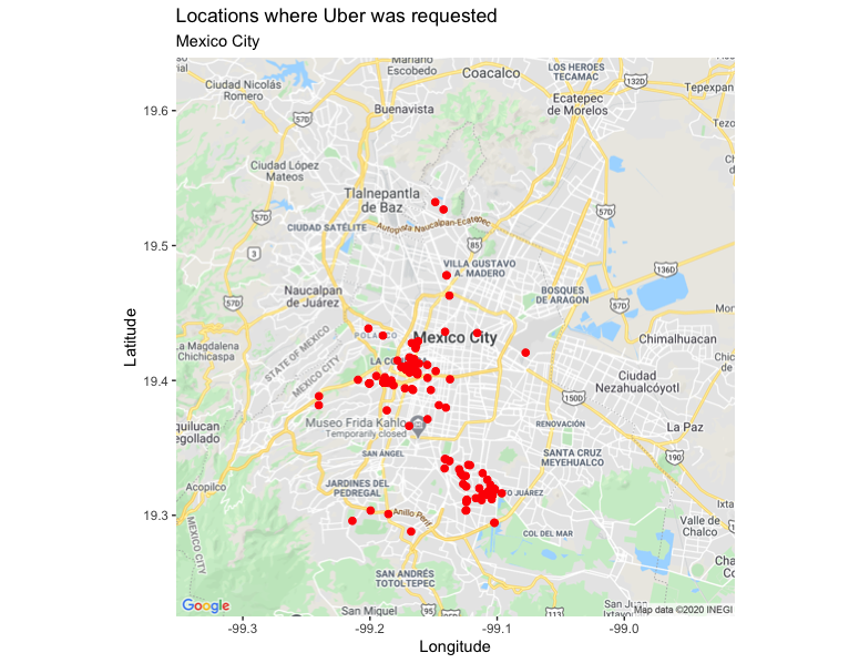
As I mentioned at the beginning, other variables that our history gives us are the longitudes and latitudes of each trip from where the service was requested. (identified as “Begin.Trip.Lng” and “Begin.Trip.Lat”). We can plot a map with “ggmap” to view locations by city. I will take my trips made in Mexico City, which is where I have a greater record of trips.
正如我在开始时提到的,我们的历史记录给我们的其他变量是请求服务的每次行程的经度和纬度。 (标识为“ Begin.Trip.Lng”和“ Begin.Trip.Lat” ))。 我们可以使用“ ggmap”绘制地图,以按城市查看位置。 我将去墨西哥城旅行,那里是我旅行的最好记录。
# MAP OF UBER REQUESTS IN MEXICO CITY
register_google(key = "YOUR_API_KEY")
MexicoCity <- subset(myTrips, City=="Mexico City")
ggmap(get_map(location = "Mexico City", zoom=11, maptype = "roadmap")) +
  geom_point(aes(Begin.Trip.Lng, Begin.Trip.Lat), data=MexicoCity, color = I('Red'), size = I(2), zoom=11) +
  labs(x = "Longitude", y = "Latitude") +
  ggtitle("Locations where Uber was requested", "Mexico City")
It’s important to register a Maps API Key as a string and replace the text “YOUR_API_KEY” in the code snippet, otherwise, you will encounter an error message like the following, which will not allow you to view the map:
将Maps API密钥注册为字符串并替换代码段中的文本“ YOUR_API_KEY”非常重要,否则,您将遇到类似以下的错误消息,该错误消息将不允许您查看地图:
It’s very simple, you can obtain a Maps API Key by following the instructions that you will find in the official documentation: https://developers.google.com/maps/documentation/javascript/get-api-key
非常简单,您可以按照官方文档中的说明获取Maps API密钥: https : //developers.google.com/maps/documentation/javascript/get-api-key
Once you have added your Maps API Key and executed the code, you will then get a map like the following. In my case, it’s notable that I do not move much in the north of Mexico City.
添加了Maps API密钥并执行了代码后,您将获得类似以下的地图。 就我而言,值得注意的是,我在墨西哥城北部的移动不多。
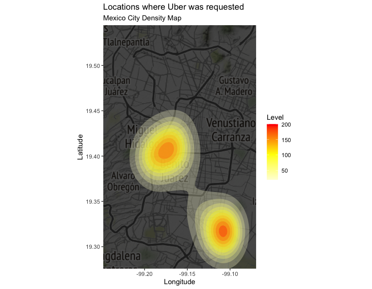
请求Uber的位置的密度图 (Density map of locations from where Uber was requested)
Complementing the previously created map, we can also create a density map with “qmplot”.
作为对先前创建的贴图的补充,我们还可以使用“ qmplot”创建一个密度贴图。
# DENSITY MAP OF UBER REQUESTS IN MEXICO CITY
qmplot(Begin.Trip.Lng, Begin.Trip.Lat, data = MexicoCity, geom = "blank",
  zoom = 11, extent = "panel", maptype = "toner-background", darken = .7, legend = "right") +
  stat_density_2d(aes(fill = ..level..), geom = "polygon", alpha = .3, color = NA) +
  scale_fill_gradient2("Level", low = "white", mid = "yellow", high = "red", midpoint = 100) +
  labs(x = "Longitude", y = "Latitude") +
  ggtitle("Locations where Uber was requested", "Mexico City Density Map")
You will get the following plot. For example, in my case, it reflects a trend regarding the location of the place where I live and the office where I work.
您将获得以下图解。 例如,就我而言,它反映了我所居住的地方和我的办公室位置的趋势。
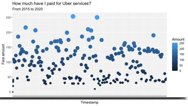
您使用Uber花了多少钱? (How much money have you spent using Uber?)
Perhaps this is another of the questions that you are asking yourself at the moment. You will find that you have the variable “Fare.Amount” with the rate paid for each service, in your local currency (in my case, in Mexican Pesos). You’ll also find the variable “Dropoff.Time” that indicates the exact timestamp the service ended at. We can visualize with a scatter graph how much of your valuable money you have paid Uber to bring you to and from your destinations.
也许这是您目前正在问自己的另一个问题。 您会发现,您有一个变量“ Fare.Amount”,其中包含为每种服务支付的费率,以您当地的货币(在我的情况下是墨西哥比索)。 您还将找到变量“ Dropoff.Time” ,该变量指示服务结束的确切时间戳。 我们可以通过散点图直观地显示您已经付给Uber多少钱来带您往返目的地。
# HOW MUCH I PAID TO UBER FROM 2015 TO 2020
totalPaid <- ggplot(myTrips, aes(x=Dropoff.Time, y=Fare.Amount, Fare.Currency = Fare.Currency)) +
  geom_point(aes(col=Fare.Amount, size=Fare.Amount)) +
  labs(col="Amount", size="size")+
  labs(x = "Timestamp", y = "Fare amount") +
  ggtitle("¿How much have I paid for Uber services?", "From 2015 to 2020")+
  guides(size=FALSE)
totalPaid
Then you will get a plot like the following, wherein my case I can see that the maximum I have paid for a service is around $ 250 pesos, and the minimum is the large amount of $ 0 pesos, ha! (of course, the first time is free).
然后,您将得到如下图所示的情节,在我的案例中,我可以看到我为一项服务支付的最高金额约为250比索,而最低金额为0美元比索,哈哈! (当然,第一次是免费的)。
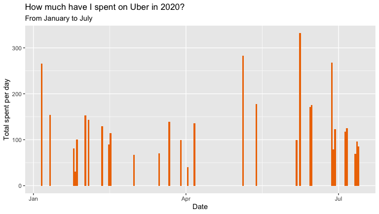
2020年您在Uber上花了多少钱? (How much money have you spent on Uber this 2020?)
This 2020 gave us a good punch with the arrival of the COVID-19, modifying our consumption habits of many things, and Uber is no exception. With the possibility of doing home office, you may see it reflected if, as in my case, and without a car, you avoided going out during the lockdown as much as possible. You can use a bar graph, to see in detail how much you have spent per day, so far this year.
2020年是COVID-19到来的一年,这改变了我们很多事情的消费习惯,Uber也不例外。 有可能进行家庭办公,就像我的情况一样,如果没有汽车,您会尽可能地避免出门,这就像我的情况一样。 您可以使用条形图详细了解今年到目前为止每天的花费。
# HOW MUCH I SPENT ON UBER IN 2020
myTrips2020 <- myTrips %>%
  filter(Request.Time >= as.Date("2020-01-01") & Request.Time <= as.Date("2020-07-13"))min(myTrips2020$Request.Time)
max(myTrips2020$Request.Time)paid2020 <- ggplot(myTrips2020, aes(Request.Time, Fare.Amount))+
  geom_bar(stat = 'identity', fill = 'darkorange2', width=1) +
  labs(x = "Date", y = "Total spent per day") +
  ggtitle("How much have I spent on Uber in 2020?", "From January to July")
paid2020
This year it’s visible that mainly in April when the health emergency was determined in the country where I live, I stopped using Uber mostly. You will get a plot like the following.
今年可见,主要是在4月,在我所居住的国家确定了医疗紧急情况后,我大部分时间停止使用Uber。 您将得到如下图。
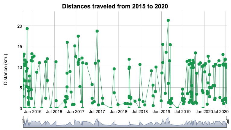
可视化您的行进距离 (Visualizing your traveled distances)
Finally, you can also view your distances traveled per trip. You will find for this the variable “Distance..miles”, which is responsible for recording the distance of the trip based on the local measurement system, that is, in my case, for example, where we operate with the decimal metric system, the distances are recorded in kilometers (km.). You can create a “dygraph” to look at the details.
最后,您还可以查看每次旅行的距离。 您会为此找到变量“ Distance..miles” ,该变量负责记录基于本地测量系统的行程距离,例如,在我的情况下,例如,我们使用十进制度量系统,距离以公里(公里)记录。 您可以创建一个“图表”以查看详细信息。
# TRAVELED DISTANCE
distanceRides <- read.csv("my_trips_uber_history.csv")
distanceRides$Request.Time <- ymd_hms(distanceRides$Request.Time)
distanceRides$Dropoff.Time <- ymd_hms(distanceRides$Dropoff.Time)
rides = xts(x=distanceRides$Distance..miles., order.by = distanceRides$Request.Time)dygraph(rides, main = "Distances traveled from 2015 to 2020") %>%
  dyOptions(drawPoints = TRUE, pointSize = 5, colors="#1a954d") %>%
  dyRangeSelector() %>%
  dyAxis("y", label= "Distance (km.)") %>%
  dyHighlight(highlightCircleSize = 0.5,
              highlightSeriesBackgroundAlpha = 1)
You will get an interactive plot like the following, wherein my case, I can see that the maximum distance in a single trip has been 21 km.
您将获得如下所示的交互式图表,在我的案例中,我可以看到单程最大距离为21 km。
Thanks for your kind reading. In the same way, as with all my articles, I share the plots generated with “plotly” in a “flexdashboard” that I put together: https://rpubs.com/cosmoduende/uber-trips-analyisis
感谢您的阅读。 以同样的方式,就像我所有的文章一样,我在“ flexdashboard”中共享由“ plotly”生成的图: https : //rpubs.com/cosmoduende/uber-trips-analyisis
And here you can also find the complete code: https://github.com/cosmoduende/r-uber-trips-analyisis
在这里您还可以找到完整的代码: https : //github.com/cosmoduende/r-uber-trips-analyisis
I thank you for having come this far, I wish you have a happy analysis, that you can put it into practice, and be as surprised and amused as I am with the results!
感谢您所做的一切,祝您分析愉快,您可以将它付诸实践,并对结果感到惊讶和高兴!
uber 数据可视化


 498
498

 被折叠的 条评论
为什么被折叠?
被折叠的 条评论
为什么被折叠?
 到【灌水乐园】发言


