


黄油安卓
Editor’s note: This article was originally published on Mighty Bear’s blog. To learn more about Mighty Bear Games, check out their website.
编者注:本文最初发表在 Mighty Bear的博客上 。 要了解有关Mighty Bear Games的更多信息,请访问其 网站 。
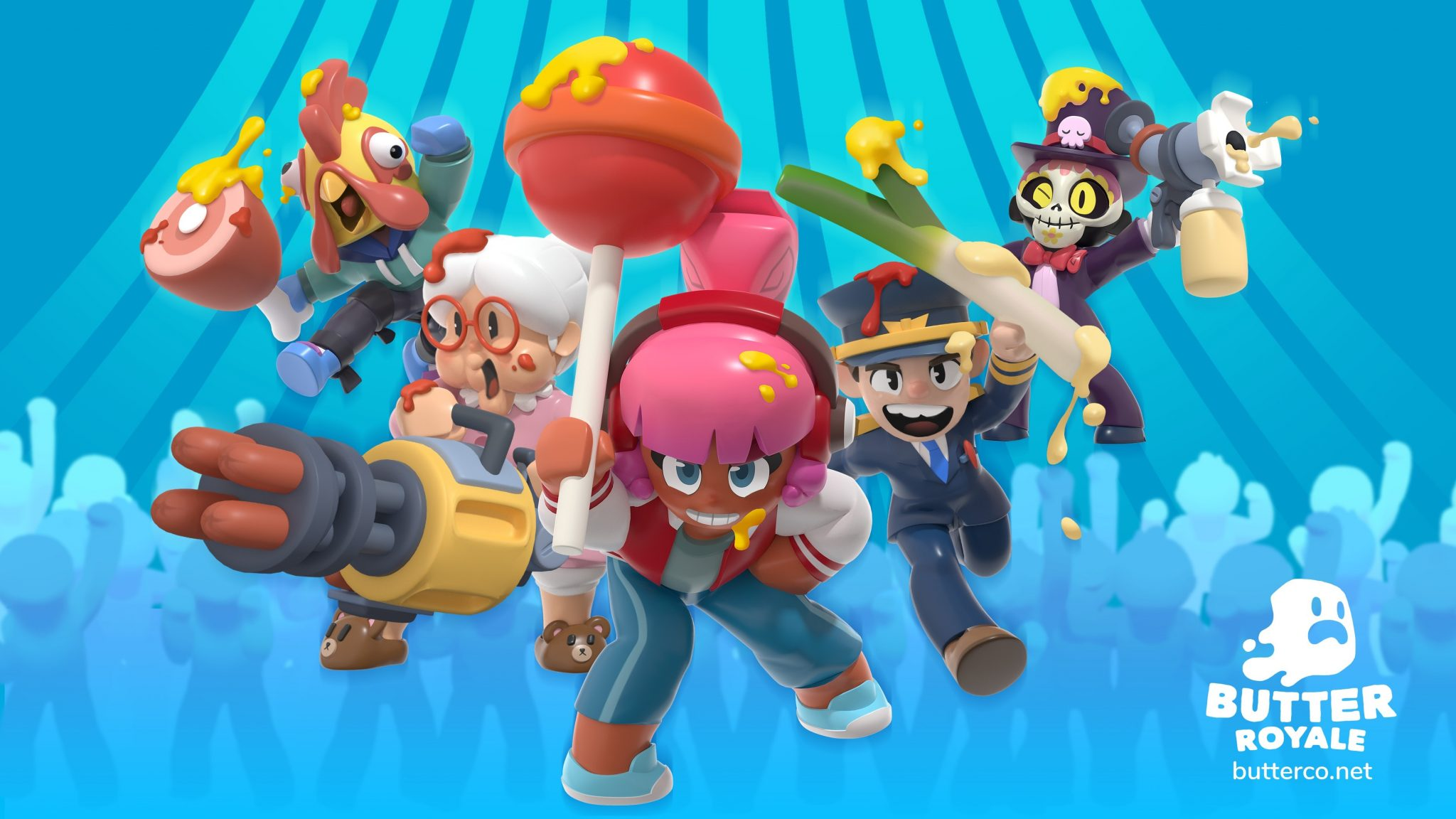
Hello! This is Gary Choo of Mighty Bear Games. In the team, I function as the Lead Artist for Butter Royale, a food fight-themed Battle Royale game that puts a family-friendly spin on this multiplayer genre. I drove the visual direction for its world, food machines, and characters. In this article, I’ll go into how we set up the art direction for our beloved characters, what factors led to its conception, and the challenges we faced. Ready? LETTUCE begin!
你好! 这是Mighty Bear Games的Gary Choo。 在团队中,我担任皇家大黄油游戏(Butter Royale)的首席艺术家,该游戏以食物战斗为主题的大逃杀(Battle Royale)游戏,在这种多人游戏类型中融入了家庭友善的特色。 我为它的世界,食物机器和角色驱动了视觉方向。 在本文中,我将探讨如何为我们心爱的角色设置艺术指导,导致其概念形成的因素以及我们面临的挑战。 准备? LETTUCE开始!
在一开始的时候… (In the beginning…)
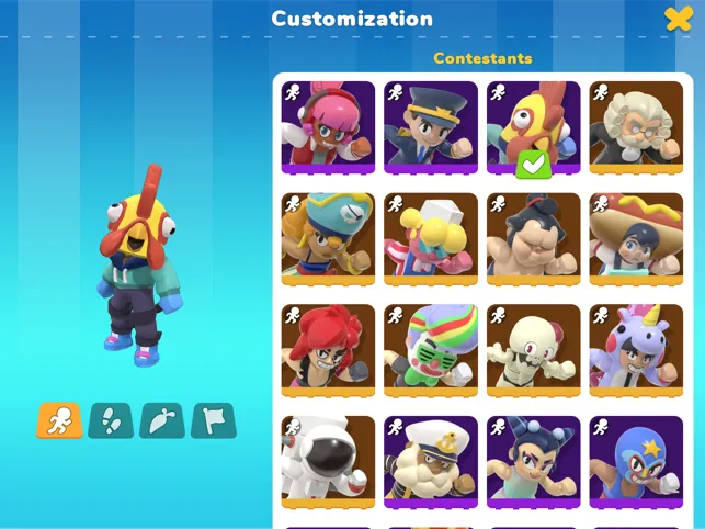
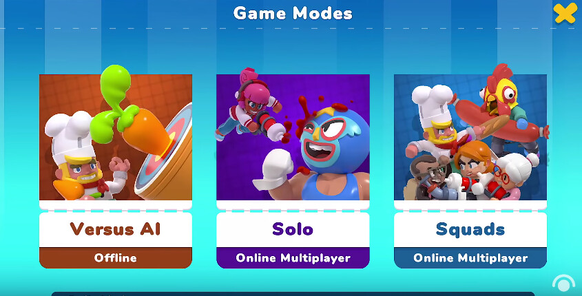
Whoops! Before we begin, let’s understand what characters represent in the context of multiplayer video games. Just like characters in stories, characters in video games share the same importance of driving a narrative. In multiplayer games, players don’t only use characters as a narrative aid, they serve as an interactive aid as well. Normally, players get to choose from 50+ character skins and then by joining games and playing with other similarly costumed players, they become part of a community. For a game like Butter Royale, we need a lot of characters to be created. Here’s what we did to create our brand of cuteness for the characters.
哎呀! 在开始之前,我们先了解一下多人视频游戏中的角色。 就像故事中的角色一样,视频游戏中的角色也同样具有驱动叙事的重要性。 在多人游戏中,玩家不仅将角色用作叙事辅助工具,而且还将其用作互动辅助工具。 通常,玩家可以从50多个角色皮肤中进行选择,然后通过加入游戏并与其他穿着类似服装的玩家一起玩,他们成为社区的一部分。 对于皇家黄油游戏,我们需要创建很多角色。 这是我们为角色创建可爱品牌的方法。
一开始(对于真实) (In the beginning (for reals))
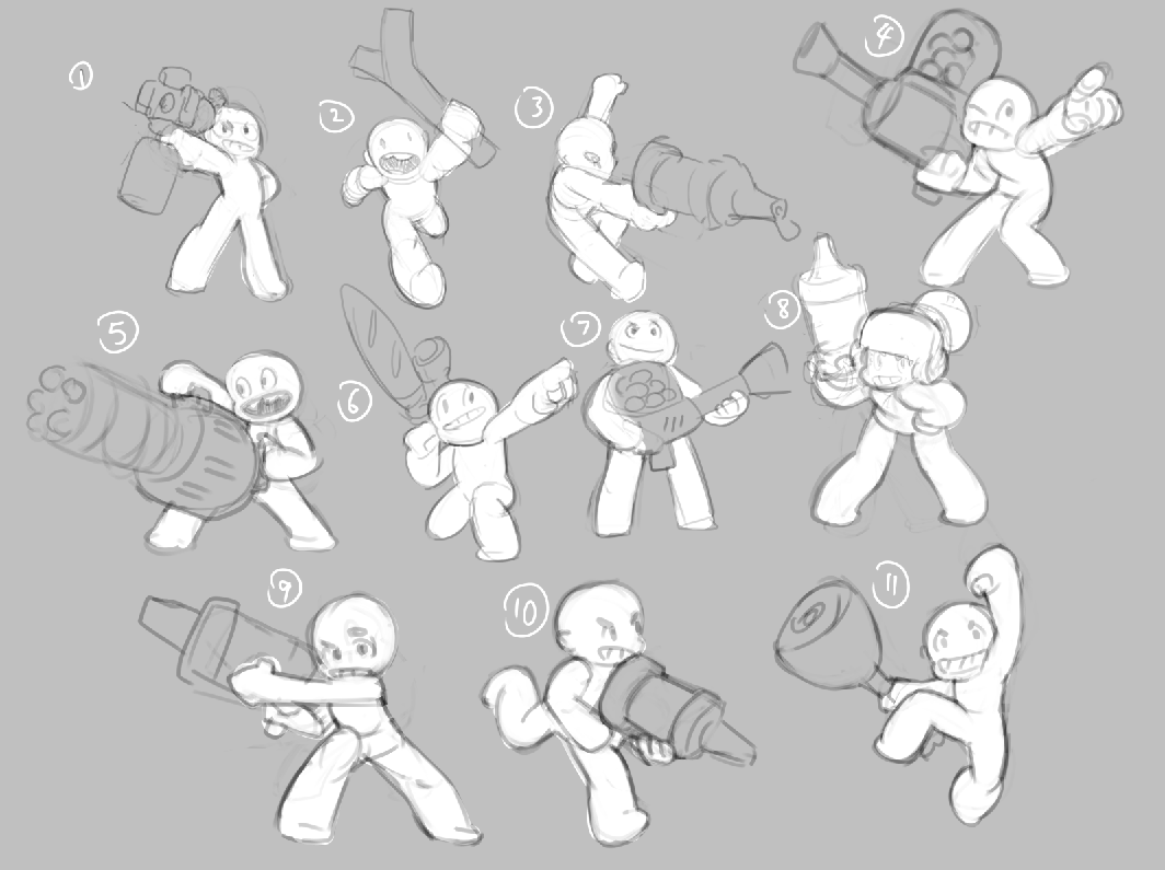
Still here? Awesome. Sketching on paper is the easiest way to get those creative juices flowing. At the start, I knew Butter Royale was going to be a combat game with epic food fighting gadgets and this gave me a gauge on the tone and expectation. I then projected it in my head before sketching what it could look like. At this stage, it’s explorative. I keep the ideas wild, ignoring technical limitations because you never know what’s achievable at this point. Some ideas may be revisited even after the release of the final product.
还在? 太棒了 在纸上素描是使这些创意汁流淌的最简单方法。 一开始,我知道《皇家黄油》将是一场史诗般的食品战斗小工具的格斗游戏,这让我对口气和期望有所了解。 然后我将其投射在脑海中,然后勾勒出它的外观。 在这个阶段,它是探索性的。 我不去理会技术局限性,而是不去理会技术局限性,因为您现在不知道可以实现什么。 即使在最终产品发布之后,有些想法也可能会被重新考虑。

故障排除阶段:此游戏适用于谁? (The troubleshooting phase: Who is this game for?)
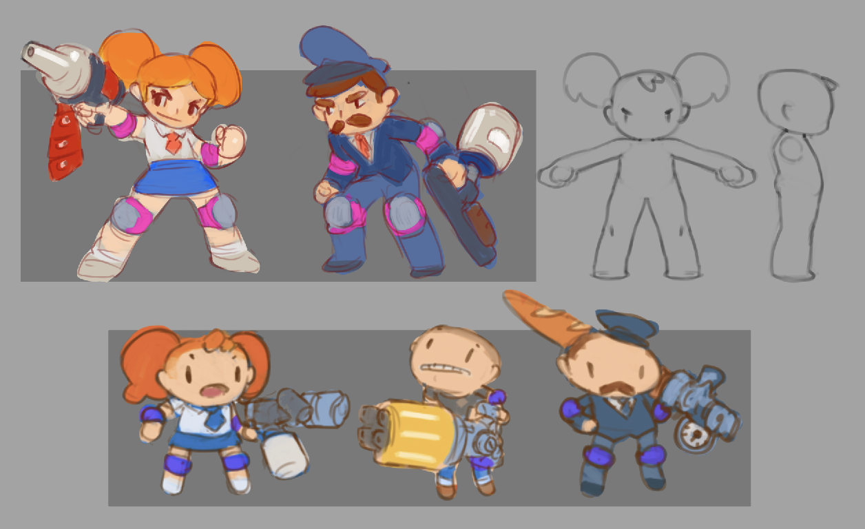
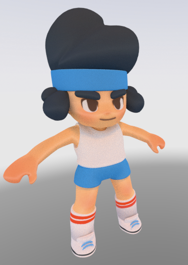
While sketching, I focus on problem-solving for the game and player needs. For Butter Royale, I learnt to ask: “Who is this game for? Who’s playing it? Is it accessible?” and design with these considerations in mind. Weapon handling and character function for players started to be the driving motivation and this led me to explore templates with a more balanced human proportion, rather than the usual large-headed characters used in many mobile games. These proportions help to convey acrobatic actions, victory poses, and dance moves.
在草绘时,我专注于解决游戏和玩家需求的问题。 对于皇家黄油,我学会了问:“这款游戏适合谁? 谁在玩? 可以进入吗?” 在设计时要考虑这些因素。 玩家的武器操控和角色功能开始成为驱动力,这促使我去探索具有更平衡人类比例的模板,而不是许多移动游戏中通常使用的大头字符。 这些比例有助于传达杂技动作,胜利姿势和舞蹈动作。
设置角色艺术指导 (Setting up the character art direction)
Here’s the meat of it! Great character designs drive or motivate players to identify and engage with your product. The truth is, if you execute your art direction strategies with a consistent visual language, you will easily establish a pattern that will forever be associated with your final product. That’s powerful stuff! These are a few steps you can follow to set up the art direction for your characters.
这是它的肉! 出色的角色设计可以驱动或激励玩家识别并参与您的产品。 事实是,如果您以一致的视觉语言执行艺术指导策略,您将很容易建立一种永远与最终产品相关联的模式。 那是强大的东西! 您可以按照以下几个步骤来设置角色的美术指导。
1.选择视觉一致性进行角色品牌塑造 (1. Choose visual consistencies for character branding)
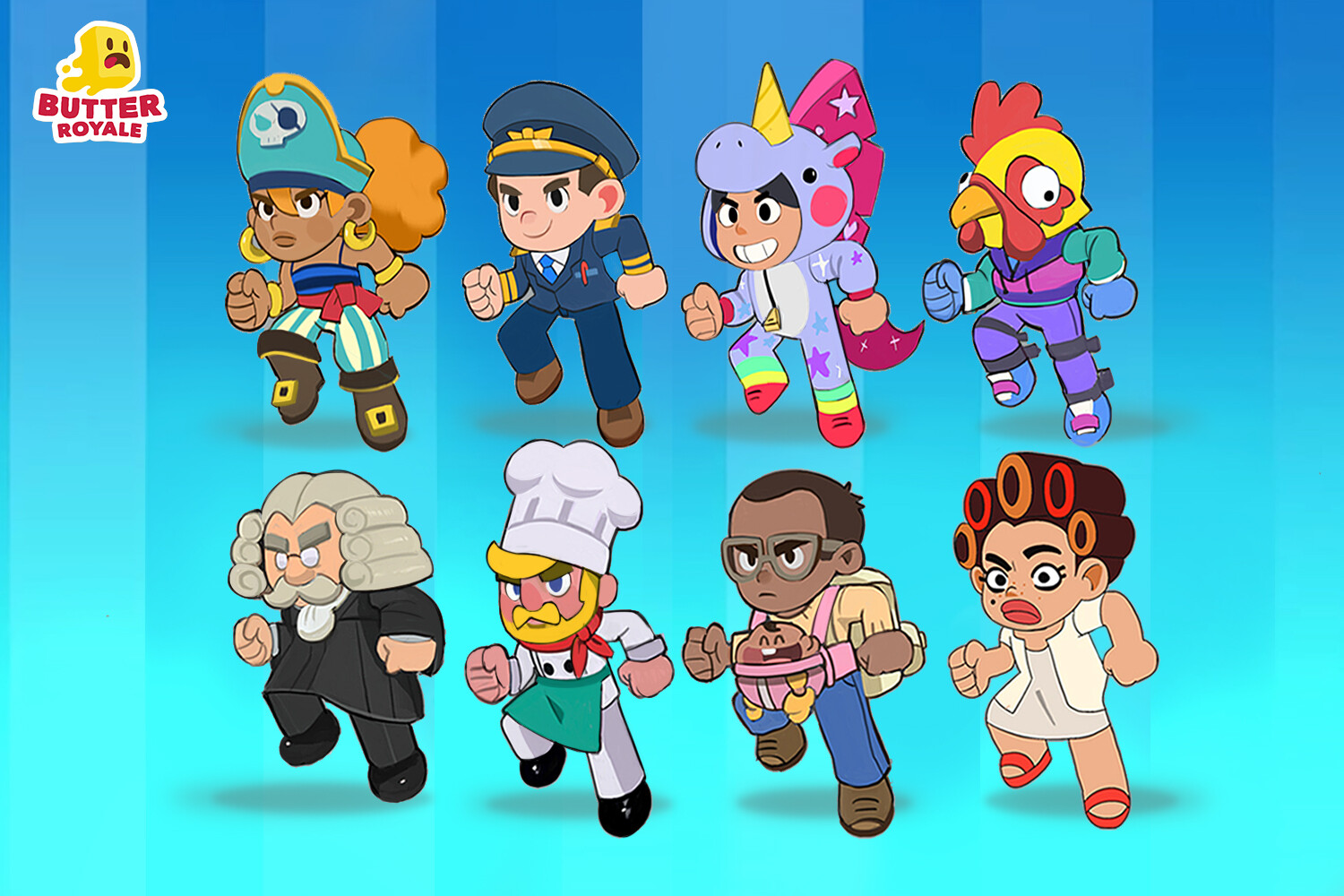
Here, we layer on rules for visual consistency. In the case of Butter Royale, the characters are from all ages, occupations, and ethnicities so the challenge here was to influence players to associate these designs with the product. This is a practice I do to solve this, I call it content combos. Here’s an example of what that means, I thought to link the characters cohesively. It’ll be a great idea that at all times they’ll be wearing protective gear. This could be a great way to add on to branding so you’ll be reminded of Butter Royale every time you see this content combo:
在这里,我们基于规则以实现视觉一致性。 就皇家黄油而言,角色来自各个年龄段,职业和种族,因此这里面临的挑战是影响玩家将这些设计与产品联系起来。 这是我为解决此问题而采取的一种做法,我称之为content combos 。 这是一个示例,我想将这些字符紧密地链接在一起。 一个很好的主意是他们始终都穿着防护装备。 这可能是添加品牌的好方法,因此,每次您看到此内容组合时,都会提醒您皇家黄油(Butter Royale):
Food weapon + protective gear + occupation
食物武器+防护装备+职业
Protective gear is also a reference to extreme sports which helps to define the genre. However, we ditched the idea later and reduced the combo to:
防护装备也是对极限运动的参考,有助于定义体裁。 但是,我们后来放弃了这个主意,并将组合缩小为:
Food weapon + occupation.
食物武器+职业 。
This approach was less complex and easier for players to identify. Sometimes having too many great ideas dilutes the branding. Having no protective gear meant that we had no design constraints regarding which occupations would go well with said gear. I did another sketch and colour pass to validate these ideas and what stood out to me was that simple content combos lead to accessibility.
这种方法不太复杂,玩家更容易识别。 有时,太多的好主意会稀释品牌。 没有防护装备意味着我们对使用该装备的职业没有设计上的限制。 我做了另一幅草图和彩色通行证以验证这些想法,而令我感到与众不同的是,简单的内容组合带来了可访问性。
2.模拟出道路图 (2. Mock it up for road mapping)
At this point, we’ve got enough material to work with for a quick 3D mockup. This step is important, the mockup is far from perfect but it helps me to envision what the end result may look like, helping us take decisions, steering it closer towards our final product vision. This mockup is useful for validating other concerns by importing it in an early prototype of our game and analysis the following:
至此,我们已经拥有足够的材料来进行快速3D建模。 这一步很重要,样机远非完美,但它可以帮助我设想最终结果可能是什么样,帮助我们做出决定,使之更接近最终产品愿景。 通过将其导入我们游戏的早期原型并分析以下内容,该模型对于验证其他问题非常有用:
- Gameplay camera angle 游戏视角
- The scale of character against the environment 人物规模对环境的影响
- Scope the work in front of us 调整我们面前的工作范围
- Generate current impressions from a player’s perspective, assess appeal, etc 从玩家的角度产生当前印象,评估吸引力等
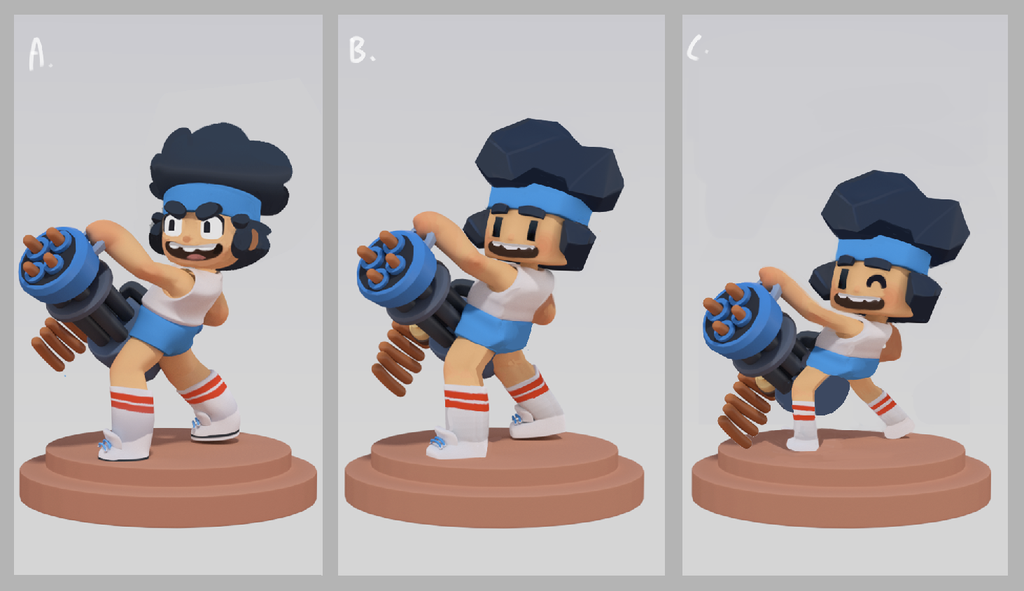
Next, with paint overs, I mocked up the geometric treatment for the characters. All characters would apply the same consistency of geometry. These three explorations were our top choices in terms of cuteness and accessibility for a global audience. All three were also in line with our product’s tone and vision. Our art team formed a discussion around the mockups, weighing out the pros and cons.
接下来,用油漆覆盖物,我模拟了角色的几何处理。 所有字符都将应用相同的几何一致性。 就全球观众的可爱程度和可及性而言,这三项探索是我们的首选。 这三个都与我们产品的色调和视觉一致。 我们的艺术团队围绕模型进行了讨论,并权衡了利弊。
A. Rounded - Technically easy for any artist to recreate and handle for outsourcing. Can adhere to a range of animation styles. A scalable style that benefits other media platforms.
A.舍入-任何艺术家在技术上都可以轻松地重新创建和处理外包。 可以坚持多种动画样式。 一种可扩展的样式,使其他媒体平台受益。
B. “Blocky” - Very popular look but designs needed to be carefully re-thought and sculpted in order for lighting to bring out the best shadows and volumes.
B.“块状”-非常流行的外观,但需要仔细地重新设计和雕刻设计,以使照明带出最佳的阴影和体积。
C. Noodle limbs - The cutest but doesn’t work for all occupation types. Noodle limbs also meant it has technical challenges. Animation style would be very stylised and specific.
C.面条四肢-最可爱,但不适用于所有职业。 面条四肢也意味着它存在技术挑战。 动画样式将非常风格化和特定化。
Option A was the one favoured over the others. It had the style treatment that hit all the boxes in our checklist.
选项A是一个优于其他选项的选项。 它的样式处理打动了我们清单中的所有框。
3.设置角色制作的设计准则 (3. Set up design guidelines for character production)
Now to take a granular look on what makes the character our own! It’s important to define clear design guidelines. This practice of consistency helps when producing a large volume of work with different teams of artists. Every decision made should echo back to the product. Here’s what we look out for.
现在来仔细看看是什么使我们的角色成为我们自己的角色! 定义清晰的设计准则很重要。 与不同艺术家团队一起制作大量作品时,这种一致性做法会有所帮助。 做出的每个决定都应回溯到产品。 这就是我们要注意的。
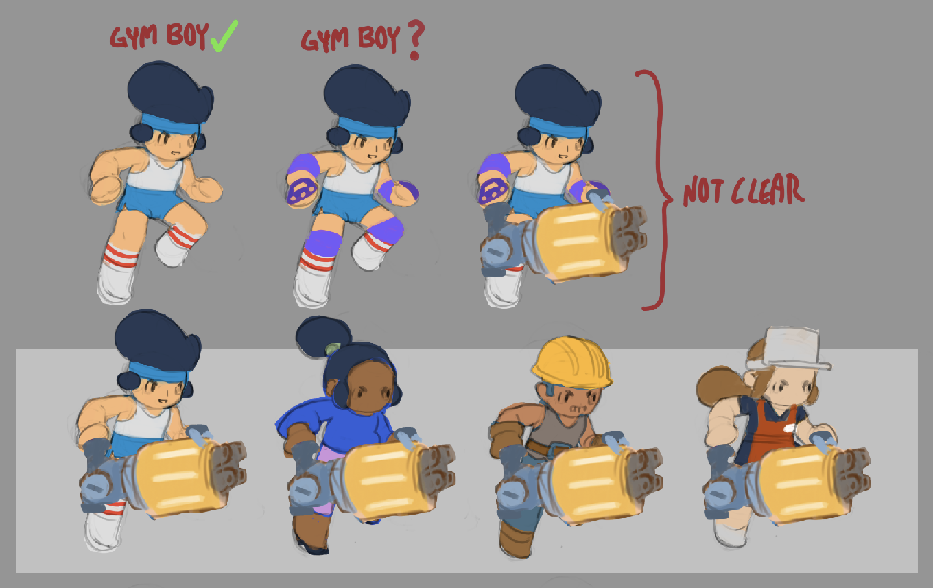
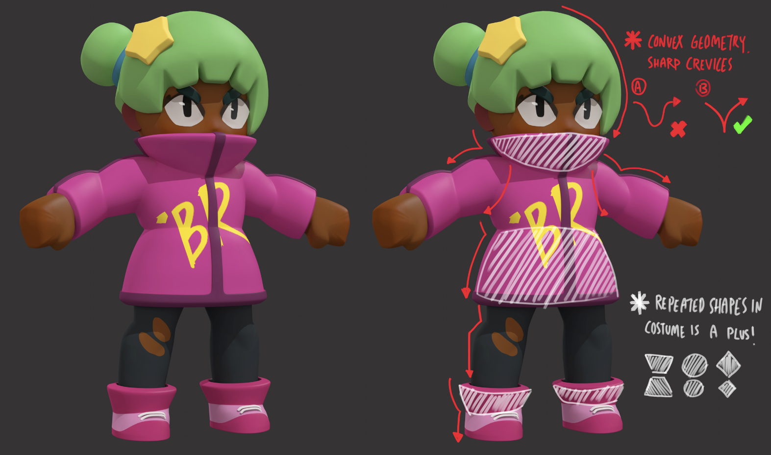
Detail Management- With the geometric treatment established earlier during the mockups, here’s how we execute it. Introduce more primitive shapes to represent costume details, this helps to eliminate unnecessary noise when viewing from the mobile screen. This step was optional but we decided that spherical, clean symmetry treatment would be the look that will carry the brand of our characters.
细节管理 -在样机创建过程中较早建立了几何处理,这就是我们执行它的方式。 引入更多原始形状来表示服装细节,这有助于消除从移动屏幕查看时出现的不必要噪音。 此步骤是可选步骤,但我们决定采用球形,整洁的对称处理方式来装饰我们的角色品牌。
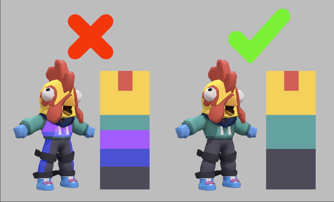
Colour Hierarchy — Viewing our characters on the mobile screen is tricky due to the size of its platform. Here, we pay attention to colour hierarchy. No more than three colours should be dominating the majority of the character, the lesser the better. Try not to decide what’s attractive at the moment, rather, decide on something that has lasting effects. This has many scalable advantages for branding and merchandising. Some of the most iconic global brands keep this as a basic design rule.
颜色层次结构 -由于其平台的大小,在移动屏幕上查看我们的字符非常棘手。 在这里,我们注意颜色层次。 字符的大部分中,不超过三种颜色应占主导地位,越少越好。 暂时不要决定什么有吸引力,而要确定具有持久影响的事物。 对于品牌和销售,这具有许多可扩展的优势。 一些最具标志性的全球品牌将其作为基本设计规则。
4.重视世界建设 (4. Attention to world building)
Introduce factions - when creating a big roster of characters, we ask, just who do we put in? Having factions and opposites automatically drives a narrative between characters, sometimes it creates playful online interactions. For example, we have a space faction which features an astronaut and an alien. Are they rivals or are they allies? Players who are playing the squad mode for Battle Royale as a group of aliens may run into a group of astronauts, what will happen then? This is scalable for social content and fan theories. This amplifies the fun factor of our product and adds a layer on world-building.
介绍派系 -在创建庞大的角色名册时,我们会问,我们只输入谁? 拥有派系和对立面会自动推动角色之间的叙事,有时会创造有趣的在线互动。 例如,我们有一个空间派系,其中有宇航员和外星人。 他们是竞争对手还是盟友? 以一群外星人的身份参加大逃杀大队模式的玩家可能会遇到一群宇航员,那么会发生什么呢? 这对于社交内容和粉丝理论是可扩展的。 这扩大了我们产品的趣味性,并为世界建设增加了一层。
Design around humour and values - Anyone can be a participant of Butter Royale, but how we do decide on the initial roster for character concepts? We lean in on humour for this. Butter Royale’s title in itself is a fantastic pun. It builds an expectation of humour, so we asked what’d be funny and out of character to see on the Butter-field? Judges, Grannies, Astronauts, Wrestlers, Scuba Divers — anyone that would at be out of place in a food fight. This augments the light-hearted tone of our product. It’s important that the Character Concepts in itself shouldn’t be confusing, players shouldn’t second guess the characters’ occupation at a glance. Layering in on top of humour, we ask if our choices are aligned with the product values — Is it inclusive? Is it non-violent? Is it playful?
围绕幽默和价值观进行设计-任何人都可以参加Royal Butter,但我们如何确定角色概念的初始花名册? 为此,我们倾向于幽默。 皇家黄油的称号本身就是一个奇妙的双关语。 它建立了一种幽默感,所以我们问在Butter-field看到什么有趣而又与众不同? 法官,阿妈,宇航员,摔跤手,水肺潜水员-那些在食物大战中不合时宜的人。 这增强了我们产品的轻松色调。 重要的是,角色概念本身不应该引起混淆,玩家也不应一目了然地猜测角色的职业。 在幽默的基础上,我们问我们的选择是否与产品价值相符-是否具有包容性? 是非暴力的吗? 好玩吗?
文献资料 (Documentation)
The final step. Having established the art direction, we need to preserve it by means of documentation. Documentation plays a crucial role in any treatment setting. Documentation helps assure continuity of quality. In the character production pipeline, there are many specific directions in treatment. Proper documentation can help the practitioner to recall those directions.
最后一步。 建立了艺术指导之后,我们需要通过文档来保存它。 文档在任何治疗环境中都起着至关重要的作用。 文档有助于确保质量的连续性。 在角色制作流程中,有许多具体的处理方向。 正确的文档可以帮助从业者回忆这些指示。
结论 (Conclusion)
And there you have it! These are the steps I took to define the look for our Butter Royale characters. If you like this post, be sure to check out these other useful links to learn more about defining a look or style for your game.
在那里,您拥有了! 这些是我为皇家黄油角色定义外观时所采取的步骤。 如果您喜欢这篇文章,请务必查看这些其他有用的链接,以了解有关为游戏定义外观或样式的更多信息。
How Nintendo created its wild new cast of fighters for Switch game Arms
Splatoon’s stylish world was inspired by skateboarding and hip hop
If you’re interested in learning more about how we do art in Mighty Bear, here are more articles!
如果您有兴趣了解有关我们如何在《大熊》中进行艺术创作的更多信息,这里有更多文章!
I hope that you’ve found this article useful and hopefully it gave you some insights into my experiences. Thanks for reading!
我希望您对本文有所帮助,并希望它对我的经验有所帮助。 谢谢阅读!
黄油安卓


 1083
1083

 被折叠的 条评论
为什么被折叠?
被折叠的 条评论
为什么被折叠?
 到【灌水乐园】发言


