


matplotlib可视化
Data analysis is about telling a story. Whether it’s a story about your customers, the services you provide or maybe even macroeconomic development, your goal as a data scientist is to deliver a message that compels, persuades, and convinces your audience to take action.
数据分析是讲故事。 无论是有关客户,提供服务或什至是宏观经济发展的故事,您作为数据科学家的目标都是传递可迫使,说服并说服听众采取行动的信息。
But power of the story depends on how well it is performed.
但是故事的力量取决于它的表现。
If you have a great story, but deliver it poorly, your audience is less likely to take action. That’s where animated presentation can help.
如果您有一个很棒的故事,但表现不佳,那么您的听众就不太可能采取行动。 这就是动画演示可以提供帮助的地方。
Animated Visualization is a rich, engaging medium, easy to manage, and will help your key points pop. It offers all the benefits of a visual medium with much smaller resource requirements than you might expect.
动画可视化是一种丰富,引人入胜的媒体,易于管理,并且可以帮助您突出关键点。 它提供视觉媒体的所有优势,而资源需求却比您预期的要少得多。
I would like to show how in a few steps you can create animation in Matplotlib.
我想展示一下如何在Matplotlib中创建动画。
# STEP 1: Import the necessary modulesimport numpy as np
import pandas as pd
from matplotlib import pyplot as plt
from matplotlib.animation import FuncAnimation
plt.style.use('seaborn-pastel')# STEP 2: Set up the plotting areafig = plt.figure(figsize=(9,7));
ax = plt.axes(xlim=(0, 4), ylim=(-2, 2));# STEP 3: Create data to plotline, = ax.plot([], [], lw=3);def init():
    line.set_data([], [])
    return line,# STEP 4: create a function to update the linedef animate(i):
    x = np.linspace(0, 4, 1000)
    y = np.sin(2 * np.pi * (x - 0.01 * i))
    line.set_data(x, y)
    return line,# STEP 5: call FuncAnimation and showanim = FuncAnimation(fig, animate, init_func=init,
                               frames=200, interval=20, blit=True);
anim.save('sine_wave.gif', writer='imagemagick');
Animated sinusoid
动画正弦曲线
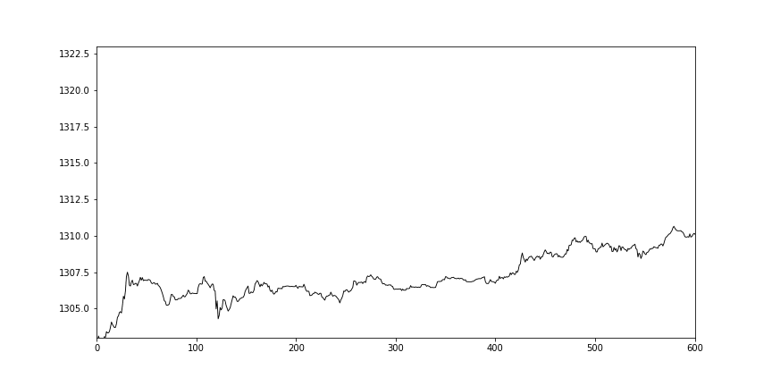
Animated Visualization of Time Series (1-minute Gold Price for 2018 yr.)
时间序列的动画可视化(2018年1分钟金价)
The Bayes update
贝叶斯更新
This animation displays the posterior estimate updates as it is refitted when new data arrives. The vertical line represents the theoretical value to which the plotted distribution should converge.
当新数据到达时,该动画将显示后验估计更新,并进行更新。 垂直线表示绘制的分布应收敛的理论值。

Animated histogram
动画直方图
This example shows how to use a path patch to draw a bunch of rectangles for an animated histogram.
本示例说明如何使用路径补丁为动画直方图绘制一堆矩形。

An animation of random data
随机数据的动画

Rain simulation
降雨模拟
Simulates rain drops on a surface by animating the scale and opacity of 50 scatter points. (Author: Nicolas P. Rougier)
通过设置50个散射点的比例和不透明度动画来模拟表面上的雨滴。 (作者:Nicolas P. Rougier)

翻译自: https://medium.com/@wetpaint3/animated-visualization-in-matplotlib-60cd9649f8f9
matplotlib可视化


 2187
2187


 被折叠的 条评论
为什么被折叠?
被折叠的 条评论
为什么被折叠?
 到【灌水乐园】发言


