


juypter
Communication is key to science and in many fields, communication means presenting data in a visual format. In some fields, such as neuroscience, it’s not uncommon to spend years editing the figures to go into a paper. This is in part due to the complexity of the data, but also in part due to the difficulty of quickly making plots to the standard of publication in the field using tools such as matplotlib. Subplots of different sizes, intricate inset plots and complex color schemes often drive scientists toward using graphical-based tools such as photoshop or inkscape.
交流是科学的关键,在许多领域,交流意味着以视觉格式呈现数据。 在某些领域,例如神经科学,花费数年时间编辑这些数字以撰写论文并不少见。 这部分归因于数据的复杂性,也部分归因于使用诸如matplotlib之类的工具难以按照现场发布标准快速绘制图的困难。 不同大小的子图,复杂的插图和复杂的配色方案经常驱使科学家们使用诸如Photoshop或Inkscape之类的基于图形的工具。
This post describes the development of a pair of tools which may extend the figure complexity easily achievable with python and matplotlib. The main idea is to graphically define subplots within a figure. This is done leveraging the fact that jupyter notebooks run in a browser, and an extension to the notebook can inject HTML/javascript drawing widgets into the notebook. This lets the user define the subplot layout using a mouse rather than the more cumbersome matplotlib numerical way of defining axes. Then, once the rough plot is done, various components can be resized algorithmically to fit within the allotted canvas space.
这篇文章描述了一对工具的开发,这些工具可以扩展使用python和matplotlib可以轻松实现的图形复杂性。 主要思想是以图形方式定义图形中的子图。 这是利用jupyter笔记本在浏览器中运行以及笔记本的扩展可以将HTML / javascript绘图小部件注入到笔记本中这一事实来完成的。 这使用户可以使用鼠标来定义子图布局,而不是使用繁琐的matplotlib数字轴定义方法。 然后,一旦完成了粗略绘制,就可以通过算法调整各种组件的大小,以适合分配的画布空间。
第1部分:绘图小部件 (Part 1: the drawing widget)
设置扩展框架(Setting up the extension skeleton)
As mentioned, the widget is built on top of the jupyter-contrib-nbextensions package, which provides a nice infrastructure for creating compartmentalized extensions which can independently be enabled/disabled. Making your own extension is a bit of cobbling together functions from existing extensions. This link is a good starting point.
如前所述,该小部件构建在jupyter-contrib-nbextensions软件包的顶部,该软件包为创建可以独立启用/禁用的分隔扩展提供了很好的基础架构。 制作自己的扩展名是将现有扩展名的功能合并在一起。 此链接是一个很好的起点。
The nbextensions package keeps each extension in its own folder in a known directory. Once you have installed the nbextensions package, this code snippet will help you find the directory
nbextensions软件包将每个扩展名保留在已知目录中的其自己的文件夹中。 安装nbextensions软件包后,此代码段将帮助您找到目录
from jupyter_core.paths import jupyter_data_dir
import os
nbext_path = os.path.join(jupyter_data_dir(), 'nbextensions')
nbext_path is where the code for your extension should ultimately end up. However, this location is not the most convenient location to develop the code, and more importantly, we’ll need some way of “installing” code here automatically anyway if we want to distribute our extension to others without having to have it included in the main nbextensions repository. (There are all sorts of reasons to do this, including “beta testing” new extensions and that as of this writing the last commit to the `master` branch of the nbextensions repository was nearly 1 year ago).
nbext_path是扩展的代码最终应在其中结束的位置。 但是,此位置并不是开发代码的最方便的位置,更重要的是,如果我们希望将扩展分发给其他人而不必将其包含在代码中,则无论如何我们都需要某种方式在此处自动“安装”代码。主要的nbextensions存储库。 (这样做的原因有很多,包括对新扩展进行“ beta测试”,以及在撰写本文时,对nbextensions存储库的“ nbextensions ”分支的最后一次提交是在1年前)。
A better approach than developing directly in nbext_path is to make a symbolic link to a more accessible coding location. Including this python script in your code directory will serve as an install script. Executing python install.py will make an appropriately named symlink from the current directory to nbext_path.
与直接在nbext_path开发相比,更好的方法是建立指向更易于访问的编码位置的符号链接。 在您的代码目录中包含此python脚本将用作安装脚本。 执行python install.py将创建一个从当前目录到nbext_path的适当名称的符号链接。
Now distribute away your extensions!
现在分发您的扩展程序!
创建扩展 (Creating the extension)
User flowLet’s briefly discuss the user flow of the extension before getting into implementation
用户流程让我们在实施之前简要讨论扩展程序的用户流程
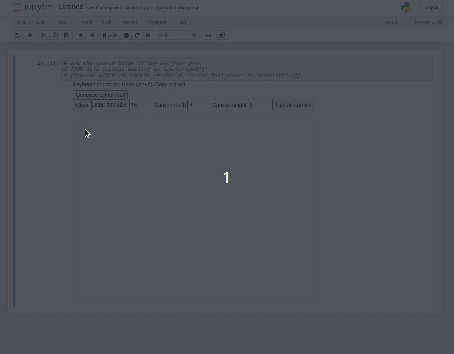
Begin with an empty notebook cell and press the icon on the far right which looks like two desktop windows.
从一个空的笔记本单元格开始,然后按最右边的图标,该图标看起来像两个桌面窗口。
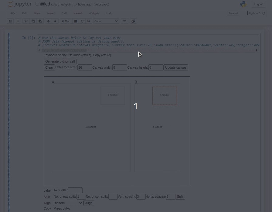
You can use your mouse to create an initial subplot:
您可以使用鼠标来创建初始子图:
When you’re satisfied with your layout, press the “Generate python cell” button to create a cell with equivalent python/matplotlib code.
当您对布局感到满意时,请按“生成python单元格”按钮以使用等效的python / matplotlib代码创建一个单元格。
The main challenges are injecting the HTML canvas when the toolbar button is pressed, and then automatically creating the python cell when the layout is ready. Once those are done, the rest of the implementation is just like every other javascript project.
主要的挑战是在按下工具栏按钮时注入HTML画布,然后在布局准备好后自动创建python单元。 完成这些操作后,其余实现将与其他所有javascript项目一样。
ImplementationThe main.js file is where most of the coding will happen. Below is the outline of the empty extension
实现main.js文件是大多数编码将在其中进行的地方。 以下是空扩展名的概述
define([
  'base/js/namespace',
  'base/js/events'
], function(Jupyter, events) {// add a button to the main toolbar
  var addButton = function() {
    Jupyter.toolbar.add_buttons_group([
      Jupyter.keyboard_manager.actions.register({
        'help': 'Add figure layout generator',
        'icon': 'fa-window-restore',
        'handler': inject_figure_widget
      }, 'add-default-cell', 'Default cell')
    ])
  }  // This function is run when the notebook is first loaded
  function load_ipython_extension() {
    addButton();
  }
  return {
    load_ipython_extension: load_ipython_extension
  };
});
This skeleton code runs a ‘startup’ function when the notebook is loaded. That ‘startup’ function creates the toolbar button and also registers a callback to the toolbar putton press. That callback, inject_figure_widget, is the ‘main’ function of the extension which will inject the HTML canvas into the notebook. To make main.js self-contained, you can define helper functions inside of the main function(Jupter, events).
笔记本计算机加载后,此框架代码将运行“启动”功能。 该“启动”功能创建工具栏按钮,还注册了对工具栏按钮按下的回调。 该回调inject_figure_widget是扩展的“主要”功能,它将HTML画布注入笔记本。 为了使main.js独立,可以在main function(Jupter, events)内定义帮助函数。
Figuring out the JS/HTML to inject a canvas into the output field is a bit of trial and error using the console and the element inspector. The rough outline is:
使用控制台和元素检查器,弄清楚JS / HTML将画布注入到输出字段中需要反复尝试。 粗略的轮廓是:
// execute the current cell to generate the output field; otherwise it won't be created
Jupyter.notebook.select();
Jupyter.notebook.execute_cell();// get reference to the output area of the cell
var output_subarea = $("#notebook-container")
  .children('.selected')
  .children('.output_wrapper')
  .children('.output');// add to DOM
let div = document.createElement("div");
output_subarea[0].appendChild(div);
Now the HTML elements of the widget can be added to div just like in any javascript-powered web page. Some special handling is needed for keyboard input elements, however. You’ll find if you try to type numbers into input fields that it converts your cell to markdown and eliminates the output field. This is because of Jupyter notebook’s default keybindings. The fix is to disable Jupyter’s keyboard manager when one of your text fields becomes in focus, and re-enable when it exits focus:
现在,可以像在任何基于JavaScript的网页中一样,将小部件HTML元素添加到div中。 但是,键盘输入元素需要一些特殊的处理。 您会发现是否尝试在输入字段中键入数字,从而将单元格转换为减价,并消除了输出字段。 这是因为Jupyter笔记本的默认键绑定。 解决方法是在其中一个文本字段成为焦点时禁用Jupyter的键盘管理器,并在退出焦点时重新启用它:
function input_field_focus() {
 Jupyter.keyboard_manager.disable();
}function input_field_blur() {
 Jupyter.keyboard_manager.enable();
}
$("#subplot_letter_input").focus(input_field_focus).blur(input_field_blur);
Other functionalityThe implemented widget has a number of other functions for which I won’t describe the implementation as it is all fairly standard javascript:
其他功能实现的窗口小部件具有许多其他功能,因为它们都是相当标准的javascript,因此我将不介绍其实现:
- Splitting plots into gridded subplots 将地块划分为网格子图
- Resizing subplots with the mouse用鼠标调整子图的大小
- Aligning horizontal/vertical edges of selected plot to other plots将选定图的水平/垂直边缘与其他图对齐
- Moving subplots by mouse用鼠标移动子图
- Moving subplots by keyboard arrows通过键盘箭头移动子图
- Copy/paste, undo, delete复制/粘贴,撤消,删除
- Creating labels创建标签
- Code generation代码生成
- Saving and reloading from within the notebook从笔记本中保存和重新加载
See the README of the widget for illustration of functionality.
有关功能的说明,请参见小部件的自述文件。
第2部分:程序调整大小 (Part 2: programmatic resizing)
The mouse-based layout tool is (hopefully) an easier way to define a complicated subplot layout. One difficulty in laying out a figure with multiple subplots in matplotlib is that sometimes text can overlap between subplots. Matplotlib is beginning to handle this issue with the tight layout feature, but that feature does not appear to be compatible with the generic way of defining subplot locations used here; it is meant to be used with the grid-based subplot layout definitions.
基于鼠标的布局工具(希望)是一种定义复杂子图布局的简便方法。 在matplotlib中布置具有多个子图的图形的一个困难是,有时文本可能在子图之间重叠。 Matplotlib开始使用紧密布局功能来解决此问题,但该功能似乎与此处定义的子图位置的通用方法不兼容; 它打算与基于网格的子图布局定义一起使用。
What we’d like as a user is to
作为用户,我们想要的是
- Create a rough layout graphically以图形方式创建粗略布局
- Fill in all the data and the labels填写所有数据和标签
- Call a routine to automatically make everything “fit” in the available space.调用例程以自动使所有内容都适合可用空间。
Step 2 must happen before everything can be “made to fit”. This is because it’s hard to account for the size of text-base elements beforehand. You might add or omit text labels, which occupies or frees space. Depending on your data range, the tick labels might a different number of characters occupying different amounts of canvas area.
必须先进行第2步,然后才能使所有内容“适应”。 这是因为很难预先考虑文本基元素的大小。 您可以添加或省略文本标签,这会占用或释放空间。 根据您的数据范围,刻度标签可能会使用不同数量的字符,占用不同数量的画布区域。
A very simple algorithm to make all the plot elements fit on the canvas is
使所有绘图元素适合画布的一种非常简单的算法是
- Calculate a bounding box around all subplot elements.计算所有子图元素周围的边界框。
- For each pair of plots, determine if the plots overlap based on the bounding boxes. 对于每对图,根据边界框确定图是否重叠。
- If there’s overlap, calculate a scale factor to reduce the width and height of the leftmost/topmost plot. Assume that the top left corner of each subplot is anchored. When this scale factor is applied, there should be no overlap for this pair of plots. (Sidenote: if two plots are overlapping assuming zero area allocated for text, they will not be resized; the assumption then is that the overlap is intentional such as for inset plots). 如果存在重叠,请计算比例因子以减少最左边/最上面图的宽度和高度。 假设每个子图的左上角均已锚定。 应用此比例因子后,这对图不应有重叠。 (旁注:如果两个图重叠,假设为文本分配了零个区域,则它们将不会调整大小;然后假设重叠是有意的,例如插图)。
- Apply the smallest pairwise scale factor globally. 全局应用最小的成对比例因子。
This is by no means the best data visualization algorithm, but it should always produce an overlap-free plot. This algorithm is implemented in this simple python module]
这绝不是最佳的数据可视化算法,但它应始终生成无重叠的图。 此算法在此简单的python模块中实现]
轴定界框 (Axis bounding box)
Finding the bounding box of various elements in maplotlib takes some trial-and-error. The data structures representing plot elements are quite flexible which can make it hard to figure out how to get the size of elements on the canvas if you’re not familiar with the API (I am firmly in the “not familiar” camp). Below is a simple search which iterates through all the children of an axis and tries to get the size of different recognized elements. I could not figure out a more uniform approach than the one below.
在maplotlib中查找各种元素的边界框需要反复试验。 表示绘图元素的数据结构非常灵活,如果您不熟悉API(我坚决属于“不熟悉”的阵营),可能很难弄清楚如何获得画布上元素的大小。 下面是一个简单的搜索,它遍历轴的所有子元素并尝试获取不同的已识别元素的大小。 我无法找到一种比以下方法更为统一的方法。
def get_axis_bounds(fig, ax, scaled=False):
    children = ax.get_children()# initial est based on ax itself
    p0, p1 = ax.bbox.get_points()
    xmax, ymax = p1
    xmin, ymin = p0for child in children:
        if isinstance(child, matplotlib.axis.XAxis):
            text_obj = filter(lambda x: isinstance(x, matplotlib.text.Text), child.get_children())
            text_obj_y = [x.get_window_extent(renderer=fig.canvas.renderer).p0[1] for x in text_obj]
            ymin_label = np.min(text_obj_y)
            if ymin_label < ymin:
                ymin = ymin_label
        elif isinstance(child, matplotlib.axis.YAxis):
            text_obj = filter(lambda x: isinstance(x, matplotlib.text.Text), child.get_children())
            text_obj_x = [x.get_window_extent(renderer=fig.canvas.renderer).p0[0] for x in text_obj]
            xmin_label = np.min(text_obj_x)
            if xmin_label < xmin:
                xmin = xmin_label
        elif hasattr(child, 'get_window_extent'):
            bb = child.get_window_extent(renderer=fig.canvas.renderer)
            if xmax < bb.p1[0]:
                xmax = bb.p1[0]
            if xmin > bb.p0[0]:
                xmin = bb.p0[0]
            if ymin > bb.p0[1]:
                ymin = bb.p0[1]
            if ymax < bb.p1[1]:
                ymax = bb.p1[1]if scaled:
        rect_bounds = np.array([xmin, ymin, xmax, ymax])
        fig_size_x, fig_size_y = fig.get_size_inches() * fig.dpi
        rect_bounds /= np.array([fig_size_x, fig_size_y, fig_size_x, fig_size_y])
        return rect_bounds
    else:
        return np.array([xmin, ymin, xmax, ymax])
There’s a small catch: this method requires matplotlib to first render the figure canvas. Before this rendering, matplotlib may not properly inform you how much space an element will take up. So you’ll have to use matplotlib in interactive mode. Presumably you’re in a jupyter environment if you’re using the widget from part 1. If you use the %matplotlib notebook style of figure generation which is interactive, this issue shouldn’t be a problem.
有一个小问题:此方法需要matplotlib首先渲染图形画布。 在渲染之前, matplotlib可能无法正确告知您元素将占用多少空间。 因此,您必须在交互模式下使用matplotlib 。 如果您使用的是第1部分中的小部件,则大概是在jupyter环境中。如果您使用交互式图形生成方式的%matplotlib notebook样式,则此问题不成问题。
Getting the boundaries of the plot area is quite a bit simpler because that’s how you specify where to draw the axes. The information is stored on the bbox attribute of the axis.
获取绘图区域的边界要简单得多,因为这是您指定绘制轴的位置的方式。 该信息存储在轴的bbox属性中。
fig_size_x, fig_size_y = fig.get_size_inches() * fig.dpi
plot_bounds = ax.bbox.get_points() / np.array([fig_size_x, fig_size_y])
Once the axis boundary and the plot boundary is known, the size of the border containing the text elements can be calculated on each side. The size of the border is fixed (unless the text changes), so the algorithm to calculate the rescaling factor on the plot is simply to scale it down by the fraction occupied by the border text
一旦知道了轴边界和绘图边界,就可以在每一侧计算包含文本元素的边界的大小。 边框的大小是固定的(除非文本发生变化),因此计算绘图上的缩放比例因子的算法只是将其按比例缩小为边框文本所占的比例
调整大小示例(Resizing examples)
Below are a few examples of auto-scaling plots to accomodate errant space occupied by text.
下面是一些自动缩放图以适应文本占用的错误空间的示例。
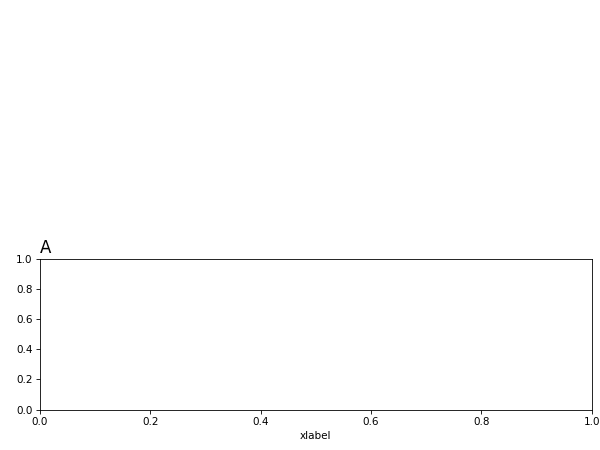
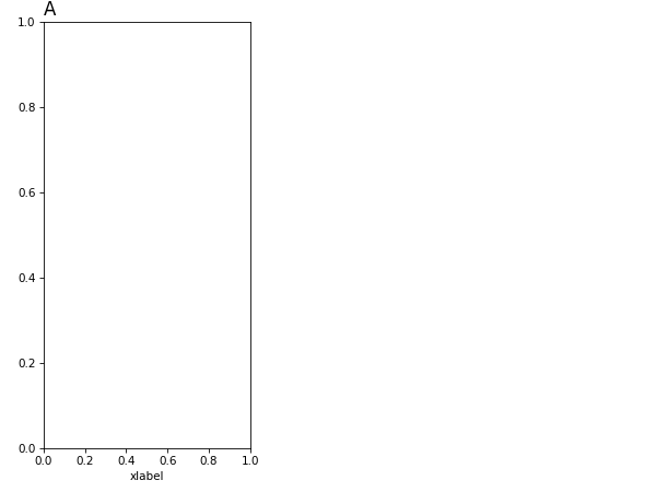
Axis extending too far horizontallyBefore:
轴水平延伸太远
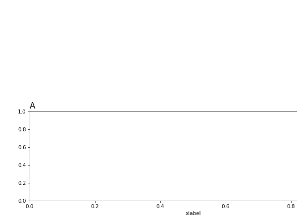
After:
后:
Axis extending too far verticallyBefore:
轴垂直延伸太远之前:
After:
后:
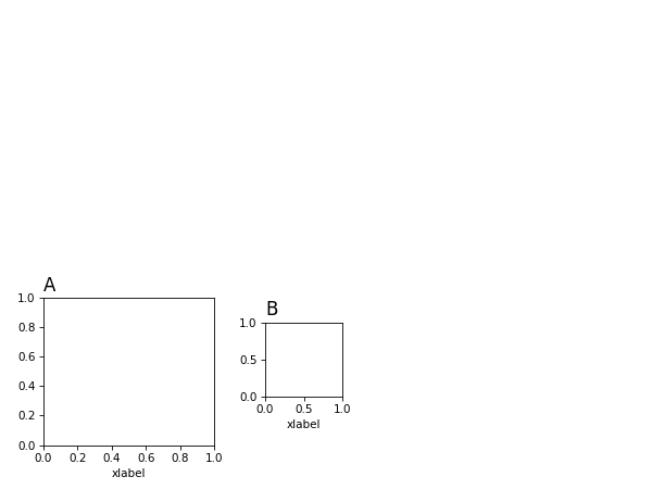
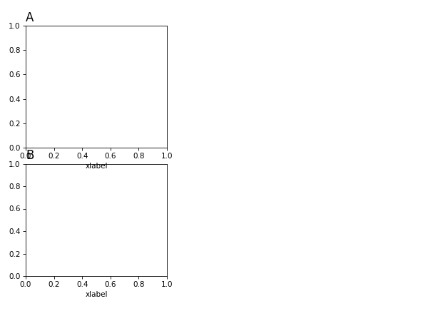
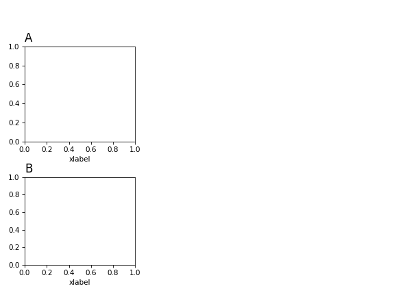
Axes overlapping horizontallyBefore:
水平重叠的轴在此之前:
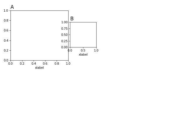
After:
后:
Axes overlapping verticallyBefore:
垂直重叠的轴在此之前:
After:
后:
结论 (Conclusion)
Altogether, this approach may automate some of the more tedious data visualization tasks researchers may face when publishing. Dealing with the layout issues algorithmically may lend itself to developing more sophisticated algorithms for laying out figures to be more naturally readable.
总之,这种方法可以使研究人员在发布时可能面临的一些更繁琐的数据可视化任务自动化。 通过算法处理布局问题可能有助于开发更复杂的算法,以使图形布局更加自然可读。
juypter


 1万+
1万+

 被折叠的 条评论
为什么被折叠?
被折叠的 条评论
为什么被折叠?
 到【灌水乐园】发言


