


python数据统计编程
总览 (Overview)
Using open source data from Wyscout, I extracted data and format into csv. To get more details, please see my article below:
使用来自Wyscout的开源数据,我将数据提取并格式化为csv。 要获取更多详细信息,请参阅以下我的文章:
Now we have prepared play by play data so I’m going to visualize football data with Python. This time, I visualize average passing position, direction and distance, this is called “Pass Sonar”.
现在我们已经准备了逐个比赛数据,因此我将使用Python可视化足球数据。 这次,我将平均通过位置,方向和距离形象化,这称为“通过声纳”。
I use Google colab so don’t need to build any environment on your laptop.
我使用Google colab,因此无需在笔记本电脑上构建任何环境。
1.读取csv并查看数据 (1. Read csv and look into data)
Firstly, read the csv files.
首先,读取csv文件。
import pandas as pd
pd.set_option(“max_columns”, 100)matches = pd.read_csv(“csv/matches.csv”)
matches_member = pd.read_csv(“csv/matches_member.csv”)
events = pd.read_csv(“csv/events.csv”)
event_kinds = pd.read_csv(“csv/eventKinds.csv”)
sub_event_kinds = pd.read_csv(“csv/subEventKinds.csv”)
players = pd.read_csv(“csv/players.csv”)
teams = pd.read_csv(“sv/teams.csv”)
I want visualize Spain v. Russia which Spain has recorded the most passes in the World Cup history, so search Spain and Russia in teams dataframe.
我想将西班牙对俄罗斯的比赛形象化,西班牙在世界杯历史上的传球次数最多,因此请在球队数据框中搜索西班牙和俄罗斯。


It looks one match has 2000+ records. This match went through penalty round, but we need only passing play of Spain. According to document, we can find matchPeriod meaning so narrow down the events with this parameter.
看起来一场比赛有2000多个记录。 这场比赛经过了点球大战,但我们只需要通过西班牙即可。 根据文档,我们可以找到matchPeriod的含义,因此可以使用此参数缩小事件范围。
- matchPeriod: the period of the match. It can be “1H” (first half of the match), “2H” (second half of the match), “E1” (first extra time), “E2” (second extra time) or “P” (penalties time);
-matchPeriod :比赛的期间。 可以是“ 1H”(比赛的上半场),“ 2H”(比赛的下半场),“ E1”(第一场额外时间),“ E2”(第二场额外时间)或“ P”(罚球时间) ;
events = events[(events.matchId == 2058004) & (events.matchPeriod != "E1") & (events.matchPeriod != "E2") & (events.matchPeriod != "P") & (events.teamId == 1598)]
We cannot visualize over 11 players on pitch (technically we can but it’s strange), so also narrow down by players who appeared at the beginning of the game.
我们无法直观地看到11个以上的球场上球员(从技术上讲我们可以做到,但这很奇怪),因此也缩小了比赛开始时出现的球员的范围。
member_spain = matches_member[(matches_member.matchId == 2058004) & (matches_member.teamId == 1598) & (matches_member.startingF == 1)]
events = events[events.playerId.isin(member_spain.playerId)]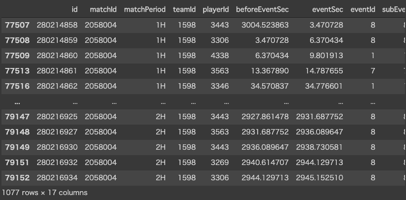
2.计算平均排名的玩家 (2. Calculate players with average position)
I found position specification on the document, so we can get average position of each player.
我在文档中找到了位置说明,因此我们可以获得每个玩家的平均位置。
- positions: the origin and destination positions associated with the event. Each position is a pair of coordinates (x, y). The x and y coordinates are always in the range [0, 100] and indicate the percentage of the field from the perspective of the attacking team. In particular, the value of the x coordinate indicates the event’s nearness (in percentage) to the opponent’s goal, while the value of the y coordinates indicates the event’s nearness (in percentage) to the right side of the field;
- 位置 :与事件关联的起点和终点位置。 每个位置都是一对坐标(x,y)。 x和y坐标始终在[0,100]范围内,从攻击团队的角度指示字段的百分比。 特别地,x坐标的值指示事件距对手目标的距离(以百分比表示),而y坐标的值指示事件距场地右侧的距离(以百分比表示);
However, a little bit tricky, x and y mean percentage. Let’s see some corner kick whose subEventId is “30”.
但是,有些棘手,x和y表示百分比。 让我们看一下subEventId为“ 30”的任意球。

We can understand 0 of x means Spain’s goal and 100 of x means opponent’s goal. (100 of y is right side for Spain according to the document)
我们可以理解x的0表示西班牙的进球,x的100表示对手的进球。 (根据文档,y的100在西班牙的右侧)
I want to visualize vertically not horizontally, so I exchange x for y and y for x. In addition, percentage is difficult to use so convert into meters. (assume pitch size is 105 x 68)
我想垂直可视而不是水平可视,因此我将x替换为y,将y替换为x。 此外,百分比很难使用,因此请转换为米。 (假设间距为105 x 68)
events["fromXm"] = round((events["fromY"]*68/100),1)
events["fromYm"] = round((events["fromX"]*105/100),1)
events["toXm"] = round((events["toY"]*68/100),1)
events["toYm"] = round((events["toX"]*105/100),1)
We are ready to calculate average position of each player. Narrow down by passing play, aggregate by each player and calculate average of x and y.
我们准备计算每个玩家的平均排名。 通过传球缩小距离,由每个球员进行汇总并计算x和y的平均值。
events.to_csv("csv/spain_passing_events.csv",index=False) #Save...pass_events = events[events.eventId == 8]pass_position = pass_events.groupby([“playerId”],as_index=False)pass_position = pass_position.agg({“fromXm”: “mean”,”fromYm”: “mean”})
In addition to this, we merge with player data to get player name.
除此之外,我们与玩家数据合并以获得玩家名称。
pass_position = pd.merge(pass_position, players, on=”playerId”)3.总结Pass Sonar的通过事件 (3. Summarize pass events for Pass Sonar)
We calculated average position of each player when they played passing, in addition to this, we also need distance and direction of accurate pass play. Therefore, I’m going to calculate these.
我们计算了每个球员传球时的平均位置,此外,我们还需要准确传球的距离和方向。 因此,我将计算这些。
Firstly, narrow down by pass play and accurate one.
首先,缩小传球和准确的传球范围。
accurate_pass_events = events[(events.eventId == 8) & (events.accurateF == 1)]
Calculate distance using Pythagoras’ theorem.
使用毕达哥拉斯定理计算距离。
import numpy as npaccurate_pass_events[“distance”] = np.sqrt(
  (abs(
    accurate_pass_events[“toXm”] — accurate_pass_events[“fromXm”]
  ) ** 2 + abs(
  accurate_pass_events[“toYm”] — accurate_pass_events[“fromYm”]
  ) ** 2).values
)
Also calculate angle. We define degree is 0 when pass goes straight forward.
还计算角度。 我们定义直通时的度数为0。
from numpy import linalg as LAdef calc_degree(fromX, fromY, toX, toY):
  u = np.array([fromX — fromX, 105 — fromY])
  v = np.array([toX — fromX, toY — fromY])
  i = np.inner(u, v)
  n = LA.norm(u) * LA.norm(v)
  c = i / n
  a = np.rad2deg(np.arccos(np.clip(c, -1.0, 1.0)))  if toX — fromX < 0:
    a = 360 — a
  return adef calc_pass_theta(row):
  return round(
    calc_degree(
      row[“fromXm”]
      ,row[“fromYm”]
      ,row[“toXm”]
      ,row[“toYm”]
    )
  )#Apply function each row
accurate_pass_events[“angle”] = accurate_pass_events.apply(
  calc_pass_theta
  ,axis=1
)
You can find 0 degree pass in the second row.
您可以在第二行找到0度通过。
Besides, we need divide into 8 directions (anything is ok) by degree. For example, if angles is between 0-22.5 and 337.5-360, I define direction 1 (means forward).
此外,我们需要按度数划分为8个方向(一切正常)。 例如,如果角度在0-22.5和337.5-360之间,则定义方向1(即向前)。
def divide(angle, divisions):
  degree = 360 / divisions
  division = ((angle + (degree / 2)) // degree) + 1  if division > angle:
    division = 1  return divisiondef divide_pass_direction(row):
  return divide(
    row[“angle”]
    ,8
  )accurate_pass_events[“direction”] = accurate_pass_events.apply(
  divide_pass_direction
  ,axis=1
)
Oops. Can you see direction 9? This means 1, so we replace it.
哎呀。 可以看到方向9吗? 这意味着1,因此我们将其替换。
accurate_pass_events = accurate_pass_events.replace({“direction”: {9: 1}})
In the end, summarize accurate pass events with player and direction and calculate average pass distance.
最后,总结准确的传球事件以及球员和方向,并计算平均传球距离。
pass_sonar = accurate_pass_events.groupby(["playerId", "direction"], as_index=False)
pass_sonar = pass_sonar.agg({"distance": "mean", "eventId": "count"})
pass_sonar = pass_sonar.rename(columns={"eventId": "amount"})
We eventually finished data preprocessing. Let’s move on visualization.
我们最终完成了数据预处理。 让我们继续进行可视化。
4.可视化 (4. Visualization)
I’m going to use matplotlib for visualization.
我将使用matplotlib进行可视化。
%matplotlib inline
import matplotlib.pyplot as pltfig = plt.figure(figsize=(7,11), facecolor=’white’)
ax = fig.add_subplot(111, facecolor=’white’)
ax.set_xlim(0, 68) #Horizontal pitch size
ax.set_ylim(0, 105) #Vertical pitch size
We plot pass sonar on average position of each player, so we use loop in pass sonar data which nested in average position data.
我们在每个玩家的平均位置绘制通过声纳,因此我们使用嵌套在平均位置数据中的通过声纳数据循环。
import matplotlib.patches as patfor _, player in pass_position.iterrows():
  ax.text(
    player.fromXm
    ,player.fromYm
    ,player.playerName.encode().decode(“unicode-escape”)
    ,ha=”center”
    ,va=”center”
    ,color=”black”
  )
  for _, pass_detail in pass_sonar[pass_sonar.playerId == player.playerId].iterrows():
    #Start degree of direction 1
    theta_left_start = 112.5
    #Color coding by distance
    color = “darkred”
    if pass_detail.distance < 15:
      color = “gold”
    elif pass_detail.distance < 25:
      color = “darkorange”    #Calculate degree in matplotlib figure
    theta_left = theta_left_start — (360 / 8) * (pass_detail.direction — 1)
    theta_right = theta_left — (360 / 8)    pass_wedge = pat.Wedge(
      center=(player.fromXm, player.fromYm)
      ,r=int(pass_detail.amount)*0.15
      ,theta1=theta_right
      ,theta2=theta_left
      ,facecolor=color
      ,edgecolor=”white”
    )    ax.add_patch(pass_wedge)
This is only 90 minutes passing plays, but Spanish players’ positions are very close and also find Jordi and Ramos short passing network while Ramos long passing to right side (maybe to Nacho?). Surprisingly, Silva and Busquets have less passes.
这仅是90分钟的传球,但西班牙球员的位置非常接近,他们还发现Jordi和Ramos的传球短线,而Ramos的传球长传到右侧(也许是Nacho?)。 出人意料的是,席尔瓦和布斯克茨的通行证更少。
5.看起来更好 (5. Look better)
Do you want to make this look better? We can do this using PIL.
您想让它看起来更好吗? 我们可以使用PIL做到这一点。
pip install pillow
from PIL import Image#convert matplotlib into PIL.Image
fig.canvas.draw()
pass_sonar_img = np.array(fig.canvas.renderer.buffer_rgba())
pass_sonar_img = Image.fromarray(pass_sonar_img)field_image = Image.open("image/field.png")
field_image.paste(pass_sonar_img,(0,0),pass_sonar_img)
This looks better and easier to understand on football field.
在足球场上,这看起来更好,更容易理解。
That’s all!! How do you think of this? Thank you for reading.
就这样!! 您如何看待? 感谢您的阅读。
python数据统计编程


 1万+
1万+

 被折叠的 条评论
为什么被折叠?
被折叠的 条评论
为什么被折叠?
 到【灌水乐园】发言


