


jetpack
I decided to test out Jetpack Compose by making a simple Twitter UI clone after I came across this tweet by Mariano Zorrilla:
在遇到Mariano Zorrilla的这则推文后,我决定通过制作一个简单的Twitter UI克隆来测试Jetpack Compose:
He used Flutter (which is an amazing tool btw for building cross platform apps) — with just one day of work, 1500 lines of code. That’s beyond impressive (specially the fact that Flutter can be hosted on CodePen as well).
他使用Flutter (这是构建跨平台应用程序的了不起的工具)–只需一天的工作,即可完成1500行代码。 这令人印象深刻(特别是Flutter也可以托管在CodePen上的事实)。
So with similar constraints, I wanted to try out Jetpack Compose. I followed the CodePen example (as closely as I could) and this is the result:
因此,在类似的限制下,我想尝试Jetpack Compose。 我遵循了CodePen示例(尽我所能),结果如下:
Complete source code:
完整的源代码:
应用程式 (The App)
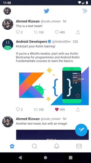
There are three screens in this app
此应用中有三个屏幕
Home Screen
主屏幕
Profile Screen
个人资料屏幕
Compose Screen
撰写画面
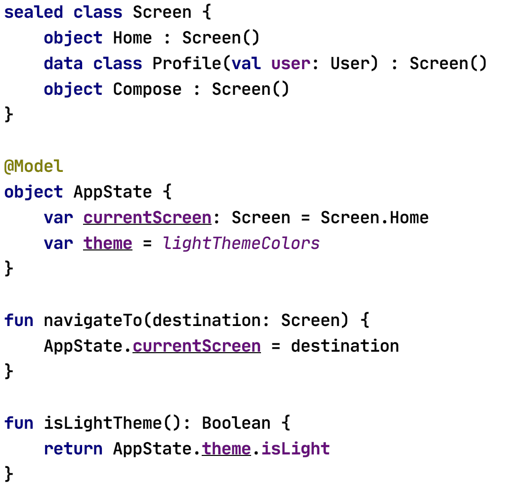
应用状态 (App State)
Before we get to the screens — take a look at app state model, which will be used for navigation and theming. I also added some helpers for navigating to individual screens & for checking theme.
在进入屏幕之前-查看应用程序状态模型,该模型将用于导航和主题化。 我还添加了一些帮助程序,用于导航到各个屏幕和检查主题。
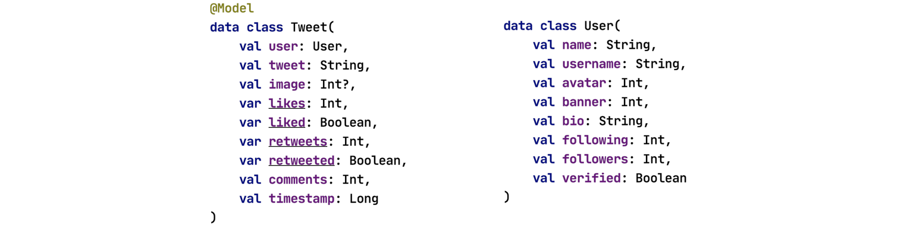
楷模 (Models)
There are two models — both data classes. The Tweet model is annotated with @Model as we update this model from our composed functions to update view state. User stays the same, hence it’s not annotated.
有两种模型-两种数据类。 当我们从组合函数中更新该模型以更新视图状态时, Tweet模型将使用@Model进行注释。 用户保持不变,因此未添加注释。
主屏幕 (Home Screen)
Home screen is a Scaffold — with drawer, bottom app bar, fab and content components. The scaffoldState is for managing the navigation drawer state. Initially the drawer is closed.
主屏幕是一个脚手架 -带有抽屉,底部应用程序栏,工厂和内容组件。 scaffoldState用于管理导航抽屉状态。 最初,抽屉是关闭的。

内容 (Content)
The content consists of a custom top bar & list of tweets. I used VerticalScroller (with column inside) for the list instead of an AdapterList, as for some reason it wasn’t as smooth when scrolling (this will change as Jetpack Compose matures). Ideally we would opt for AdapterList instead — but for now, I’m using the scroller.
内容包括自定义顶部栏和鸣叫列表。 我用了VerticalScroller (里面有列) 列表而不是AdapterList,因为某种原因,滚动时不那么顺畅(这会随着Jetpack Compose的成熟而改变)。 理想情况下,我们将改为选择AdapterList-但现在,我正在使用滚动条。

顶栏 (Top Bar)
As it’s a custom top bar — I used a Surface with some elevation. Inside it’s a simple row with three image resources, all arranged in a SpaceBetween pattern.
因为它是自定义的顶部栏,所以我使用了具有一定高度的Surface。 它的内部是一个简单的行,其中包含三个图像资源,所有资源均以SpaceBetween模式排列。

鸣叫布局 (Tweet Layout)
The tweet layout is also basically composed up of Rows & Columns.
该tweet布局也基本上由行和列组成。

个人资料屏幕 (Profile Screen)
For profile screen, I used ConstraintLayout within a VerticalScroller — the reason for using this layout is how simple it is to place profile image on top banner.
对于配置文件屏幕,我在VerticalScroller中使用了ConstraintLayout -使用此布局的原因是将配置文件图像放置在顶部横幅上非常简单。

约束条件 (Constraints)
Here’s an example of setting constraints inside the ConstraintSet. This is how I placed the image at the center of Banner’s bottom.
这是在ConstraintSet内部设置约束的示例。 这就是我将图像放置在Banner底部中心的方式。

For other constraints — you can view the complete source code.
对于其他限制,您可以查看完整的源代码 。
撰写画面 (Compose Screen)
Compose screen is also built using columns and rows. Additionally it includes TextField for input.
撰写屏幕也是使用列和行构建的。 此外,它包括用于输入的TextField 。

主题化 (Theming)
There are three themes light, dark and darker. Compose library gives us light and dark color palettes where we set primary, accent, background colors etc. These are considered “themes”.
有三个主题: 浅色 , 深色和深色 。 Compose库为我们提供了浅色和深色调色板,可在其中设置原色,强调色,背景色等。这些被视为“主题”。

And here’s how I switch the theme from a dialog:
这是我从对话框中切换主题的方式:

ThemeOption is a custom compose layout with a Radio Button & Text — I pass in on click event which triggers the theme switch.
ThemeOption是带有单选按钮和文本的自定义撰写布局-我传入了触发主题切换的click事件。
局限性 (Limitations)
While implementing the layout — there were some limitations, as Compose is in pre-release dev stage.
实施布局时-存在一些限制,因为Compose处于发行前的开发阶段。
Something like CoordinatorLayout is not available yet (which allows us to do custom app bar animations). Hence I wasn’t able to add that in Profile screen.
诸如CoordinatorLayout之类的东西尚不可用(这使我们能够进行自定义应用栏动画)。 因此,我无法在“个人资料”屏幕中添加该内容。
TextField doesn’t have placeholder/hint. So I had to implement one myself.
TextField没有占位符/提示。 所以我必须自己实施。
There’s currently no pull to refresh functionality available in lists.
当前没有列表中可用的刷新功能。
Next up — check out Compose implementation of Android 10’s Calculator UI
接下来—检查Android 10的计算器UI的撰写实现
Previously I also covered other composable layouts:
以前,我还介绍了其他可组合的布局:
Disclaimer: As the Jetpack Compose is in development phase — any of these APIs can change at any time. So as the source of truth, please always refer to the official documentation.
免责声明:由于Jetpack Compose处于开发阶段-这些API中的任何一个都可以随时更改。 因此,作为真实来源,请始终参考官方 文档 。
That’s it for now, thank you for reading! 🙂
就是这样,谢谢您的阅读! 🙂
翻译自: https://android.jlelse.eu/jetpack-compose-twitter-ui-96f76577143a
jetpack


 2546
2546

 被折叠的 条评论
为什么被折叠?
被折叠的 条评论
为什么被折叠?
 到【灌水乐园】发言


