


交互设计精髓
重点 (Top highlight)
什么是空间? (What is Space?)
Space is the dimension of height, depth and width within which all things exist and move. Space or Empty space or White space or Negative space are alias given to describe intensional spaces made in design. In a
空间是万物存在和移动的高度,深度和宽度的维度。 空格或空白空间或空白或负空格是别名,用于描述设计中的内涵空间。 在一个
digital world, we live in limited dimension of screen. People tend to fill up empty spaces to get maximum benefit out of it but rather know the importance and beauty of it. 在数字世界中 ,我们生活在屏幕的有限尺寸中。 人们倾向于填充空白空间,以从中获得最大的利益,但他们知道其重要性和美丽。Negative space creates a vacuum of content, which draws more importance and adheres attention to the existing content. Not only these they helps in readability, provide feedback and increase usability. These spaces creates room to breath and users feel comfortable looking or exploring it.
负空间会造成内容真空,这将引起更大的重视并持续关注现有内容。 它们不仅有助于提高可读性,提供反馈并提高可用性。 这些空间为呼吸创造了空间,用户在寻找或探索时都感到舒适。
“Good visual hierarchy isn’t about wild and crazy graphics or the newest Photoshop filters, it’s about organizing information in a way that’s usable, accessible, and logical to the everyday site visitor.”
“良好的视觉层次结构与疯狂的图形或最新的Photoshop过滤器无关,而在于以对日常站点访问者可用,可访问且合乎逻辑的方式组织信息。”
Brandon Jones — Former Editor of Tuts+
布兰登·琼斯 ( Brandon Jones) -Tuts +的前编辑
Space takes its major role in other field of design as well like Architecture. Architects have their in-depth analysis of spaces which is widely called Space Planning. Its a in-depth analysis of how floor space is used without wasting space. But in context of digital spaces we just focus on how we do our layouts right.
空间需要它的主要作用在设计的其他方面,以及类似的结构 。 建筑师对空间进行了深入的分析,这被称为空间规划。 它深入分析了如何使用地板空间而不浪费空间。 但是在数字空间的背景下,我们只专注于如何正确地进行布局。
In Graphic design, we generally see the term Negative space used. The graphical element used in graphics with any hidden shapes or identity inside design which can completely change the aesthetic of the element designed.
在图形设计中 ,我们通常会看到术语负空间。 图形中使用的图形元素,在设计内部具有任何隐藏的形状或标识,可以完全改变设计元素的美感。
If everything yells for your viewer’s attention , nothing is heard.- Aarron Walter “Design for Emotion”
如果一切都引起观众的注意,那么什么也听不见。-Aarron Walter“情感设计”
空间类型 (Types of Space)
The types of spaces in digital world can be classified by functionality and size. According to functionality it can be active or passive and according to size it can be micro and macro white space as well.
数字世界中的空间类型可以按功能和大小进行分类。 根据功能,它可以是主动或被动的,根据大小,它也可以是微观和宏观的空白。
Micro Space: It is the space between the small elements like letters, lines, icons, forms, paragraph, buttons and graphical element. Adding micro space whenever our design needs a little more breathing room but you don’t have enough canvas left to work with. Tweaking the amount of space between our smallest elements will help us to express clearly and become noticeable which ultimately improve our design and look rather less over cluttered.
微小空间:它是小元素之间的空间,如字母,线条,图标,表单,段落,按钮和图形元素。 只要我们的设计需要更多的呼吸空间,但您没有足够的画布可以使用时,就可以添加微空间。 调整最小元素之间的空间量将有助于我们清晰表达并变得引人注目,这最终改善了我们的设计,并且看上去不太凌乱。
Macro Space:It is the term given to larger volumes of white space. The space between bigger elements like text columns and graphics. It also refers to paddings and margins. These areas have a greater impact on the user’s journey through our product and macro space is often pretty accurately planned. It separates and groups elements giving visual clues of functionality and uplifts readability.
宏空间:这是赋予大量空白空间的术语。 较大的元素(如文本列和图形)之间的空间。 它还指填充和边距。 这些区域对用户使用我们产品的旅程产生更大的影响,并且通常非常准确地计划了宏空间。 它对元素进行了分离和分组,从而提供了可视化的功能线索并提升了可读性。

Active White Space:This is the space that you make a conscious effort to add to your design for emphasis and structure. Active white space is often asymmetrical, which makes the design look more dynamic and active. It draws a user’s attention and to emphasize certain elements like a headline, logo or graphic inside our design.
活动空白空间:这是您有意识地努力添加到设计中以强调和结构化的空间。 活动空白通常是不对称的,这使设计看起来更加动态和活跃。 它引起了用户的注意,并强调了我们设计中的某些元素,例如标题,徽标或图形。
Passive White Space:The space between small objects that goes unnoticed. The designers use it to create texts or arrange paragraphs or icons. It generally occurs naturally, such as the area between words on a line or the space surrounding a logo or graphic element. Though it goes without being noticed, this white space is intentionally added there in a very subtle way, to allow the eye to easily read the design/text.
被动空白:小对象之间的空间不被注意。 设计师使用它来创建文本或安排段落或图标。 它通常是自然发生的,例如行中单词之间的区域或徽标或图形元素周围的空间。 尽管没有引起注意,但还是有意以非常细微的方式在其中添加了此空白区域,以使眼睛能够轻松阅读设计/文本。
空间的重要性 (Importance of Space)
Designers love it, website owners want to fill it. Whitespace seems to be one of the most controversial aspects of design.
设计师喜欢它,网站所有者想要填充它。 空白似乎是设计中最具争议的方面之一。
— Paul Boag
保罗·波格
The importance of space are countless. The problem I mostly face during times is lack of realisation among business stakeholders is they want to squeeze more into the screen as mentioned in the quote.
空间的重要性无数。 我有时遇到的主要问题是业务涉众之间缺乏意识到,因为他们想像报价中所提到的那样挤进屏幕。
Separation and Grouping of elements can be clearly seen and users can easily distinguish and differentiate between elements based on proximity.
可以清楚地看到元素的分离和分组 ,并且用户可以轻松地基于接近度来区分和区分元素。
Adds luxury and sophistication to the element as a whole. White space can actually become a central element in a design when it’s used to create a certain mood or look.
整体上增加了奢华感和精致感 。 当空白空间用于营造某种氛围或外观时,实际上可以成为设计中的核心元素。
Adding emphasis to the design can be really helpful with space. The negative space is giving you visual clues about where you should be looking, providing plenty of buffer room around an element so that your brain can quickly process it.
在设计上增加重点对于节省空间确实很有帮助。 负空间为您提供视觉提示,让您知道应该去哪里,并在元素周围提供足够的缓冲空间,以便大脑可以快速处理它。
Spaces invokes imagination, when we see space in design, it allows us to imagine and roam free.
空间激发了想象力 ,当我们看到设计中的空间时,它使我们能够自由想象和漫游。
It creates visual hierarchy to the elements when gaps are created to ensure that the users can find and digest information presented more easily.
当创建间隙时,它会为元素创建视觉层次结构 ,以确保用户可以更轻松地查找和消化所呈现的信息。
Enhancing the usability in a sense where users will be able to easily read and comprehend the content you want to serve them. They should not be intimidated by a large amount of text — when its spacing is not big enough, it will look difficult to comprehend and it will result in a higher rate of leaving the website or application. Whereas enough white space will prevent that happening.
从某种意义上说, 增强了可用性 ,使用户能够轻松地阅读和理解您想要为他们提供的内容。 它们不应被大量文本吓倒–当其间距不够大时,将难以理解,并且导致离开网站或应用程序的比率更高。 而足够的空白将阻止这种情况的发生。
More spaces makes the experience of the user more lightweight, easy and comfortable to explore.
更多的空间使用户的体验更轻便,易于探索。
明显的用法 (Noticeable Usage)
The industry leaders and leading tech companies have been using this actively to get the advantages provided by the power of space. Let’s see some of the example in real world.
行业领导者和领先的科技公司一直在积极使用此功能,以获取太空力量所提供的优势。 让我们看看现实世界中的一些例子。
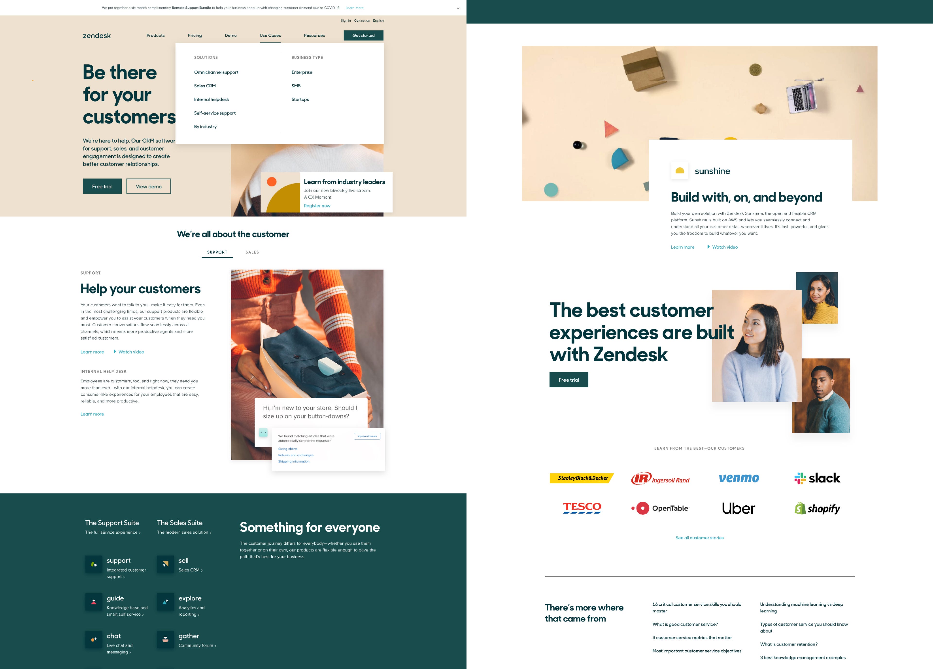
Zendesk has awesome use of white space into their design despite use of awesome color combination. We can see that our eyes flows into the design and it’s obvious to see the text with high visual weight and spaces creates more attention to it.
尽管使用了很棒的色彩组合, Zendesk在设计中还是大量使用了白色空间。 我们可以看到我们的眼睛进入了设计,很明显看到具有高视觉重量和空间的文本会引起更多关注。
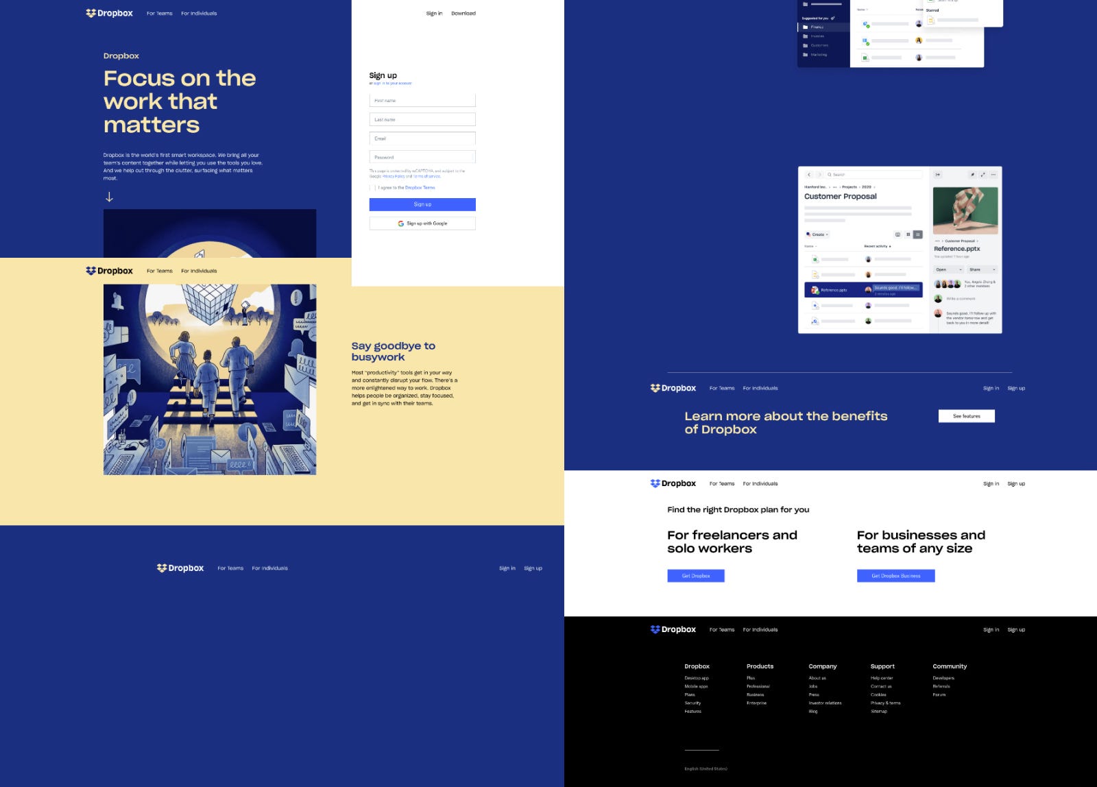
Dropbox have moved to a vast surprising rebrand. The colors and whitespaces used to make the content separate out from each other is awesome and well achieved. The separated blocks help keep the copy contained while still providing ample breathing room for the content, we’ll see whitespace is also used on a micro-level through the line-height, font size, and kerning are all taken into consideration.
Dropbox已经改头换面了。 用来使内容彼此分离的颜色和空白很棒,而且效果很好。 分隔的块有助于保留副本,同时仍为内容提供足够的喘息空间,我们将在行高度,字体大小和字距调整等所有方面都考虑到了空格的空白。

Apple are the early adopters of whitespace. The screen of apple would always have more focus to product and declutter the UI with empty spaces. Also one of the most noticeable thing they do is interactivity as well.
苹果是空白的最早采用者。 苹果的屏幕将始终将更多的精力放在产品上,并用空白填充UI。 他们所做的最引人注目的事情之一就是交互性。
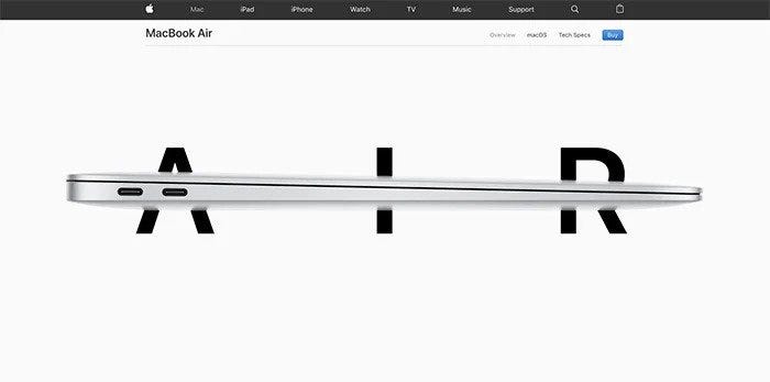
Not only does Apple execute active whitespace throughout the website well by placing imagery strategically to draw the users eye to specific elements down the page, but the company also uses passive whitespace to guide the user through the content without a hitch.
苹果公司不仅可以通过战略性地放置图像来吸引用户注意页面上的特定元素,从而在整个网站上很好地执行主动空白 ,而且该公司还使用被动空白来引导用户浏览内容而毫不费力。
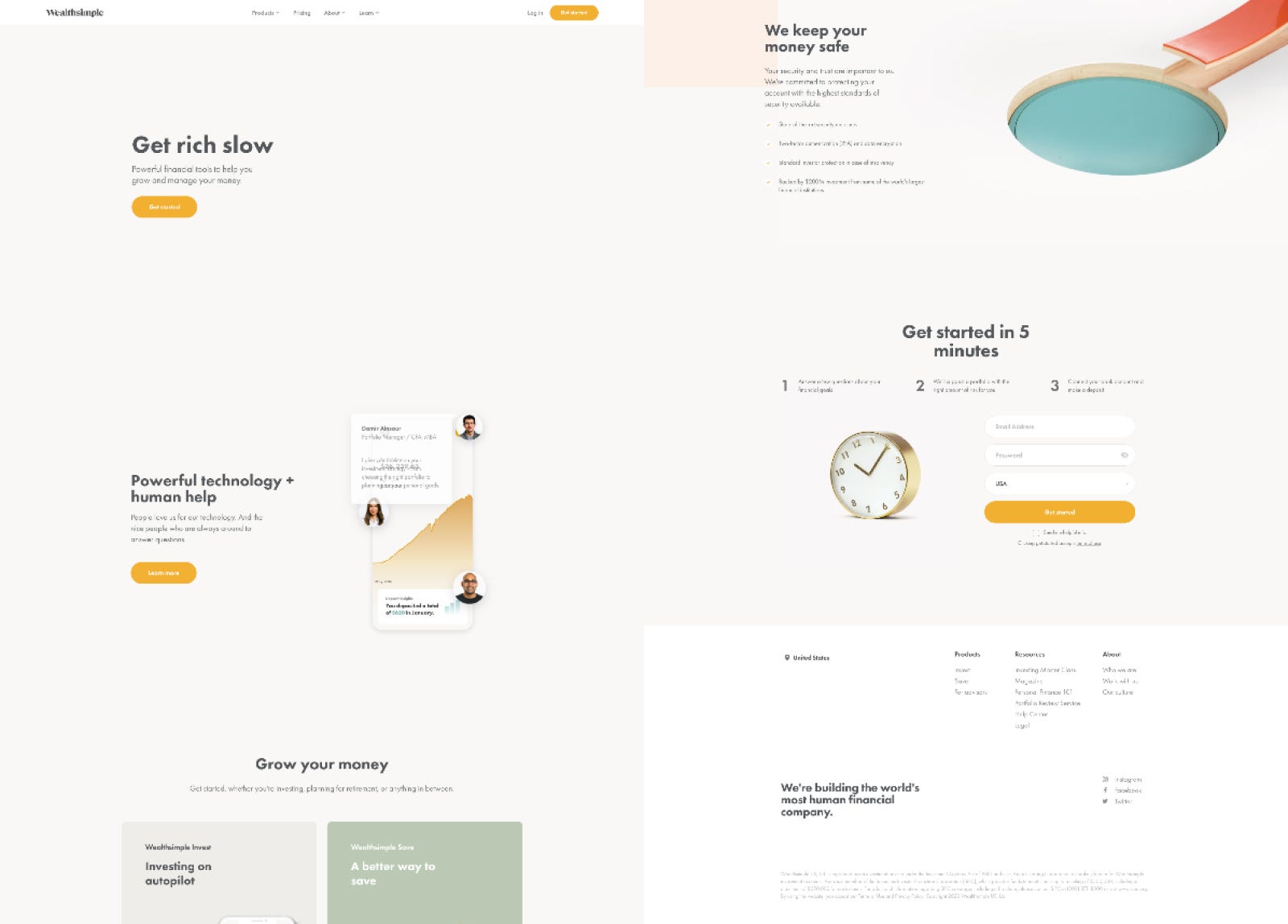
WealthSimple homepage is just to its notch. Its so simple and pleasure to navigate through the screens and also an excellent example of how to use whitespace as well. The angles used in images also provides generous whitespace. Users eyes are also drawn into the animation used and distinguished CTA sections.
WealthSimple主页即将到位 。 在屏幕上导航是如此简单和愉快,也是如何使用空白的一个很好的例子。 图像中使用的角度还提供了宽敞的空白。 用户的眼睛也被吸引到所使用的动画和出色的CTA部分中。
As a designer we cannot neglect one of its core fundamental principle. It’s really useful for the basic functions of a site or app like readability and navigation. But making smart use of whitespace can drive to success of the product and make users happy in making the interaction with the product.
作为设计师,我们不能忽略其核心基本原则之一。 对于网站或应用程序的基本功能(如可读性和导航)确实非常有用。 但是,聪明地使用空白可以推动产品成功,并使用户高兴地与产品进行交互。
So, we should bear in mind that the power of white space goes far beyond aesthetics and can be strategically used to further more enhance business related goals and making users engaged.
因此,我们应该记住,空白的作用远不止于美学,而且可以在战略上用于进一步提高与业务相关的目标并吸引用户的参与。
翻译自: https://uxdesign.cc/the-essence-of-space-in-design-b71f42166b82
交互设计精髓


 533
533

 被折叠的 条评论
为什么被折叠?
被折叠的 条评论
为什么被折叠?
 到【灌水乐园】发言


