


vsco
Among the many photo-editing apps, VSCO has definitely become a popular favorite among both experienced photographers as well as “aesthetic” Instagram users. However, my interaction with the app starts and ends with using a few key filters and (maybe) tweaking the exposure or saturation of an image. After taking a closer look at VSCO, I realized just how many features it offers… and how few most users are aware of. On the other hand, I also realized the many features I wished it did have.
在许多照片编辑应用程序中,VSCO无疑已成为经验丰富的摄影师以及“审美” Instagram用户的最爱。 但是,我与应用程序的交互开始和结束时使用了一些关键滤镜,并且(也许)调整了图像的曝光或饱和度。 在仔细研究了VSCO之后,我意识到它提供了多少功能……以及大多数用户所了解的很少。 另一方面,我也意识到了我希望它具有的许多功能。
* Study done in 2019 * 2019年完成的研究用户研究 (User Research)
为什么会这样呢? (Why is this the case?)
I first began to wonder whether other people had a similar experience with the app. After asking several of my friends for their opinions, I organized their thoughts/complaints/suggestions/praises into the following diagram.
我首先开始怀疑其他人是否对该应用程序有类似的体验。 向几个朋友征求意见后,我将他们的想法/投诉/建议/赞扬整理成下图。

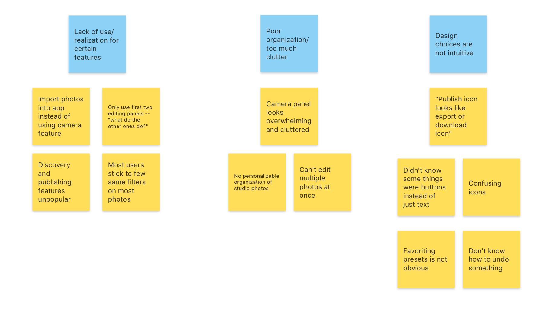
Their main complaints could be organized into the following categories:
他们的主要投诉可以分为以下几类:
The app was overwhelming: features seemed too cluttered at times, users mostly stuck to the same few filters/advanced edits
该应用程序不知所措:功能有时看起来过于混乱,用户大多停留在相同的几个过滤器/高级编辑上
It had poor organization: the minimalistic design of VSCO was impeding on users’ abilities to organize and group photos
它的组织能力很差: VSCO的简约设计妨碍了用户组织和分组照片的能力
The app was unintuitive: the purpose of some icons was not made obvious, certain features were not easily accessible
该应用程序不直观:某些图标的用途不明显,某些功能不易使用
仔细看看应用程序 (A closer look at the app)
After my initial research, I revisited the app in order to find specific areas for improvement. Since the most popular use of the app seems to be its editing features (as opposed to publishing and discovery), I decided to focus on the studio gallery, editing panel, and camera panel.
经过初步研究,我重新访问了该应用程序,以查找需要改进的特定领域。 由于该应用程序最受欢迎的用途似乎是其编辑功能(与发布和发现相对),因此我决定专注于工作室图库,编辑面板和相机面板。

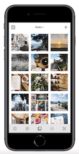
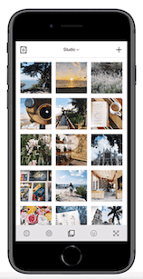
The VSCO studio lacks any option for organization and can appear overwhelming to users who have imported several photos into their gallery over time. As a result, it is difficult to locate photos, causing users to continuously scroll until happening upon the correct one. The “options” overlay unnecessarily takes up half the screen and darkens the photos beneath it.
VSCO工作室缺少任何组织选项,并且对于随时间推移将几张照片导入其图库的用户而言似乎显得不知所措。 结果,很难找到照片,导致用户不断滚动直到碰到正确的照片为止。 “选项”叠加层不必要地占据了屏幕的一半,并使下面的照片变暗。
The main complaints with the editing panel seemed to be that it was overwhelming and took too long to understand. This made sense considering several important editing features, such as the “undo” and “favorite” buttons, were difficult to find—especially for beginners. There was also no option to edit multiple photos at a time, a feature which would greatly reduce editing time for users importing more than one photo at a time.
编辑小组的主要抱怨似乎是它不堪重负,花了太长时间来理解。 考虑到很难找到几个重要的编辑功能,例如“撤消”和“收藏夹”按钮,这是有道理的,尤其是对于初学者而言。 还没有一次可以编辑多张照片的选项,该功能将大大减少用户一次导入多张照片的编辑时间。
The camera panel strays from VSCO’s minimalistic design in that an overlay of advanced features reduces the amount of space available for capturing an image. This cluttered appearance may be related to why most users opt for simply importing photos into the app rather than using the built-in camera.
摄像机面板偏离了VSCO的简约设计,因为高级功能的叠加减少了可用于捕获图像的空间量。 这种混乱的外观可能与为什么大多数用户选择将照片简单地导入应用程序而不是使用内置相机的原因有关。
初始设计过程 (The Initial Design Process)
设计一个有组织的工作区 (Designing an organized workspace)
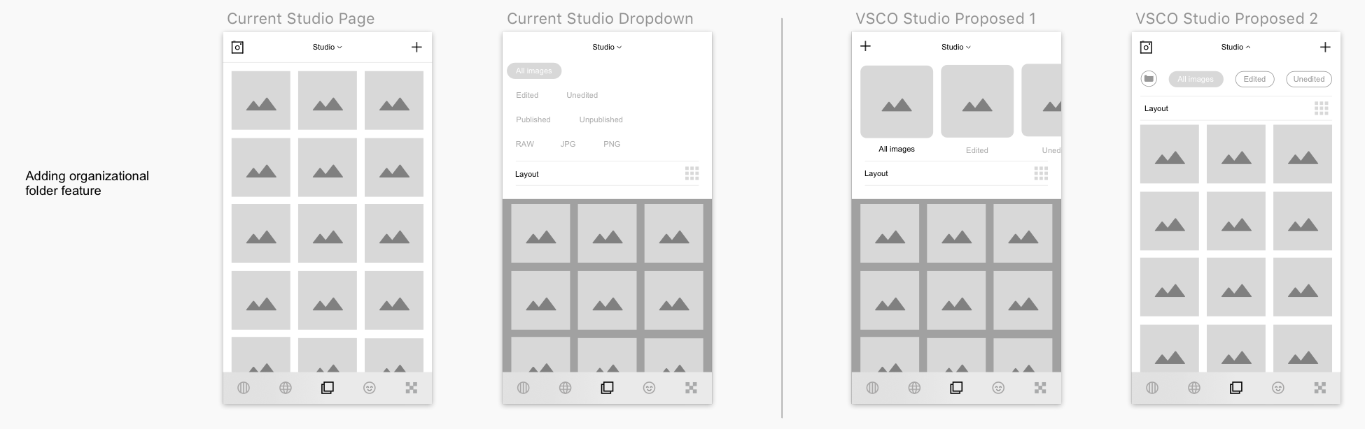
I wanted to add an “album” or “folder” feature where users could organize and narrow down their studio page. VSCO currently offers a rudimentary version of this in that it allows users to filter images based on whether they have been edited, published, or have a certain file type. However, VSCO does not allow users to customize these categories themselves. I created two potential explorations: the first offers a preview to each album while the second mimics the current dropdown design. I chose to go with the second option as it was more in tune with VSCO’s current design and also less obtrusive to the rest of the gallery.
我想添加一个“相册”或“文件夹”功能,以便用户可以组织和缩小其工作室页面。 VSCO当前提供了此功能的基本版本,它使用户可以根据图像是否已被编辑,发布或具有某种文件类型来过滤图像。 但是,VSCO不允许用户自己自定义这些类别。 我创建了两个潜在的探索:第一个探索每个专辑,第二个模仿当前的下拉设计。 我选择第二种选择,因为它更符合VSCO的当前设计,并且对画廊的其他部分也不太吸引人。
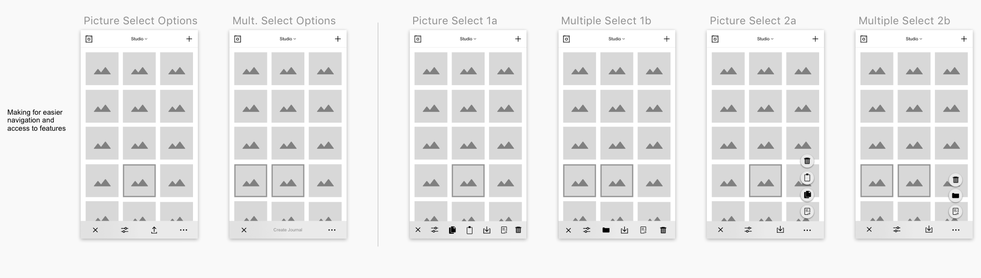
Instead of the previous “options” panel which was unnecessarily large and obtrusive, I wanted to include a more sleek way to access these tools. I came up with two variations—the first being a new task bar with all the tool options side-by-side and the second a set of pop-up options. The first design appeared a bit too busy and crowded, so I opted for the pop-up buttons which introduce interactivity without covering most of the screen. In addition, I changed the “download” icon since the original icon looked a bit like an export or publish icon.
与其之前的“选项”面板不必要的大而引人注目,倒不如我希望提供一种更为流畅的方式来访问这些工具。 我提出了两个变体–第一个是一个新的任务栏,所有工具选项并排放置,第二个是一组弹出选项。 第一个设计看起来有点太忙和拥挤,所以我选择了弹出式按钮,这些按钮在不覆盖整个屏幕的情况下引入了交互性。 另外,我更改了“下载”图标,因为原始图标看上去有点像导出或发布图标。
初学者友好的编辑面板 (A beginner friendly editing panel)
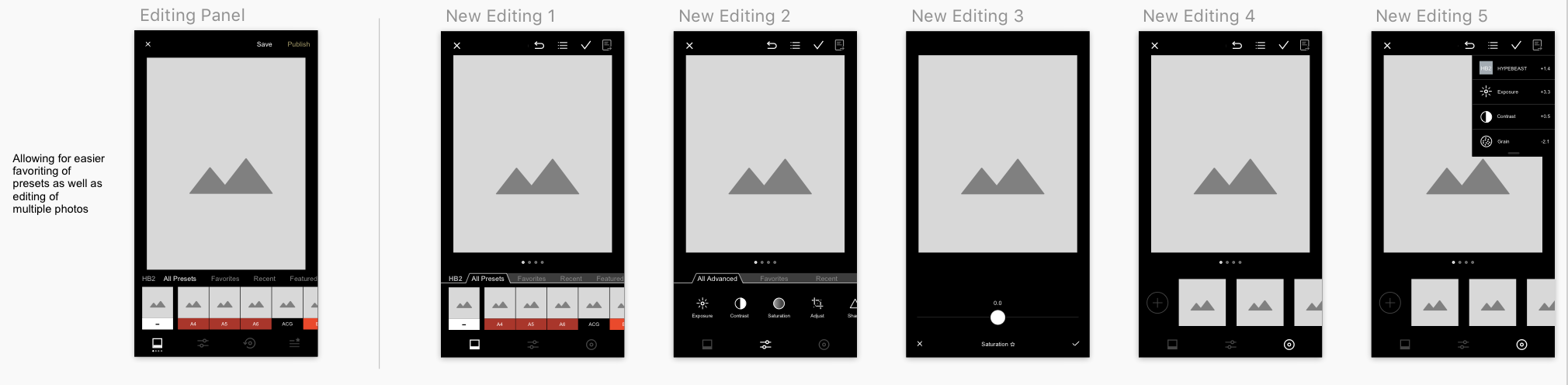
A raised “tab” appearance was created for the headers above filters in order to make them look like clickable buttons. In the current editing panel, favoriting a filter was done by holding down the filter until a star icon popped up—a feature several users did not know about. As a result, I wanted to include this feature in a more obvious spot. I opted for including a star icon next to the filter name (as seen in the third iteration) as users frequently use the scroll bar to apply filters and would be more likely to see star icon as opposed to holding down the filter. Icons were included at the top to allow for easy access to features such as the undo action, edit history, save button, and publish button. In addition, users can now edit multiple pictures at once by swiping left or right. These changes soften the learning curve for new users as well as make frequently used features more accessible.
为过滤器上方的标题创建了凸起的“标签”外观,以使它们看起来像可单击的按钮。 在当前的编辑面板中,通过按住过滤器直到弹出一个星形图标来完成对过滤器的偏爱,这是几个用户都不知道的功能。 因此,我想将此功能包括在更明显的位置。 我选择在过滤器名称旁边添加一个星形图标(如第三次迭代所示),因为用户经常使用滚动条来应用过滤器,并且与按住该过滤器相比,更有可能看到星形图标。 顶部包括图标,可轻松访问撤消操作,编辑历史记录,保存按钮和发布按钮等功能。 此外,用户现在可以向左或向右滑动一次编辑多张图片。 这些变化使新用户的学习曲线变软,并使常用功能更易于访问。
整理相机面板 (Decluttering the camera panel)
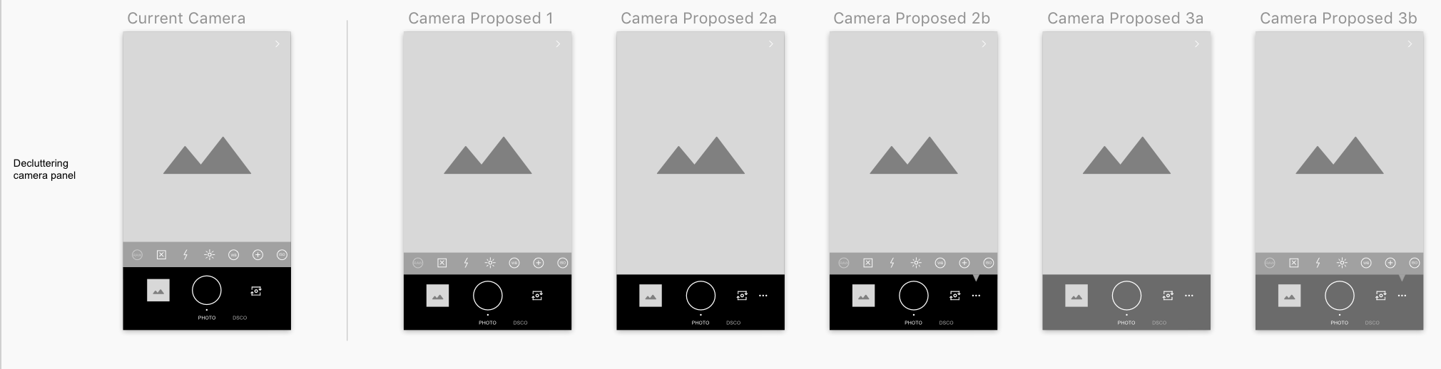
Finally, I played around with the camera panel. My first instinct was to simply reduce the size of the black task bar, but it still appeared too cluttered. In the second iteration, I made the advanced edits a pop-up feature rather than a permanent overlay on the screen. This gives users the choice to either use the edits or remove them for maximum screen size. I experimented with opacity as well, but ultimately chose to go with the second design as it was the most similar to VSCO’s current look, but still allowed for a less cluttered appearance.
最后,我在相机面板上玩耍。 我的第一个直觉是简单地减小黑色任务栏的大小,但它看起来仍然很杂乱。 在第二次迭代中,我使高级编辑成为弹出功能,而不是在屏幕上永久覆盖。 这使用户可以选择使用编辑或将其删除以达到最大屏幕尺寸。 我也进行了不透明度的实验,但最终选择了第二种设计,因为它与VSCO的当前外观最为相似,但外观仍然比较整洁。
最终产品 (The Final Product)
After incorporating all the research and wireframing, I created a prototype in Sketch + InVision with the following new features. The final design maintains the simplicity and minimalism of VSCO while still making the app more accessible for all its users.
结合所有研究和线框图后,我在Sketch + InVision中创建了具有以下新功能的原型。 最终设计保留了VSCO的简单性和简约性,同时仍使该应用程序可供其所有用户使用。
新的弹出选项 (New pop-up options)
These interactions add a sense of playful animation to the application while reducing the obtrusiveness of the prior “options” overlay.
这些交互为应用程序增加了一种有趣的动画效果,同时降低了先前“选项”覆盖的吸引力。
资料夹功能 (Folder feature)
The ability to group photos and create folders allows users to organize their gallery. This provides a simple and intuitive functionality similar to that of the “Photos” app.
对照片进行分组和创建文件夹的功能使用户可以组织自己的画廊。 这提供了类似于“照片”应用程序的简单直观的功能。

简化的摄像头面板 (Simplified camera panel)
Allowing users to toggle between the advanced edits on the camera panel makes for a less cluttered interface.
允许用户在相机面板上的高级编辑之间切换,从而使界面更简洁。
轻松编辑 (Easy editing)
The ability to edit multiple photos, easily favorite filters, and undo changes makes frequently used editing features more accessible to users.
编辑多张照片,轻松收藏的滤镜和撤消更改的功能使用户更易于使用常用的编辑功能。
While VSCO is one of the most popularly used photo-editing apps, there are still several improvements that can be made. In terms of its features, VSCO provides a variety of editing options and filters. However, in terms of its usability, VSCO can definitely be better at making its unique features easily accessible.
尽管VSCO是最常用的照片编辑应用程序之一,但仍然可以进行一些改进。 就功能而言,VSCO提供了各种编辑选项和过滤器。 但是,就可用性而言,VSCO绝对可以更好地使其易于访问的独特功能。
From a design perspective, this case study required me to balance the current design and purpose of VSCO with the user’s needs and preferences. In the beginning, I found myself making changes to the app that I wanted, but needed to evaluate whether they a) fit with the theme of the app and b) would actually improve the user experience of VSCO. In more broad terms, I learned a great deal about the design process as a whole. This case study made me realize the importance of both user and market research in identifying areas for improvement within the application.
从设计的角度来看,此案例研究要求我在VSCO的当前设计和目的与用户的需求和偏好之间取得平衡。 在开始的时候,我发现自己在更改应用程序, 我想,但评估他们一)是否符合与应用程序和b的主题)实际上会提高VSCO的用户体验的需要。 从广义上讲,我从整个设计过程中学到了很多东西。 这个案例研究使我意识到用户和市场研究在确定应用程序中需要改进的地方时的重要性。
翻译自: https://uxdesign.cc/vsco-redesign-a-more-intuitive-and-simplified-interface-9373a470f708
vsco


 422
422

 被折叠的 条评论
为什么被折叠?
被折叠的 条评论
为什么被折叠?
 到【灌水乐园】发言


