


 本文介绍了在图标设计中如何进行像素捕捉,特别是如何在AD18软件中设置像素捕捉,确保图标在渲染过程中的清晰度和精确性。
如何设置ad18捕捉图标
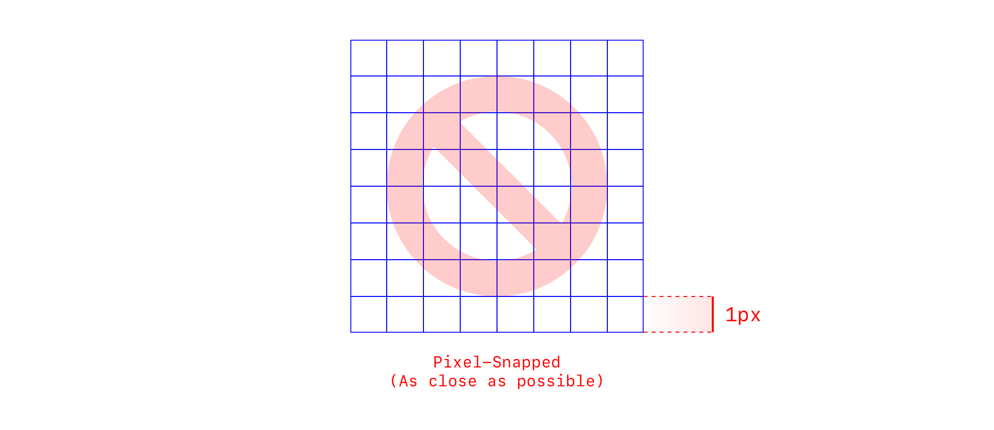
More in the iconography series:• Foundations of Iconography• 7 Principles of Icon Design• 5 Ways to Create a Settings Icon• Icon Grids & Keylines Demystified• 3 Classic Icon FamiliesWe all want our designs to display sharp on all platforms, for all our users. To achieve this goal for digital icons, a best practice has held the standard: it is recommended to pixel-fit or pixel-snap icons to sit precisely on a pixel grid. This means that all strokes and shapes snap to 1px increments and are positioned on the pixel.
我们都希望我们的设计能在所有平台上为所有用户展示出清晰的图像。 为了实现数字图标的这一目标,最佳实践已成为标准:建议对像素适合或像素捕捉的图标精确放置在像素网格上。 这意味着所有笔触和形状均以1px增量对齐并位于像素上。

Most icon guides and design systems advocate this in their specs — Google Material, Adobe Spectrum, IBM Carbon, and Firefox Photon to name a few.
大多数图标指南和设计系统在其规范中都提倡这样做-仅举几例,例如Google Material , Adobe Spectrum , IBM Carbon和Firefox Photon 。
The rationale is that because digital images are rendered to a matrix of pixels on screen, aligning elements to whole pixels produces sharper results; placing elements on subpixels or half pixels leads to fuzzier results.
基本原理是,由于数字图像被渲染到屏幕上的像素矩阵,因此将元素与整个像素对齐可以产生更清晰的结果; 将元素放在亚像素或半像素上会导致模糊的结果。

Though curved and angled lines can’t perfectly conform to a square pixel, the idea is to get as close as possible.
尽管弯曲和成角度的线不能完全符合正方形像素,但其想法是尽可能地靠近。
Makes sense, but I wanted to dig a little deeper. With today’s high resolution screens and potential non-integer scaling (e.g., from density-independent pixels), does this guidance still hold true? How important is pixel-snapping in practice? What effects do device, browser, file type, design software, and display magnification have on an icon’s render?
很有道理,但我想更深入一点。 在当今的高分辨率屏幕和潜在的非整数缩放(例如,来自与密度无关的像素 )上的情况下,此指南仍然适用吗? 像素捕捉在实践中有多重要? 设备,浏览器,文件类型,设计软件和显示放大率对图标的渲染有什么影响?
To answer these questions, I conducted a test.
为了回答这些问题,我进行了测试。
程序 (Procedure)
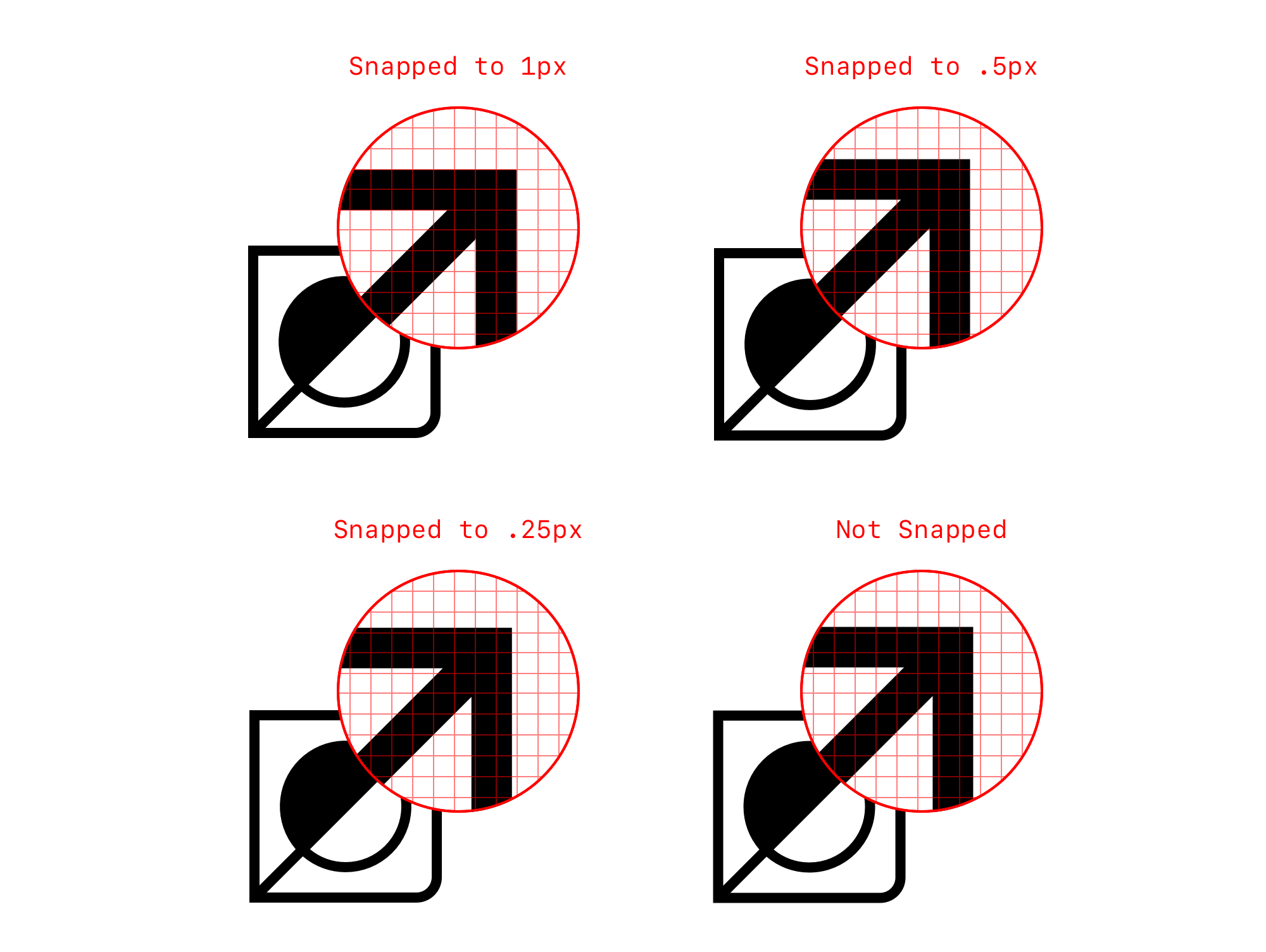
I created 4 test icons on a 48 x 48px canvas, using a 2px stroke and a range of straight lines and curves.
我使用2px笔划以及一系列直线和曲线在48 x 48px的画布上创建了4个测试图标。
Variant 1 was snapped to 1 pixel
变体1捕捉到1个像素
Variant 2 was snapped to .5 pixels
版本2捕捉到0.5像素
Variant 3 was snapped to .25 pixels
变体3 被捕捉到.25像素
Variant 4 sat on an odd subpixel number (.315 pixels)
变体4位于奇数子像素编号( .315像素 )
I exported these from both Illustrator and Sketch, as both SVG and PNG, and displayed them in an HTML page at 4 sizes (the 48 x 48px original, 64 x 64px, 32 x 32px, 24 x 24px). I then ran the test by examining the assets across 7 devices and 3 browsers:
我将它们从Illustrator和Sketch导出为SVG和PNG ,并在HTML页面中以4种尺寸显示它们(原始尺寸48 x 48px , 64 x 64px , 32 x 32px , 24 x 24px )。 然后,我通过检查7种设备和3种浏览器上的资产来运行测试:
MacBook Pro (Chrome, Firefox, Safari)
MacBook Pro(Chrome,Firefox,Safari)
Lenovo Thinkpad (Chrome, Firefox)
联想Thinkpad(Chrome,Firefox)
Windows 10 gaming PC with an Acer P244W monitor (Chrome, Firefox)
带有Acer P244W显示器的Windows 10游戏PC(Chrome,Firefox)
iPad Pro (Chrome, Firefox, Safari)
iPad Pro(Chrome,Firefox,Safari)
Pixel 3a (Chrome, Firefox)
Pixel 3a(Chrome,Firefox)
Motorola Moto E4 (Chrome, Firefox)
摩托罗拉Moto E4(Chrome,Firefox)
iPhone 11 Pro (Chrome, Firefox, Safari)
iPhone 11 Pro(Chrome,Firefox,Safari)
I repeated the process 3 times to be confident in what I was seeing.
我重复了3次此过程,以对自己看到的内容充满信心。
结果汇总 (Results Summary)
The detailed results are nuanced. For our purposes, I’ll summarize the takeaways here. Unfortunately, I won’t be able to illustrate all the findings; that would be a bit like talking about the matrix while inside the matrix. 🙃
详细结果细微差别。 为了我们的目的,我将在这里总结一下要点。 不幸的是,我无法说明所有发现。 这有点像在矩阵内部谈论矩阵。 🙃
Pixel-snapping to 1px and .5px produced the best results overall, but was not always make-or-break. In some cases, the effects of pixel-snapping was more magnified, in others less so. Not snapping on the Acer monitor created extremely fuzzy results while Apple devices were much more forgiving in their rendering of all variants. It seemed that the lower the resolution, the more important pixel-snapping was. Sometimes snapping to the pixel was sharpest (ThinkPad, Acer), sometimes snapping to the half pixel was sharpest (Pixel 3a, Motorola in one case), and sometimes snapping to 1px and .5px were tied (Apple devices: MacBook Pro, iPhone 11 Pro, iPad Pro). Snapping to .5px was the fuzziest variant on the Acer. It’s important to caveat that I evaluated sharpness at a very close distance (~4–5 inches) from the screen. There may be a bit more tolerance at a normal viewing distance.
将像素捕捉到1px和.5px总体上可获得最佳效果,但并非总是成败。 在某些情况下,像素捕捉的影响会更大,而在其他情况下,则不会。 如果没有在Acer显示器上捕捉快照,则会产生极其模糊的结果,而Apple设备在渲染所有变体时要宽容得多。 分辨率越低,像素捕捉越重要。 有时捕捉到像素最清晰(ThinkPad,Acer),有时捕捉到半像素最清晰(Pixel 3a,摩托罗拉在一种情况下),有时捕捉到1px和.5px 并列 (Apple设备:MacBook Pro,iPhone 11) Pro,iPad Pro)。 捕捉到.5px是Acer上最模糊的版本。 需要警告的一点是,我评估了距屏幕非常近的距离(约4-5英寸)的清晰度。 在正常观看距离下可能会有更多的公差。
The device (hardware + operating system + monitor) had a bigger effect on rendering than the browser. Differences across browsers within a device were slight, while the differences were much more pronounced between devices. For example, the Pixel 3a was pretty even-handed in it’s rendering, anti-aliasing all test stimuli fairly well. In contrast, the Lenovo Thinkpad display had an overall sharper, more jagged look. When it comes to which level of snap was sharpest, devices running Windows 10 shared similar results, devices running Android shared similar results, and devices running an Apple OS shared similar results. The operating system seems to have a big influence on how screen rendering is handled.
该设备(硬件+操作系统+监视器)比浏览器对渲染的影响更大。 设备中浏览器之间的差异很小,而设备之间的差异则更为明显。 例如,Pixel 3a的渲染相当均匀,可以很好地抗锯齿化所有测试刺激。 相比之下,Lenovo Thinkpad显示器的整体外观更加清晰,参差不齐。 当谈到最清晰的快照级别时,运行Windows 10的设备共享相似的结果,运行Android 10的设备共享相似的结果,运行Apple OS的设备共享相似的结果。 操作系统似乎对屏幕渲染的处理方式有很大影响 。
More factors outside of icon design and export confound sharpness of rendering. Magnifying the browser display (to 110%, 125%, 200%, etc.) changed which icons looked sharper. Resizing icons in code (to 24px, 32px, 64px) similarly led to unpredictable results. In theory, the 24px icon (1px stroke) would be sharper than 32px icon (1.33px stroke) but this was not always the case. Beyond these, there are many more considerations to test for: graphics cards, anti-aliasing preferences, privacy screens, viewer’s distance from the screen, ambient lighting conditions, etc.
图标设计和导出之外的更多因素会混淆渲染的清晰度。 放大浏览器显示(分别为110%,125%,200%等),可以使图标看起来更清晰。 将代码中的图标大小调整为24px,32px,64px同样会导致无法预测的结果。 从理论上讲,24px图标(1px笔画)比32px图标(1.33px笔画)更锐利,但这并非总是如此。 除此之外,还有许多要测试的注意事项:图形卡,抗锯齿首选项,隐私屏幕,查看者与屏幕的距离,环境照明条件等。
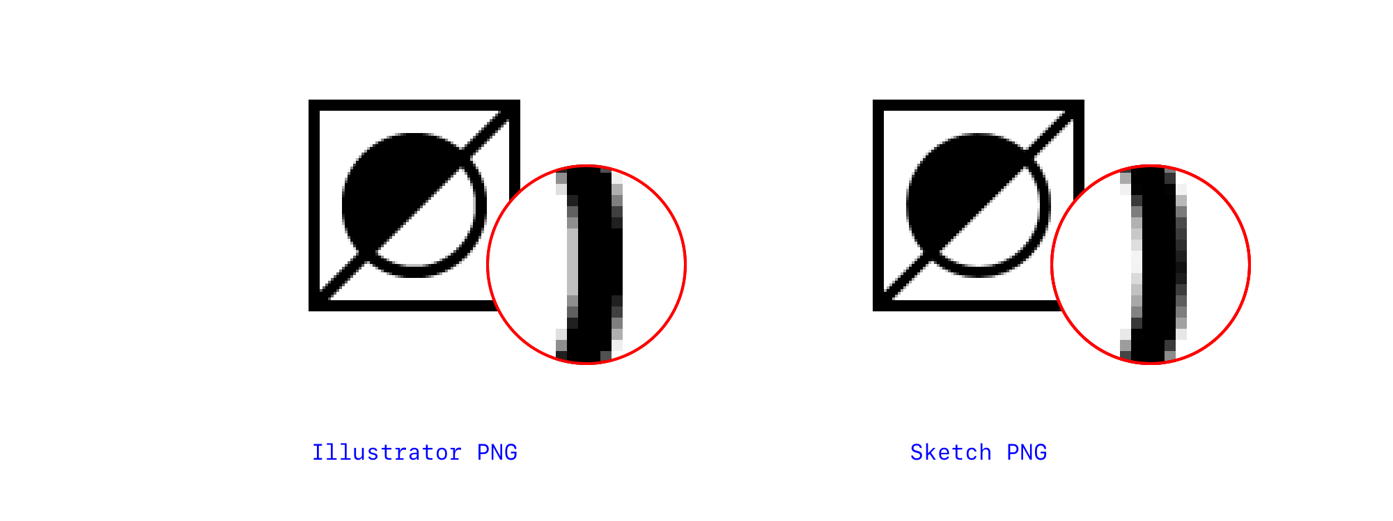
Illustrator vs. Sketch exports were comparable, though I preferred Sketch slightly. For SVGs, assets from Illustrator and Sketch were indistinguishable from each other. For PNGs, the difference was more noticeable, especially zoomed in—but you’ll probably never be viewing icons at 3200% in use. Sketch seems to apply smoother, finer antialiasing.
Illustrator与Sketch的导出效果相当,尽管我稍微偏爱Sketch。 对于SVG,Illustrator和Sketch的资产彼此无法区分。 对于PNG,差异更明显,尤其是放大-但是您可能永远不会以3200%的使用率查看图标。 草图似乎可以应用更平滑,更精细的抗锯齿。
SVGs outperformed PNGs. In the laptops and tablets, SVG vs. PNG performance was comparable. In the mobile devices, SVGs were clearly sharper. Overall, SVGs were much more forgiving of not pixel-snapping and more flexible to scale up and down since they are vector-based.
SVG优于PNG。 在笔记本电脑和平板电脑中,SVG与PNG的性能相当。 在移动设备中,SVG明显更清晰。 总体而言,由于SVG是基于矢量的,因此它们对像素捕捉的宽容度更高,并且在缩放时更灵活。
‘Sharper’ was not always better and probably needs clearer definition. There are different kinds of sharp. We opened with a general understanding of the word but there’s some nuance when we apply it. In my study, sometimes icons appeared sharp but undesirably aliased with jagged edges (Motorola, Thinkpad). There is a sweet spot to define. Perhaps ‘crisp’ would be a better word to describe sharp, but smooth.
“更锐利”并不总是更好,可能需要更清晰的定义。 有不同种类的锋利的东西。 我们最初对这个词有一个大致的了解,但是在使用它时会有些细微差别。 在我的研究中,有时会出现图标尖锐但不希望别名 锯齿边缘 (摩托罗拉,Thinkpad的)。 有一个定义的最佳位置。 也许用“酥脆”来形容敏锐而流畅的词是一个更好的词。
推荐建议 (Recommendations)
The results from this test lead me to one (not new) key recommendation—use SVGs where possible. They are the most flexible and forgiving, and perform best overall:
该测试的结果使我提出了一个(不是新的) 关键建议-尽可能使用SVG 。 它们是最灵活,最宽容的,并且在整体上表现最佳:
- An icon designer can design one size that an interface designer can scale to a variety of sizes (to the degree that the details allow; different sizes may require different levels of detail) 图标设计者可以设计一种尺寸,界面设计者可以将其缩放为各种尺寸(在细节允许的范围内;不同的尺寸可能需要不同的细节级别)
- A programmer can dynamically resize the icon in code and apply other transformations like fill color, stroke color, and stroke width 程序员可以在代码中动态调整图标的大小,并应用其他转换,例如填充颜色,笔触颜色和笔触宽度
- An end user can scale their browser magnification up without sacrificing icon quality 最终用户可以在不牺牲图标质量的情况下扩大其浏览器的放大倍数
- SVGs generally look crisper than PNGs, even when not pixel-snapped SVG通常看起来比PNG更清晰,即使没有像素捕捉也是如此
- SVG file size is smaller than PNG SVG文件大小小于PNG
An SVG critic may say it’s hard to attain perfect crispness when you scale an asset to another size. This is true, but it may be worthwhile to trade a bit of crispness for the benefits above, especially when there are so many factors outside a designer’s control.
SVG评论家可能会说,将资产缩放到另一尺寸时,很难获得完美的松脆度。 的确是这样,但是值得为上面的好处付出一些松脆的代价,尤其是当设计师无法控制的因素太多时。
A few more suggestions. Pixel-snapping to 1px or .5px is preferred for both SVGs and PNGs. Design at the smallest common size (design additional custom sizes as needed) and avoid scaling PNGs in use. To support older, lower resolution devices, snapping to 1px is safest. No matter what you decide in terms of snapping, it’s most important to develop a set of stylistic rules for your icons for consistency. Make the math easy for yourself and don’t forget to test your icons live in context.
还有一些建议。 SVG和PNG都建议将像素设置为1px或.5px。 以最小的公共尺寸进行设计(根据需要设计其他自定义尺寸),并避免缩放正在使用的PNG。 为了支持较旧的较低分辨率的设备,最安全的捕捉为1px。 没有你在捕捉方面决定的事情,它开发了一套谋篇为你的图标的一致性是最重要的。 简化数学运算,不要忘记在上下文中测试图标。
后记:期望与现实 (Afterword: Expectation vs. Reality)
Pixel-snapping is preferred, but don’t obsess. If it gets in the way of a clear message or a desired aesthetic, let it go.
首选像素捕捉,但不要痴迷。 如果它妨碍了明确的信息或理想的美观,请放手。
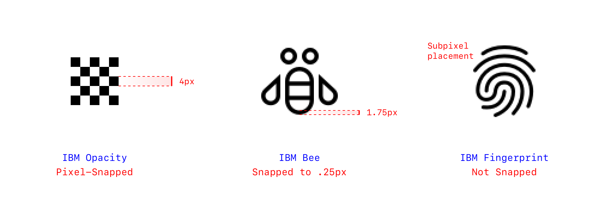
Despite the strict specifications put forth by the industry, there’s a severe lack of follow-through if you examine the digital products, websites, icon libraries, and source files around us. A quick audit of the icons on Facebook, Instagram, Google, and Twitter landing pages reveals that some are pixel-snapped, but many are not. A deeper review of IBM Carbon’s icons reveals that they occasionally bend the rules:
尽管业界提出了严格的规范,但是如果您检查一下我们周围的数字产品,网站,图标库和源文件,则仍然严重缺乏后续操作。 对Facebook,Instagram,Google和Twitter登陆页面上的图标进行的快速审核显示,其中一些图标被像素捕捉了,但是很多却没有。 更深入地回顾IBM Carbon的 图标表明它们偶尔会违反规则:
The reason for the disparity between the guidance and the execution might simply be that pixel-snapping is hard to adhere to at scale, that sometimes there is a good reason to use subpixels to get the point across (pixel-snapping is an art and a science), or perhaps pixel-snapping doesn’t matter as much as we say it does. Do your own investigation and make sure to check the more critical boxes first:
指导与执行之间存在差异的原因可能仅仅是像素抓取难以大规模地坚持,有时有充分的理由使用子像素来表达观点(像素抓取是一门艺术,科学),或者像素捕捉并不像我们所说的那么重要。 做您自己的调查,并确保首先选中更重要的框:
Make sure you aren’t sacrificing the integrity of the message or the integrity of the shapes to snap perfectly.
确保您没有牺牲消息的完整性或形状的完整性以完美捕捉。
When we started designing for digital, we coded everything to exact pixels to get the look we wanted. We were set on pixel-perfect. But over time, we realized the medium itself is fluid, and our canvas not exact. Our code adapted to serve a myriad of form factors by using relative units, percentage-based content blocks, flexible flowing of content. I’d propose a similar adaptive approach to icons — give up a little precision for much more flexibility. Many icon sets like Feather and Remix are doing just that.
当我们开始为数字设计时,我们将所有内容编码为精确的像素,以得到我们想要的外观。 我们被设置为像素完美的。 但是随着时间的流逝,我们意识到介质本身是流动的,而我们的画布并不精确。 我们的代码通过使用相对单位,基于百分比的内容块,灵活的内容流来适应多种形式的因素。 我将为图标提出一种类似的自适应方法-放弃一些精度以提高灵活性。 许多图标集(例如Feather和Remix)就是这样做的。
🙏 Thanks to: Toby Fried, Lonny Huff, and Monica Chang
to 感谢:Toby Fried,Lonny Huff和Monica Chang
翻译自: https://uxdesign.cc/pixel-snapping-in-icon-design-a-rendering-test-6ecd5b516522
如何设置ad18捕捉图标


 1万+
1万+

 被折叠的 条评论
为什么被折叠?
被折叠的 条评论
为什么被折叠?
 到【灌水乐园】发言


