


figma设计
Figma教程 (Figma Tutorial)
Do you like staring at a blank canvas every time you start a new project in Figma?
每次在Figma中启动新项目时,您是否喜欢盯着一块空白的画布?
I’m guessing you’re not a big fan right, but it’s a practice that you’ve possibly followed from time to time?
我猜你不是一个忠实拥护者,但这是您可能不时遵循的一种做法?
Wouldn’t it be better if you could kick-start your design projects faster, and get your head into that free-flowing creative space instantly?
如果您可以更快地启动设计项目并立即进入自由流动的创意空间,这会更好吗?
Well my dear friends, this is where a Design Starter Kit can come to your assistance. Cue the intro music!
亲爱的朋友们,这是设计入门套件可以为您提供帮助的地方。 提示介绍音乐!
So what is a Design Starter Kit, you may ask? Is it one of those ‘Design Systems’ that everyone talks about in that bubble we call #DesignTwitter?
那么,您可能会问什么是设计入门工具包? 每个人都在那个我们称为#DesignTwitter的泡沫中谈论的“设计系统”之一吗?
Not quite. Is it a valuable, and essential part of an overall Design System? Absolutely.
不完全的。 它是整个设计系统的重要组成部分吗? 绝对。
Is it one of those ‘UI Kits’ that you see on design marketplaces all the time?
它是您始终在设计市场上看到的“ UI套件”之一吗?
It isn’t that either. Unlike those ‘dime to a dozen UI Kits’ which have been created with a certain aesthetic, or to serve a particular industry, a Starter Kit is more vanilla in its base look, and feel, and doesn’t lock you into a specific style. It’s open for you to add your own interpretation dependant on the project at hand.
也不是。 与以某种美学风格创建或服务于特定行业的“一打一打UI工具包”不同,入门工具包的基本外观和感觉更具香草味,并且不会将您锁定为特定样式。 您可以根据自己的项目添加自己的解释,这是开放的。
So what is it then?
那是什么呢?
I like to think of it as more of a Component Library and Style Guide rolled into one. Something which enables you to have those core UI elements pre-built, ready to go, allowing your creativity room to breathe, and enabling you to focus on the nuances of a design project much faster than you may have done previously. Simple as that really.
我更喜欢将它看作是更多的组件库和样式指南 。 它使您能够预先构建,准备使用这些核心UI元素,使您的创造力得以释放,并使您能够比以前更快地专注于设计项目的细微差别。 就这么简单 。
Y’know, I like drawing rectangles as much as the next man/woman but I don’t want to go through the hassle of creating common UI elements such as Buttons, Form Inputs, Modals, Cards, and everything in between each time I start a new project. Nah!
知道,我喜欢下一个男人/女人一样喜欢绘制矩形,但是我不想经历创建通用UI元素(如Buttons , Form Inputs , Modals , Cards以及每次我之间的所有事物)的麻烦开始一个新项目。 不!
So with all that said, let me show you how I put together my own Starter Kit; Cabana for Figma, and in the process help you better understand what goes into creating a versatile and powerful Kit for yourself, enabling you to get your next project off to a flying start.
综上所述,让我向您展示如何组合自己的入门套件; Cabana for Figma ,并在此过程中帮助您更好地了解如何为自己创建一个功能强大的多功能套件,使您可以开始下一个项目。
Staring at a Blank Canvas Syndrome (S. B. C. S.) be gone!
盯着空白的画布综合症(SBCS)消失了!
P.S. Due to the fact that I created my own Starter Kit in Sketch first, I will cross-reference that tool from time to time, just to let you see how the different tools handle creating a Kit such as this.
PS 由于我首先在Sketch中创建了自己的入门工具包,因此我将不时地交叉引用该工具,以让您了解不同的工具如何处理此类工具包。
为什么要先构建强大的调色板 (Why you should build a strong Color Palette before anything else)
 W
W
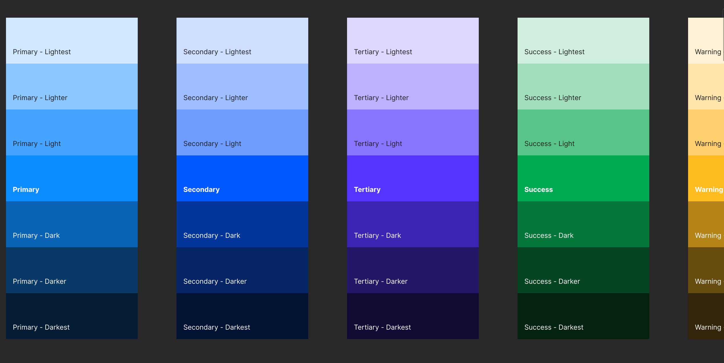
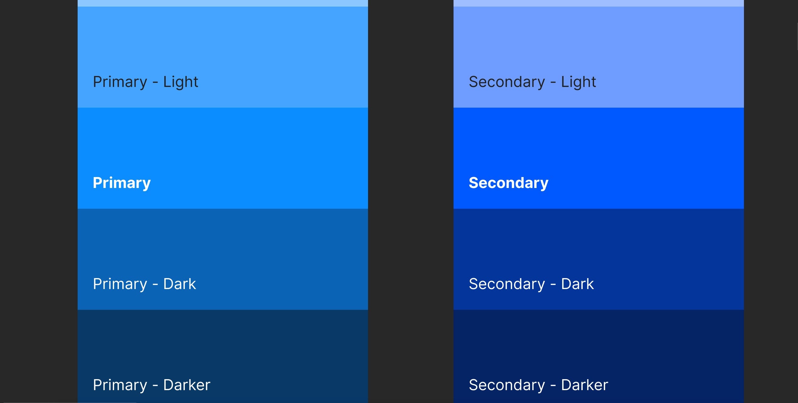
当您开始在Figma内创建自己的入门工具包时,您想从 调色板 首先,在这样做时,要保持您的 基色 在可能的情况下(例如,通常的嫌疑犯- 主 , 次要的 和 第三 )。 当然,出于灵活性的目的,这是有意义的,然后通过提供不同程度的 色调(较浅的变体) 和 阴影(深色变体) 。
I’ve said it before, and I’ll say it again, you can create an aesthetically appealing, and user-friendly site, or app with just great Color, and Type choices alone, and having that wider range of Tints, and Shades to call upon brings a generous amount of versatility for when you do.
我已经说过了,我再说一遍,您可以创建一个美观且易于使用的网站,或者仅使用出色的Color和Type选择并拥有更广泛的Tints和Shades的应用程序调用时会带来大量的多功能性。
Now you could go ahead and create the varying Tints and Shades from your initial Base Color by tweaking the Saturation, and Lightness values from the HSL option inside of the Color Panel in Figma, but that’s a time consuming process, and who’s got the time right?
现在,您可以通过在Figma的“颜色面板”中调整HSL选项的“ 饱和度 ”和“ 亮度”值,从初始基础颜色创建各种色调和阴影,但这是一个耗时的过程,谁来对得起?
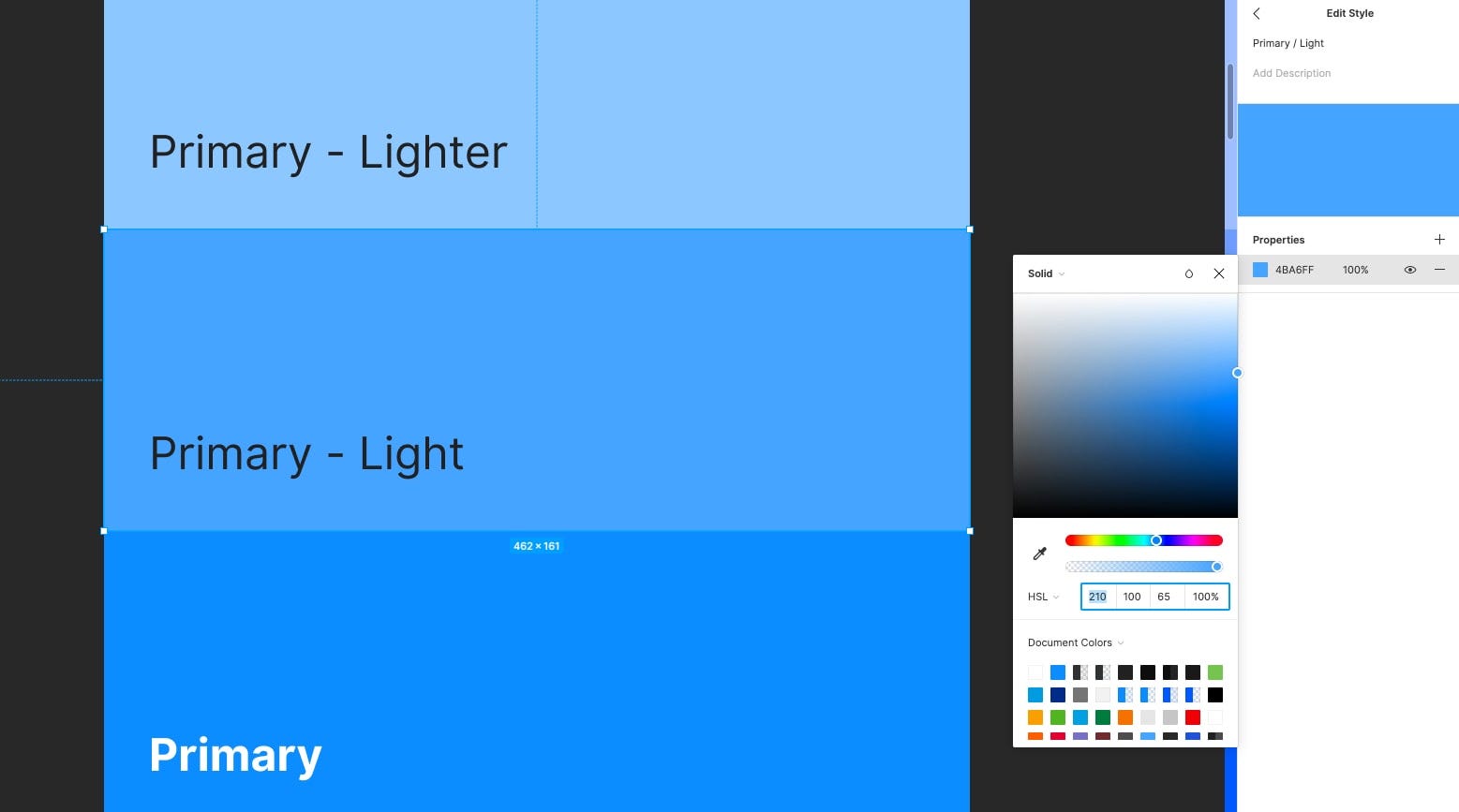
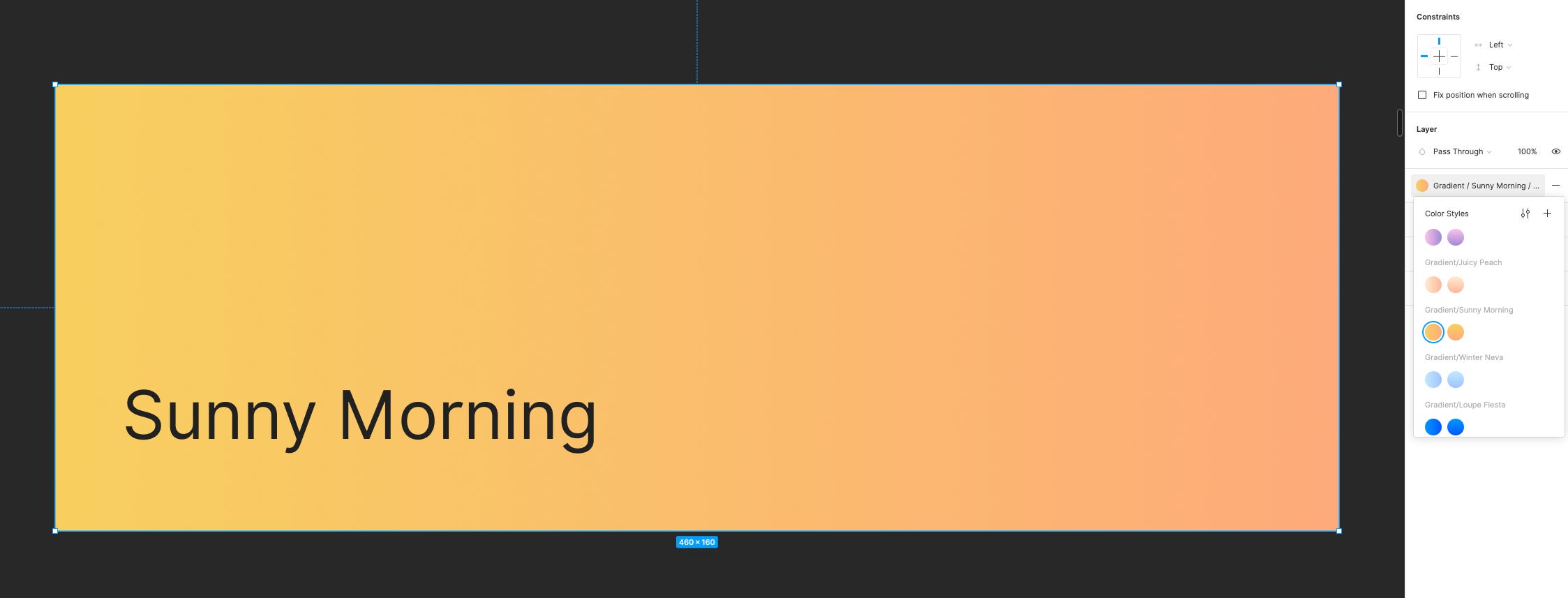
A tool that I use to make the whole Tints & Shades creation process even quicker, and one that I highly recommend, can be found at the following link: https://maketintsandshades.com
可以在以下链接中找到一种我用来使整个“色调和阴影”创建过程更快的工具,并且我强烈推荐该工具: https : //maketintsandshades.com
Here you can quickly, and easily produce Tints & Shades by simply pasting in your Base Color HEX value, which in turn will then produce perfectly computed Tints & Shades for you.
在这里,您只需粘贴您的Base Color HEX值即可快速,轻松地生成“色调和阴影”,然后可以为您生成完美计算的“色调和阴影”。
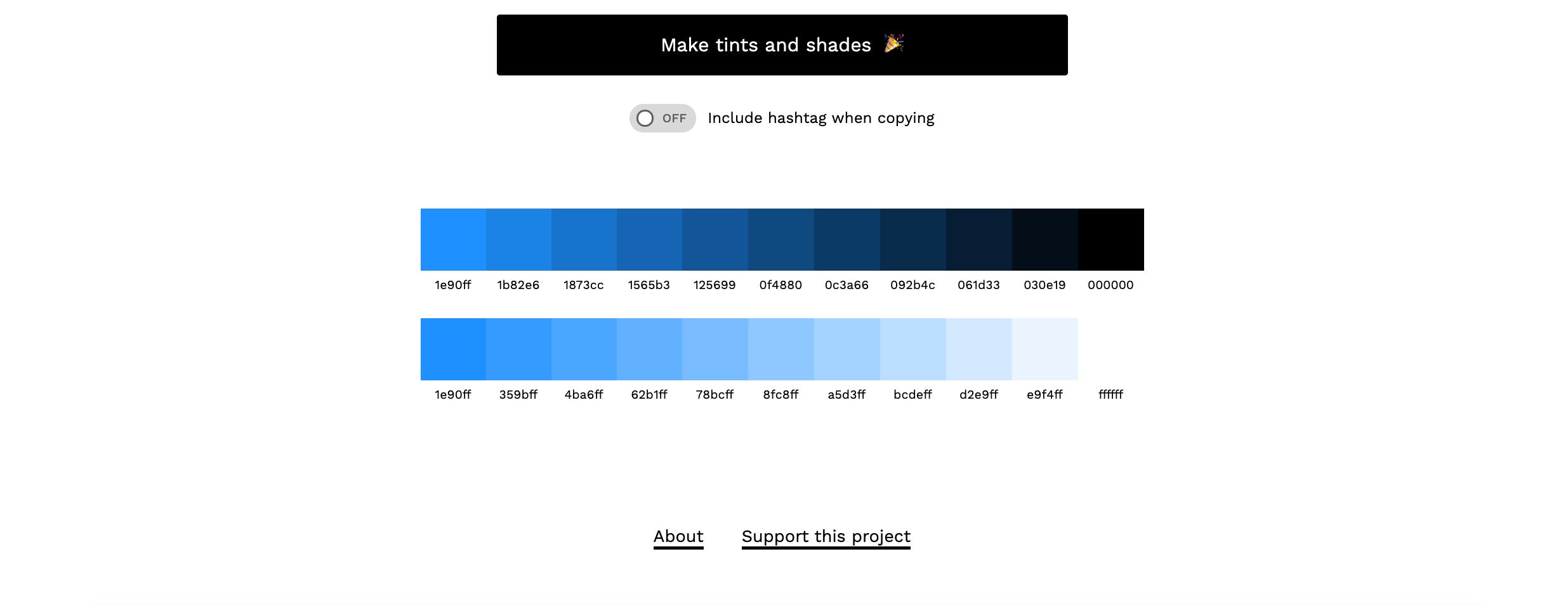
You then select which Tints & Shades you’d like to use inside of your Kit and then simply copy back across your chosen HEX values, which you can then insert into the relevant Fill options. Give me a time-saving high-five folks!
然后,您可以选择要在工具包中使用的色调和底纹,然后简单地跨选择的十六进制值进行复制,然后将其插入相关的“填充”选项中。 给我省时的五个人!
Before we move on, let me give you a simple tip on naming conventions when it comes to your Color Palette…
在继续之前,让我给您一个有关调色板的命名约定的简单提示...
I highly recommend using something as simple as the following…
我强烈建议您使用以下简单的内容…
Primary / Base
主要/基础
Secondary / Base
中学/基础
Using the good ol’ forward slash (/) will categorise your Colors for you and aids in quickly finding the relevant Color from the Inspector panel when required.
使用正斜杠(/)将对您的颜色进行分类,并在需要时帮助快速从“检查器”面板中找到相关的颜色。

You’ll also need to look at implementing the standard Red (Error), Green (Success), and Yellow (Warning) Base Colors for usage within Notifications, Badges, and Input Field Borders for example.
您还需要考虑实现标准的红色(错误) , 绿色(成功)和黄色(警告) 基色 ,例如在Notifications , Badges和Input Field Borders中使用。
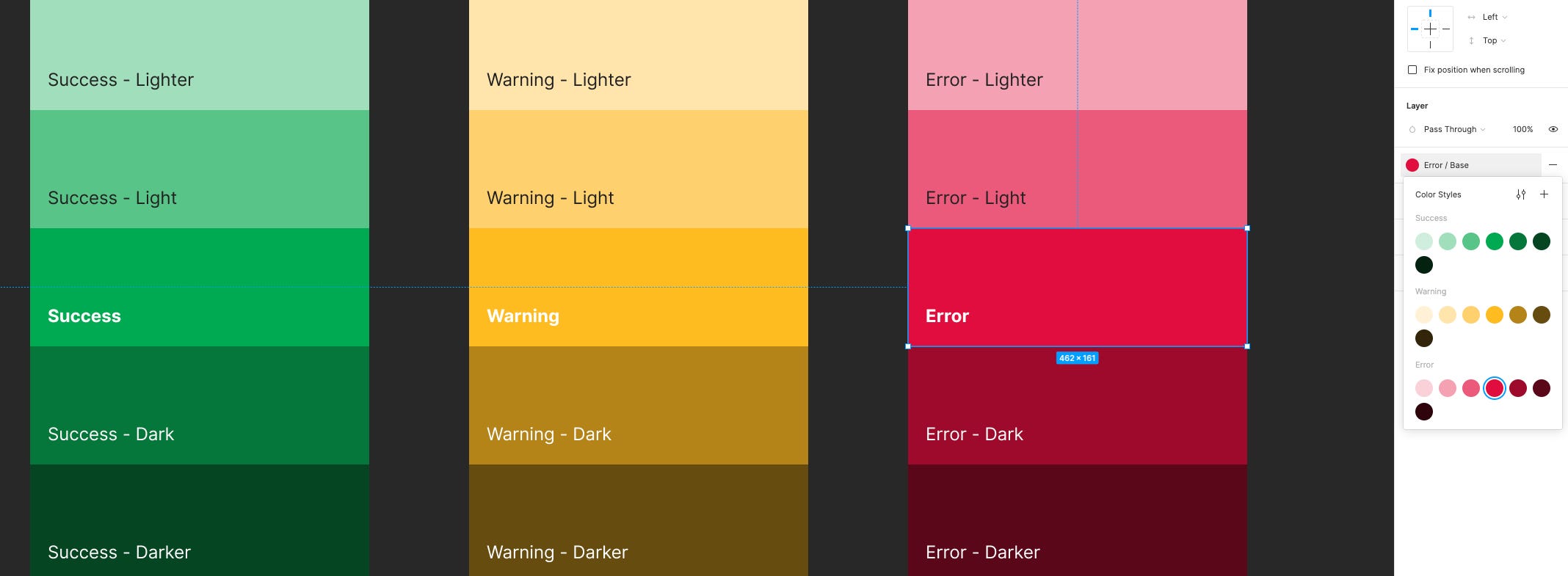
Black and varying shades of Grey are an absolute must too. You don’t need to go overboard with the Grey variants here, around 4 or 5 will give you enough variety for your future projects.
黑色和深浅不一的灰色也是绝对必须的。 您无需在这里过度使用Gray变体,大约4或5可以为您将来的项目提供足够的多样性。
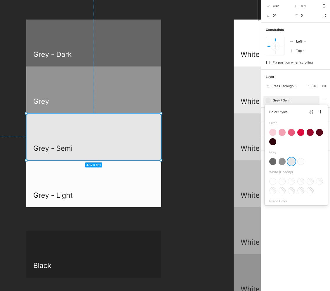
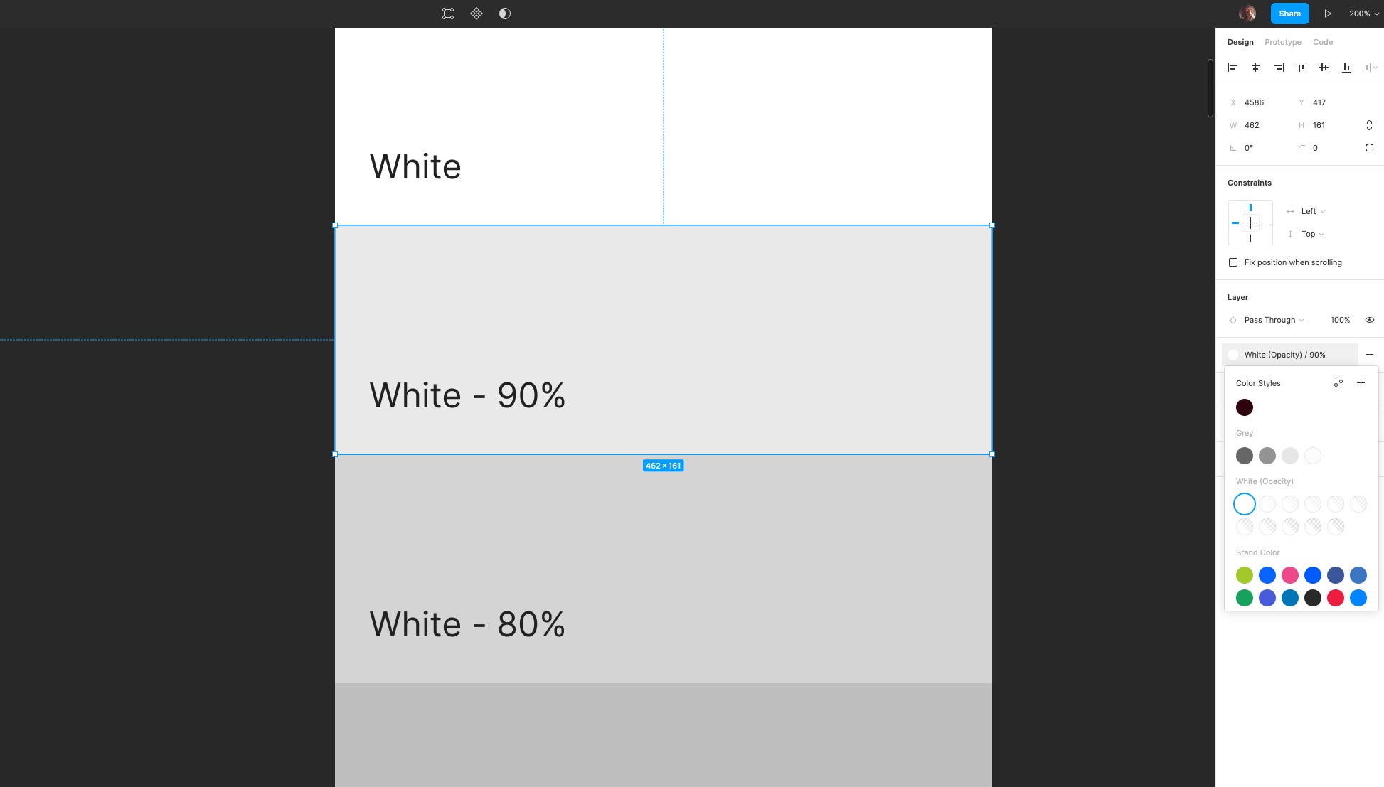
As well as the obligatory White, I also recommend adding White with varying levels of Opacity. These variants are perfect for when, for example, you want to insert an Icon over the top of a Color or Image, letting you easily allow as much, or as little of the Color or Image to leak through.
除了强制性的白色外 ,我还建议添加不透明度不同的白色。 这些变体非常适合例如在您想要在颜色或图像的顶部插入图标的情况下使用,从而使您轻松地让多少或更少的颜色或图像泄漏出去。
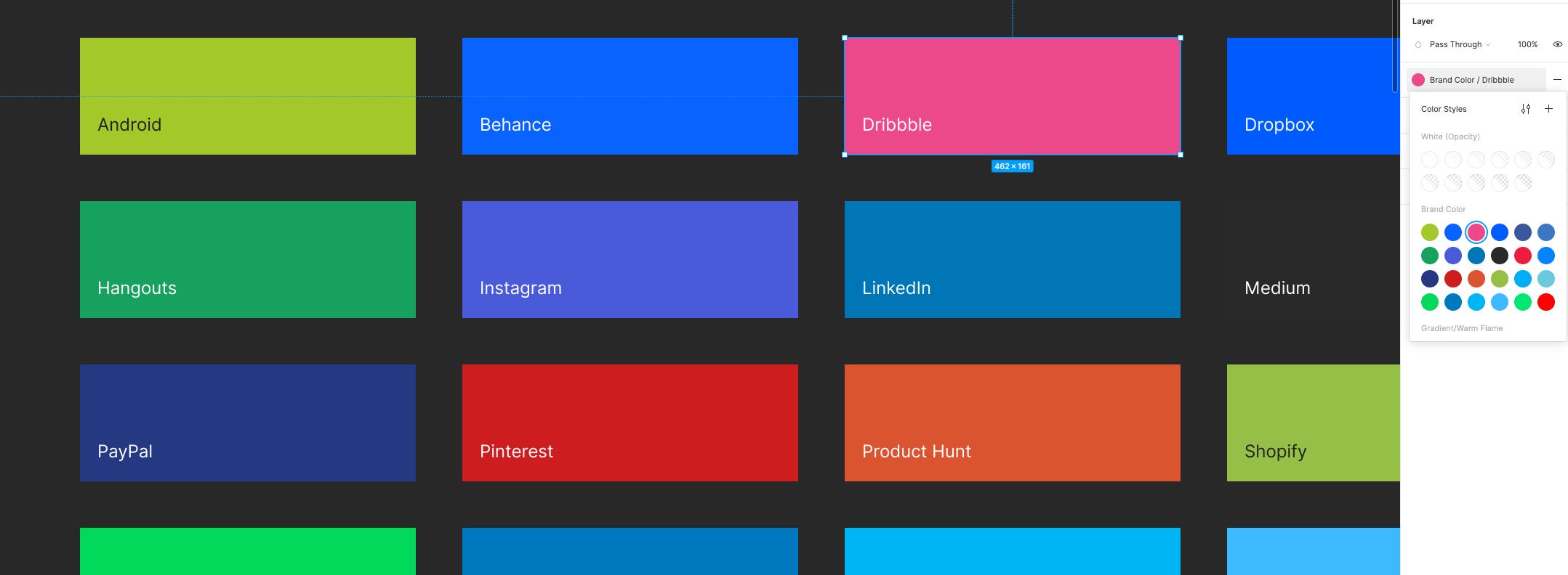
And don’t forget those multi-purpose Brand Colors. You’ll find yourself calling upon these for many projects, and it pays to create them at the same time as your main Color Palette. For my own Starter Kit I opted for a generous variety, giving myself plenty of options for future products.
并且不要忘记这些多用途的品牌色彩 。 您会发现自己在许多项目中都要求使用它们,并且与主调色板同时创建它们很有意义。 对于我自己的入门工具包,我选择了多种多样的选择,为自己将来的产品提供了很多选择。
And last, but not least, a healthy selection of Gradients always comes in handy. Who doesn’t love a good Gradient right?
最后但并非最不重要的一点是,总是可以轻松选择健康的渐变 。 谁不喜欢一个好的渐变对吗?
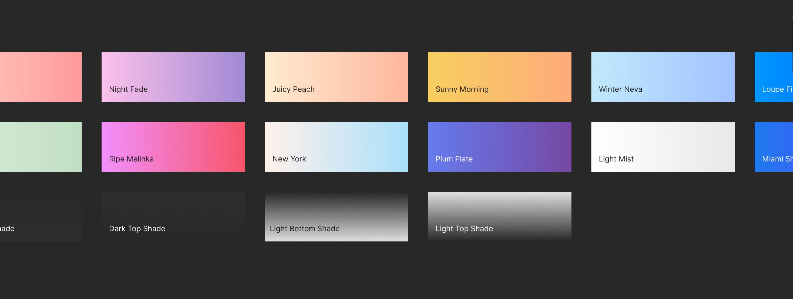
Now, are Gradients an absolute must for a Base Kit? Maybe not, but like I’ve mentioned before, implementing them right at the start of the initial build can save you any back-and-to if a future project calls upon them.
现在,基本套件绝对需要渐变色吗? 也许不是,但是就像我之前提到的那样,如果将来的项目需要它们,那么在初始构建的开始就立即实施它们可以节省您的任何麻烦。
If you do decide to add Gradients in your initial build make sure you give yourself some versatility by maybe adding both a Left to Right, and Top to Bottom variant from the get-go.
如果您决定在初始构建中添加渐变,请确保从一开始就添加从左到右和从上到下的变体,以确保自己具有一定的多功能性。
给自己很多版式选项,以涵盖台式机和移动设备的使用 (Give yourself plenty of Typography options to cover both Desktop and Mobile usage)
Like I mentioned earlier, my own Kit was built for Sketch initially, and if you’re knowledgable of that tool you’ll know that when it comes to creating Text Styles there that things can become quite overwhelming due to the fact that you have to create separate styles to cover Alignment, and Color variants also.
就像我之前提到的,我自己的工具包最初是为Sketch构建的,如果您对该工具有所了解,就会知道在创建文本样式时,由于您必须创建单独的样式以覆盖Alignment和Color变体。
Thankfully, in Figma things are kept much simpler.
幸运的是,在Figma中,事情变得更加简单。
Unlike Sketch, which like I mentioned, ties Alignment, and Color together within the Text Style. Figma breaks these apart, allowing you to have a lot less Text Styles to manage, and makes for a much cleaner, and lighter file than what Sketch currently offers. Hurrah!
与我提到的Sketch不同,它在Text Style中将Alignment和Color绑定在一起。 Figma将它们分开,使您可以管理的文本样式少得多,并且比Sketch当前提供的文件更整洁,更轻便。 欢呼!
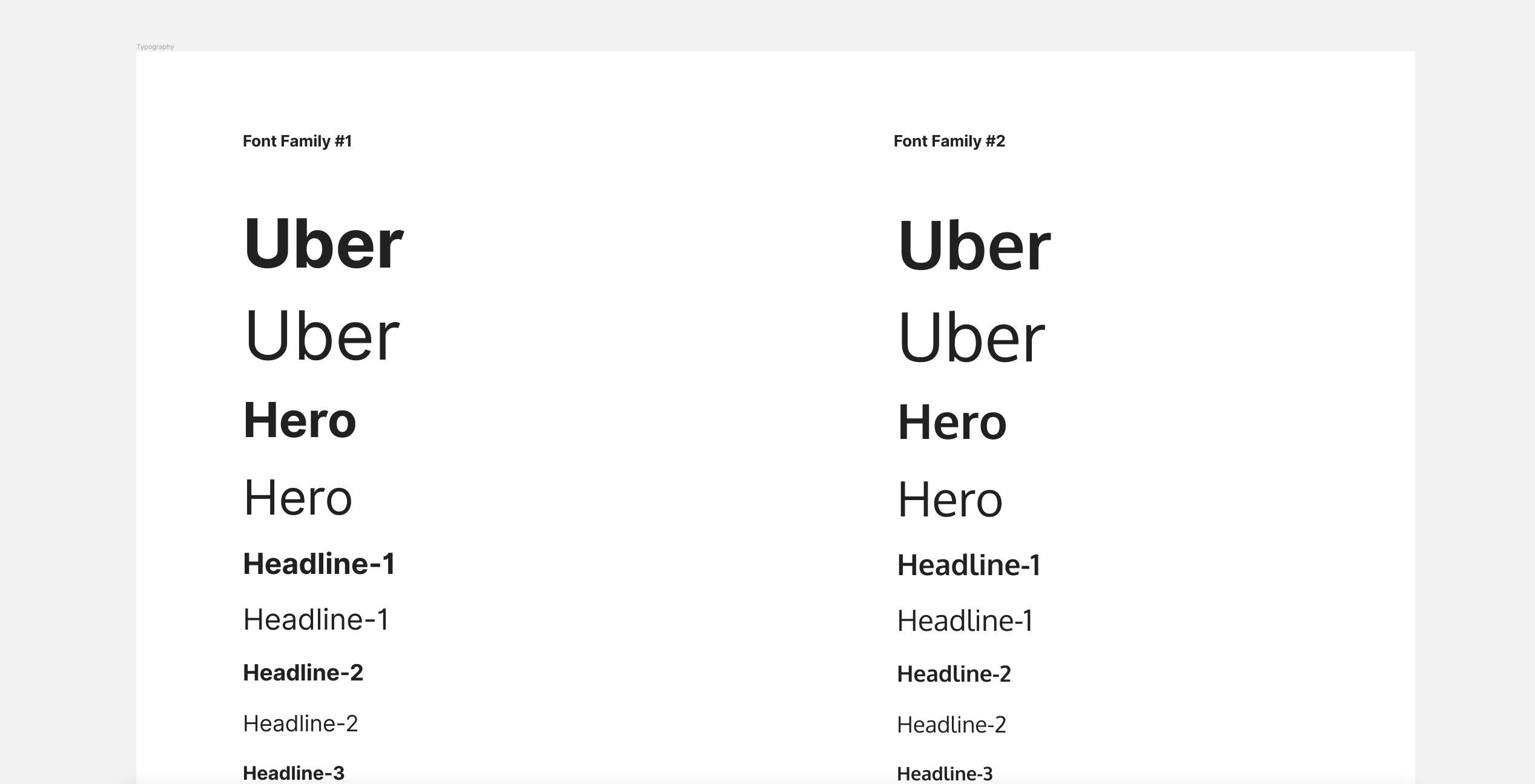
Even so, when building out your own Kit I recommend, if possible, to try and stick to a 2 Font Family rule if possible otherwise your Text Style panel can become a little more bloated than you’d actually prefer.
即使这样,在构建自己的工具包时,我还是建议尽量尝试遵循2字体系列规则,否则“文本样式”面板可能会比实际所需的更加膨胀。
For my own Kit, I chose Inter and Oxygen as the Base Font Families due to the fact that they complement each other really well, and they’re not too decorative as initial Base options.
对于我自己的工具包,我选择Inter和Oxygen作为基本字体系列,是因为它们可以很好地互补,而且作为初始基本选项并不太装饰。
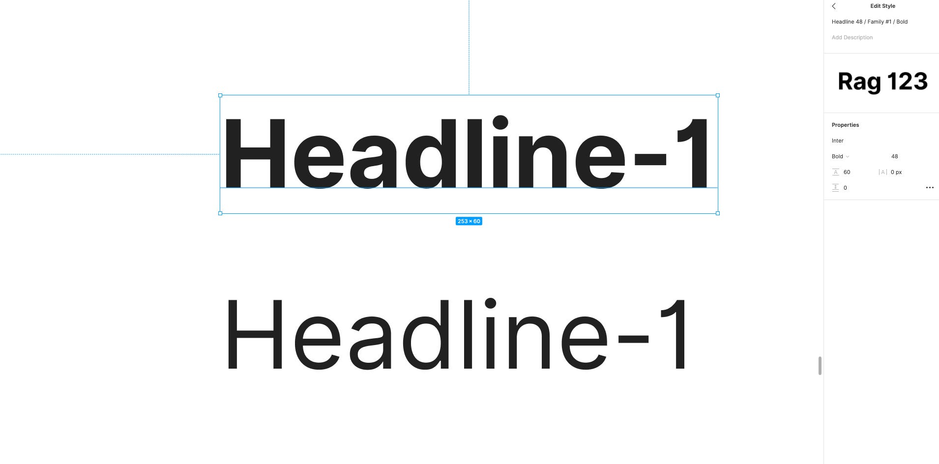
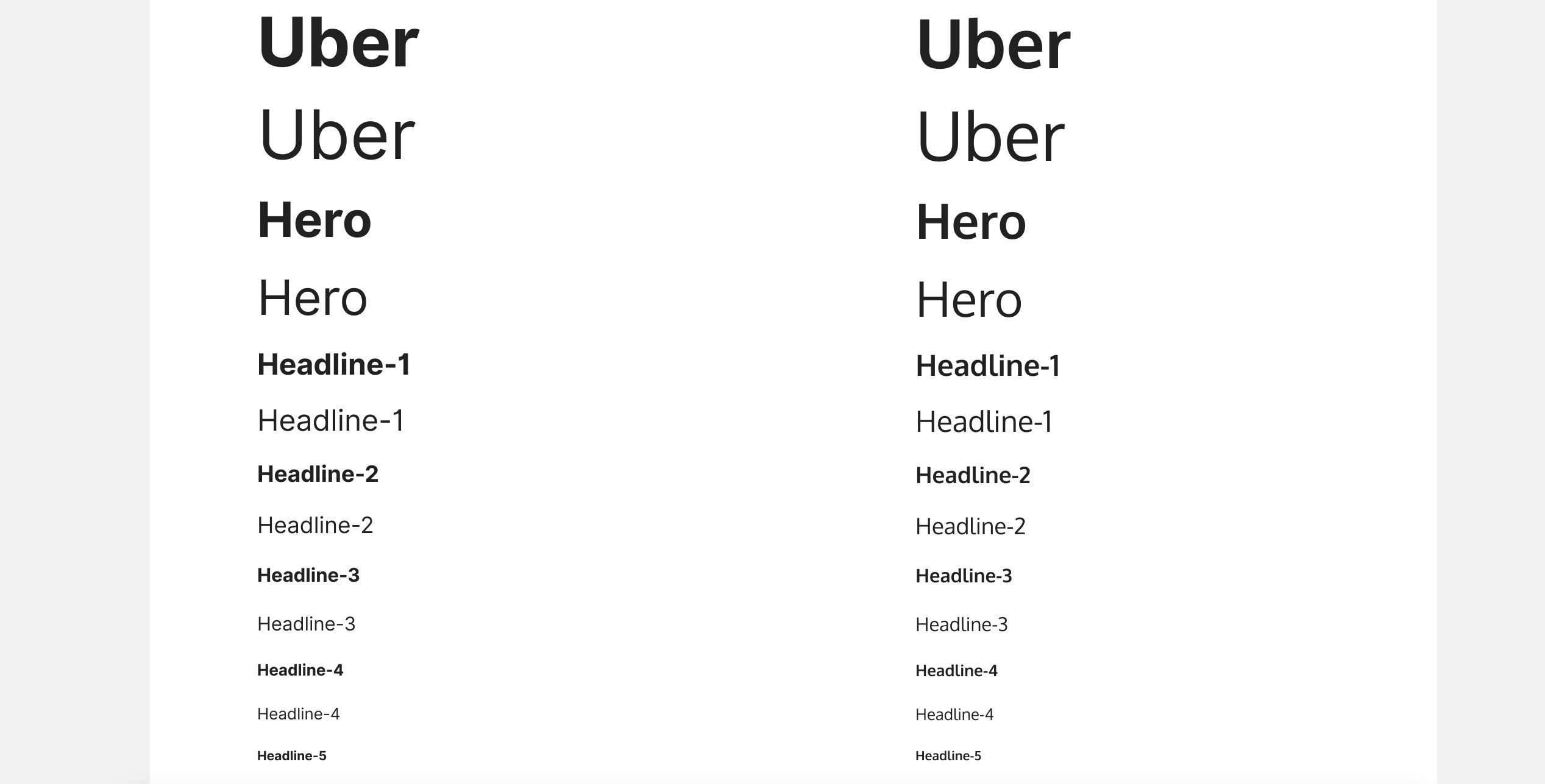
As well as creating oversized Display Styles (in my case; Uber and Hero), I also created styles for the usual suspects of H1 to H5 using Modular Scaling, with my Body text size set at 18pt, and using a Ratio of 1.2.
除了创建超大的显示样式 (在我的例子中为Uber和Hero)之外,我还使用Modular Scaling(我的正文文本大小设置为18pt ,比率为1.2 )为常见的H1至H5嫌疑人创建样式。
The Body I set at a healthy 18pt to improve legibility, and reduce eye fatigue, especially when creating long-form content.
我将Body I设置为健康的18点,以提高可读性并减少眼睛疲劳,尤其是在制作长形内容时。
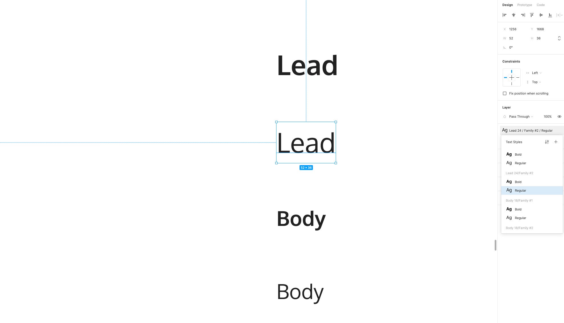
On top of the Headings, and Body styles, I created styles for Lead, Small, Caption, and X-Small, with the latter being perfect for when creating designs for mobile, and the former for when dealing with Desktop projects.
除了标题和正文样式之外,我还创建了Lead , Small , Caption和X-Small样式,后者非常适合创建移动设计,而前者则适合处理桌面项目。
The naming convention here is entirely down to you, and what you feel most comfortable with. I know some folks like to opt for a naming structure like Heading 1 through to Heading 6, and Body, Body L, Body S etc… and a million other kinds of naming conventions. Whatever floats your naming boat!
这里的命名约定完全取决于您以及您最满意的内容。 我知道有些人喜欢选择一种命名结构,例如标题1到标题6以及Body , Body L , Body S等……以及上百万种其他命名约定。 无论您的命名船如何漂浮!
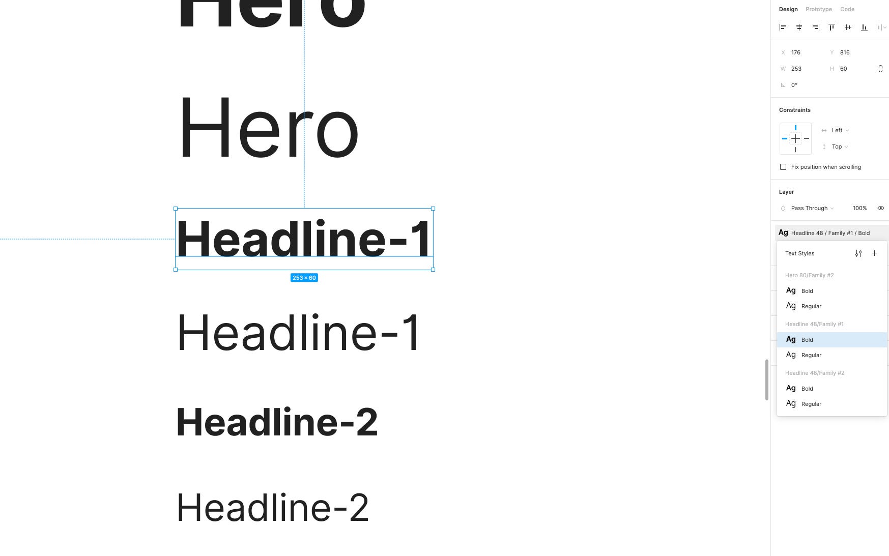
What I do recommend though, and following a similar pattern to your Color Palette, is to once again use those trusty forward slashes (/) to group your Text Styles and make them much easier to reference.
不过,我建议并遵循与调色板类似的模式,再次使用那些可信赖的正斜杠(/)对文本样式进行分组,并使它们更易于引用。
Something like the following works great…
像下面这样的东西效果很好…
Lead 24 / Family #1 / Regular
Lead 24 / Family#1 / Regular
Lead 24 / Family #2 / Regular
Lead 24 / Family#2 / Regular
With these 2 Font Families and their various styles (ie; Hero, H1, Body etc…) I suggest creating a Regular and Bold weight variant as the bare minimum. You can of course add to this to suit your personal preferences at any point (ie; Light, Semi-Bold etc…)
对于这2个字体家族及其各种样式(例如Hero,H1,Body等),我建议创建一个Regular和Bold权重变量作为最低要求。 当然,您可以随时添加此设置以适合您的个人喜好(例如:浅色,半粗体等)。
To enable consistency throughout your designs, I suggest making sure that all of your text styles align to a Baseline Grid, which in my case with Cabana was a 4pt Baseline Grid. Again feel free to tighten, or loosen the Line Height dependant on the Font Family you decide to use.
为了确保整个设计的一致性,我建议确保所有文本样式都与“ 基线网格”对齐,在我的Cabana案例中,这是一个4pt的“基线网格” 。 再次根据您决定使用的字体系列,随意拧紧或放松线高。
I also suggest creating Styles (ie; Hero, H1, Body etc…) for both Font Families. It’s a little more work in the initial setup but it allows you the freedom to easily swap between the two Fonts, and doesn’t restrict you when for example you want to swap out Font Family X for Headings, and Font Family Y for Body or vice-versa. Give yourself the flexibility from the very beginning and save yourself any back-and-to at a later date .
我还建议为两个字体家族都创建样式(即Hero,H1,Body等)。 在初始设置中还需要做更多的工作,但是它使您可以自由地在两种字体之间轻松地进行交换,并且在例如要将字体系列X替换为标题,将字体系列Y替换为Body或字体时不受限制。反之亦然。 从一开始就给自己灵活性,以后再来回保存。
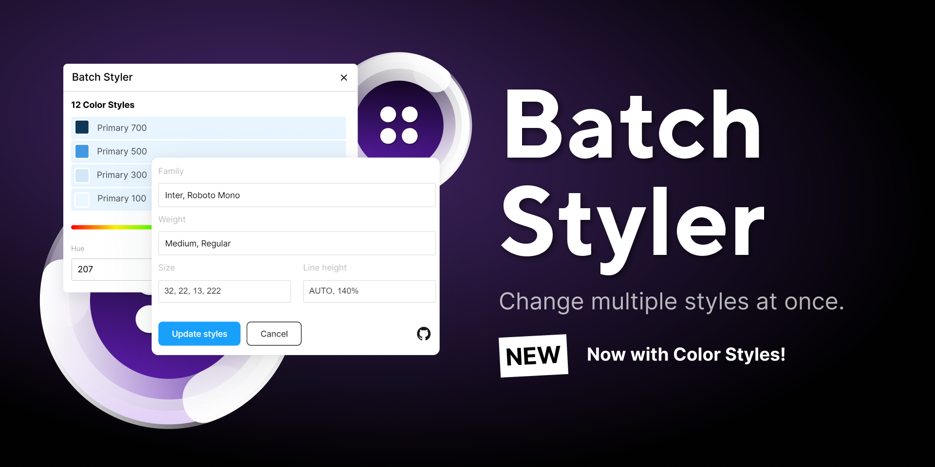
Before we move on, I must admit, and again, referring back to Sketch, that that tool does make the process of changing a Font Family (once all your Styles are in place) a much simpler job than Figma currently does.
在继续之前,我必须承认,再说一遍Sketch,该工具确实使更改字体系列(一旦所有样式都就位)的过程比Figma当前的工作简单得多。
In Sketch you simply select a different Family from the Inspector (ie; swapping out Inter for Proxima Nova) and all those Styles are instantly updated with the new family. In Figma currently you have to do things manually, each Style at a time. Sucks I know!
在Sketch中,您只需从检查器中选择一个不同的系列(即,将Inter换成Proxima Nova),所有这些样式都会立即用新的系列更新。 目前,在Figma中,您必须手动执行操作,一次需要每个样式。 我知道糟透了!
But don’t despair peeps, there’s an awesome plugin that I highly recommend called Batch Styler from the mucho talented Jan Six. With this super-handy plugin you can change multiple styles at once, and say “Adios” to all that manual silliness. Hurrah once more!
但是,请不要失望,有一个非常棒的插件,我强烈推荐来自才华横溢的Jan Six的一个名为Batch Styler的插件。 有了这个超级方便的插件,您可以一次更改多种样式,并对所有手动傻话说“ Adios” 。 再次欢呼!
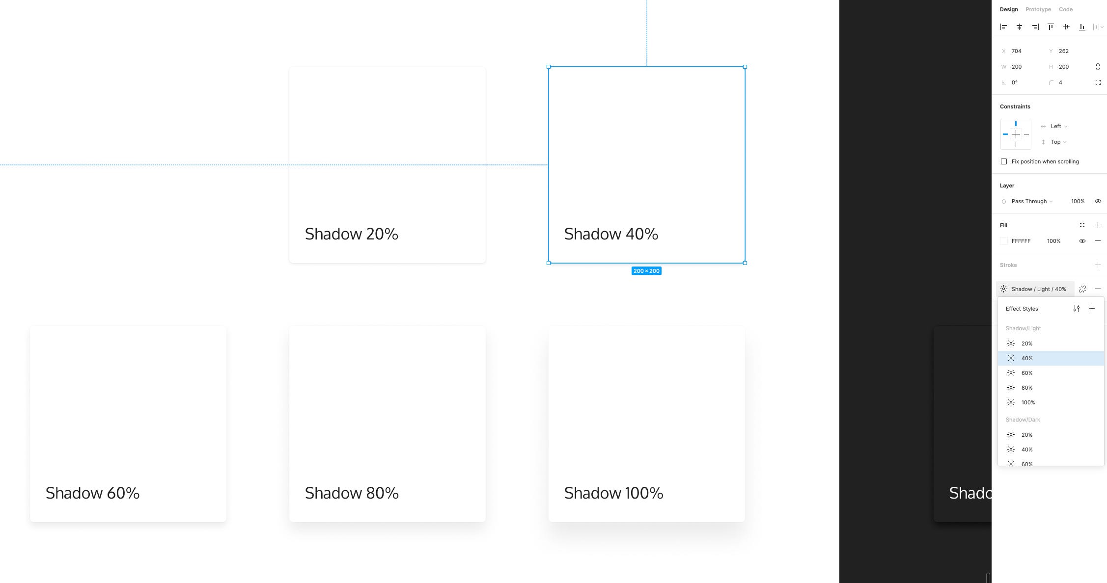
最后,不要忘记那些急需的“高程和阴影”! (And finally, don’t forget those much needed Elevations and Shadows!)
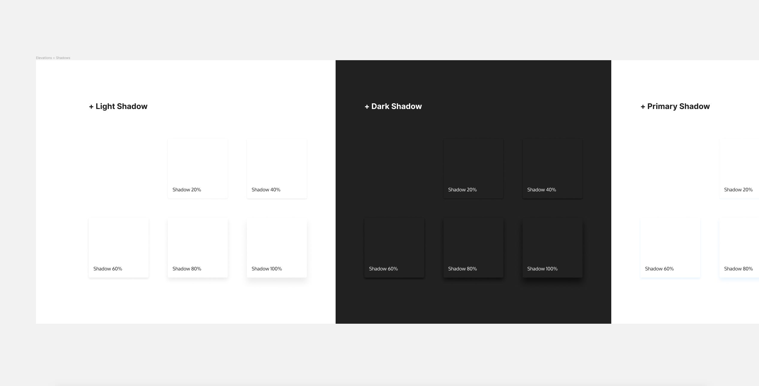
One last addition to the core styles of any good Starter Kit, alongside your Color Palette, and Typography Styles are Elevations and Shadows.
任何好的入门工具包的核心样式中,最后一个除了“调色板”和“版式样式”之外还有“ 高程和阴影” 。
I suggest creating Shadows suitable for both Light, and Dark designs, as well as possibly Shadows (and their accompanying Elevations, ie; 20%, 40%, 60% etc…) for both your Primary, and Secondary Base Colors, allowing yourself a little more versatility from the start.
我建议为原色和次要 基色创建适合于浅色和深色设计的阴影,以及可能的阴影(及其伴随的高程,即20%,40%,60%等),以使自己从一开始就具有更多的多功能性。
Before we wrap things up here, remember that Color, Typography, and in some cases Shadow & Elevation Styles are the key foundational elements of any great Starter Kit, and every Component that you subsequently create is going to feature those Styles in some shape or form so it pays to get them into place first before you create anything else.
在这里总结之前,请记住颜色 , 版式以及某些情况下的阴影和高程样式是任何出色的入门工具包的关键基础要素,并且您随后创建的每个组件都将以某种形状或形式呈现这些样式。因此在创建其他任何东西之前先将它们放置到位是值得的。
Once you have those Core Styles in place then you can move forward with adding more foundational elements such as Icons, as well as creating the many Components that will build out a solid Starter Kit, and I’ll be touching upon these in later parts of this lil’ Tutorial Series.
一旦有了这些核心样式,就可以继续添加更多基本元素(例如图标),并创建许多组件来构建可靠的入门工具包,我将在本教程的后续部分中进行介绍。这个小教程系列 。
You can check out Part 2 here.
您可以 在此处 查看第2部分 。
不想构建自己的入门套件? 看看Cabana for Figma… (Don’t want to build your own Starter Kit? Check out Cabana for Figma…)
SPECIAL OFFER: Due to current events, please use the code CABANA30 to receive 30% OFF.
特价:由于当前事件,请使用代码CABANA30享受30%的折扣 。
Marc. Designer, Author, Father, and creator of mrcndrw.com
马克 mrcndrw.com的 设计师,作者,父亲和创建者
翻译自: https://uxdesign.cc/how-to-build-a-design-starter-kit-in-figma-part-one-934d0536d92c
figma设计


 3335
3335


 被折叠的 条评论
为什么被折叠?
被折叠的 条评论
为什么被折叠?
 到【灌水乐园】发言


