


汉堡菜单
重点 (Top highlight)
I was recently designing a hamburger menu for a client and before I knew it, I had embarked on this journey where I was reading article after article about the accessibility issues which accompany a hamburger icon. Turns out, these menu icons which entered the world of user-interface design in 1981 through Norm Cox, are controversial yet one on the most popular navigation bar components. One thing which piqued my interest was that despite being a target of such strict scrutiny, hamburgers are still widely used in navigation bars and headers by companies like Google and Microsoft.
我最近正在为一个客户设计一个汉堡菜单,在不知不觉中,我就开始了这段旅程,在这里我逐篇阅读有关汉堡图标附带的可访问性问题的文章。 事实证明,这些菜单图标在1981年通过Norm Cox进入了用户界面设计的世界,尽管存在争议,但仍是最受欢迎的导航栏组件之一。 引起我兴趣的一件事是,尽管汉堡包受到了如此严格的审查,但仍被Google和Microsoft等公司广泛用于导航栏和标题中。
Before we can talk about why these three menacing stacked lines are so deeply embedded in the online world, let’s take a look at their flaws.
在我们讨论为什么这三条令人生畏的堆叠式生产线如此深入地嵌入在线世界之前,让我们先看看它们的缺陷。
1.它们使重要信息对用户隐藏。 (1. They keep important information hidden from the user.)
A widely accepted design principle is that users should have all the information they need while navigating a web/mobile app. According to Apple UX Evangelist Mike Stern,
广泛接受的设计原则是,用户在浏览Web /移动应用程序时应拥有所需的所有信息。 根据Apple UX传播者Mike Stern的说法,
“Remember, the [two] key things about an intuitive navigation system is that they tell you where you are, and they show you where else you can go.”
“请记住,关于直观导航系统的[两个]关键问题是,它们告诉您您在哪里,并且向您显示您可以去的其他地方。”
“Hamburger menus are terrible at both of those things because the menu is not on the screen. It’s not visible. Only the button to display the menu is.”
“汉堡菜单在这两个方面都很糟糕,因为菜单不在屏幕上。 不可见 只有显示菜单的按钮是。”
Oh the irony, Mr. Stern. Apple is a fan of using hamburger icons like no other. Coming to the main point, hamburger goes against user-friendliness because it takes two clicks/taps to navigate to a screen where a traditional link only takes one. That too, without showing the users what they are navigating to.
噢,讽刺的是,斯特恩先生。 苹果公司非常喜欢使用汉堡包图标。 谈到要点,汉堡包违反了用户友好性,因为它需要两次单击/轻击才能导航到传统链接仅需一次的屏幕。 同样,也没有向用户显示他们要导航到的内容。
2.它们在触摸屏上的位置较难触及 (2. Their position is less reachable on touch screens)
Have you ever found yourself lying in your bed, your phone in your hand above your face, and as you try to reach the far left corner with your thumb, you realize it was a mistake but it’s too late now because the phone has already slipped out of your hand and hit your face. If you haven’t, then trust me, nothing hurts like the classic square edge of an iPhone SE. For me, it was either the back button or a hamburger icon which lead to those moments.
您是否曾经发现自己躺在床上,手机在您的脸上方,并且当您尝试用拇指到达最左角时,您意识到这是一个错误,但为时已晚,因为手机已经滑落伸出你的手,打了你的脸。 如果还没有,请相信我,没有什么比iPhone SE的经典方形边缘更伤人了。 对我而言,导致这些时刻的是后退按钮或汉堡包图标。
It is extremely important to understand that a component which contains the most important buttons in any phone app should be the easiest to reach, which is not the case in a hamburger icon. According to a research on the relative ease of access of different parts of a touch screen, hamburger icons are the furthest to reach as they are usually present in the top-left or top-right corners of a screen.
理解包含任何电话应用程序中最重要按钮的组件应该最容易找到是非常重要的,而在汉堡包图标中则并非如此。 根据对触摸屏不同部分的相对访问的便捷性的研究 ,汉堡包图标最远,因为它们通常出现在屏幕的左上角或右上角。
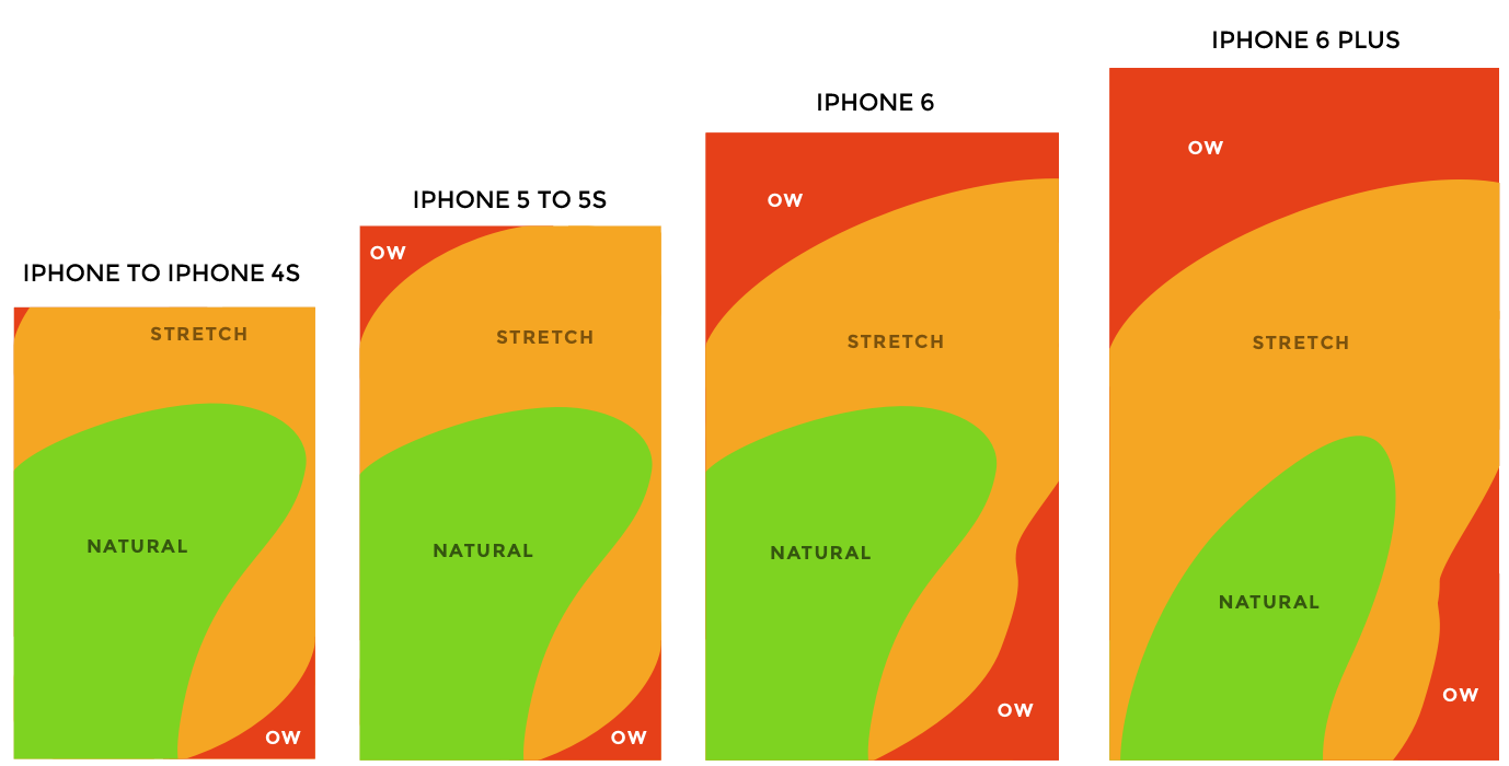
As the present-day phones are getting bigger, hamburger icons are getting pushed further away from the ‘natural’ zone into the ‘ow’ zone. This might be a subtle aspect, but on large apps with many tabs and complex hierarchies, tapping hamburger icon each time a user has to navigate one screen backwards or forwards can make it frustrating.
随着当今电话的体积越来越大,汉堡包图标正逐渐从“自然”区域推向“低”区域。 这可能是一个微妙的方面,但是在具有许多选项卡和复杂层次结构的大型应用程序中,每次用户必须向后或向前浏览一个屏幕时,都点击汉堡包图标可能会使它感到沮丧。
If any other web design component had these downsides, it would have been taken over by more accessible alternatives. So why is it that hamburger icons have become an almost essential part of responsive apps and websites.
如果任何其他Web设计组件有这些缺点,那么它将由更易于访问的替代方案取代。 那么,为什么汉堡包图标已成为响应式应用程序和网站的基本组成部分。
1.他们的受欢迎程度超过了所有关切。 (1. Their popularity outweighs all concerns.)
Being in use for around forty years, hamburger icons are so well known by designers and users that they can act as standalone components without any extra labels such as that of a ‘menu’. Such popularity counters Mike Stern’s argument above because the users do not need to know what’s behind the hamburger icon. The image of three lines stacked on top of each other immediately conveys the idea to the user that it contains links to different parts of an app/website.
汉堡包图标已经使用了大约40年,它在设计人员和用户中广为人知,以至于它们可以作为独立的组件使用而无需任何额外的标签,例如“菜单”。 这种受欢迎程度反驳了Mike Stern的上述论点,因为用户不需要知道汉堡图标的背后是什么。 三行叠加在一起的图像立即向用户传达了一个想法,即其中包含指向应用程序/网站不同部分的链接。
2.多功能性是无限的。 (2. The versatility is endless.)
Google utilized a hamburger icon for chrome settings and still does for gmail and other services. Apple and Microsoft use it to point to their navigation bar links on smaller screens. Quite frankly, the hamburger icon is like the ‘miscellaneous’ folder you have in your drive. Anything can go inside it. On top of that, it saves space, a commodity highly valued in the ‘small screen’ ecosystem.
Google在chrome设置中使用了一个汉堡包图标,而在gmail和其他服务中仍然使用。 Apple和Microsoft使用它在较小的屏幕上指向其导航栏链接。 坦率地说,汉堡包图标就像您驱动器中的“杂项”文件夹一样。 任何东西都可以进入里面。 最重要的是,它节省了空间,这是在“小屏幕”生态系统中极有价值的商品。
Do I enjoy animating hamburger icons? Yes. The number of ways you can rotate three lines around are infinite. But do I find it frustrating when I have to reach across to it just to get to the contact page? A bit. From a developer’s point of view, it comes down to what you hope to achieve with your website. If you are trying to go for a minimalist design or are confined by the limitations of smaller screens, then accessibility can be sacrificed by implementing hamburger icon. However, if you are a firm believer of user-friendliness over everything else, then there are better alternatives you can employ in your apps.
我喜欢动画汉堡图标吗? 是。 旋转三行的方式是无限的。 但是当我不得不深入到联系页面时,是否感到沮丧? 一点点。 从开发人员的角度来看,它取决于您希望通过网站实现的目标。 如果您尝试采用简约设计或受限于较小屏幕的限制,则可以通过实现汉堡包图标来牺牲可访问性。 但是,如果您坚信用户友好性高于其他一切,那么您可以在应用程序中采用更好的选择 。
汉堡菜单


 扫一扫
扫一扫
 641
641

 被折叠的 条评论
为什么被折叠?
被折叠的 条评论
为什么被折叠?
 到【灌水乐园】发言


