


houseparty不流畅
Houseparty has become very popular during the COVID-19 period because it helps you connect with others in a fun way. The concept is simple, you open the app and jump on a video call with your friends. You can even play online games with them (UNO®, Trivias, etc).
Houseparty在COVID-19期间非常受欢迎,因为它可以帮助您以有趣的方式与他人联系。 这个概念很简单,您打开应用程序并与朋友进行视频通话。 您甚至可以与他们一起玩在线游戏(UNO®,Trivias等)。
So although I love the app, I found myself often confused on how to use it. In this article, I want to explore an alternate design.
因此,尽管我喜欢该应用程序,但我发现自己经常对如何使用它感到困惑。 在本文中,我想探讨一种替代设计。
方法 (Approach)
My approach follows the double diamond framework (read more about here): we find the problem(s) then we come up with solutions that we test with users before we implement them.
我的方法遵循双菱形框架( 在此处了解更多信息 ):找到问题后,我们提出了在实施之前要与用户一起测试的解决方案。
Finally, before we get started, this is not supposed to be a complete app redesign (which would take months), but a simple exercise on how the user experience could be improved.
最后,在我们开始之前,这不应该是一个完整的应用程序重新设计(需要几个月的时间),而是一个有关如何改善用户体验的简单练习。
问题 (The problem)
Although the concept behind the app is simple, the problem that I encountered is that the interface is confusing to use. Let me explain further by looking at usability heuristics (created by Norman Nielsen):
尽管该应用程序背后的概念很简单,但我遇到的问题是该接口使用起来很混乱。 让我通过查看可用性启发法( 由Norman Nielsen创建 )进一步说明:
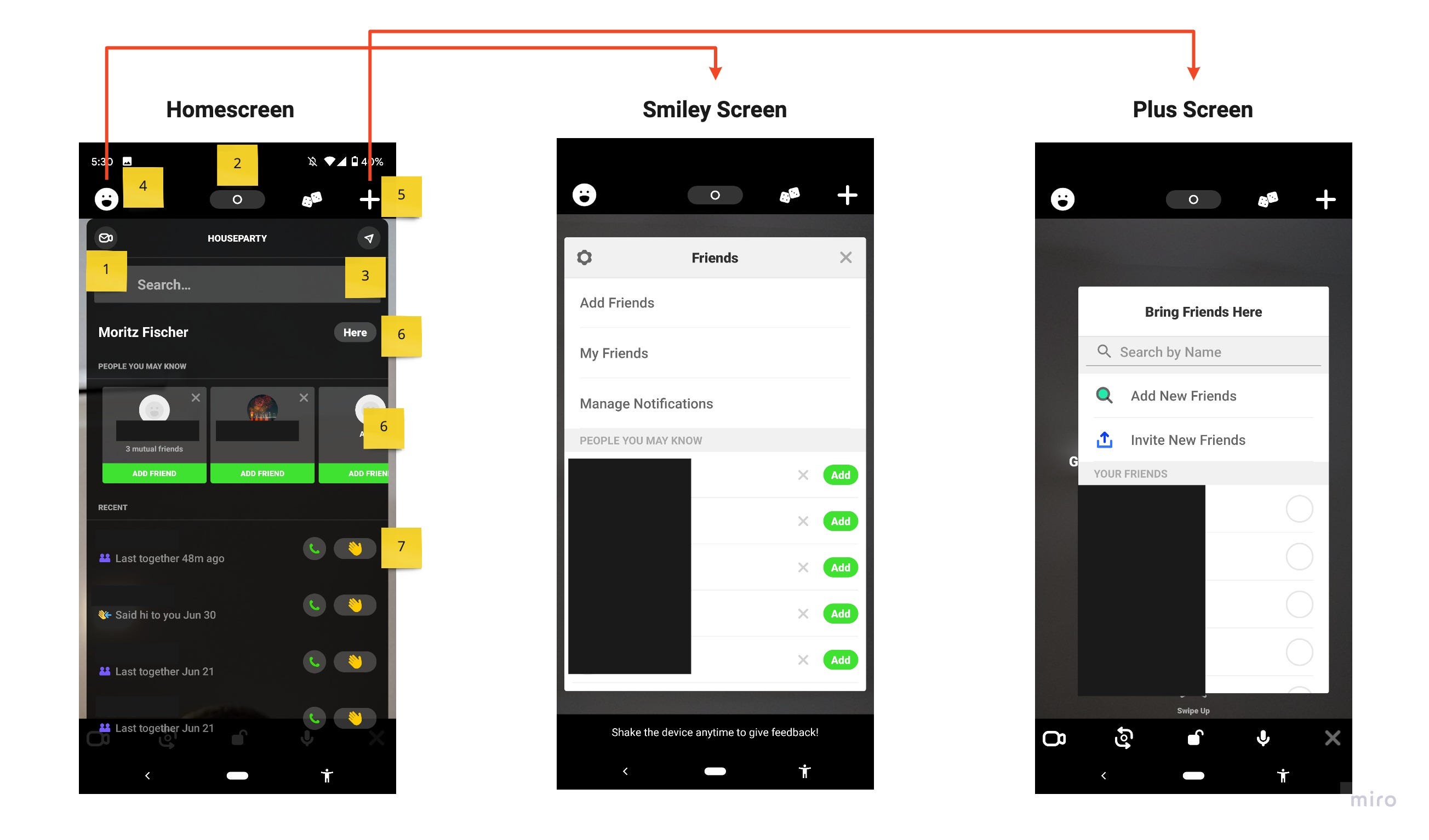
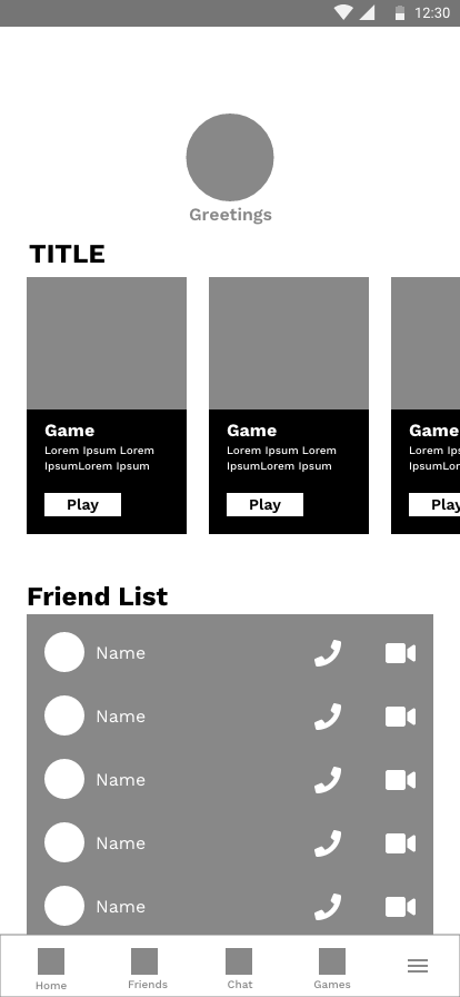
No navigation, no home screen: Relating to flexibility and efficiency of use, the screen on the left is what you see when you open the app. There is no navigation, which is probably intended this way, but left me confused because there are a lot of things going on.
没有导航,没有主屏幕:关于灵活性和使用效率,打开您的应用程序后会看到左侧的屏幕。 没有导航,可能是这种方式的目的,但是让我感到困惑,因为发生了很多事情。
Vague icons (1,2,3,4,5,7): Relating to consistency and standards, what does the smile or the plus sign or the camera symbol or paper plane or the hand mean? This seems trivial, but clicking on the hand sends a wink to my boss (for example) who now knows that I am playing Houseparty during work hours! So icons need to be very clear on what they do (error prevention).
模糊的图标(1、2、3、4、5、7): 关于一致性和标准 ,微笑或加号,相机符号或纸飞机或手是什么意思? 这看似微不足道,但是单击手上的手势会眨眨眼给我的老板(例如),他现在知道我在工作时间内正在玩Houseparty! 因此,图标必须非常清楚其功能(预防错误)。
Duplicated screens: Clicking on the smiley or the plus sign brings me to similar pages (see above) where I can invite friends. Is there a difference?
屏幕重复:单击笑脸或加号会将我带到相似的页面(请参见上文),在这里我可以邀请朋友。 有区别吗?
So although I had a hunch that a better UX is needed, as a designer, I need to resist the temptation to jump to conclusions and back up any hunches with proper user research.
因此,尽管我有预感,需要一个更好的用户体验,但作为一名设计师,我仍然需要抵制诱惑,以得出结论并通过适当的用户研究来支持任何预感。
用户研究 (User Research)
To confirm that the above points actually represent challenges for users, I checked the Google Play Store to see what users are saying. The app has a 3.9 star rating which is lower than other apps in this category. But the negative comments focus mostly on bugs in the app, which is not part of this exercise.
为了确认以上几点对用户而言确实构成挑战,我检查了Google Play商店以了解用户在说什么。 该应用程序具有3.9星评级,低于该类别中的其他应用程序。 但是负面评论主要针对应用程序中的错误,这不是本练习的一部分。
So I needed another approach: I invited 15 friends, family and colleagues to Houseparty and then asked them what they think of the app.
因此,我需要另一种方法:我邀请15个朋友,家人和同事参加Houseparty,然后问他们对应用程序的看法。
Almost all of them mentioned (without me prompting them) the same problems that I highlighted above.
几乎所有人都提到了(而我没有提醒他们)与我上面强调的相同的问题。
Plus, many were bothered that the camera was on by default when the app starts (the camera is actually on but hidden behind the UI elements, so you get surprised when you find out it was on the whole time). It makes sense for apps like Snapchat to turn on the camera by default. Here you want to try out the AR filters and you expect the camera to be on, but I don’t see a need for the camera to be on in Houseparty right away. In a world where people value their privacy this seems scary.
此外,许多人为应用程序启动时默认情况下相机处于打开状态感到困扰(相机实际上处于打开状态,但隐藏在UI元素后面,因此当您发现相机一直处于打开状态时,您会感到惊讶)。 对于像Snapchat这样的应用程序,默认情况下开启相机是有意义的。 在这里,您想尝试使用AR滤镜,并且希望可以打开相机,但我认为没有必要立即在Houseparty中打开相机。 在人们重视隐私的世界里,这似乎很可怕。
角色 (Personas)
First I thought this app is for the Gen Zs, but based on the imagery on their website and on the Google Play Store, it seems they are targeting people in their 30s. The users from the research above were within this age range, which is assured me that the feedback is valid.
首先,我认为该应用程序适合Z世代,但基于他们网站和Google Play商店上的图像,看来他们的目标受众是30多岁的年轻人。 以上研究的用户都在这个年龄范围内,这使我确信反馈是有效的。
任务和电汇 (Task & Wire Flows)
Before jumping into wireframes, I recommend to spend some time on crafting the general flow of the user, which depends on their goal (here is a great article that explains the whole process).
在进入线框之前,我建议花一些时间来设计用户的总体流程,这取决于他们的目标( 这是一篇很好的文章 ,解释了整个过程)。
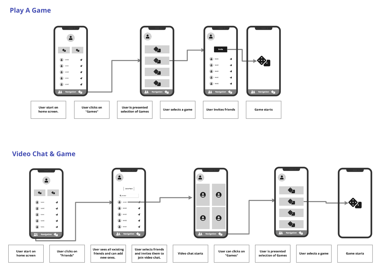
For this exercise, I focused on two of the main tasks that a user will do in Houseparty: start a video chat and play a game with friends.
在本练习中,我重点介绍了用户在Houseparty中要完成的两个主要任务:开始视频聊天和与朋友玩游戏。
Task Flow: I like to start with the simplest exercise which is designing task flows (boxes below).
任务流程:我想从最简单的练习开始,即设计任务流程(下面的框)。
Tip: The easier the design exercise, the faster you can iterate. In this case, you are drawing boxes that you can quickly shift around or rename. This could even be a group exercise to get everyone on the project aligned.
提示:设计工作越轻松,迭代越快。 在这种情况下,您正在绘制可以快速移动或重命名的框。 这甚至可以是一个小组练习,以使项目中的每个人保持一致。
Also, this really forces you to think of the steps that are involved to reach the goal without worrying about screen content/layout. This give you a good foundation for everything that follows.
另外,这确实迫使您考虑实现目标所涉及的步骤,而不必担心屏幕内容/布局。 这为后续的所有操作奠定了良好的基础。
Wire Flows: These are the black and white frames you see below. This does not have to be the final layout, but is a good exercise to think about what kind of content (UI elements) you need on each screen, which will ultimately lead you to the layout.
线流:这些是您在下面看到的黑白帧。 这不一定是最终的布局,而是一个很好的练习,考虑每个屏幕上需要什么样的内容(UI元素),最终将您带到该布局。
线框 (Wireframes)
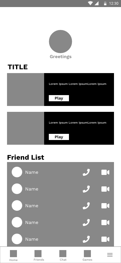
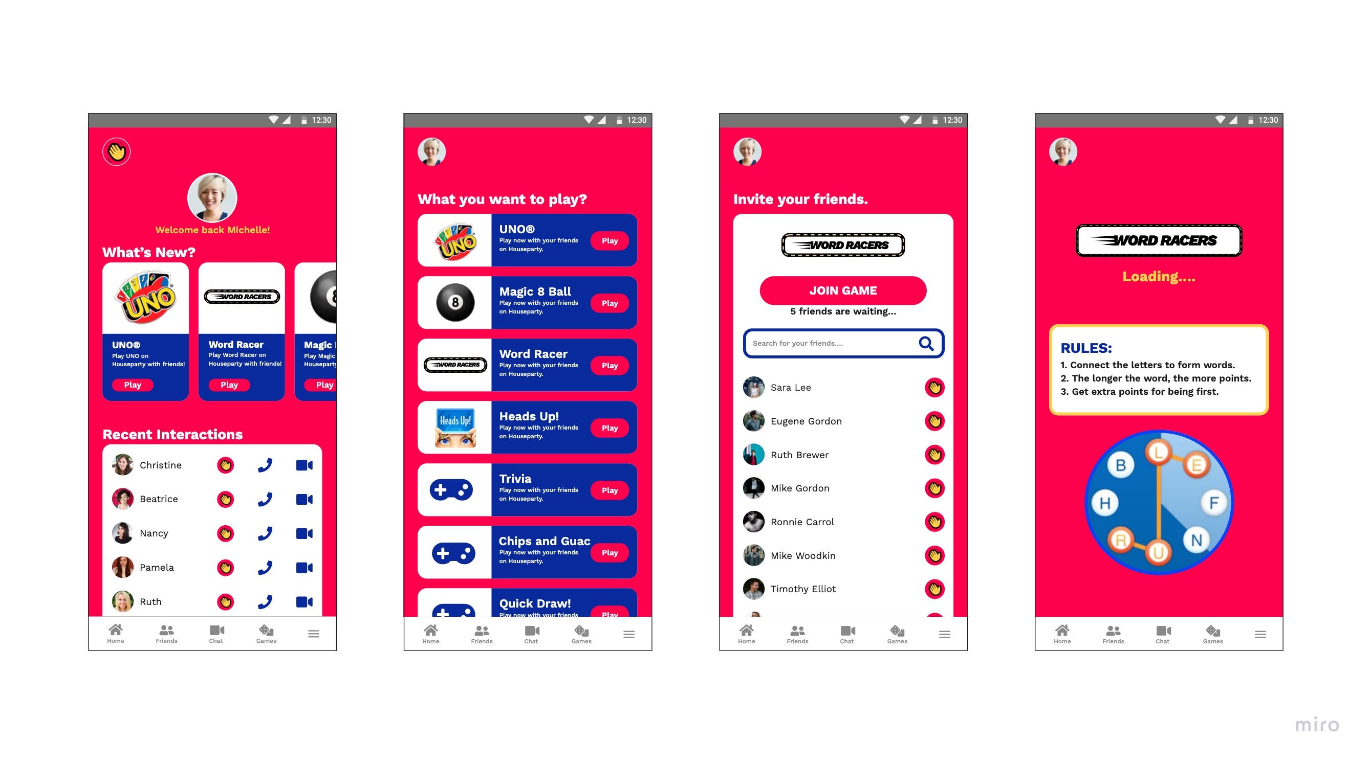
Once you have finished the wire flows, you know how many app screens you need. Now It is time to go into more details and layout our screens. Below a couple of iterations of the home screen. During this phase, I also look at other popular apps (Facebook, Spotify, etc) to take cues on how they structure their pages (profile pic in upper left corner, bottom navigation, etc). Following certain standards will ensure that your app is user friendly.
一旦完成了流程,就知道需要多少个应用程序屏幕。 现在是时候进入更多细节并布局屏幕了。 在主屏幕的几个迭代下面。 在此阶段,我还将研究其他流行的应用程序(Facebook,Spotify等),以提示它们如何构造页面(左上角的个人资料图片,底部导航等)。 遵循某些标准将确保您的应用程序易于使用。

设计 (Design)
I use Adobe XD to design websites and app. There are a couple of tools out there (Figma, Sketch, etc), but at the end of the day it is really what you make out of the tool. XD allows me to create interactive prototype, which is great for presentations, user testing or handover to developers (click here to try out the prototype).
我使用Adobe XD设计网站和应用程序。 那里有几个工具(Figma,Sketch等),但归根结底,这实际上是您使用该工具制作的。 XD允许我创建交互式原型,非常适合演示,用户测试或移交给开发人员( 单击此处以试用原型 )。
设计UI时,我的主要想法是: (My main thoughts when designing the UI were:)
Color and Typography: Houseparty uses a lot of different colors and is quite “loud” (even small icons have different colors), so I also tried to reflect this corporate identity in this design with a red background and a bold typeface. At the same time, I reduced the color pallet to red, blue and yellow to create some consistency.
颜色和版式: Houseparty使用许多不同的颜色,并且非常“响亮”(即使小图标也具有不同的颜色),因此我还尝试在该设计中以红色背景和大胆的字体反映这种公司形象。 同时,我将调色板减少为红色,蓝色和黄色,以保持一致性。
Common UI Elements: Known as design systems, companies like Google, Apple and even Airbnb created UI component libraries that are based on their years of experience designing and testing apps. I used a design system for this exercise, which makes work not only more efficient, but I can be confident that the UI element will be user friendly and I don’t run into problems later.
常见的UI元素: Google,Apple甚至Airbnb等公司都被称为设计系统,它们基于多年的设计和测试应用程序的经验创建了UI组件库。 我为此练习使用了一个设计系统,该系统不仅使工作效率更高,而且可以确信UI元素将是用户友好的,以后也不会遇到问题。
Bottom navigation: Finally, one of the biggest changes to the UI is the bottom navigation. Most apps follow the practice of showing icons together with text, which according to a lot of research leads to the best user experience (don’t make me guess what this icon means!).
底部导航:最后,UI的最大变化之一就是底部导航。 大多数应用程序都遵循将图标与文本一起显示的做法,根据大量研究,这种做法可带来最佳的用户体验(不要让我猜测此图标的含义!)。
用户测试 (User testing)
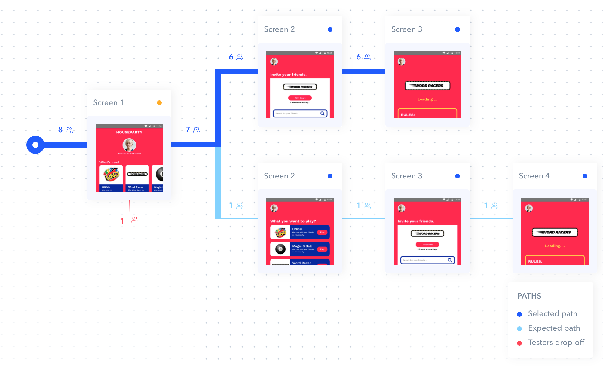
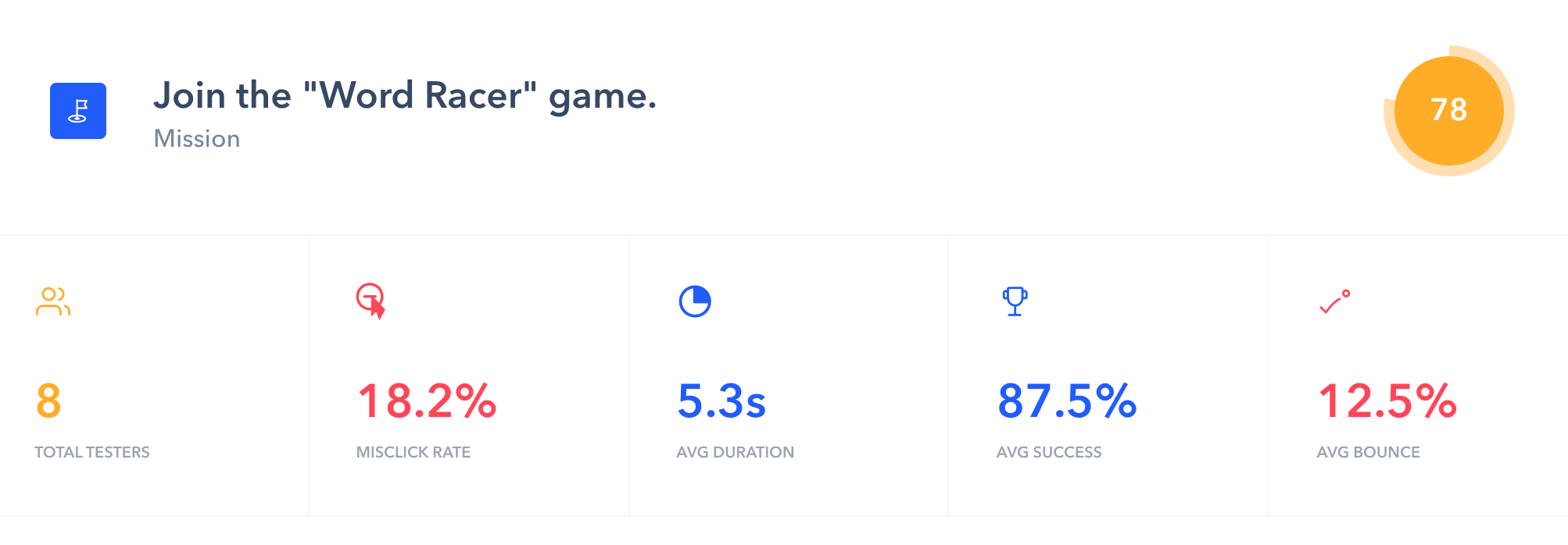
To test if the new design really works, I used Maze.design, which lets you build a prototype that you can share with users (Try it, here is the link to this prototype). The test was: Can users successfully navigate to the “Word Racer” game?
为了测试新设计是否真的有效,我使用了Maze.design,它使您可以构建可以与用户共享的原型( 尝试一下,这里是此原型的链接 )。 测试是:用户能否成功导航到“ Word Racer”游戏?
What I learned
我学到的是
First of all, you actually don’t need a lot of users to detect UX issues. Nielsen Norman Group states that 5 users are enough to find 80% of the issues (more details here).
首先,您实际上不需要很多用户来检测UX问题。 Nielsen Norman Group指出,只有5个用户可以找到80%的问题( 更多详细信息,请点击此处 )。
90% of users were able to complete the task (screenshot #1), which gives me confidence that the design is easy to navigate (one of the primary objectives of this exercise).
90%的用户能够完成任务(屏幕截图1),这使我相信设计易于导航(此练习的主要目标之一)。
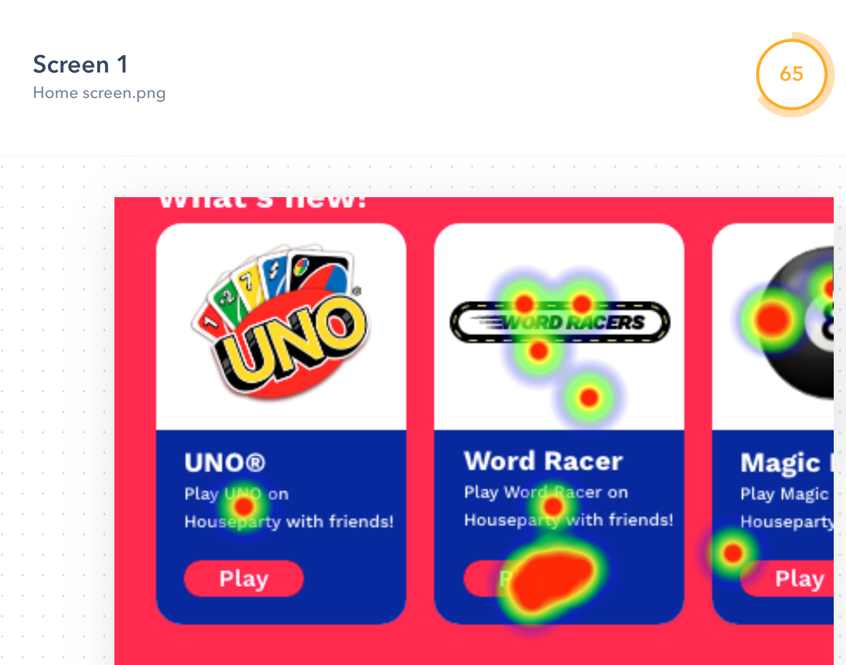
A second finding was that there were almost 20% of misclicks (screenshot #2), which means users clicked on the wrong item. Maze.design, allows us to analyze this further with heatmaps (screenshot #3). Most of the misclicks can be attributed to users clicking on the card instead of the button. This great insight and I fixed this by making the whole card clickable.
第二个发现是几乎20%的误点击(屏幕截图2),这意味着用户点击了错误的项目。 Maze.design,使我们能够通过热图进一步分析这一点(屏幕截图3)。 大部分误点击可归因于用户点击卡片而非按钮。 这种深刻的见解,我通过使整个卡片都可点击来解决。
Again this was just an exercise to show how an alternate design of the app could look like. This is not to say that this design will perform better on a large scale (users never like big re-designs).
再次,这只是一个演示应用程序的替代设计外观的练习。 这并不是说这种设计在大规模上会表现更好(用户永远不会喜欢大型的重新设计)。
I hope you enjoyed this article and please sign-up for Houseparty (if you have not already). It is a great way to connect with colleagues and friends when working from home and you need a short break.
希望您喜欢这篇文章,如果不是,请注册Houseparty。 这是在家中与同事和朋友联系的好方法,您需要短暂休息。
翻译自: https://uxdesign.cc/houseparty-app-redesign-a-ux-case-study-f23469e1a88b
houseparty不流畅


 201
201

 被折叠的 条评论
为什么被折叠?
被折叠的 条评论
为什么被折叠?
 到【灌水乐园】发言


