


初级爬虫师
重点 (Top highlight)
Like many UXers, I got into the industry from a non-visual background (in my case it was Business and later on Human Cognition). Even though I found great benefits coming from those backgrounds, it also meant I had no UI/Visual skills to put in practice at first. If you’re also from a non-visual background, I feel your pain :)
像许多UXer一样,我是从非视觉背景进入这个行业的(在我的情况下是商业,后来是人类认知)。 即使我发现从这些背景中受益匪浅,这也意味着我一开始没有实践UI / Visual技能。 如果您也是非视觉背景的人,我会感到很痛苦:)
In this article, I join a set of core principles that I’ve learned throughout my journey that helped me become a better visual thinker and execute better UIs.
在本文中,我加入了我在整个旅程中学到的一组核心原则,这些原则帮助我成为了更好的视觉思想家和执行了更好的UI。
Note: all the principles below refer to “elements”. By elements, I mean all the components that you may be trying to balance in a UI (like text, shapes, images, call to actions, etc)
注意:以下所有原则均指“要素”。 所谓元素,是指您可能试图在UI中平衡的所有组件(例如文本,形状,图像,号召性用语等)
#1对比和意义(给出层次) (#1 Contrast and Meaning (to give hierarchy))
When designing interfaces, what we’re trying to essentially do is to convey meaning (helping users making sense of the interface) so that they can achieve their goals (i.e complete an order online, share an image with a friend, etc). In order to help users disseminate information, the elements in an interface should have a hierarchy that helps users find what they need first.
在设计界面时,我们实际上要做的是传达含义(帮助用户理解界面),以便他们可以实现自己的目标(即,在线完成订单,与朋友共享图像等)。 为了帮助用户传播信息,界面中的元素应具有帮助用户首先找到他们所需要的层次结构。
How to apply Contrast and Meaning when designing?
设计时如何应用对比度和含义?
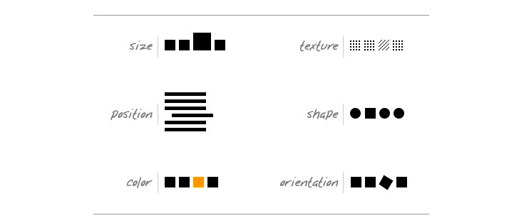
Hierarchy is conveyed through contrast (between elements). Contrast can be created by using visual cues such as colour, position, size, shape, orientation, etc. Knowing how to make use of these forms of contrast is key to design interfaces that support user goals.
层次结构通过对比(元素之间)传达。 可以通过使用视觉提示(例如颜色,位置,大小,形状,方向等)来创建对比度。了解如何利用这些对比形式是设计支持用户目标的界面的关键。
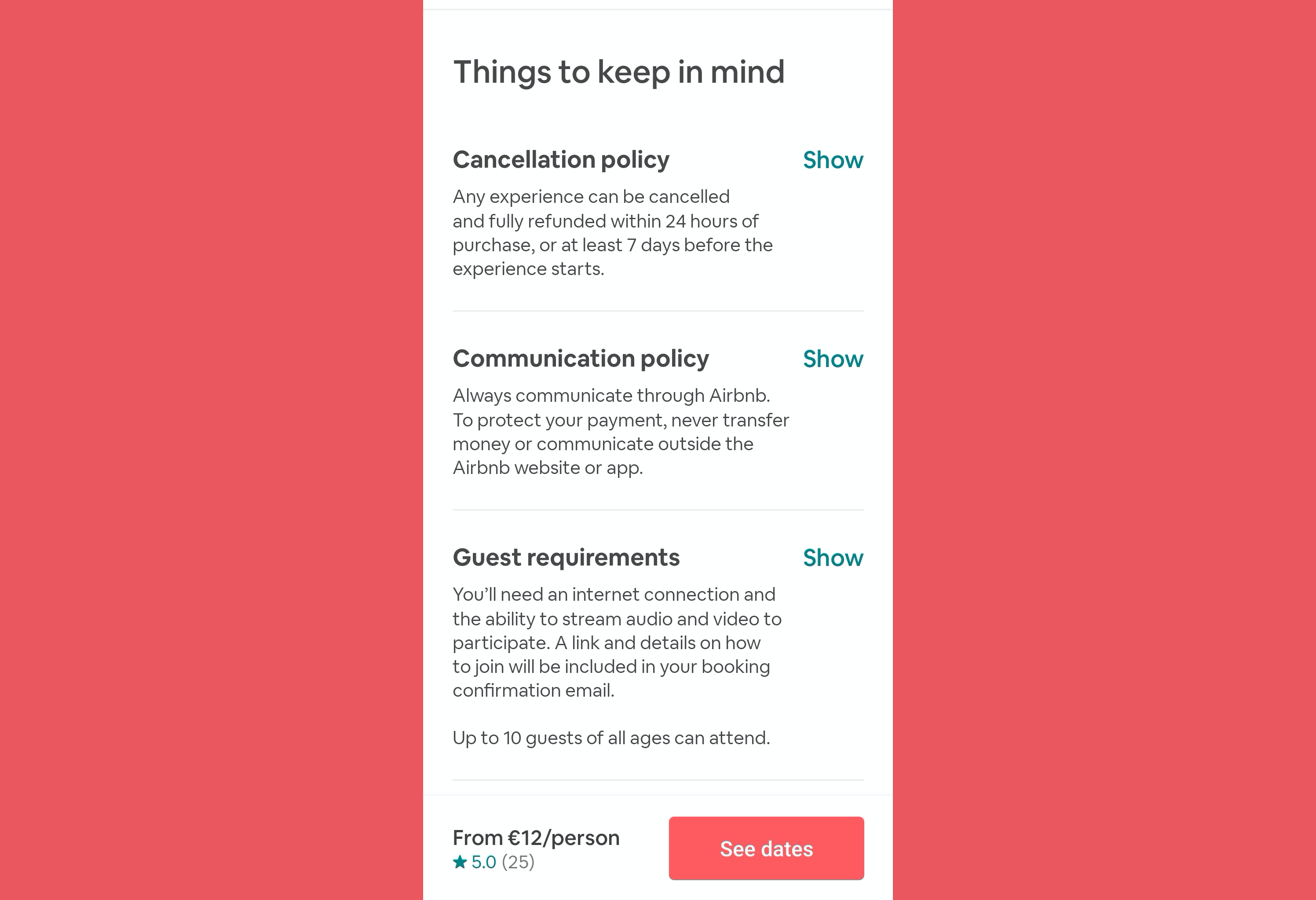
Take the example of Airbnb. It makes use of a big and bold font for headers when compared to body text which is small and thin (so that users can easily scan which policy information they’re looking for). It also makes use of colour and shape to highlight the main call to action ‘see dates’ when compared to the other call to actions ‘show’ (to visually guide users to their next step of the user flow).
以爱彼迎为例。 与较小的正文相比,它在标题中使用了大胆的字体(以便用户可以轻松地扫描他们要查找的策略信息)。 与其他呼吁“展示”的呼吁相比,它还利用颜色和形状突出了主要呼吁号召“查看日期”(以视觉方式指导用户进行用户流程的下一步)。
Key takeaway: Design is largely an application of visual contrasts, which are used to define hierarchy. “Each element on the page has to be positioned, styled, sized, or otherwise distinguished in accordance with its specific importance.”
关键要点: 设计在很大程度上是视觉对比的应用,用于定义层次结构。 “页面上的每个元素都必须根据其特定重要性进行定位,设置样式,设置大小或以其他方式区分。”
#2格式塔原理(组合元素) (#2 Gestalt principles (to combine elements))
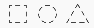
Gestalt principles are a set of ‘laws’ that describe how people tend to see objects by grouping similar elements and finding patterns. It refers to the human tendency to ‘perceive the sum of all parts as opposed to the individual elements’. It is the reason why we can identify the square shape on the top image even though they are just a set of lines detached from each other.
格式塔原理是一组“法律”,描述了人们如何通过对相似元素进行分组和寻找模式来看待物体的方式。 它指的是人的倾向“感知所有部分的总和 ,而不是单个元素”。 这就是为什么我们可以在顶部图像上识别正方形的原因,即使它们只是彼此分离的一组线。
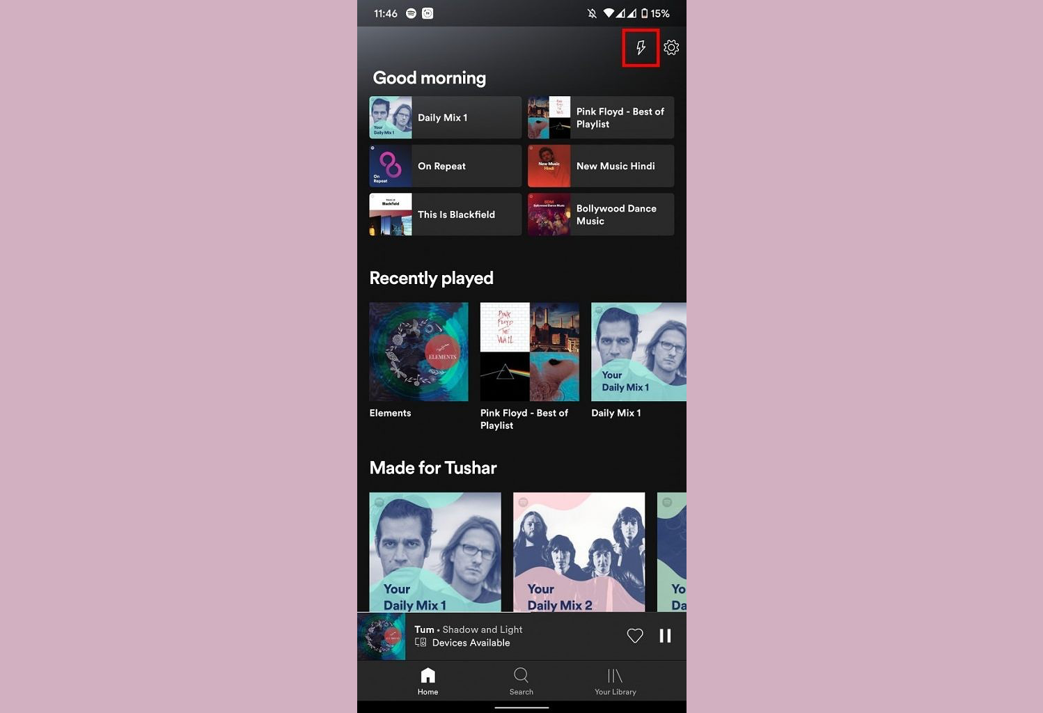
How to apply Gestalt principles when designing? Make use of visual elements like shape, colour or size to infer a visual relation on elements that are logically connected. For example, if two elements are closely related, reducing negative space between them, giving them the same shape or placing them under the same background leads the human brain to think they are indeed closely tied. On the other hand, visually ‘grouping’ elements that are not logically connected can confuse users. Some of these visual elements communicate relations more strongly than others (e.i colour > size > shape). See how Spotify makes use of different shapes and sizes to create a visual distinction between the different types of content they present (Daily mixes are big and square-shaped while ‘Good morning’ contents are small and rectangular-shaped).
设计时如何应用格式塔原理? 利用形状,颜色或大小等视觉元素来推断逻辑上相连的元素的视觉关系。 例如,如果两个元素紧密相关,则减少它们之间的负空间,赋予它们相同的形状或将它们置于相同的背景下会使人脑认为它们确实紧密地联系在一起。 另一方面,视觉上未逻辑连接的“分组”元素会使用户感到困惑。 这些视觉元素中的一些比其他元素更能传达关系(例如,颜色>大小>形状)。 了解Spotify如何利用不同的形状和大小在它们所呈现的不同类型的内容之间建立视觉上的区别(每日混合大而方形,而“早安”内容则小而矩形)。
Key takeaway: Infer a visual relation to elements that have a logical relation. And the other way around.
关键要点:推断具有逻辑关系的元素的视觉关系。 反之亦然。
For more on Gestalt principles, check this article and this one.
#3黄金分割率(与大小和平衡元素有关) (#3 Golden Ratio (to size and balance elements))
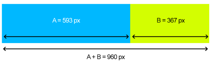
The Golden Ratio (A/B =1.618 = PHI) is a ratio based on the Fibonacci sequence where A is the longest length and B the shortest. It is interesting because it’s highly prevalent in the physical world, from proportions of plants and animals to the ratio used to balance the ovals of the Toyota logo. I know, it’s weird to think that most things in the world have the same mathematical ratio! Even though we don’t consciously notice this ratio when looking at things around us, it’s so prevalent that science has found the human brain identifies and processes images based on the golden ratio more quickly than it does images with a different ratio.
黄金比率( A / B = 1.618 = PHI )是基于斐波纳契数列的比率,其中A是最长的长度,B是最短的长度。 有趣的是,它在物理世界中非常普遍,从动植物的比例到用来平衡丰田徽标椭圆形的比例。 我知道,奇怪的是,世界上大多数事物都具有相同的数学比率! 即使我们在观察周围的事物时并没有自觉地注意到该比例,但它是如此普遍,以至于科学发现人脑比黄金比例的图像更能更快地识别和处理基于黄金比例的图像。
How to apply the Golden ratio when designing? It helps us create shapes that are aesthetically pleasing (take a rectangle per example) by multiplying the length of the short side (A) by the golden ratio of 1.618. So, the long side (B) should have a length of 1.618.
设计时如何应用黄金分割率? 通过将短边(A)的长度乘以1.618的黄金比例,可以帮助我们创建美观的形状(以每个示例为一个矩形)。 因此,长边(B)的长度应为1.618。
Key takeaways: Using the 1.618 ratio helps us, designers, to create layers that are appealing and easier to process to the eye and brain. Also, making use of the Golden ratio to create or use guides helps us to place elements in a balanced way.
关键要点:使用1.618比率有助于我们(设计师)创建吸引人的层,并易于处理,使眼睛和大脑感到满意。 此外,利用黄金比例创建或使用指南有助于我们平衡地放置元素。
For more on the Golden Ratio, check this article.
有关黄金分割的更多信息,请查看本文 。
#4三分法则(放置元素) (#4 Rule of Thirds (to place elements))
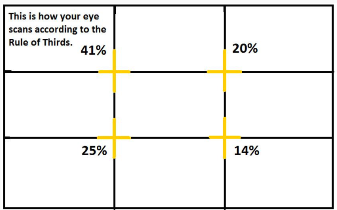
The Rule of Thirds is a simple way to position elements where the eyes of our users tend to fall in the screen. These sweet spots are four and their appeal to the eye differ from each other (see image above). This can be explained by the way the eye usually screens information like an “F”, starting from the top left, then down, then up but to the right and finally to the bottom right.
三分法则是将元素定位在用户的眼睛倾向于落在屏幕上的简单方法。 这些最佳点是四个,它们对眼睛的吸引力彼此不同(请参见上图)。 这可以用眼睛通常从“左”开始,从下到下,然后从上到右,最后到右下的方式筛选信息的方式来解释。
How to apply this rule when designing? When placing elements in a background consider the sweet spots of the screen. This can be done by dividing the screen equally into thirds, both horizontally and vertically resulting in 9 boxes that are equally-shaped.
设计时如何应用此规则? 将元素放置在背景中时,请考虑屏幕的最佳位置。 可以通过将屏幕在水平和垂直方向上均等分成三等分,从而得到9个形状相同的盒子。
Key takeaway: Making use of the sweet spots by placing key elements (like a call to action) where the eye will automatically fall towards can help your product and your users achieve its goals.
关键要点:通过将关键元素(例如号召性用语)放置在眼睛会自动落在其中的关键点,可以帮助您的产品和用户实现其目标。
For more on the Rule of Thirds, check this article.
有关三分法则的更多信息,请查看本文 。
翻译自: https://uxdesign.cc/4-visual-principles-for-junior-designers-1d13cde32b45
初级爬虫师


 6260
6260

 被折叠的 条评论
为什么被折叠?
被折叠的 条评论
为什么被折叠?
 到【灌水乐园】发言


