


ui边框设计图
第2部分 (Part 2)
Welcome to the second part of the UI Design shapes basics. This time we’ll cover two of the most essential properties of a shape — fills and borders. This is also a part of the free chapters from Designing User Interfaces.
欢迎使用UI设计形状基础的第二部分。 这次,我们将介绍形状的两个最重要的属性-填充和边框。 这也是《 设计用户界面 》中免费章节的一部分。
填充 (Fills)
As we have stated in part 1 of this series, most of UI design is about moving rectangles around. So let’s start with a humble rectangle. In most design tools you can draw it by pressing the R key.
正如我们在本系列的第1部分中所述,大多数UI设计都是围绕移动矩形 。 因此,让我们从一个不起眼的矩形开始。 在大多数设计工具中,您可以通过按R键来绘制它。
When you create a new rectangle, it usually already has a fill attached to it. In most cases it’s simply grey, so you will remember to change the color yourself. Sometimes it has a border too.
创建新矩形时,通常通常已经附加了填充。 在大多数情况下,它只是灰色,因此您会记得自己更改颜色。 有时它也有边框。
Back in the very early Sketch days it only had an outline, and you could selectively switch off parts of it. But luckily this is now a thing of the past.
在Sketch的早期,它只有一个轮廓,您可以有选择地关闭它的一部分。 但是幸运的是,这已经成为过去。
The reason for this predefined color is because grey is neutral enough so adding a new shape won’t ruin your already beautifully crafted interface, but yet you’ll still be able to see that new object.
使用这种预定义颜色的原因是,灰色足够中性,因此添加新形状不会破坏您本来就精美的界面,但是您仍然可以看到该新对象。

To make it simple fill is another name for the object’s background. It can be a color, a gradient, or a photo. Each of these can also have a different level of opacity (transparency) ranging from 0 (fully transparent — invisible) to 100 (fully opaque, with no transparency).
为了简单起见,填充是对象背景的另一个名称。 它可以是颜色,渐变或照片。 这些中的每一个还可以具有不同的不透明度(透明度)级别,范围从0(完全透明-不可见)到100(完全不透明,没有透明度)。

Pro tip:
专家提示:
Most of the modern design tools allow you to set opacity with the number keys on your keyboard. Just select an object and press 1 (for 10%), 2 (for 20%) and so on. Pushing 0 will switch between 0% and 100% opacity (so you sometimes need to press it twice).
大多数现代设计工具都允许您使用键盘上的数字键设置不透明度。 只需选择一个对象,然后按1(代表10%),2(代表20%),依此类推。 按下0将在0%和100%不透明度之间切换(因此有时您需要按两次)。
If an object doesn’t have a fill, is also lacking a border or an effect, it won’t be visible in the interface as it requires some defining characteristics to be visible. You’ll still be able to select it, however, move it around, and modify it. It will also still exist in the layers list.
如果对象没有填充,也没有边框或效果,则它在界面中将不可见,因为它需要一些定义的特征才能可见。 您仍然可以选择它,但是可以四处移动并修改它。 它也将仍然存在于图层列表中。

填充类型 (The types of fill)
There are three main possibilities of a fill and an absence of one. So you can either have NO FILL, or have a single color, gradient or image backgrounds.
填充和不存在三种主要可能性。 因此,您可以没有填充,也可以只有一种颜色,渐变或图像背景。
A while ago patterns were considered another kind of a fill, but in reality they’re just images with a potential to tile them, so they fall into the image category.
前一段时间,图案被认为是另一种填充,但实际上它们只是具有平铺潜力的图像,因此它们属于图像类别。
堆积填充 (Stacking fills)

You can also add more than one type of fill to the image. Obviously for this to work the fill layers need to be at least partially transparent, or you’ll only going to see the top one. In this example from Sketch you see an image fill as the base, and a semi-transparent gradient fill on top of it.
您还可以为图像添加多种类型的填充。 显然,要使填充层起作用,填充层至少必须部分透明,否则您只会看到最上面的一层。 在Sketch的此示例中,您将看到图像填充为基础,并且在其顶部为半透明渐变填充。
多梯度 (The multi-gradient)
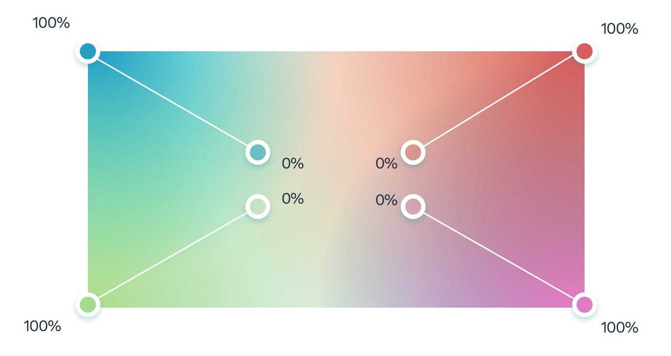
You can use this principle to achieve some pretty interesting, organic effects of multiple overlapping gradients like in the example above. To do this, simply create four radial gradients that start at each corner of your shape, and fade out towards the center. Experiment with their size and position until you like the result.
您可以使用此原理来实现多个重叠渐变的一些非常有趣的有机效果,如上例所示。 为此,只需创建四个径向渐变,这些渐变从形状的每个角开始并向中心逐渐淡出。 试验它们的大小和位置,直到您满意为止。

The most common fills you’re probably going to use however, are color and gradient.
但是,您可能要使用的最常见的填充是颜色和渐变。
边框 (Borders)
Borders are after the fill, the second styling an object can have.
填充之后是边框,对象可以具有第二种样式。
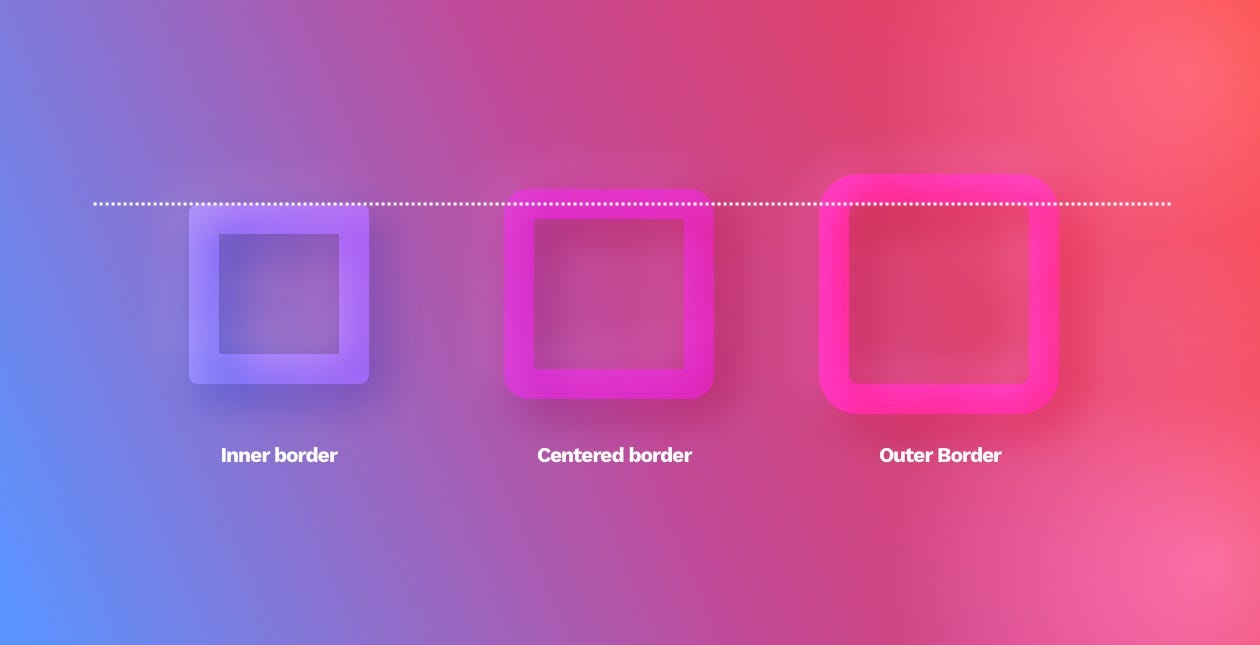
The border is a line that goes around our object. It can go inside (inner border), outside (outer border), or between them (center). Remember that only the inner border doesn’t visually make the object larger.
边框是围绕我们对象的一条线。 它可以进入内部(内部边界),外部(外部边界)或它们之间(中间)。 请记住,只有内部边框不会在视觉上使对象变大。
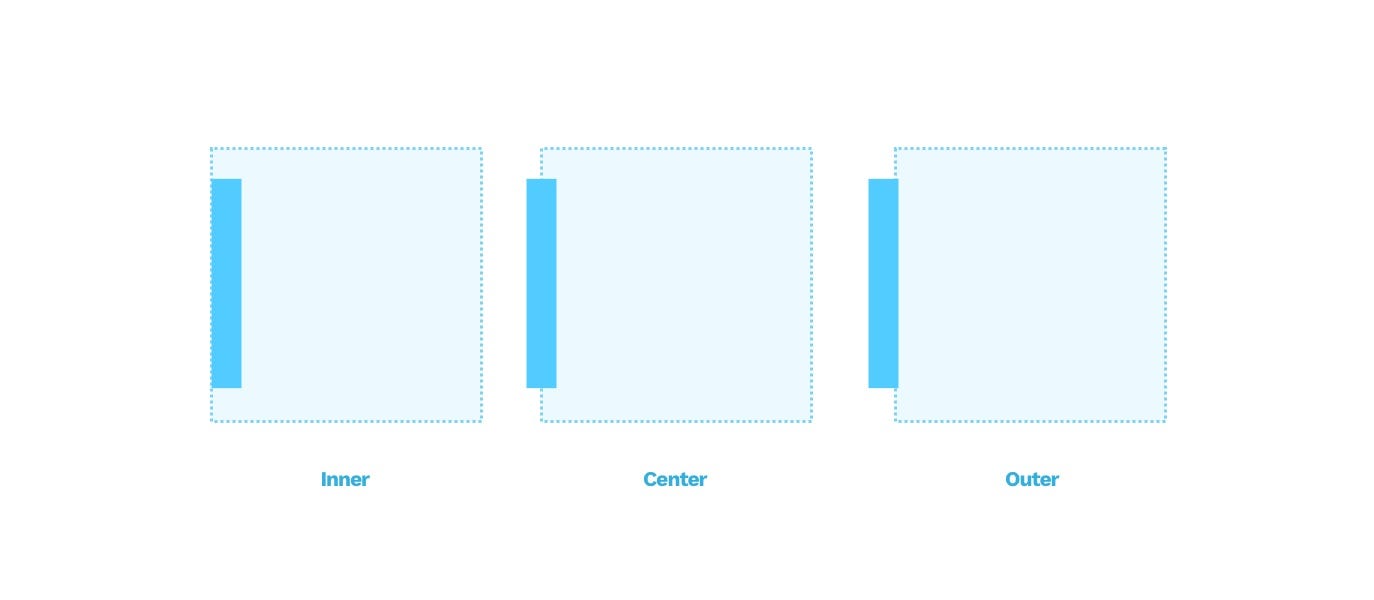
In the example above, the box is 60 x 60 points. The border is 10 points thick. In the middle image, that makes our box larger by 5 points on each side. In the third example, the border is completely outside, making the box larger by 10points in every direction.
在上面的示例中,该框为60 x 60点。 边框是10点粗。 在中间的图像中,这使我们的盒子每边大5个点。 在第三个示例中,边框完全在外部,使框在每个方向上都扩大了10个点。
边框样式 (Border styles)
The border can have different weights (width) in points and can be a dashed or dotted line. We can also fill it with both a color and a gradient.
边框的磅数可以有不同的权重(宽度),可以是虚线或虚线。 我们也可以用颜色和渐变填充它。

Most of the design tools allow you also to modify the endings and joints of your lines (also known as paths).
大多数设计工具还允许您修改线条(也称为路径)的末端和接缝。
The ends can be open, flat, or rounded while the joints can be sharp, rounded, or angled.
末端可以是开放的,平坦的或圆形的,而接头可以是锐利的,圆形的或成角度的。

The roundness of joints and endings can work well if your interface is generally rounded. If not, then just keep it at the default setting.
如果您的界面通常是圆形的,则关节和末端的圆度可以很好地工作。 如果不是,则将其保留为默认设置。

Thanks for getting this far. I believe it’s worth to sometimes revisit the very basics of a craft and that’s what this series is all about. Borders and fills are an essential part of UI, so it’s good to be able to bend them to your needs every time. In the next installment, we’ll cover all types of Shadows in UI design.
感谢您的帮助。 我认为有时值得回顾一下手Craft.io品的基本知识,这就是本系列的全部内容。 边框和填充是UI的重要组成部分,因此每次都可以根据需要弯曲边框和填充是很好的。 在下一部分中,我们将介绍UI设计中的所有类型的Shadows。
If you want to read more about the shapes and UI design in general, check out our 📘 book at www.designingui.com — there are free chapters there as well.
如果您想全面了解形状和UI设计的更多信息,请访问我们的design书,网址为www.designingui.com -那里也有免费的章节。
翻译自: https://uxdesign.cc/ui-design-shapes-objects-basics-fills-and-borders-ed294a17bcbb
ui边框设计图


 扫一扫
扫一扫
 5853
5853

 被折叠的 条评论
为什么被折叠?
被折叠的 条评论
为什么被折叠?
 到【灌水乐园】发言


