


谷歌抽屉
A couple of months ago Google has celebrated with enthusiasm 15 years of Google Maps, one of the most used and appreciated services worldwide from the company.
几个月前,Google热情地庆祝Google Maps诞生15周年,这是该公司在全球范围内使用最广泛,最受欢迎的服务之一。
On the occasion of the birthday, some changes were made to the app — the one that most stands out is certainly the new icon — but one in particular has created a sensation: burgers and drawers have apparently disappeared.
在生日那天,对应用程序进行了一些更改(最引人注目的当然是新图标),但是其中一个特别引起了轰动:汉堡和抽屉显然已经消失了 。

什么是汉堡包和抽屉? (What are hamburger and drawer?)
Excellent question! These two names could create a bit of confusion, however I’m simply talking about two graphic elements that we already saw in many everyday applications that we used for years.
很好的问题! 这两个名称可能会造成一些混乱,但是我只是在谈论我们已经使用了很多年的许多日常应用程序中已经看到的两个图形元素。
For hamburger menu, or, more precisely, hamburger button, I refer to that icon with three horizontal bars that is usually always in the top left corner in applications. The name “hamburger” comes from its resemblance to a hamburger sandwich, with the two lines at the top and bottom to indicate the slices of bread, and the central one to indicate the hamburger.
对于汉堡菜单,或更准确地说,是汉堡按钮 ,我指的是带有三个水平条的图标,通常在应用程序中始终位于左上角。 “汉堡包”的名称类似于汉堡包三明治,顶部和底部的两行分别表示面包片,中间的两行表示汉堡包。
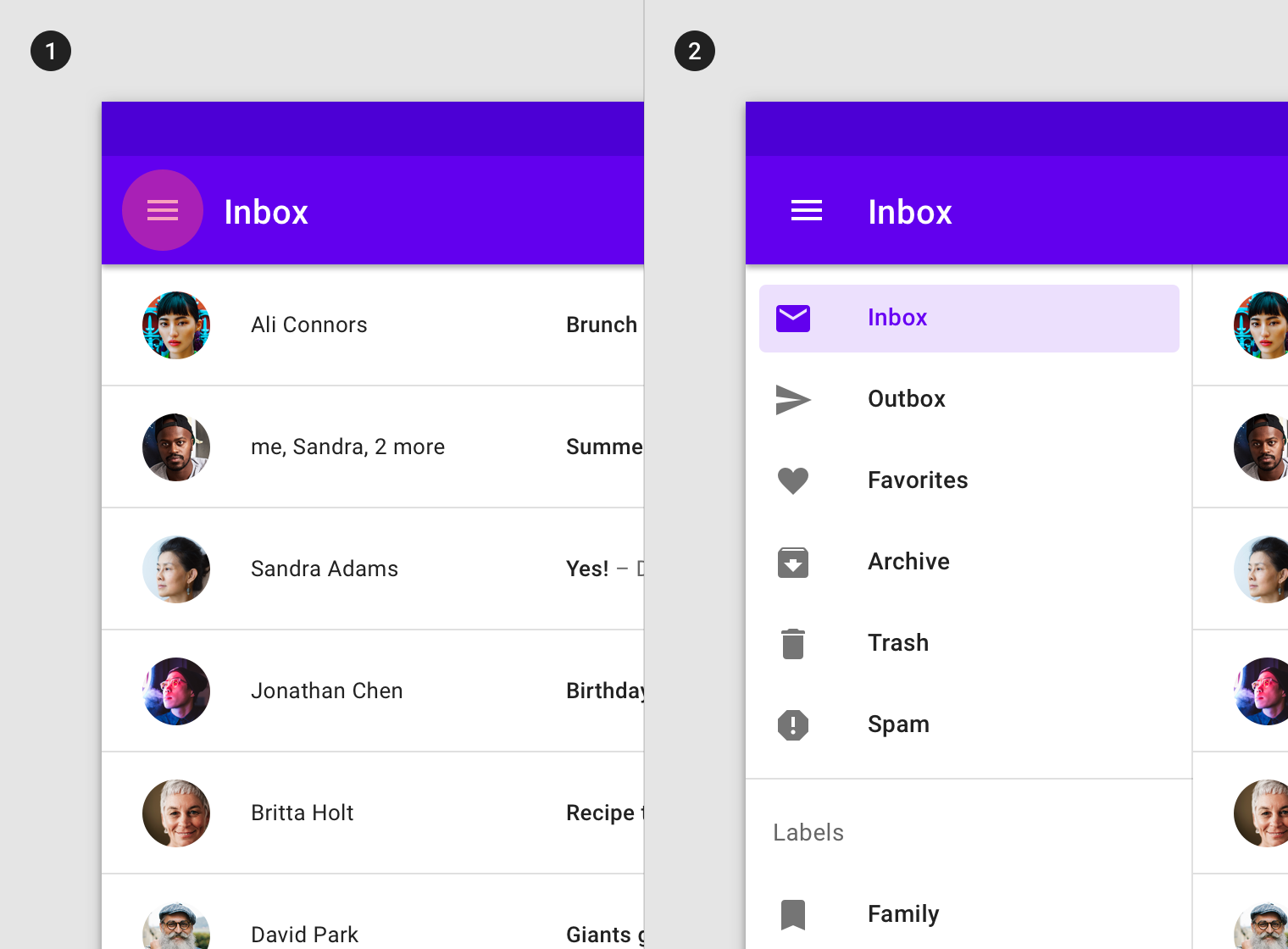
The drawer, or navigation drawer, is that graphic element that usually pops out from the left when we click on the hamburger. And it contains a lot of interesting things, like links to other pages of the app or information on the account logged in.
抽屉或导航抽屉是当我们单击汉堡包时通常从左侧弹出的图形元素。 它包含许多有趣的内容,例如指向应用程序其他页面的链接或登录帐户的信息。
这是真的! 我也有那个按钮! /等一下,我在应用程序中看不到该按钮! (It’s true! I have that button too! / Wait, I don’t see that button in the app!)
The hamburger button and its drawer are elements that are easily found in Android applications, Google itself has included them, for several years, in a multitude of applications. And so many Android developers.
汉堡包按钮及其抽屉是在Android应用程序中很容易找到的元素,多年来,Google本身已将其包含在众多应用程序中。 许多Android开发人员。
They are not exclusive to the green robot, however, and can therefore also be found in some iOS applications: Apple has always preferred a tabbed approach, rather than the use of a drawer, no app developed by Apple has in fact a drawer (well, maybe the mail app has a very similar thing), or a hamburger button.
但是,它们并不是绿色机器人所独有的,因此也可以在某些iOS应用程序中找到它们: Apple一直偏爱使用选项卡式方法 ,而不是使用抽屉,Apple开发的任何应用程序实际上都没有抽屉( ,也许邮件应用程序有一个非常相似的东西)或一个汉堡按钮。
The guidelines for the development of apps also change according to the operating system: the specifications for the Android apps include the Drawer component, the Apple ones for iOS do not. This is why many apps have different styles based on the operating system for which they are developed: for example the Telegram app has a drawer on Android but itdoes not have it on iOS.
应用程序开发的准则也会根据操作系统而有所不同: Android应用程序的规范包括Drawer组件,Apple的iOS规范则没有 。 这就是为什么许多应用根据其开发的操作系统而具有不同样式的原因:例如,Telegram应用在Android上具有抽屉,而在iOS上则没有。
Finally, drawers and hamburger menus are not exclusive to mobile applications: they can also be found on websites, especially in their mobile versions.
最后,抽屉和汉堡菜单并不是移动应用程序独有的:它们也可以在网站上找到,尤其是在移动版本中。
那么,Google是否正在从其应用程序中删除抽屉? (So, is Google removing the drawer from its applications?)
Well, maybe. Obviously this does not mean that apps will be poorer in content from now on: everything that was in the navigation drawer has been moved and made available in other parts of the app.
好吧, 也许吧 。 显然,这并不意味着从现在开始应用程序的内容将变得更糟:导航抽屉中的所有内容都已移动并可以在应用程序的其他部分使用。
But there are some changes in progress. We have already talked about Google Maps, which removed this graphic element a few weeks ago, but it is not the only Google app to have done so.
但是有一些变化。 我们已经讨论过Google Maps,它已在几周前删除了该图形元素,但这并不是唯一的Google app。
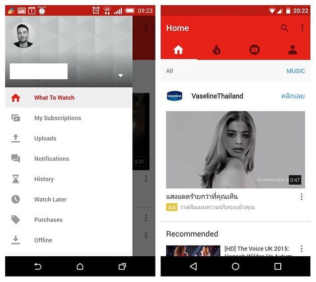
We don’t know if YouTube was the first on the list, certainly one of the firsts though: back in 2015 (yes, five years have already passed) the drawer was replaced by some tabs positioned just below the appbar. In the meantime, the app has been updated again and now the tabs are at the bottom, more easily accessible.
我们不知道YouTube是否排在首位,尽管无疑是首创:在2015年(是的,已经过去了五年) ,抽屉被位于应用栏正下方的一些标签所取代 。 同时,该应用已再次更新,现在选项卡位于底部,更易于访问。
Even Google Fit once had the classic hamburger button that opened a drawer once. It has now been replaced by a bottom navigation bar. Other apps are still changing: for example Google Ads shows the drawer in some cases, while a bottom bar in others (in these situations Google is likely to be testing server side, releasing the new layout gradually and in a limited way).
即使是Google Fit,也曾经有过经典的汉堡包按钮,可以一次打开抽屉。 现在,它已被底部导航栏取代。 其他应用程序仍在变化:例如,在某些情况下,Google Ads显示抽屉,而在其他情况下,则显示底部栏(在这种情况下,Google可能正在测试服务器端,并以有限的方式逐渐发布新的版式)。
抽屉怎么了 (What’s wrong with the drawer?)
Well, to be honest there is more than one reason why the drawer, but especially the hamburger menu, is a slightly outdated design pattern. The gentlemen of the Nielsen Norman Group (great experts in the sector) say it, and their article is pretty long, so something obviously is wrong.
好吧,说实话,抽屉(尤其是汉堡菜单)是一种过时的设计模式,原因有多个。 尼尔森·诺曼集团(Nielsen Norman Group)的先生们(该领域的杰出专家)说过, 他们的文章很长,因此显然是错误的。
We try to explain it in a slightly shorter way:
我们尝试以一种简短的方式来解释它:
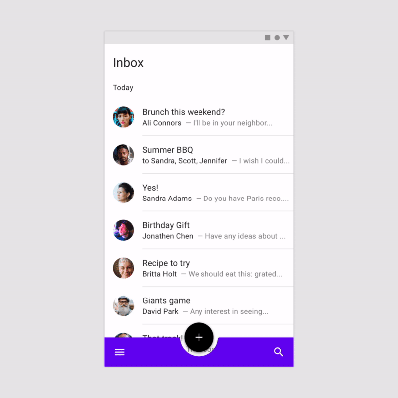
The hamburger button is difficult to reachOf course it is: most of the times it is in the upper left, the furthest point to reach with our beautiful right thumb. Furthermore, even the most important items in the drawer will always be at the top. Maybe once the problem was less pronounced, but in recent years smartphone displays have gotten bigger and bigger, and now this thing has become a problem.
汉堡包按钮很难触及当然是这样:大多数情况下,它位于左上角,这是我们美丽的右手拇指触及的最远点。 此外,即使抽屉中最重要的物品也始终位于顶部。 也许问题一度不那么明显,但近年来智能手机的显示屏越来越大,现在这已经成为一个问题。
There are multiple operations to do
有多个操作要做
This too may seem like a small problem, but a drawer forces us to make two taps on the screen instead of one: one on the hamburger button to open the drawer and one on the item we want to click. Third millennium problems, but still problems.
这似乎也似乎是一个小问题,但是抽屉迫使我们在屏幕上点击两次而不是两次:一次在汉堡按钮上打开抽屉,另一次在我们要单击的项目上。 第三千年的问题,但仍然是问题。
We don’t see immediately what we need
我们没有立即看到我们需要的东西
The elements we need are in the drawer, and where is the drawer? Hidden behind the frames of our display. And as long as we don’t tap on the hamburger button it doesn’t pop out.
我们需要的元素在抽屉中,抽屉在哪里? 隐藏在我们显示器的框架后面。 而且,只要我们不点击汉堡包按钮,它就不会弹出。
In the latest version of Android, opening the drawer by dragging it is almost impossible
在最新版本的Android中,几乎不可能通过拖动来打开抽屉
To open a classic drawer you can also swipe (drag your finger, for non-professionals) from the left edge of your smartphone to the right. This has been possible for a multitude of years BUT … in the latest version of Android, the same action, the swipe from left to right, also is used to go back. And so it happens that you want to open the drawer and exit the app instead.
要打开经典抽屉,您还可以从智能手机的左边缘向右滑动(对于非专业人士,请拖动手指)。 但是已经有很多年了……但是在最新版本的Android中,相同的动作(从左向右滑动)也可以返回。 因此,碰巧您想打开抽屉并退出应用程序。
This is an accessibility problem, but not caused by the drawer itself; simply Google likes to experiment without solving the problems it creates.
这是一个可访问性问题,但不是由抽屉本身引起的。 只是Google喜欢尝试解决未解决的问题。

有哪些选择? (What are the alternatives?)
Now that the reputation of drawer and hamburger (button) has dropped a lot, let’s see together some alternatives or some improvements that can be made to significantly improve the usability of an app.
既然抽屉和汉堡包(按钮)的声誉下降了很多,让我们一起来看一下可以显着提高应用程序可用性的一些替代方案或改进。
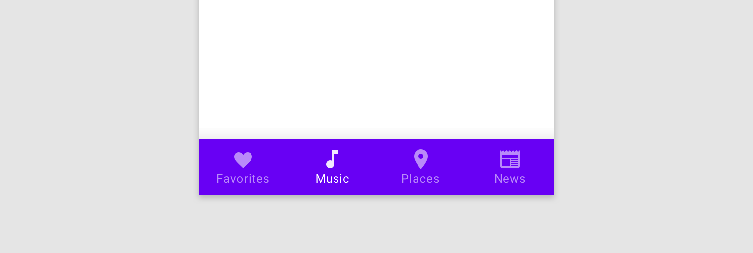
A nice Bottom Navigation Bar
一个漂亮的底部导航栏
It shows only the most important elements, it is at the bottom and therefore easily accessible by fingers, it is always visible. It is also the solution that many are adopting to replace the drawer, and Google is also implementing it extensively (for a while it has become part of the official Material Design components).
它仅显示最重要的元素,它在底部,因此手指可以轻松访问,并且始终可见。 这也是许多人用来替换抽屉的解决方案,并且Google也在广泛实施它(一段时间以来,它已成为官方Material Design组件的一部分)。
However, Apple has been using it since iOS 3. More than ten years ago.
但是,苹果从iOS 3开始就使用它。 十多年前 。
A Bottom Navigation Drawer
底部导航抽屉
It doesn’t sound like a big innovation, does it? To be fair, this solution maintains all the graphic elements we have talked about so far, drawer and hamburger, but with many advances towards the problems they had: the hamburger button is at the bottom and much more accessible, and the drawer, popping up from the bass, it shows first of all (and not too far from the bottom) the most important voices, and only then the secondary ones.
这听起来不像是一项重大创新,不是吗? 公平地讲,此解决方案保留了到目前为止我们讨论过的所有图形元素(抽屉和汉堡包),但是在解决它们所遇到的问题方面取得了许多进步:“汉堡包”按钮位于底部并且更易于访问,并且抽屉弹出从低音开始,它首先显示最重要的声音(并且离底部不远),然后显示次要声音。
Two clicks remain to be done instead of one. A solution therefore suitable only for apps used by people who are not in a hurry.
还需要单击两次,而不是单击一次。 因此,此解决方案仅适用于不着急的人使用的应用程序。
结论 (Conclusions)
At the end, we don’t know if Google will take the plunge by removing the drawer from its applications. But we saw that he would have more than one reason to do it, or at least fix some problems.
最后,我们不知道Google是否会通过从应用程序中删除抽屉来采取行动。 但是我们看到他这样做的理由不止一个,或者至少可以解决一些问题。
And all developers or owners of applications should do the same: nobody likes to use an application that limits us in use instead of helping us.
所有应用程序的开发人员或所有者都应这样做:没有人喜欢使用限制我们使用的应用程序而不是帮助我们。
Many are already doing it: apart from Google and Apple (which has taken a lot of care in this since the beginning) there are a lot of apps that over the years have changed their user interface to be easier to use. I’m talking about Spotify, Facebook, Instagram, Netflix, and many, many others.
许多公司已经这样做了:除了Google和Apple(从一开始就在这方面进行了很多注意)之外,许多应用程序多年来已将其用户界面更改为更易于使用。 我说的是Spotify,Facebook,Instagram,Netflix等。
我们是谁? (Who we are?)
We are a team of developers and designers based in Padua, Italy.We make mobile applications and web apps, using Flutter, React and React Native. We are always ready to create something great!
我们是一个位于意大利帕多瓦的开发人员和设计师团队,我们使用Flutter,React和React Native制作移动应用程序和Web应用程序。 我们随时准备创造伟大的事物!
Our website | Dribbble | Instagram | Linkedin
我们的网站 | Dribbble | Instagram | 领英
Are you interested on what we do? Drop us a few lines!
您对我们的工作感兴趣吗? 给我们几行 !
翻译自: https://medium.com/mabiloft/is-google-finally-killing-the-navigation-drawer-62337acb194e
谷歌抽屉


 289
289


 被折叠的 条评论
为什么被折叠?
被折叠的 条评论
为什么被折叠?
 到【灌水乐园】发言


