


ios设计组件
As a native iOS developer, I’ve been jealous of web developers who can use design systems in their everyday workflow. The ability to look through the library and copy the code of a component can increase the development speed.
作为本地iOS开发人员,我很嫉妒可以在日常工作流程中使用设计系统的Web开发人员。 浏览库并复制组件代码的能力可以提高开发速度。
Let’s compare how the radio button is described for web and mobile on the Shopify’s design system called Polaris. As we can see, the code snippet is provided for the web, unlike iOS or Android, where you can find just images of the representation.
让我们比较一下Shopify设计系统Polaris上针对Web和移动设备的单选按钮的描述方式。 如我们所见,与iOS或Android不同,该代码段是为网络提供的,在iOS或Android中,您只能找到表示形式的图像。
Usually, iOS developers implement typography, colors, imagery, simple components like buttons and switches, and that’s it. UIKit is not as friendly for design systems as Web or even SwiftUI, where you can construct user interfaces in a nice declarative way. As we still need to support a few previous versions of iOS where SwiftUI is not available, we can develop an approach that can help us to construct user interfaces much quicker and in a more declarative manner.
通常,iOS开发人员实现排版,颜色,图像,按钮和开关等简单组件,仅此而已。 UIKit对设计系统不如Web甚至SwiftUI友好,在Web上甚至可以通过一种很好的声明性方式构造用户界面。 由于我们仍然需要支持SwiftUI不可用的一些早期iOS版本,因此我们可以开发一种方法,以帮助我们更快,更声明性地构建用户界面。
什么是设计系统,如何提高开发速度? (What is a design system, and how it can increase the development speed?)
A design system is a collection of reusable components, guided by clear standards, that can be assembled together to build any number of applications.
设计系统是在明确的标准指导下的可重复使用组件的集合,这些组件可以组装在一起以构建任意数量的应用程序。
Benefits of having a design system components in your app:
在您的应用中包含设计系统组件的好处:
- You need to write components once and reuse them all over the app. It’s like a big box of UI Lego pieces that can be assembled in near-infinite ways. 您需要编写一次组件,然后在整个应用程序中重复使用它们。 这就像一个可以以几乎无限的方式组装的UI Lego件大盒子。
- Junior developers can be responsible for making these components separately from the business logic. 初级开发人员可以负责与业务逻辑分开制作这些组件。
- Components can be reused in different apps. 组件可以在不同的应用程序中重复使用。
- Collaboration and knowledge sharing increase. 合作和知识共享增加。
- Clean and clear codebase. 清理并清除代码库。
- The ability to copy/paste code from a library page. 从库页面复制/粘贴代码的能力。
该方法 (The approach)
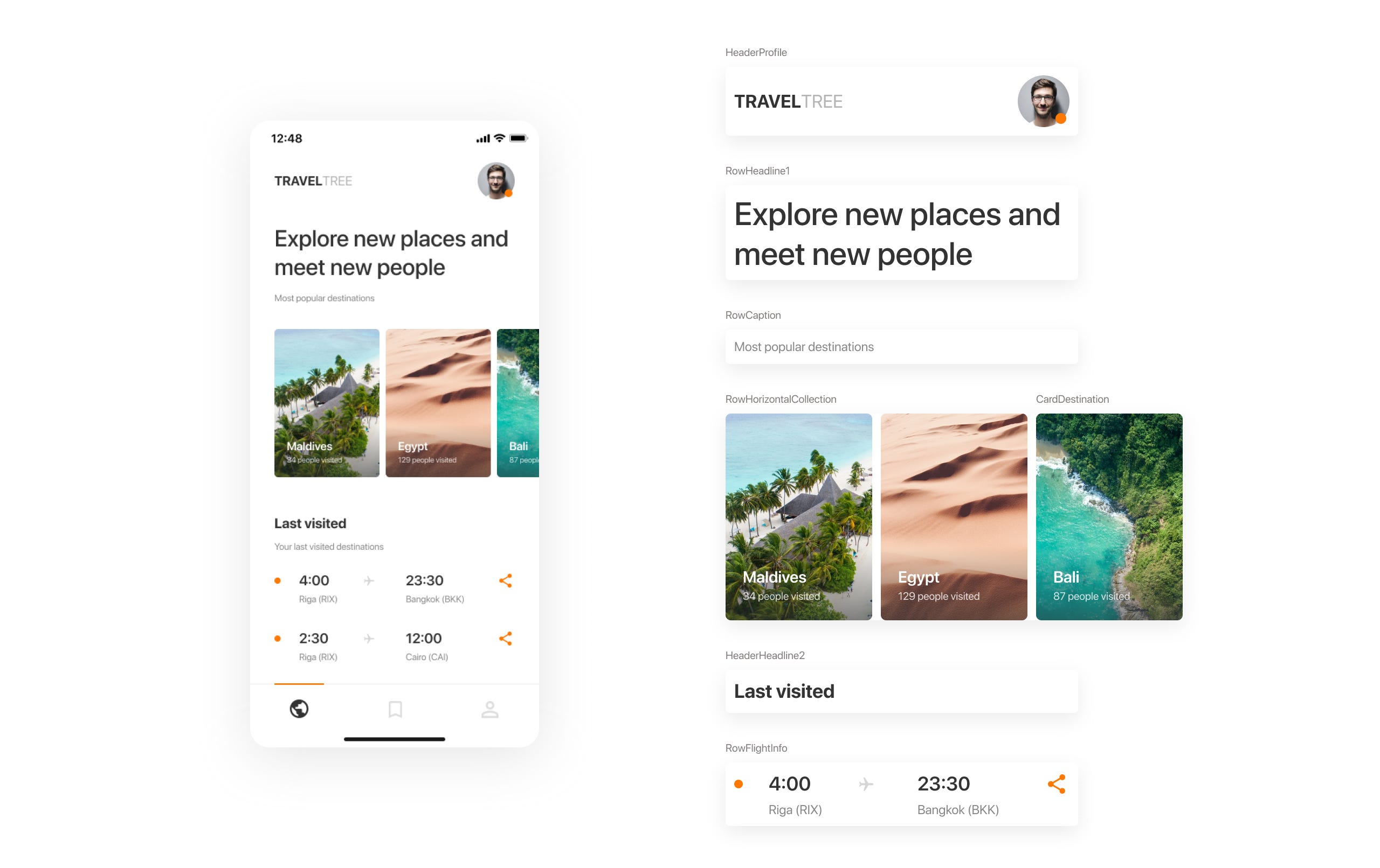
I think it is not worth mentioning how to wrap Fonts, Typography, or Imagery into the design system on iOS as there are plenty of examples on the internet that can be easily found. Let’s focus on making “Lego bricks” of our user interface. As an example, I will take an interface from a dribbble shot that was made by my teammate Andrey Lohmatov, and split it into components.
我认为不值得一提的是如何将字体,印刷术或图像包装到iOS的设计系统中,因为互联网上有很多示例可以轻松找到。 让我们集中精力制作用户界面的“乐高积木”。 例如,我将从队友安德烈·洛马托夫 ( Andrey Lohmatov )制作的带球镜头中获取一个界面,并将其拆分为多个部分。
Airbnb’s MagazineLayout library fits well for our purpose. I like the idea that any screen can be represented as a set of cards and rows on a collection view. The library has handy declarations of item widths based on a fraction of the total available width (full width, 1/2, 1/3, etc.).
Airbnb的 MagazineLayout库非常适合我们的目的。 我喜欢这样的想法,即任何屏幕都可以表示为集合视图上的一组卡片和行。 该库基于总可用宽度的一小部分(全宽,1 / 2、1 / 3等)方便地声明了项目的宽度。
To keep the project well organized we can introduce a naming convention for our components.
为了使项目井井有条,我们可以为组件引入命名约定。
Row — full-width cell (RowText, RowFlightInfo).
行 -全形单元格(RowText, RowFlightInfo)。
Card — a cell with a fractioned width (CardDestination, CardPhoto).
Card —宽度不等的单元格(CardDestination,CardPhoto)。
Header — supplementary header view (HeaderHeadline1, HeaderHeadline2WithSubtitle).
标头 -补充标头视图(HeaderHeadline1,HeaderHeadline2WithSubtitle)。
Footer — supplementary footer view (FooterTotalText).
页脚 -补充页脚视图(FooterTotalText)。
You can add more types, I just giving you the idea.
您可以添加更多类型,我只是给您一个想法。
Now, we can wrap cell manipulation with configurators approach from one of my previous articles. Configurators will help us to write the UI in a more declarative way. Basically, you will construct the user interface in a viewcontoller’s view model.
现在,我们可以使用我以前的文章之一中的配置器方法包装单元操作。 配置器将帮助我们以更具声明性的方式编写UI。 基本上,您将在viewcontoller的视图模型中构造用户界面。
In my implementation, I will use the following stack: MagazineLayout, RxSwift, RxFlow. If you’re not familiar with RxSwift, I highly recommend trying it, as reactive programming is a must nowadays (Combine as an example). You can check the demo project on Github straight away if you don’t want to go through the steps of the implementation.
在我的实现中,我将使用以下堆栈: MagazineLayout ,R xSwift和RxFlow 。 如果您不熟悉RxSwift,我强烈建议您尝试使用它,因为如今响应式编程是必须的(以Combine为例)。 如果您不想执行实施步骤,可以立即在Github上检查演示项目 。
编码时间 (Time to code)
I will not stop on each aspect of the implementation, as the complete code is available on Github. Let’s got through the main ideas.
我不会在实现的各个方面停下来,因为Github上提供了完整的代码。 让我们了解一下主要思想。
Each cell and supplementary view should have a view model.
每个单元格和补充视图应具有一个视图模型。
struct RowTextVM: MagazineCellDataType {


    var sizeMode: MagazineLayoutItemSizeMode {
        return MagazineLayoutItemSizeMode(widthMode: .fullWidth(respectsHorizontalInsets: true),
                                          heightMode: .dynamic)
    }


    let text: String


    init(text: String) {
        self.text = text
    }


    var diffHash: Int {
        return text.hashValue
    }


    func configurator() -> CellConfigurator {
        return RowTextConfigurator(item: self)
    }


    func didSelect() {
        //
    }
}
Cell’s view model should conform to a set of protocols that are responsible for sizing, selection, and configuration.
Cell的视图模型应符合一组负责确定大小,选择和配置的协议。
typealias MagazineCellDataType = Diffable & CellSizable & SelectableData & CellConfigurableCell’s configurator can be defined in the cell’s class and follow the same naming convention.
单元的配置器可以在单元的类中定义,并遵循相同的命名约定。
typealias RowTextConfigurator = MagazineCellConfigurator<RowTextVM, RowText>
final class RowText: MagazineLayoutCollectionViewCell, ConfigurableCell {


    private let textLabel: UILabel = {
        let label = UILabel(frame: .zero)
        label.bonMotStyle = Typography.Text
        label.numberOfLines = 0
        label.textColor = .captionText
        return label
    }()


    override init(frame: CGRect) {
        super.init(frame: frame)


        self.contentView.addSubview(textLabel)
        textLabel.snp.makeConstraints {
            $0.leading.trailing.equalToSuperview()
            $0.top.bottom.equalToSuperview()
        }
    }

    required init?(coder: NSCoder) {
        fatalError("init(coder:) has not been implemented")
    }

    func configure(item: RowTextVM) {
        textLabel.styledText = item.text
    }
}
Each screen can be split into sections. A section may contain header, footer, items, background, and insets.
每个屏幕都可以分为几部分。 一个节可以包含页眉,页脚,项目,背景和插图。
struct MagazineLayoutSection {
    let header: HeaderInfo
    let footer: FooterInfo
    let items: [CellConfigurator]
    let background: BackgroundInfo
    let sectionInset: UIEdgeInsets
    let itemsInset: UIEdgeInsets
}
Now we can make a base view controller where we initialize a collection view and handle all MagazineLayout’s delegate and data source methods. This class should have a binder for sections where you will bind sections from a viewcontroller’s view model. The base view controller can be inherited and used for most of the screens of your app.
现在,我们可以创建一个基本视图控制器 ,在其中初始化集合视图并处理所有MagazineLayout的委托和数据源方法。 此类应具有节的装订器,您将在其中绑定ViewController的视图模型中的节。 基本视图控制器可以继承并用于应用程序的大多数屏幕。
To be more flexible with the UI, we can implement automatic registration of cells in UICollectionView. You can check the implementation of the CollectionViewCellsRegistrator in the demo project. Cells are registered on sections change and can be registered with/without nibs.
为了更加灵活地使用UI,我们可以在UICollectionView中实现单元的自动注册。 您可以在演示项目中检查CollectionViewCellsRegistrator的实现。 单元在部分更改时被注册,并且可以在有或没有笔尖的情况下注册。
Finally, the screen layout can look like this:
最后,屏幕布局如下所示:
[
            MagazineLayoutSection(items: [
                RowDestinationTitleVM(title: "Indonesia, Bali").configurator()
            ], sectionInset: UIEdgeInsets(top: 0, left: 32, bottom: 16, right: 16)),

            MagazineLayoutSection(items: [
                RowTextVM(text: "Some Text").configurator()
            ], header: .init(item: header1.configurator(),
                             visibilityMode: .visible(heightMode: header1.heightMode, pinToVisibleBounds: false)),
               sectionInset: UIEdgeInsets(top: 0, left: 32, bottom: 16, right: 16)),

            MagazineLayoutSection(items: [
                RowHorizontalCardsCollectionVM(items: [
                    CardPhotoThumbnailVM(url: "https://***"),
                    CardPhotoThumbnailVM(url: "https://***"),
                    CardPhotoThumbnailVM(url: "https://***"),
                    CardPhotoThumbnailVM(url: "https://***")
                    ],
                                               itemWidth: 164,
                                               itemHeight: 120,
                                               itemsSpacing: 8).configurator()
            ], header: .init(item: header2.configurator(),
                             visibilityMode: .visible(heightMode: header1.heightMode, pinToVisibleBounds: false)),
               sectionInset: UIEdgeInsets(top: 16, left: 32, bottom: 32, right: 16),
               itemsInset: UIEdgeInsets(top: 8, left: -32, bottom: 0, right: -16))
]
You just manipulating with sections and cells' view models.
您只需要处理部分和单元格的视图模型。
视差标头 (Parallax headers)
Parallax headers can be easily added to any screen as each screen is based on UICollectionView. MXParallaxHeader works for us on many projects.
视差标头可以轻松地添加到任何屏幕,因为每个屏幕都基于UICollectionView。 MXParallaxHeader在许多项目中为我们工作。
导航 (Navigation)
In Chili Labs, we are using RxFlow for navigation in all our apps. It is a navigation framework for iOS applications, based on a Reactive Flow Coordinator pattern.
在Chili Labs中 ,我们使用RxFlow在所有应用程序中进行导航。 它是基于Reactive Flow Coordinator模式的iOS应用程序导航框架。
A cell’s view model can be a Stepper and emit steps to a VC’s view model, which will forward these steps to a flow handler. Steps can be emitted on a cell selection or a button tap inside the cell. That makes the navigation handling simpler and reusable.
单元的视图模型可以是步进器,并向VC的视图模型发出步骤,VC将把这些步骤转发给流处理程序。 可以在单元格选择或单元格内部的按钮点击上发出步骤。 这使得导航处理更加简单和可重用。
服务器驱动的用户界面 (Server-driven UI)
After some manipulations, this approach can be easily connected with a backend to make a server-driven UI. The backend can return a structure of the layout that should be rendered on the screen.
经过一些操作后,可以轻松地将此方法与后端连接以创建服务器驱动的UI。 后端可以返回应该在屏幕上呈现的布局结构。
示范项目 (Demo project)
I made a proof-of-concept project on Github to show the power of the technique described in this article.
I hope this approach will increase the quality of your apps as well as delivery speed.
我希望这种方法可以提高应用程序的质量以及交付速度。
Thanks for reading!
谢谢阅读!

Receive a new Mobile development related stories first. — Hit that follow buttonTwitter: @ ChiliLabswww.chililabs.io
首先接收与移动开发相关的新故事。 —点击关注按钮Twitter:@ ChiliLabs www.chililabs.io
翻译自: https://medium.com/chili-labs/implementing-design-system-components-on-ios-6afe873ea586
ios设计组件


 扫一扫
扫一扫
 3127
3127

 被折叠的 条评论
为什么被折叠?
被折叠的 条评论
为什么被折叠?
 到【灌水乐园】发言


