


react 异步按钮
Welcome back! This week’s articles cover an assortment of SwiftUI micro-interactions that I’ve made for my apps. The benefits these interactions bring can really help make your app feel polished and simple to use.
欢迎回来! 本周的文章涵盖了我为我的应用所做的各种SwiftUI微交互。 这些交互带来的好处可以真正帮助您使应用程序更美观,更易于使用。
Today’s micro-interaction tutorial is about creating a custom button for asynchronous tasks such as downloading, sending, or loading data.
今天的微交互教程是关于为异步任务(如下载,发送或加载数据)创建自定义按钮的。
创建AsyncButton (Creating AsyncButton)
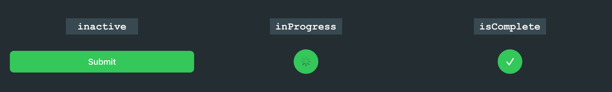
Before we get programming, let’s explain the different states of AsyncButton:
在开始编程之前,让我们解释一下AsyncButton的不同状态:
inactive— User has not started asynchronous task.inactive-用户尚未启动异步任务。inProgress— Actively processing asynchronous task.inProgress—主动处理异步任务。isComplete— Asynchronous task complete.isComplete异步任务完成。
During each of these states, the AsyncButton will show a different View describing the asynchronous task:
在每种状态下, AsyncButton将显示一个描述异步任务的不同View :
入门 (Getting Started)
Below is the template for our AsyncButton, which includes properties for the states described above. We're going to focus on programming the views for the different states. If you're curious about how the init function works or what @ViewBuilder is, then I encourage you to check out Majid Jabrayilov's article on the power of the @ViewBuilder property wrapper in SwiftUI.
以下是AsyncButton的模板,其中包含上述状态的属性。 我们将专注于对不同状态的视图进行编程。 如果您想了解如何init函数作品还是什么@ViewBuilder是,那么我建议你检查出马吉德Jabrayilov的文章上的功率的@ViewBuilder 在SwiftUI属性包装 。
struct AsyncButton<Content: View>: View {

    var isComplete: Bool
    let action: ()->()
    let content: Content

    @State private var inProgress: Bool

    init(isComplete: Bool, action: @escaping ()->(), @ViewBuilder label: ()->Content) {
        self.action = action
        self.isComplete = isComplete
        self.content = label()
        self._inProgress = State.init(initialValue: false)
    }

    var body: some View {
        Button(action: {
            // Call Async Task and update View
        }, label: {
            // Show the different state views
        })
    }


}
编程不同的视图状态 (Programming the Different View States)
Inside the label: closure, we're going to start off by utilizing VStack to group all of the different state views. I chose a VStack specifically for animating the AsyncButton state changes. If we set the alignment of the stack to .center, then the new views will animate from the center of the button, making it seem like the button is resizing itself.
在label:封闭内部,我们将开始使用VStack对所有不同的状态视图进行分组。 我选择了VStack专门为动画的AsyncButton状态的变化。 如果我们将堆栈的对齐方式设置为.center ,则新视图将从按钮的中心进行动画处理,从而使按钮看起来像在调整自身大小。
struct AsyncButton<Content: View>: View {

    var isComplete: Bool
    let action: ()->()
    let content: Content

    @State private var inProgress: Bool

    init(isComplete: Bool, action: @escaping ()->(), @ViewBuilder label: ()->Content) {
        self.action = action
        self.isComplete = isComplete
        self.content = label()
        self._inProgress = State.init(initialValue: false)
    }

    var body: some View {
        Button(action: {
            // Call Async Task and update View
        }, label: {
            // Show the different state views
            VStack(alignment: .trailing) {
                if inProgress && !isComplete {
                    ProgressView()
                        .foregroundColor(.white)
                } else if isComplete {
                    Image(systemName: "checkmark")
                        .resizable()
                        .frame(width: 15, height: 15, alignment: .center)
                        .foregroundColor(.white)
                } else {
                    content
                }
            }
        })
    }


}
As the state of the button changes, we return different views such as the ProgressView, Image, and content, which is provided when instantiated.
随着按钮状态的变化,我们将返回不同的视图,例如ProgressView , Image和content ,这些视图在实例化时提供。
更新按钮状态 (Updating Button State)
When the user taps the AsyncButton, we want to make sure we do two things:
当用户点击AsyncButton ,我们要确保我们做两件事:
- Call the action closure that was passed by the developer during instantiation. 调用开发人员在实例化过程中传递的动作关闭。
Update the state of the
AsyncButtonby updating theinProgressproperty.通过更新
inProgress属性来更新AsyncButton的状态。
var body: some View {
        Button(action: {
            // Update Button State, and call passed `action` closure
            if !inProgress { action() }
            withAnimation(Animation.easeInOut(duration: 0.4)) {
                inProgress = true
            }

        }, label: {
            VStack(alignment: .trailing) {
                if inProgress && !isComplete {
                    ProgressView()
                        .foregroundColor(.white)
                } else if isComplete {
                    Image(systemName: "checkmark")
                        .resizable()
                        .frame(width: 15, height: 15, alignment: .center)
                        .foregroundColor(.white)
                } else {
                    content
                }
            }
        })


    }
添加样式 (Adding Styling)
Below, I added some styling to the AsyncButton, but I encourage you to play around with it and modify it to suit your app's theme or style:
下面,我在AsyncButton添加了一些样式,但我鼓励您尝试一下并对其进行修改以适合您应用的主题或样式:
var body: some View {
    Button(action: {
        if !inProgress { action() }
        withAnimation(Animation.easeInOut(duration: 0.4)) {
            inProgress = true
        }


    }, label: {
        VStack(alignment: .trailing) {
            if inProgress && !isComplete {
                ProgressView()
                    .foregroundColor(.white)
            } else if isComplete {
                Image(systemName: "checkmark")
                    .resizable()
                    .frame(width: 15, height: 15, alignment: .center)
                    .foregroundColor(.white)
            } else {
                content
            }
        }
        .frame(maxWidth: isComplete || inProgress ? 50 : .infinity, maxHeight: isComplete  || inProgress ? 50 : nil, alignment: .center)
        .padding(.vertical, isComplete  || inProgress ? 0 : 12)
        .foregroundColor(.white)
        .background(Color.green)
        .cornerRadius(isComplete || inProgress ? 25 : 8)
        .font(Font.body.weight(.semibold))
        .padding(.all, 20)
    })


}
使用AsyncButton (Using AsyncButton)
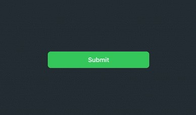
This example shows how to create a basic submit button using our complete AsyncButton:
这个例子展示了如何使用我们完整的AsyncButton创建一个基本的提交按钮:
import SwiftUI


struct SubmitButton_Test: View {

    @State var complete: Bool = false
    @State var inProgress: Bool = false

    var body: some View {
        AsyncButton(isComplete: complete, action: {
            inProgress = true
            // Start Async Task (Download, Submit, etc)
            DispatchQueue.main.asyncAfter(deadline: .now() + 2) {
                withAnimation {
                    complete = true
                }
            }
        }) {
            Text(complete || inProgress ? "" : "Submit")
        }
    }
}
Thanks for reading!
谢谢阅读!
翻译自: https://medium.com/@jboullianne/micro-interactions-async-button-279a37c4f41e
react 异步按钮


 365
365

 被折叠的 条评论
为什么被折叠?
被折叠的 条评论
为什么被折叠?
 到【灌水乐园】发言


