


机器视觉与应用程序杂志
What does the customer first see in your application? Yes, its your application design. So it is very important to pay attention to how the design is made. There’s so many factors to include, like how usually people meaning a symbol, how their preference, what common sense in design, etc. More factor you look, more people will attract with it.
客户首先在您的应用程序中看到什么? 是的,它是您的应用程序设计。 因此,注意设计是非常重要的。 其中包含许多因素,例如人们通常如何象征符号,他们的喜好,设计中的常识等。您看的因素越多,就会吸引更多的人。
Today I’ll explain about one of common sense in design your apps User Interface. The principle called Nielsen’s 10 Usability Heuristics for UI Design. They are called “heuristics” because it’s only common sense principle and not specific guide of usability. To read more detail, you can read this on : Nielsen, J. (1994a). Enhancing the explanatory power of usability heuristics. Proc. ACM CHI’94 Conf. (Boston, MA, April 24–28), 152–158.
今天,我将介绍有关设计应用程序用户界面的常识之一。 该原理称为Nielsen的UI设计的10个可用性启发法。 之所以称为“启发式”,是因为它只是常识性原理,而不是可用性的特定指南。 要了解更多详细信息,请阅读以下文章: Nielsen,J.(1994a)。 增强可用性启发式方法的解释能力。 进程 ACM CHI'94会议。 (马萨诸塞州波士顿,4月24-28日),152-158 。
Nielsen的UI设计的10种可用性试探法 (Nielsen’s 10 Usability Heuristics for UI Design)
#1:系统状态的可见性 (#1: Visibility of system status)
Everything user’s do to your app, there must be some feedback about it. With this, user will not be confused about what happening. The information / feedback also need appear within reasonable time (not to fast nor to long).
用户对您的应用所做的一切,都必须对此有一些反馈。 这样,用户将不会对发生的事情感到困惑。 信息/反馈也需要在合理的时间内出现(不要太快也不要太长)。
#2:系统与现实世界之间的匹配 (#2: Match between system and the real world)
Here, you must know who is your system talk to. The apps should speak with user language, so they will know what the meaning of it. You can’t let user communicate directly with system (I mean, don’t speak with system term language). More real-world and natural your app speak, more convenient when user use it.
在这里,您必须知道与您的系统交谈的对象。 这些应用程序应该使用用户语言进行交流,因此他们将知道它的含义。 您不能让用户直接与系统通信(我的意思是,不要用系统术语语言讲话)。 让您的应用程序更具真实性和自然性,使用户使用起来更加方便。
#3:用户控制和自由 (#3: User control and freedom)
Your user also a human, they do some mistake. Here you must provide some “undo and redo” to your app. When user by an accident click a button or link, there should be a “emergency exit” to recover what user do. The “emergency exit” instruction must clear without having to do much effort.
您的用户也是人,他们会犯一些错误。 在这里,您必须为应用提供一些“撤消和重做”功能。 当用户无意中单击按钮或链接时,应该有一个“紧急出口”以恢复用户的操作。 必须紧急清除“紧急出口”指令,而无需付出很多努力。
#4:一致性和标准 (#4: Consistency and standards)
Application pages must be consistent and according to standard. Don’t make user confused by using ambiguous word, like when user fill some form instead using “submit” you should using “submit and next” when there’s be more form to be filled by user. A transition between page should not to difference, user will confused like “am I still in the same apps?”.
申请页面必须一致且符合标准。 不要通过使用歧义词来使用户感到困惑,例如当用户填写某种表格而不是使用“提交”时,当用户要填写的表格更多时,应使用“提交并提交下一个”。 页面之间的过渡不应该有所不同,用户会感到困惑,例如“我仍在使用相同的应用程序吗?”。
#5:认可而不是回忆 (#5: Recognition rather than recall)
as much as possible, make a thing to be clear and easy to recognize. The user should not have to remember information about a thing to know your stuff meaning. Instructions for use of the system should be visible or easily to get whenever appropriate.
尽可能使事物清晰易辨。 用户不必记住有关事物的信息即可知道您的东西含义。 该系统的使用说明应清晰可见,或在适当时易于获取。
#6:错误预防 (#6: Error prevention)
“An ounce of prevention is worth a pound of cure”, it’s also applies in our work. Good to prepare some error message, but it’s better to prevent that error to occurring in the first place. Either eliminate error-prone conditions or check for them and present users with a confirmation option before they commit to the action.
“一分预防胜于一磅治疗”,这也适用于我们的工作。 准备一些错误消息是很好的做法,但是最好首先防止该错误发生。 消除容易出错的条件,或者检查条件,并在用户执行操作之前向其提供确认选项。
#7:使用的灵活性和效率 (#7: Flexibility and efficiency of use)
When the user become wider, there will be some advance people in it. I mean there will be more people with more knowledge about your app and they wanna work faster and more efficient. In this case, your app should provide flexibility system both for inexperienced and experienced users.
当用户变得更广泛时,其中会有一些先行者。 我的意思是,将会有更多的人对您的应用有更多的了解,他们想要更快,更高效地工作。 在这种情况下,您的应用程序应为没有经验的用户和有经验的用户提供灵活性系统。
#8:美学和简约设计 (#8: Aesthetic and minimalist design)
All of your pages must only consist a relevant and necessary contents. More irrelevant contents just make user more confused. So make sure to check it’s relevance if you wanna add more content.
您的所有页面都只能包含相关且必要的内容。 更多无关的内容只会使用户更加困惑。 因此,如果您想添加更多内容,请确保检查其相关性。
#9:帮助用户识别,诊断错误并从错误中恢复 (#9: Help users recognize, diagnose, and recover from errors)
When you attempted as much as possible to prevent an error, there is no guarantee that user not produce some error. So, you should inform user with plain language (no codes), precisely indicate the problem, and constructively suggest a solution.
当您尝试尽可能防止错误时,不能保证用户不会产生任何错误。 因此,您应该使用简单的语言(无代码)通知用户,准确地指出问题所在,并建设性地提出解决方案。
#10:帮助和文档 (#10: Help and documentation)
Even though it is better if the system can be used without documentation, it may be necessary to provide help and documentation. Any such information should be easy to search, focused on the user’s task, list concrete steps to be carried out, and not be too large.
即使可以在没有文档的情况下使用系统会更好,但可能仍需要提供帮助和文档。 任何此类信息都应该易于搜索,着眼于用户的任务,列出要执行的具体步骤,并且不要太大。
实施(在我的项目上) (Implementation (on my project))
Currently, I participating in PPL (Proyek Perangkat Lunak) or software project course. The project is about SmartCMR, here we make costumer membership application. So my apps can register and identification a costumer to be a member only with his or her face. Here is Nielsen’s 10 Usability Heuristics implemented in my project. *we built it using Bahasa Indonesia, cause almost all of our target and stakeholder is from Indonesia*
目前,我参加了PPL(Proyek Perangkat Lunak)或软件项目课程。 该项目是关于SmartCMR的,在这里我们制作客户会员申请。 因此,我的应用程序可以注册和识别客户以仅以其面部身份成为会员。 这是我的项目中实施的Nielsen的10种可用性启发式方法。 *我们使用印度尼西亚语(Bahasa Indonesia)建造了它,因为我们几乎所有目标客户和利益相关者都来自印度尼西亚*
#1: Visibility of system status There’s an indicator that the photo has taken, so user know the app has take her photo (Capture Indicator figure).
#1:系统状态的可见性有一个已拍摄照片的指示符,因此用户知道该应用程序已拍摄了她的照片(“捕捉指示符”图)。

#2: Match between system and the real world It’s simple instruction in common Indonesian language (Ready Page Instruction figure).
#2:系统与现实世界之间的匹配这是印度尼西亚通用语言的简单指令(“就绪页面指令”图)。

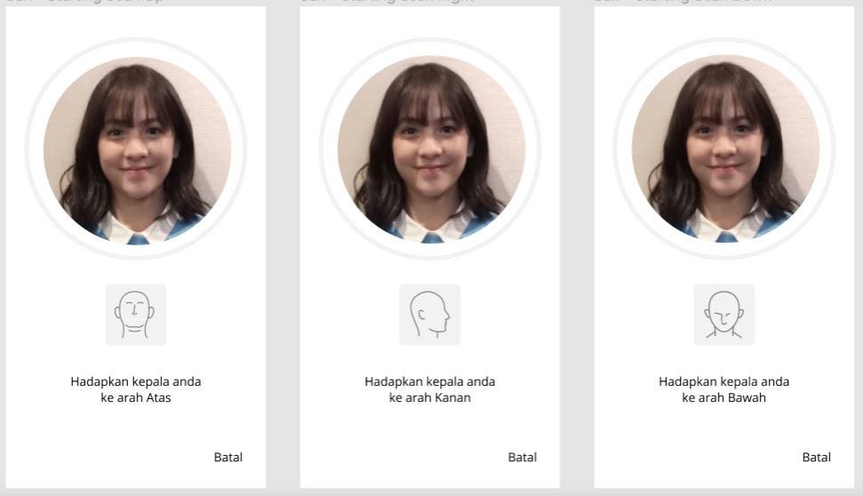
#3: User control and freedomBack icon (Batal) in every state of registration and after select a passcode (Registration Stages, Passcode Confirmation figure).
#3:在每种注册状态下,以及选择密码(“注册阶段”,“密码确认”图)后,用户控制和LibertyBack图标(Batal)。
#4: Consistency and standards Color, theme, icon are identically all app pages (Capture Indicator, Ready Page Instruction, Registration Stages, Passcode Confirmation figure, etc).
#4:一致性和标准所有应用程序页面的颜色,主题,图标都相同(捕获指示器,就绪页面说明,注册阶段,密码确认图等)。
#5: Recognition rather than recall All instruction are simple an to the point, so user don’t need to remember step by step (Registration Stages, figure).
#5:识别而不是回忆所有指令都非常简单,因此用户不需要逐步记住(注册阶段,如图)。

Besides example in my app, there are Google recommendation when you searching in Google search box. It’s prevent user to recall what information that he / she actually want to search. Google recommend what information that usually searched related to one or two words that user type. More example is Purchase History feature that usually implement in many e-commerce. User don’t have to remember what item that he / she bought last time.
除了我的应用程序中的示例外,在Google搜索框中进行搜索时还有Google推荐。 这样可以防止用户回忆起他/她实际要搜索的信息。 Google建议通常搜索的信息与用户键入的一两个单词有关。 更多示例是通常在许多电子商务中实现的购买历史记录功能。 用户不必记住他/她上次购买的商品。

#6: Error prevention When cashier fill the registration form and he / she just write a password that easy to remember and choose a very simple one, we prevent it by showing an error (Gunakan 8–20 karakter dengan campuran huruf dan angka) or in English (Use 8–20 character with word and number in it).
#6:错误预防当收银员填写注册表时,他/她只写了一个容易记住的密码并选择了一个非常简单的密码,我们通过显示错误来防止它出现(Gunakan 8–20 karakter dengan campuran huruf dan angka)或英文(使用8-20个字符,带单词和数字)。

#7: Flexibility and efficiency of use It’s actually not one of my app feature, It is my browser (Google Chrome) feature. When you already login to some website, there will be a username suggestion below the username form. Here, when cashier want to login but he / she have already login in same device.
#7:灵活性和使用效率实际上,这不是我的应用程序功能之一,而是我的浏览器(Google Chrome)功能。 当您已经登录某个网站时,在用户名表格下方将出现一个用户名建议。 在这里,当收银员想登录但他/她已经在同一设备上登录了。

For other example is Mac OS gives users the freedom to create their custom keyboard and shortcut commands.
再例如,Mac OS使用户可以自由创建自己的自定义键盘和快捷键命令。

#8: Aesthetic and minimalist design Here is my apps homepage, it’s only contain 2 icon (Registration and Identification) and a navbar.
#8:美观而简约的设计这是我的应用程序主页,它仅包含2个图标(注册和标识)和一个导航栏。

#9: Help users recognize, diagnose, and recover from errorsWhen something is not right in registration or identification it will show this red page. When user type wrong URL it will show this 404 error page
#9:帮助用户识别,诊断和从错误中恢复如果在注册或标识中出现错误,它将显示此红色页面。 当用户键入错误的URL时,它将显示此404错误页面

#10: Help and documentationWe don’t implement this feature yet, but here an example from Slack app. Slack have a feature called Slack Bot. This feature can do much thing, but important one is it help user to answer any question about using Slack.
#10:帮助和文档我们尚未实现此功能,但这里是Slack应用程序中的示例。 Slack具有一个称为Slack Bot的功能。 这个功能可以做很多事情,但是重要的是它可以帮助用户回答有关使用Slack的任何问题。

See yaa…
再见…
Thus the writing that I made about basic heuristic of visual design (Nielsen’s 10 Usability Heuristics). Maybe it still in brief way, but hopefully what I have written can be implemented in your project. Then it can help your user to be get more interested with your application.
因此,我撰写的有关视觉设计基本启发式的文章(Nielsen的10可用性启发式)。 也许它仍然很简短,但是希望我写的东西可以在您的项目中实现。 然后,它可以帮助您的用户对您的应用程序更加感兴趣。
Regards,
问候,
Gusti Ngurah Yama Adi PutraComputer Science of University of Indonesia 2017
Gusti Ngurah Yama Adi Putra印度尼西亚大学计算机科学2017
翻译自: https://medium.com/@sef.gustingurah.yama/visual-design-the-face-of-your-apps-67a03427824f
机器视觉与应用程序杂志


 被折叠的 条评论
为什么被折叠?
被折叠的 条评论
为什么被折叠?
 到【灌水乐园】发言


